Posts for Tag: data
Rubik’s Cube World Records for 3×3 Puzzles (Regular, feet, blindfolded, one-handed)
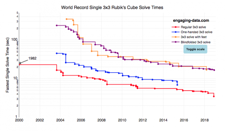
I recently taught my daughter how to solve the rubik’s cube using “the beginner method”. She’s getting decently fast, but when we watched some youtube videos about really fast speed cubers, we were blown away by how fast people can solve the cube. The world record time is under 4 seconds! I thought it’d be fun to document the progression of world records since the cube was introduced in 1980.
What was interesting in looking through the records are the strange events that people compete in and post amazing times in. Blindfolded! With Feet! One-handed! Feet or one-handed is at least in the realm of possibility, though it would slow down my already slow solves, but blindfolded is next-level stuff.
Hover over the different data series for the events to see the record-holder’s name, country, solve time and competition for each world record. You can also toggle the y-axis scale from linear to log scale in order to distinguish between the latest world records as they tend to converge and have very small changes.
Not sure if it’s motivating or discouraging to see these ridiculously fast solve times. Knowing that we’ll never be able to beat people who solve the cube blindfolded is a bit humbling.
Data and Tools:
Data was downloaded from cubecomps.com, a speed cubing website and the data was plotted using the open-sourced Plot.ly javascript engine.
Bay Area Air Quality from Napa and Santa Rosa Fires
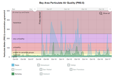
The fires in Napa and Santa Rosa California have been burning for about a week and a half so far and these fires have resulted in numerous deaths (with many more missing), significant property damage (over 4000 buildings), and forced the evacuation of tens of thousands from their homes. Luckily, these fires are mostly contained at this point with incredible work from firefighters and as well as from the weather (link to fire status on the CalFire’s websites on the Tubbs, Atlas, Nuns fires).
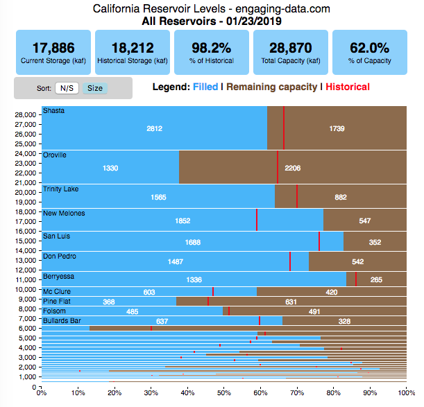
How Fast Are California Reservoirs Filling Up?
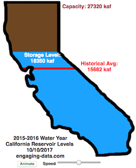
Update: I added a date slider to let you scrub through dates as well as the ability to pause the animation.
In my California water levels visualization, I presented a “bar graph” showing the amount of water currently in California’s reservoirs. However, I thought it’d be interesting to see how this has changed over the course of the last few months, since the state has gotten alot of rain and snow recently.
This visualizations “animates” the graph for recent history (going back to October 1, 2015) showing how the recent rains (or lack thereof) has been caused the levels of the reservoirs in California to rise (and fall).
The historical average represents a daily average reservoir level. It changes for each day of the water year to represent seasonality of precipitation and runoff.
Click the “animate” button below the figure and you can use the slider to change the speed of animation as it cycles through the days. I added a Date slider which lets you scrub through all the dates and animate from different points. (more…)
How Much Water is in California Reservoirs? – Current and Historical Visualization
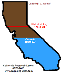
**Check out the new reservoirs dashboard**
California has had an issue with drought, especially for the past few years now. Recently, 2016-2017’s El Nino weather patterns has brought a significant amount of rain to the state and helped alleviate some, but not all, of the major issues.
I’ve been very curious to understand how the rain storms we experience are lessening the impact of the drought, and whether one wet season (like 2016-2017) can really “get the state out of a drought”. One way to assess this is to look at the status of California reservoirs.
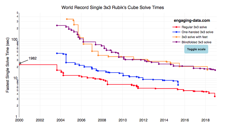
Rubik’s Cube World Records for 3×3 Puzzles (Regular, feet, blindfolded, one-handed)
I recently taught my daughter how to solve the rubik’s cube using “the beginner method”. She’s getting decently fast, but when we watched some youtube videos about really fast speed cubers, we were blown away by how fast people can solve the cube. The world record time is under 4 seconds! I thought it’d be fun to document the progression of world records since the cube was introduced in 1980.
What was interesting in looking through the records are the strange events that people compete in and post amazing times in. Blindfolded! With Feet! One-handed! Feet or one-handed is at least in the realm of possibility, though it would slow down my already slow solves, but blindfolded is next-level stuff.
Hover over the different data series for the events to see the record-holder’s name, country, solve time and competition for each world record. You can also toggle the y-axis scale from linear to log scale in order to distinguish between the latest world records as they tend to converge and have very small changes.
Not sure if it’s motivating or discouraging to see these ridiculously fast solve times. Knowing that we’ll never be able to beat people who solve the cube blindfolded is a bit humbling.
Data and Tools:
Data was downloaded from cubecomps.com, a speed cubing website and the data was plotted using the open-sourced Plot.ly javascript engine.
Bay Area Air Quality from Napa and Santa Rosa Fires
The fires in Napa and Santa Rosa California have been burning for about a week and a half so far and these fires have resulted in numerous deaths (with many more missing), significant property damage (over 4000 buildings), and forced the evacuation of tens of thousands from their homes. Luckily, these fires are mostly contained at this point with incredible work from firefighters and as well as from the weather (link to fire status on the CalFire’s websites on the Tubbs, Atlas, Nuns fires).
How Fast Are California Reservoirs Filling Up?
Update: I added a date slider to let you scrub through dates as well as the ability to pause the animation.
In my California water levels visualization, I presented a “bar graph” showing the amount of water currently in California’s reservoirs. However, I thought it’d be interesting to see how this has changed over the course of the last few months, since the state has gotten alot of rain and snow recently.
This visualizations “animates” the graph for recent history (going back to October 1, 2015) showing how the recent rains (or lack thereof) has been caused the levels of the reservoirs in California to rise (and fall).
The historical average represents a daily average reservoir level. It changes for each day of the water year to represent seasonality of precipitation and runoff.
Click the “animate” button below the figure and you can use the slider to change the speed of animation as it cycles through the days. I added a Date slider which lets you scrub through all the dates and animate from different points. (more…)
How Much Water is in California Reservoirs? – Current and Historical Visualization
**Check out the new reservoirs dashboard**
California has had an issue with drought, especially for the past few years now. Recently, 2016-2017’s El Nino weather patterns has brought a significant amount of rain to the state and helped alleviate some, but not all, of the major issues.
I’ve been very curious to understand how the rain storms we experience are lessening the impact of the drought, and whether one wet season (like 2016-2017) can really “get the state out of a drought”. One way to assess this is to look at the status of California reservoirs.
Recent Comments