Posts for Tag: countries
California is World’s 4th Largest Economy

This is one of an ongoing series of visualizations about the state of California. This one is about the state’s economy, which recently moved into 4th place (2024), if California were its own country. It is, however, still part of the United States.
The visualization shows the relative sizes of the top 10 world economies (including the US, with California removed for context). California has the smallest population of any of the top 10, with #9 Canada just barely larger than California in population, though with a significantly smaller sized economy (about 1/2 the size).
Hover over the countries to see their GDP and population. California is behind the United States, China and Germany in total economic output (in nominal terms), but ahead of much larger countries Japan and India and the United Kingdom.
The state’s economy produces $4.1 Trillion dollars of economic output, driven by a range of industries including technology, real estate, manufacturing, agriculture and health care. It is a hub for innovation and entrepreneurship. California is also the leading agricultural state in the United States. Immigration is a huge part of the state’s workforce.
Sources and Tools:
2024 economic data was downloaded from the International Monetary Fund (IMF). This visualization is made using d3.js, an open-source javascript visualization library.

Snake on a Globe

Navigate the globe to the specified cities eating as many apples as you can
I coded a unique twist on the classic snake game, Snake on a Globe, where your mission is to eat as many apples as you can when given their location and find the best ways to navigate the globe.
The game includes the largest cities in the world and tests your geographical knowledge about country and city locations. Your challenge is to move to the next apple and city in the most efficient manner, moving only along lines of longitude or latitude. But remember you are on a sphere so you can move around the globe in any of four directions: over the poles and east and west.
Instructions
Use the arrow keys (or WASD or IJKL) to move up, down, left and right along the lines of longitude and latitude to try to get to the named city.
The score increases for each apple you eat and there are extra bonus points for the largest cities. For each apple you eat, your body gets longer
The game calculates the least number of steps to move between one apple and the next and your score will start to decline once you exceed this number of steps. The game will remind you that your score is going down because it will be shown in red.
The game ends when your score goes to zero (i.e. you took too long to eat an apple) or if you collide with your own body. One caveat is that you can cross over the poles without hitting your own body if you are on a different line of longitude.
See how many apples you can eat and whether you can get a high score.
Sources and Tools:
The list of cities and their population is from Simplemaps. The game is coded with Three Globe and Three.js, 3D javascript libraries in javascript and HTML and CSS.

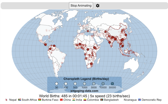
Global Birth Map

Where in the world are babies being born and how fast?
This interactive, animated map shows the where births are happening across the globe. It doesn’t actually show births in real-time, because data isn’t actually available to do that. However, the map does show the frequency of births that are occurring in different locations across the world. And you can see it in two ways, by country and also geo-referenced to specific locations (along a 1degree grid across the globe). There are many different ways to view this global birth map and these options are laid out in the controls at the top of the map. The scrolling list across the bottom also shows the country of each of the dots on the map.
Instructions
- Speed – change the slider to change the rate at which births show up on the map from real-speed to 25x faster
- Map projection – change the map projection
- Highlight country – an outline around the country when a birth occurs
- Choropleth – Build – as each birth occurs, the background color of the country will slowly change to reflect the number of births in the country
- Choropleth – Show – this option colors all the countries to show the number of births per day that occur in the country
- Dots – Show – this is the main feature that shows where each birth is occurring at the frequency that it does occur.
- Dots – Persist – this feature shows where previous births have occurred and the dots get darker as more births happen in that location.
If you hover (or click on mobile) on a country during the animation, it will display how many births have occurred since the animation stared.
Population distribution data combined with country birthrates
I used data that divided and aggregated the world’s population into 1 degree grid spacing across the globe and I assigned the center of each of these grid locations to a country. Then the country’s annual births (i.e. the country’s population times its birthrate) were distributed across all of the populated locations in each country, weighted by the population distribution (i.e. more populated areas got a greater fraction of the births).
Data Sources and Tools
Population and birthrate data for 2023 was obtained from Wikipedia (Population and birth rates). Population distribution across the globe was obtained from Socioeconomic Data and Applications Center (sedac) at Columbia University.
I used python to process country, population distribution data and parse the data into the probability of a birth at each 1 degree x 1 degree location. Then I used javascript to make random draws and predict the number of births for each map location. D3.js was used to create the map elements and html, css and javascript were used to create the user interface.
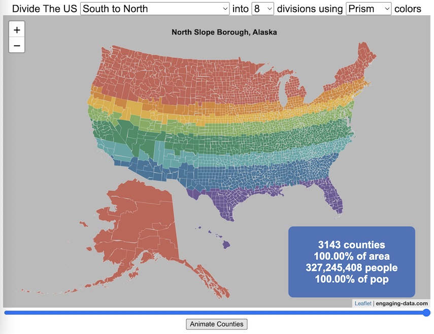
Splitting the US by Population

This visualization lets you divide the US into 1,2,3,4,5,8 and 10 different segments with equal population and across different dimensions. The divisions are made using counties as the building blocks (of which there are 3143 in the US). There are numerous different ways to make the divisions. This lets you make the divisions by different types of geographic directions and divisions by population density.
Instructions
- Select a dimension on which to divide up the country – there are geographic dimensions, like north to south or east to west, or by population density
- For some geographic divisions (concentric rings or pie slices), you can choose the geographic center of the divisions
- You can also choose the number and color scheme of the divisions
- To show the divisions, either click the Animate Counties button or use the slider to add counties
If you can think of other interesting ways to divide up the US, please let me know and I can try to add them to this visualization.
Sources and Tools:
2018 county population data is from US Census Bureau. The map visualization is created using the Leaflet javascript mapping library and the data wrangling and user interface and interactivity are created using HTML, CSS and Javascript code.
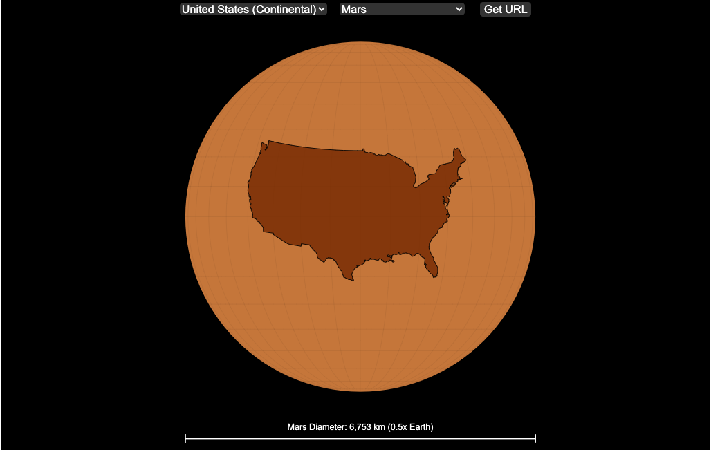
Countries Mapped onto Solar System Bodies
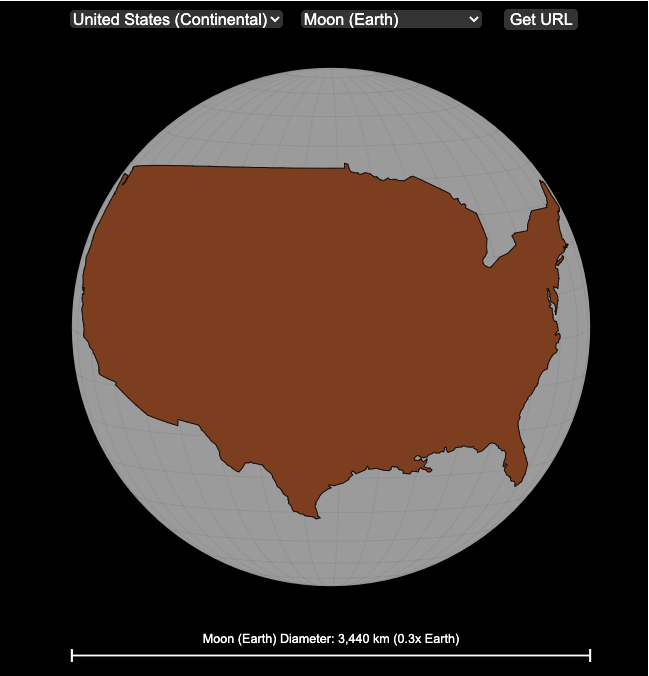
We can compare the sizes of countries and continents to planets and moons by projecting a map of a specific country onto another planet. Select a country and planet or moon to find out.
In one of my kid’s favorite books, there’s a picture demonstrating how Pluto is the same size as Australia. It has a satellite image of the country and an image of the former ninth planet superimposed on top as if it were hovering above the country. That image has stuck with me and I thought it would be interesting to see how other countries would compare with other planets and bodies in our solar system. As I’ve been working with javascript graphing/mapping library, D3.js and making maps/globes, I realized I should try to “project” individual countries onto these planets to see what they looked like.
Instructions
This visualization should be pretty self explanatory. You can select a country or continent and a planet or moon (or the sun) in the solar system. The visualization will then project the land onto the body and you have a simple visual comparison of the size of the country/continent and the planet or moon. You can drag on the visualization to rotate the planet.
There are some combinations that are not possible because the country/continent is too large to be projected onto the body without overlap. In these cases, the planet or country will be greyed out in the selection menu. You can click the “Get URL” button and share a specific map combination (country and planet) by copying the address in the url address bar.
The visualization also displays the area of the country/continent and the surface area of the planet or body. In some cases, the percentage may not look correct but remember that you can only see half of the planet surface and that it’s actually a hemisphere (half a sphere and not just a circle). It becomes clearer if you draw the surface of the planet around.
Calculations
The calculations to project a country onto another body involves starting with a set of coordinates (made up of longitude and latitude values) which define the border of the country, in the geojson format. To display them on Earth, the coordinates are modified so that the center of the country is centered at the intersection between the equator and prime meridian [0 deg latitude, 0 deg longitude].
To display them projected on a different planet or moon, it is necessary to change the latitude and longitude values of each point of the polygon country border so that it represents the same distance away from the polygon center. I used the Haversine formula to calculate the distance and bearing between two points on a sphere and then used the inverse to find the coordinates that were that distance and bearing from the center point on a sphere of a different size. These formulas can be found here. The main idea is that the distance representing one degree of latitude on Earth will be half as large on a planet that is half the size of Earth (like Mars). Thus, the distance between the center of a country and a point on the border will be a different number of degrees latitude and longitude from the center point on a different planet than on Earth. And this calculatin is done using these formulae.
Sources and Tools:
This visualization was made using the open-source, d3 javascript dataviz library and UI are made using HTML, CSS and javascript.
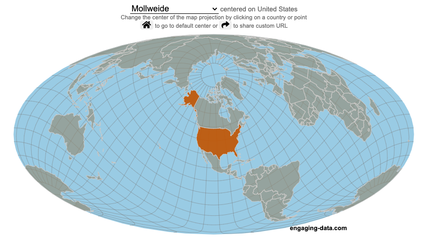
Country Centered Map Projections

What does it look like if you center a map on a specific country? Click on a country to find out.
World maps are used to show the geographic relationships between the countries and regions of the world. Their design shapes our perception of the world and those relationships. Two of the important aspects of map design are the choice of map projection and what is centered in the map. The idea for this map dataviz is to let users create their own country centered map by centering the map where you choose (on a country of your choice or a specific point) and the map projection.
As discussed in my real country size mercator map, there aren’t any perfect map projections as you try to represent the 3-dimensional surface of a sphere on a 2-dimensional map. Each map projection has advantages and disadvantages.
Instructions
- Click on a country or point on the ocean to center the map projection onto this area
You can choose between the following map projections:
- Orthographic (globe) – a map projection that looks like a globe
- Mercator – a very common cylindrical map projection used in many web maps which expands sizes of land near the top and bottom edges
- Mollweide – a pseudocylindrical projection that maintains equal area of land masses. Areas near the top and bottom edges can be distorted
- Equirectangular – another cylindrical projection but latitude lines are kept equidistant. Areas near top and bottom edges of map are wider than in reality.
- Gall Peters – an equal area cylindrical projection that stretches shapes vertically at the equator and shrinks shapes vertically at the poles.
In addition, you can:
- Rotate the map in increments of 45 degrees using the ⟲ and ⟳ buttons.
- Share maps of your home country, chosen map projection and rotation by clicking on the share button (and copying the URL).
The number of different maps you can create is quite large and will give you a different and often unusual perspective on the world. If you choose the cylindrical projections (Mercator, equirectangular, Gall Peters) you will see some interesting distortions when you focus on different countries or regions. The reasoning is that because the map is rectangular (i.e. the longitude lines are kept parallel on the map, while in reality longitude lines converge at the poles), land masses near the top and bottom of the map will grow as they are widened (and in the case of the Mercator, made taller) to accommodate the map projection. Because the Orthographic and Mollweide projections have converging longitude lines, they do not exhibit the same level of distortion.
If you are interested in map projections, they are described in this wikipedia article. For a cylindrical projections, you can think of it as encircling the globe with a rolled surface which forms the side of a cylinder. See this image from wikipedia.

In the standard projection, the globe is touching this cylinder at the equator, but this map lets you move any country or point to the place where it intersects the cylinder and then projects the land masses onto the cylinder. Land masses at the top and bottom of the sphere in this orientation will be more distorted at top and bottom of the map projections in these cylindrical projections.
Sources and Tools:
This map was made using the open-source, d3 javascript dataviz library and based on Mike Bostock’s observable maps notebook.
California is World’s 4th Largest Economy
This is one of an ongoing series of visualizations about the state of California. This one is about the state’s economy, which recently moved into 4th place (2024), if California were its own country. It is, however, still part of the United States.
The visualization shows the relative sizes of the top 10 world economies (including the US, with California removed for context). California has the smallest population of any of the top 10, with #9 Canada just barely larger than California in population, though with a significantly smaller sized economy (about 1/2 the size).
Hover over the countries to see their GDP and population. California is behind the United States, China and Germany in total economic output (in nominal terms), but ahead of much larger countries Japan and India and the United Kingdom.
The state’s economy produces $4.1 Trillion dollars of economic output, driven by a range of industries including technology, real estate, manufacturing, agriculture and health care. It is a hub for innovation and entrepreneurship. California is also the leading agricultural state in the United States. Immigration is a huge part of the state’s workforce.
Sources and Tools:
2024 economic data was downloaded from the International Monetary Fund (IMF). This visualization is made using d3.js, an open-source javascript visualization library.
Snake on a Globe
Navigate the globe to the specified cities eating as many apples as you can
I coded a unique twist on the classic snake game, Snake on a Globe, where your mission is to eat as many apples as you can when given their location and find the best ways to navigate the globe.
The game includes the largest cities in the world and tests your geographical knowledge about country and city locations. Your challenge is to move to the next apple and city in the most efficient manner, moving only along lines of longitude or latitude. But remember you are on a sphere so you can move around the globe in any of four directions: over the poles and east and west.
Instructions
Sources and Tools:
The list of cities and their population is from Simplemaps. The game is coded with Three Globe and Three.js, 3D javascript libraries in javascript and HTML and CSS.
Global Birth Map
Where in the world are babies being born and how fast?
This interactive, animated map shows the where births are happening across the globe. It doesn’t actually show births in real-time, because data isn’t actually available to do that. However, the map does show the frequency of births that are occurring in different locations across the world. And you can see it in two ways, by country and also geo-referenced to specific locations (along a 1degree grid across the globe). There are many different ways to view this global birth map and these options are laid out in the controls at the top of the map. The scrolling list across the bottom also shows the country of each of the dots on the map.
Instructions
- Speed – change the slider to change the rate at which births show up on the map from real-speed to 25x faster
- Map projection – change the map projection
- Highlight country – an outline around the country when a birth occurs
- Choropleth – Build – as each birth occurs, the background color of the country will slowly change to reflect the number of births in the country
- Choropleth – Show – this option colors all the countries to show the number of births per day that occur in the country
- Dots – Show – this is the main feature that shows where each birth is occurring at the frequency that it does occur.
- Dots – Persist – this feature shows where previous births have occurred and the dots get darker as more births happen in that location.
If you hover (or click on mobile) on a country during the animation, it will display how many births have occurred since the animation stared.
Population distribution data combined with country birthrates
I used data that divided and aggregated the world’s population into 1 degree grid spacing across the globe and I assigned the center of each of these grid locations to a country. Then the country’s annual births (i.e. the country’s population times its birthrate) were distributed across all of the populated locations in each country, weighted by the population distribution (i.e. more populated areas got a greater fraction of the births).
Data Sources and Tools
Population and birthrate data for 2023 was obtained from Wikipedia (Population and birth rates). Population distribution across the globe was obtained from Socioeconomic Data and Applications Center (sedac) at Columbia University.
I used python to process country, population distribution data and parse the data into the probability of a birth at each 1 degree x 1 degree location. Then I used javascript to make random draws and predict the number of births for each map location. D3.js was used to create the map elements and html, css and javascript were used to create the user interface.
Splitting the US by Population
This visualization lets you divide the US into 1,2,3,4,5,8 and 10 different segments with equal population and across different dimensions. The divisions are made using counties as the building blocks (of which there are 3143 in the US). There are numerous different ways to make the divisions. This lets you make the divisions by different types of geographic directions and divisions by population density.
Instructions
- Select a dimension on which to divide up the country – there are geographic dimensions, like north to south or east to west, or by population density
- For some geographic divisions (concentric rings or pie slices), you can choose the geographic center of the divisions
- You can also choose the number and color scheme of the divisions
- To show the divisions, either click the Animate Counties button or use the slider to add counties
If you can think of other interesting ways to divide up the US, please let me know and I can try to add them to this visualization.
Sources and Tools:
2018 county population data is from US Census Bureau. The map visualization is created using the Leaflet javascript mapping library and the data wrangling and user interface and interactivity are created using HTML, CSS and Javascript code.
Countries Mapped onto Solar System Bodies
We can compare the sizes of countries and continents to planets and moons by projecting a map of a specific country onto another planet. Select a country and planet or moon to find out.
In one of my kid’s favorite books, there’s a picture demonstrating how Pluto is the same size as Australia. It has a satellite image of the country and an image of the former ninth planet superimposed on top as if it were hovering above the country. That image has stuck with me and I thought it would be interesting to see how other countries would compare with other planets and bodies in our solar system. As I’ve been working with javascript graphing/mapping library, D3.js and making maps/globes, I realized I should try to “project” individual countries onto these planets to see what they looked like.
Instructions
This visualization should be pretty self explanatory. You can select a country or continent and a planet or moon (or the sun) in the solar system. The visualization will then project the land onto the body and you have a simple visual comparison of the size of the country/continent and the planet or moon. You can drag on the visualization to rotate the planet.
There are some combinations that are not possible because the country/continent is too large to be projected onto the body without overlap. In these cases, the planet or country will be greyed out in the selection menu. You can click the “Get URL” button and share a specific map combination (country and planet) by copying the address in the url address bar.
The visualization also displays the area of the country/continent and the surface area of the planet or body. In some cases, the percentage may not look correct but remember that you can only see half of the planet surface and that it’s actually a hemisphere (half a sphere and not just a circle). It becomes clearer if you draw the surface of the planet around.
Calculations
The calculations to project a country onto another body involves starting with a set of coordinates (made up of longitude and latitude values) which define the border of the country, in the geojson format. To display them on Earth, the coordinates are modified so that the center of the country is centered at the intersection between the equator and prime meridian [0 deg latitude, 0 deg longitude].
To display them projected on a different planet or moon, it is necessary to change the latitude and longitude values of each point of the polygon country border so that it represents the same distance away from the polygon center. I used the Haversine formula to calculate the distance and bearing between two points on a sphere and then used the inverse to find the coordinates that were that distance and bearing from the center point on a sphere of a different size. These formulas can be found here. The main idea is that the distance representing one degree of latitude on Earth will be half as large on a planet that is half the size of Earth (like Mars). Thus, the distance between the center of a country and a point on the border will be a different number of degrees latitude and longitude from the center point on a different planet than on Earth. And this calculatin is done using these formulae.
Sources and Tools:
This visualization was made using the open-source, d3 javascript dataviz library and UI are made using HTML, CSS and javascript.
Country Centered Map Projections
What does it look like if you center a map on a specific country? Click on a country to find out.
World maps are used to show the geographic relationships between the countries and regions of the world. Their design shapes our perception of the world and those relationships. Two of the important aspects of map design are the choice of map projection and what is centered in the map. The idea for this map dataviz is to let users create their own country centered map by centering the map where you choose (on a country of your choice or a specific point) and the map projection.
As discussed in my real country size mercator map, there aren’t any perfect map projections as you try to represent the 3-dimensional surface of a sphere on a 2-dimensional map. Each map projection has advantages and disadvantages.
Instructions
- Click on a country or point on the ocean to center the map projection onto this area
You can choose between the following map projections:
- Orthographic (globe) – a map projection that looks like a globe
- Mercator – a very common cylindrical map projection used in many web maps which expands sizes of land near the top and bottom edges
- Mollweide – a pseudocylindrical projection that maintains equal area of land masses. Areas near the top and bottom edges can be distorted
- Equirectangular – another cylindrical projection but latitude lines are kept equidistant. Areas near top and bottom edges of map are wider than in reality.
- Gall Peters – an equal area cylindrical projection that stretches shapes vertically at the equator and shrinks shapes vertically at the poles.
In addition, you can:
- Rotate the map in increments of 45 degrees using the ⟲ and ⟳ buttons.
- Share maps of your home country, chosen map projection and rotation by clicking on the share button (and copying the URL).
The number of different maps you can create is quite large and will give you a different and often unusual perspective on the world. If you choose the cylindrical projections (Mercator, equirectangular, Gall Peters) you will see some interesting distortions when you focus on different countries or regions. The reasoning is that because the map is rectangular (i.e. the longitude lines are kept parallel on the map, while in reality longitude lines converge at the poles), land masses near the top and bottom of the map will grow as they are widened (and in the case of the Mercator, made taller) to accommodate the map projection. Because the Orthographic and Mollweide projections have converging longitude lines, they do not exhibit the same level of distortion.
If you are interested in map projections, they are described in this wikipedia article. For a cylindrical projections, you can think of it as encircling the globe with a rolled surface which forms the side of a cylinder. See this image from wikipedia.
In the standard projection, the globe is touching this cylinder at the equator, but this map lets you move any country or point to the place where it intersects the cylinder and then projects the land masses onto the cylinder. Land masses at the top and bottom of the sphere in this orientation will be more distorted at top and bottom of the map projections in these cylindrical projections.
Sources and Tools:
This map was made using the open-source, d3 javascript dataviz library and based on Mike Bostock’s observable maps notebook.
Recent Comments