Posts for Tag: countries
Most COVID-19 deaths in the US could have been avoided
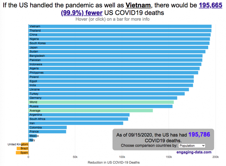
The US coronavirus death rate is quite high compared to other countries (on a population-corrected basis)
US coronavirus deaths have surpassed 300,000. Many of these deaths could have been avoided if swift action had been taken in February and March, as many other countries did. This graph shows an rough estimate of the number of US deaths that could have been avoided if the US had acted similar to other countries.
This graph takes the rate of coronavirus deaths by country (normalized to their population size) and imagines what would happen if the US had had that death rate, instead of its own. It then applies that reduction (or increase) in death rate to the total number of deaths that the US has experienced. The US death rate is about 600/million people in September 2020 and if a country has a death rate of 60/million people, then 90% of US deaths (about 180,000 people) could have been avoided if the US had matched their death rate. The government response to the pandemic is one of several important factors that determine the number of cases and deaths in a country. This means proper messaging about the need to wear masks and socially distance as well as providing payments to citizens and business to help them during the economic shutdown. Other important factors can include the overall health of the population, the population structure (i.e. age distribution of population), ease of controlling borders to prevent cases from entering the country, presence of universal or low-cost health care system, and relative wealth and education of the population.
The graph lets you compare the potential reduction in US deaths when looking at 30 different countries. You can choose those 30 countries based on total population, GDP or GDP per capita. These give somewhat different sets of countries to compare death rates, which is an indication of the effectiveness of the coronavirus response.
A valid criticism of this graph is that testing and data collection is very different in each of the countries shown and the comparisons are not always valid. This is definitely a problem with all coronavirus data but for the most part, the very large differences between death rates would still exist even if data collection were totally standardized. Some of the data from the poorest countries is less reliable, because they have less testing capabilities.
Source and Tools:
Data on coronavirus deaths by country is from covid19api.com and downloaded and cleaned with a python script. Graph is made using the plotly open source javascript library.

Greenhouse gas emissions from airplane flights
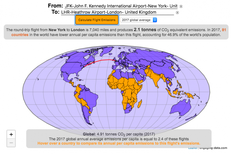
Traveling by airplane produces significant greenhouse gas emissions
Flying in an airplane is likely the most greenhouse gas intensive activity you can do. In a few short hours, you can can travel thousands of miles across the continent or ocean. It takes a large amount of fossil-fuel energy (oil) to lift an 80+ ton airplane off the ground and propel it at 600 miles per hour through the air. Every hour of travel (in a Boeing 737) consumes around 750 gallons of jet fuel.
Even when dividing the fuel usage across all of the passengers (and cargo) of an aircraft, airplane travel consumes a significant amount of fuel per passenger. The fuel economy is estimated to be about the same as a fairly efficient hybrid car driven by one person (60-70 passenger miles per gallon). However, because you can go 10 times faster and much further more easily than you would in a car, airline travel can, on an absolute basis, emit larger amounts of greenhouse gases. In fact, an individual passenger’s share of emissions from a single airplane flight can exceed the annual average greenhouse gas emissions per capita from a number of countries (and the global average).
The following flight calculator and data visualization shows the miles and emissions produced per passenger by a airplane trip that you can specify. Choose two airports that you are interested in and click the “Calculate Flight Emissions” button to see the emissions associated with a round-trip flight between these two cities. The map will show you the flight route and also shows you the countries in the world where this one single round-trip flight produces more emissions per passenger than the average resident does in one year from all sources (annual per capita emissions).
In addition to individual countries, the tool also compares the flight’s per passenger emissions to the global average emissions per capita in 2017 (4.91 tonnes) and the emissions required to achieve a 22℃ climate stabilization in 2030 (3.08 tonnes) and in 2050 (1.37 tonnes). These 2030 and 2050 numbers are based on an International Energy Agency scenario.
Calculations of Airplane Emissions
The emissions calculated by this calculator are based on calculations from myclimate.org, a non-profit environmental organization.
The fuel consumption of a jet depends on the size of the aircraft and distance traveled, but takeoff and climbing to cruising altitude are particularly fuel-intensive. On shorter flights, the takeoff and initial climb will constitute a greater proportion of the total flight time so fuel consumption per mile will be higher than on longer (e.g. international) flights.
The detailed methodology is described in more detail in this document.
In addition to emissions of CO2 from the burning of jet fuel, jets also emit other gases (including methane, NOx, and water vapor) which can also contribute to warming (also known as “radiative forcing”). Because the emissions are occurring at high altitude, these gases can have different impacts than those at lower altitude. A number of studies have estimated the impact of these other gases can significantly contribute to the overall radiative forcing and have somewhere between 1.5 and 3 times the impact that the CO2 alone would. A number of studies, including the myclimate calculator use a factor of 2 to account for these non-CO2 gases and their warming impact, and that is what is used in this calculator as well.
Unlike cars, trucks and trains, it is much harder to power airplanes with batteries and electricity and producing low-carbon jet fuels from biomass is proving very challenging.
In order to achieve climate stabilization at 2 degrees C, global emissions need to basically go to zero over the next 40 years. With a growing global population, this means that the allowable emissions per person will shrink rapidly over these coming decades.
Ultimately, while aviation is a small part of global greenhouse gas emissions, it is a larger part of emissions in richer countries (i.e. if you are reading/viewing this post). And there are many in these richer countries who fly a disproportionate amount and therefore contribute a disproportionate amount of emissions. Hopefully, putting airplane travel in this context can help us better understand the impact of our actions and choices and maybe even change behavior for some.
Tools and Data Sources
The calculator estimates flight emissions based on the myclimate carbon footprint calculator. Data for CO2 emissions by country was downloaded from the European Commissions’s Emissions Database for Global Atmospheric Research. The map was built using the leaflet open-source mapping library in javascript.

Assembling the World Country-By-Country

Watch the world assemble country-by-country based on a specific statistic
This map lets you watch as the world is built-up one country at a time. This can be done along the following statistical dimensions:
- Country name
- Population – from United Nations (2017)
- GDP – from United Nations (2017)
- GDP per capita
- GDP per area
- Land Area – from CIA factbook (2016)
- Population density
- Life expectancy – from World Health Organization (2015)
- or a random order
These statistics can be sorted from small to large or vice versa to get a view of the globe and its constituent countries in a unique and interesting way. It’s a bit hypnotic to watch as the countries appear and add to the world one by one.
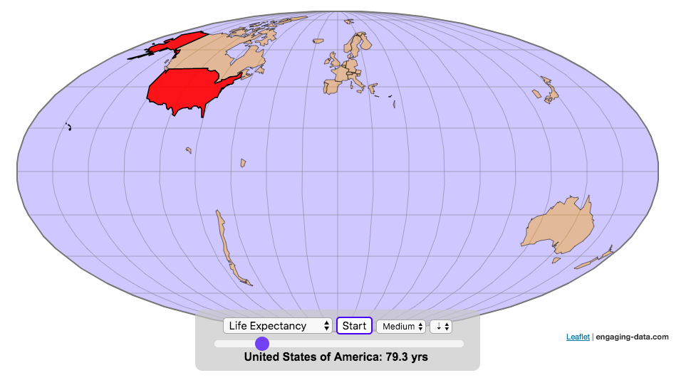
You can use this map to display all the countries that have higher life expectancy than the United States:
select “Life expectancy”, sort from “high to low” and use the scroll bar to move to the United States and you’ll get a picture like this:
or this map to display all the countries that have higher population density than the United States:
select “Population density, sort from “high to low” and use the scroll bar to move to the United States and you’ll get a picture like this:

I hope you enjoy exploring the countries of the world through this data viz tool. And if you have ideas for other statistics to add, I will try to do so.
Data and tools: Data was downloaded primarily from Wikipedia: Life expectancy from World Health Organization (2015) | GDP from United Nations (2017) | Population from United Nations (2017) | Land Area from CIA factbook (2016)
The map was created with the help of the open source leaflet javascript mapping library
Real Country Sizes Shown on Mercator Projection (Updated)
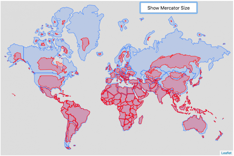
Hover or click on a country to see how much it shrinks from the Mercator projection size.
Check out some other engaging and interactive map dataviz:
I remember as a child thinking that Alaska was as large as 1/2 of the continental US. Later, however, I learned that while it is the largest state, it is actually only about 1/5 the size of the lower 48 states. My son has also remarked that Greenland is very big. And while it is very big, it’s nowhere near the size of the continent of Africa.
The map above shows the distortion in sizes of countries due to the mercator projection. Pressing on the button animates the country ‘shrinking’ to its actual size or ‘growing’ to the size shown on the mercator projection. It was inspired by a similar animation that I saw on reddit and decided I wanted to try to build the same thing.
The mercator projection is a commonly used projection on computer maps because it has perpendicular latitude and longitude lines (forming rectangles). It is formed by projecting the globe onto a cylinder A variant of the was adopted by Google maps, which helped establish it as the informal standard for web-based maps (although Google maps now also uses a globe view, instead of a map projection when zooming out to a very wide view).
Areas far from the equator are distorted in terms of their distances and are shown much larger than they actually are. This is one of the major issues with a projection of a globe onto a cylinder area. This is why Greenland, Russia and Canada shrink so much in height and width in the animation, they are fairly high in latitude in the Northern Hemisphere. Also important is that the closer you are to the poles, the more the distortion when a country is shown on the Mercator projection. Since longitude lines converge at the poles, but are parallel on a Mercator, the closer a part of a country is to the poles, the more that part will get stretched wider relative to a part of a country that is not as close to the poles. As a clear example, see what happens to the southern part of Australia, relative to the northern end. Similarly, the latitude lines also get further apart on a Mercator projection, while on a globe they stay equidistant. This means that the parts of countries that are nearer the poles will get taller, i.e. stretched out from a north-south perspective relative to parts of countries that are further from the poles. You can see this clearly in the northern ends of Russsia and Greenland, where the tops get smushed down.
This next graph shows each country plotted with their actual land area and apparent land area as shown on a Mercator projection. The further the countries are from the 1:1 line the greater the overestimate of their size from the Mercator (also color coded to be red). It is a logarithmic plot showing many different orders of magnitude in country size. The table also shows the top 10 countries whose size is overestimated (and the difference in land area in square kilometers or as a percentage reduction from the size in the Mercator projection).
As it shows, Greenland is the country that has the largest percent difference between its apparent size in a Mercator projection and it’s real size (it’s only about 1/4 of the apparent size). And Russia is the country with the largest absolute difference between these two sizes.
This is the original graph that keeps the shape of the countries exactly the same and just scales the size. This is incorrect because as you move towards the poles the distances between longitude lines decreases. As a result the tops (northern ends) of countries will shrink more than the bottoms (southern ends) of countries in the Northern Hemisphere and vice versa in the Southern Hemisphere.
Old map that changes sizes but incorrectly preserves the Mercator shape

Calculations:
I calculated the area in two ways, one assuming latitude and longitude are rectangular coordinates (i.e. Mercator projection) and the other was the actual area.
The new coordinates needed to draw the “real size” of the countries are derived by calculating the distance between the center of the country and each of the coordinates in the country’s shapefile. As you move towards the poles on a globe, the distance between longitude lines decreases as a function (cosine) of latitude. In a mercator projection, the longitude lines are shown as equi-distant regardless of latitude. In this calculation, we create a new set of coordinates by calculating the distance between the center of the polygon and each set of coordinates and change the coordinates to reflect the shrinking of distance between longitude lines as you head towards the poles.
In the previous version of this animation, I calculated the latitude and longitude coordinates for the outline of the “real” size by modifying the original latitude and longitude by the ratio of these two areas to draw the new smaller, “real” country size.
Data and tools: This visualization was made using the Leafletjs javascript mapping library and country shapefiles (converted to geojson).
Most COVID-19 deaths in the US could have been avoided
The US coronavirus death rate is quite high compared to other countries (on a population-corrected basis)
US coronavirus deaths have surpassed 300,000. Many of these deaths could have been avoided if swift action had been taken in February and March, as many other countries did. This graph shows an rough estimate of the number of US deaths that could have been avoided if the US had acted similar to other countries.
This graph takes the rate of coronavirus deaths by country (normalized to their population size) and imagines what would happen if the US had had that death rate, instead of its own. It then applies that reduction (or increase) in death rate to the total number of deaths that the US has experienced. The US death rate is about 600/million people in September 2020 and if a country has a death rate of 60/million people, then 90% of US deaths (about 180,000 people) could have been avoided if the US had matched their death rate. The government response to the pandemic is one of several important factors that determine the number of cases and deaths in a country. This means proper messaging about the need to wear masks and socially distance as well as providing payments to citizens and business to help them during the economic shutdown. Other important factors can include the overall health of the population, the population structure (i.e. age distribution of population), ease of controlling borders to prevent cases from entering the country, presence of universal or low-cost health care system, and relative wealth and education of the population.
The graph lets you compare the potential reduction in US deaths when looking at 30 different countries. You can choose those 30 countries based on total population, GDP or GDP per capita. These give somewhat different sets of countries to compare death rates, which is an indication of the effectiveness of the coronavirus response.
A valid criticism of this graph is that testing and data collection is very different in each of the countries shown and the comparisons are not always valid. This is definitely a problem with all coronavirus data but for the most part, the very large differences between death rates would still exist even if data collection were totally standardized. Some of the data from the poorest countries is less reliable, because they have less testing capabilities.
Source and Tools:
Data on coronavirus deaths by country is from covid19api.com and downloaded and cleaned with a python script. Graph is made using the plotly open source javascript library.
Greenhouse gas emissions from airplane flights
Traveling by airplane produces significant greenhouse gas emissions
Flying in an airplane is likely the most greenhouse gas intensive activity you can do. In a few short hours, you can can travel thousands of miles across the continent or ocean. It takes a large amount of fossil-fuel energy (oil) to lift an 80+ ton airplane off the ground and propel it at 600 miles per hour through the air. Every hour of travel (in a Boeing 737) consumes around 750 gallons of jet fuel.
Even when dividing the fuel usage across all of the passengers (and cargo) of an aircraft, airplane travel consumes a significant amount of fuel per passenger. The fuel economy is estimated to be about the same as a fairly efficient hybrid car driven by one person (60-70 passenger miles per gallon). However, because you can go 10 times faster and much further more easily than you would in a car, airline travel can, on an absolute basis, emit larger amounts of greenhouse gases. In fact, an individual passenger’s share of emissions from a single airplane flight can exceed the annual average greenhouse gas emissions per capita from a number of countries (and the global average).
The following flight calculator and data visualization shows the miles and emissions produced per passenger by a airplane trip that you can specify. Choose two airports that you are interested in and click the “Calculate Flight Emissions” button to see the emissions associated with a round-trip flight between these two cities. The map will show you the flight route and also shows you the countries in the world where this one single round-trip flight produces more emissions per passenger than the average resident does in one year from all sources (annual per capita emissions).
In addition to individual countries, the tool also compares the flight’s per passenger emissions to the global average emissions per capita in 2017 (4.91 tonnes) and the emissions required to achieve a 22℃ climate stabilization in 2030 (3.08 tonnes) and in 2050 (1.37 tonnes). These 2030 and 2050 numbers are based on an International Energy Agency scenario.
Calculations of Airplane Emissions
The emissions calculated by this calculator are based on calculations from myclimate.org, a non-profit environmental organization.
The fuel consumption of a jet depends on the size of the aircraft and distance traveled, but takeoff and climbing to cruising altitude are particularly fuel-intensive. On shorter flights, the takeoff and initial climb will constitute a greater proportion of the total flight time so fuel consumption per mile will be higher than on longer (e.g. international) flights.
The detailed methodology is described in more detail in this document.
In addition to emissions of CO2 from the burning of jet fuel, jets also emit other gases (including methane, NOx, and water vapor) which can also contribute to warming (also known as “radiative forcing”). Because the emissions are occurring at high altitude, these gases can have different impacts than those at lower altitude. A number of studies have estimated the impact of these other gases can significantly contribute to the overall radiative forcing and have somewhere between 1.5 and 3 times the impact that the CO2 alone would. A number of studies, including the myclimate calculator use a factor of 2 to account for these non-CO2 gases and their warming impact, and that is what is used in this calculator as well.
Unlike cars, trucks and trains, it is much harder to power airplanes with batteries and electricity and producing low-carbon jet fuels from biomass is proving very challenging.
In order to achieve climate stabilization at 2 degrees C, global emissions need to basically go to zero over the next 40 years. With a growing global population, this means that the allowable emissions per person will shrink rapidly over these coming decades.
Ultimately, while aviation is a small part of global greenhouse gas emissions, it is a larger part of emissions in richer countries (i.e. if you are reading/viewing this post). And there are many in these richer countries who fly a disproportionate amount and therefore contribute a disproportionate amount of emissions. Hopefully, putting airplane travel in this context can help us better understand the impact of our actions and choices and maybe even change behavior for some.
Tools and Data Sources
The calculator estimates flight emissions based on the myclimate carbon footprint calculator. Data for CO2 emissions by country was downloaded from the European Commissions’s Emissions Database for Global Atmospheric Research. The map was built using the leaflet open-source mapping library in javascript.
Assembling the World Country-By-Country
Watch the world assemble country-by-country based on a specific statistic
- Country name
- Population – from United Nations (2017)
- GDP – from United Nations (2017)
- GDP per capita
- GDP per area
- Land Area – from CIA factbook (2016)
- Population density
- Life expectancy – from World Health Organization (2015)
- or a random order
These statistics can be sorted from small to large or vice versa to get a view of the globe and its constituent countries in a unique and interesting way. It’s a bit hypnotic to watch as the countries appear and add to the world one by one.
You can use this map to display all the countries that have higher life expectancy than the United States:
select “Life expectancy”, sort from “high to low” and use the scroll bar to move to the United States and you’ll get a picture like this:
or this map to display all the countries that have higher population density than the United States:
select “Population density, sort from “high to low” and use the scroll bar to move to the United States and you’ll get a picture like this:
I hope you enjoy exploring the countries of the world through this data viz tool. And if you have ideas for other statistics to add, I will try to do so.
Data and tools: Data was downloaded primarily from Wikipedia: Life expectancy from World Health Organization (2015) | GDP from United Nations (2017) | Population from United Nations (2017) | Land Area from CIA factbook (2016)
The map was created with the help of the open source leaflet javascript mapping library
Real Country Sizes Shown on Mercator Projection (Updated)
Hover or click on a country to see how much it shrinks from the Mercator projection size.
Check out some other engaging and interactive map dataviz:
I remember as a child thinking that Alaska was as large as 1/2 of the continental US. Later, however, I learned that while it is the largest state, it is actually only about 1/5 the size of the lower 48 states. My son has also remarked that Greenland is very big. And while it is very big, it’s nowhere near the size of the continent of Africa.
The map above shows the distortion in sizes of countries due to the mercator projection. Pressing on the button animates the country ‘shrinking’ to its actual size or ‘growing’ to the size shown on the mercator projection. It was inspired by a similar animation that I saw on reddit and decided I wanted to try to build the same thing.
The mercator projection is a commonly used projection on computer maps because it has perpendicular latitude and longitude lines (forming rectangles). It is formed by projecting the globe onto a cylinder A variant of the was adopted by Google maps, which helped establish it as the informal standard for web-based maps (although Google maps now also uses a globe view, instead of a map projection when zooming out to a very wide view).
Areas far from the equator are distorted in terms of their distances and are shown much larger than they actually are. This is one of the major issues with a projection of a globe onto a cylinder area. This is why Greenland, Russia and Canada shrink so much in height and width in the animation, they are fairly high in latitude in the Northern Hemisphere. Also important is that the closer you are to the poles, the more the distortion when a country is shown on the Mercator projection. Since longitude lines converge at the poles, but are parallel on a Mercator, the closer a part of a country is to the poles, the more that part will get stretched wider relative to a part of a country that is not as close to the poles. As a clear example, see what happens to the southern part of Australia, relative to the northern end. Similarly, the latitude lines also get further apart on a Mercator projection, while on a globe they stay equidistant. This means that the parts of countries that are nearer the poles will get taller, i.e. stretched out from a north-south perspective relative to parts of countries that are further from the poles. You can see this clearly in the northern ends of Russsia and Greenland, where the tops get smushed down.
This next graph shows each country plotted with their actual land area and apparent land area as shown on a Mercator projection. The further the countries are from the 1:1 line the greater the overestimate of their size from the Mercator (also color coded to be red). It is a logarithmic plot showing many different orders of magnitude in country size. The table also shows the top 10 countries whose size is overestimated (and the difference in land area in square kilometers or as a percentage reduction from the size in the Mercator projection).
As it shows, Greenland is the country that has the largest percent difference between its apparent size in a Mercator projection and it’s real size (it’s only about 1/4 of the apparent size). And Russia is the country with the largest absolute difference between these two sizes.
This is the original graph that keeps the shape of the countries exactly the same and just scales the size. This is incorrect because as you move towards the poles the distances between longitude lines decreases. As a result the tops (northern ends) of countries will shrink more than the bottoms (southern ends) of countries in the Northern Hemisphere and vice versa in the Southern Hemisphere.
Old map that changes sizes but incorrectly preserves the Mercator shape
Calculations:
I calculated the area in two ways, one assuming latitude and longitude are rectangular coordinates (i.e. Mercator projection) and the other was the actual area.
The new coordinates needed to draw the “real size” of the countries are derived by calculating the distance between the center of the country and each of the coordinates in the country’s shapefile. As you move towards the poles on a globe, the distance between longitude lines decreases as a function (cosine) of latitude. In a mercator projection, the longitude lines are shown as equi-distant regardless of latitude. In this calculation, we create a new set of coordinates by calculating the distance between the center of the polygon and each set of coordinates and change the coordinates to reflect the shrinking of distance between longitude lines as you head towards the poles.
In the previous version of this animation, I calculated the latitude and longitude coordinates for the outline of the “real” size by modifying the original latitude and longitude by the ratio of these two areas to draw the new smaller, “real” country size.
Data and tools: This visualization was made using the Leafletjs javascript mapping library and country shapefiles (converted to geojson).
Recent Comments