Posts for Tag: animation
Solar (Sun) Intensity By Location and Time
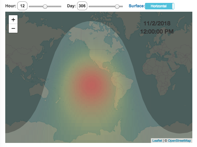
This visualization shows the amount of solar intensity (also called solar insolation and measured in watts per square meter) all across the globe as a function of time of day and day of year. This is an idealized calculation as it does not take into account reductions in solar intensity due to cloud cover or other things that might block the sun from reaching the earth (e.g dust and pollution).
As would be expected, the highest amount of solar intensity occurs on the globe right where the sun is overhead and as the angle of the sun lowers, the solar intensity declines. This is why the area around the equator and up through the tropics is so sunny, the sun is overhead here the most. If you click on the map you should see a popup of the intensity of sunlight at that location.
As the earth rotates over the course of a day, the angle of the sun changes and eventually the angle is so low, the sun is blocked by the horizon (this is sunset).
Instructions
- The default is to show the sunlight intensity for the current date and time but you can change it by moving the sliders for hour or day.
- You can also toggle between the orientation of the surface that you measure the sunlight on. The default shows the intensity of sunlight on a horizontal surface. The other option shows the intensity on a surface that is oriented to face the sun (i.e. perpendicular)
Again, the intensity will depend on the angle it makes with the sun and so it depends on your location on earth (i.e. latitude). Latitudes around the equator will receive more sunlight because their angle is closer to perpendicular.
Shifting through the days of the year, you can start to see the cause of the seasons as the amount of sunlight changes and more or less sunlight goes to each of the northern and southern hemispheres.
Calculations and Tools:
The calculations for solar intensity are based on equations from “Renewable and Efficient Electric Power Systems” by Gilbert Masters Chapter 7. Calculations were made using javascript and visualized using the Leaflet.js library with Open Street Map tiles.
This was a fun project for me to learn online mapping tools and programming.

Shall We Play A (Market Timing) Game?
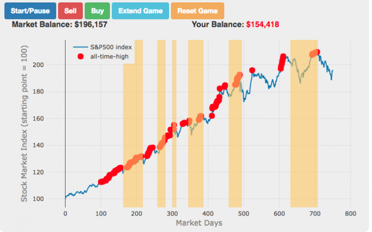

The Market Timing Game simulation is premised on the idea that buying-and-holding index investing and index funds are a no-brainer investment strategy and market timing (i.e. trying to predict market direction and trading accordingly) is a less than optimal strategy. The saying goes “Time in the market not timing the market”. In this simulation, you are given a 3-year market period from sometime in history (data starts January 1, 1950 and goes through the most recent market price, as prices are updated daily) or you can run in Monte Carlo mode (which picks randomly from daily returns in this period) and you start fully invested in the market and can trade out of (and into) the market if you feel like the market will fall (or rise). The goal is to see if you can beat the market index returns.
(more…)
Interactive Dot Illusion (Individual Linear Motion Yields Circular Motion)
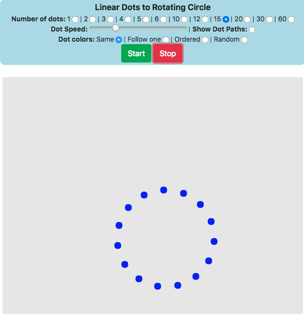
This post doesn’t really involve data, but I was just messing around with animation and the canvas in Javascript and decided to make this. It’s a fun little interactive web animation that makes aggregate circular motion from a bunch of dots moving in straight lines. There are no real instructions except to mess with the controls and see what it does to the animation (i.e. change the number of dots, the speed slider, the dot colors, and show the dot paths).
(more…)
How Fast Are California Reservoirs Filling Up?
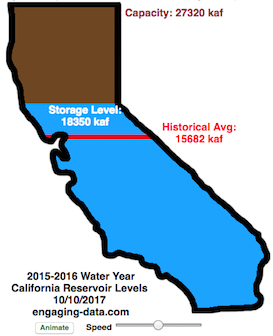
Update: I added a date slider to let you scrub through dates as well as the ability to pause the animation.
In my California water levels visualization, I presented a “bar graph” showing the amount of water currently in California’s reservoirs. However, I thought it’d be interesting to see how this has changed over the course of the last few months, since the state has gotten alot of rain and snow recently.
This visualizations “animates” the graph for recent history (going back to October 1, 2015) showing how the recent rains (or lack thereof) has been caused the levels of the reservoirs in California to rise (and fall).
The historical average represents a daily average reservoir level. It changes for each day of the water year to represent seasonality of precipitation and runoff.
Click the “animate” button below the figure and you can use the slider to change the speed of animation as it cycles through the days. I added a Date slider which lets you scrub through all the dates and animate from different points. (more…)
Solar (Sun) Intensity By Location and Time
This visualization shows the amount of solar intensity (also called solar insolation and measured in watts per square meter) all across the globe as a function of time of day and day of year. This is an idealized calculation as it does not take into account reductions in solar intensity due to cloud cover or other things that might block the sun from reaching the earth (e.g dust and pollution).
As would be expected, the highest amount of solar intensity occurs on the globe right where the sun is overhead and as the angle of the sun lowers, the solar intensity declines. This is why the area around the equator and up through the tropics is so sunny, the sun is overhead here the most. If you click on the map you should see a popup of the intensity of sunlight at that location.
As the earth rotates over the course of a day, the angle of the sun changes and eventually the angle is so low, the sun is blocked by the horizon (this is sunset).
Instructions
- The default is to show the sunlight intensity for the current date and time but you can change it by moving the sliders for hour or day.
- You can also toggle between the orientation of the surface that you measure the sunlight on. The default shows the intensity of sunlight on a horizontal surface. The other option shows the intensity on a surface that is oriented to face the sun (i.e. perpendicular)
Again, the intensity will depend on the angle it makes with the sun and so it depends on your location on earth (i.e. latitude). Latitudes around the equator will receive more sunlight because their angle is closer to perpendicular.
Shifting through the days of the year, you can start to see the cause of the seasons as the amount of sunlight changes and more or less sunlight goes to each of the northern and southern hemispheres.
Calculations and Tools:
The calculations for solar intensity are based on equations from “Renewable and Efficient Electric Power Systems” by Gilbert Masters Chapter 7. Calculations were made using javascript and visualized using the Leaflet.js library with Open Street Map tiles.
This was a fun project for me to learn online mapping tools and programming.
Shall We Play A (Market Timing) Game?
The Market Timing Game simulation is premised on the idea that buying-and-holding index investing and index funds are a no-brainer investment strategy and market timing (i.e. trying to predict market direction and trading accordingly) is a less than optimal strategy. The saying goes “Time in the market not timing the market”. In this simulation, you are given a 3-year market period from sometime in history (data starts January 1, 1950 and goes through the most recent market price, as prices are updated daily) or you can run in Monte Carlo mode (which picks randomly from daily returns in this period) and you start fully invested in the market and can trade out of (and into) the market if you feel like the market will fall (or rise). The goal is to see if you can beat the market index returns.
(more…)
Interactive Dot Illusion (Individual Linear Motion Yields Circular Motion)
This post doesn’t really involve data, but I was just messing around with animation and the canvas in Javascript and decided to make this. It’s a fun little interactive web animation that makes aggregate circular motion from a bunch of dots moving in straight lines. There are no real instructions except to mess with the controls and see what it does to the animation (i.e. change the number of dots, the speed slider, the dot colors, and show the dot paths).
(more…)
How Fast Are California Reservoirs Filling Up?
Update: I added a date slider to let you scrub through dates as well as the ability to pause the animation.
In my California water levels visualization, I presented a “bar graph” showing the amount of water currently in California’s reservoirs. However, I thought it’d be interesting to see how this has changed over the course of the last few months, since the state has gotten alot of rain and snow recently.
This visualizations “animates” the graph for recent history (going back to October 1, 2015) showing how the recent rains (or lack thereof) has been caused the levels of the reservoirs in California to rise (and fall).
The historical average represents a daily average reservoir level. It changes for each day of the water year to represent seasonality of precipitation and runoff.
Click the “animate” button below the figure and you can use the slider to change the speed of animation as it cycles through the days. I added a Date slider which lets you scrub through all the dates and animate from different points. (more…)
Recent Comments