Archive for the ‘Fun’ Category:
Iceberger Remixed and Improved – Iceberg Simulator
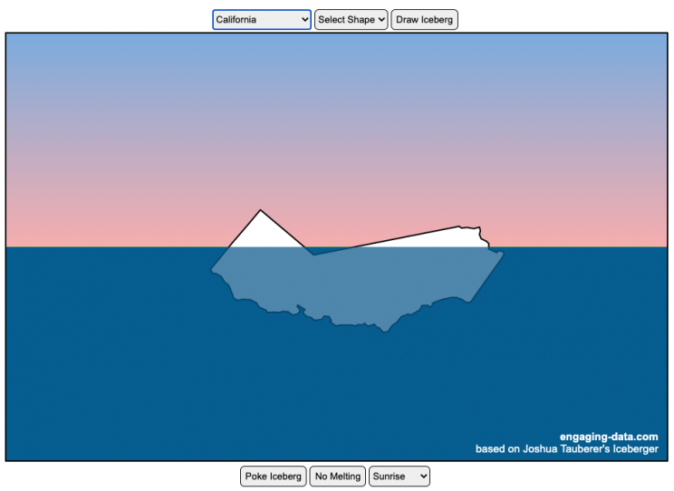
The code has been updated to allow for multiple chunks of icebergs now, which can occur via melting if you draw an iceberg a certain way.
Draw (or choose) an iceberg and visualize how it will float and melt
I was so impressed with the interactive Iceberger tool that Josh Tauberer (@JoshData) made that I had to modify it and add some additional features. Click here to see the original. My additions allow you to conjure up pre-made “icebergs” to see how they float and also allow some interaction. Try “poking” the icebergs you make.
Josh and I were both inspired by a tweet by Megan Thompson-Munson (@GlacialMeg).
Today I channeled my energy into this very unofficial but passionate petition for scientists to start drawing icebergs in their stable orientations. I went to the trouble of painting a stable iceberg with my watercolors, so plz hear me out.
(1/4) pic.twitter.com/rtkCYub38b
— Megan Thompson-Munson (@GlacialMeg) February 19, 2021
Instructions
You can choose between 3 different iceberg creation options:
- Draw Iceberg – the original Iceberger option. Choose this option and draw any shape you want and see how it floats.
- Select State – Choose this option and select from one of the states of the United States to see how it will float.
- Select Shape = Choose this option and select from one of the premade shapes to see how it will float.
Once the iceberg has been created, you can also affect it in a couple of different ways:
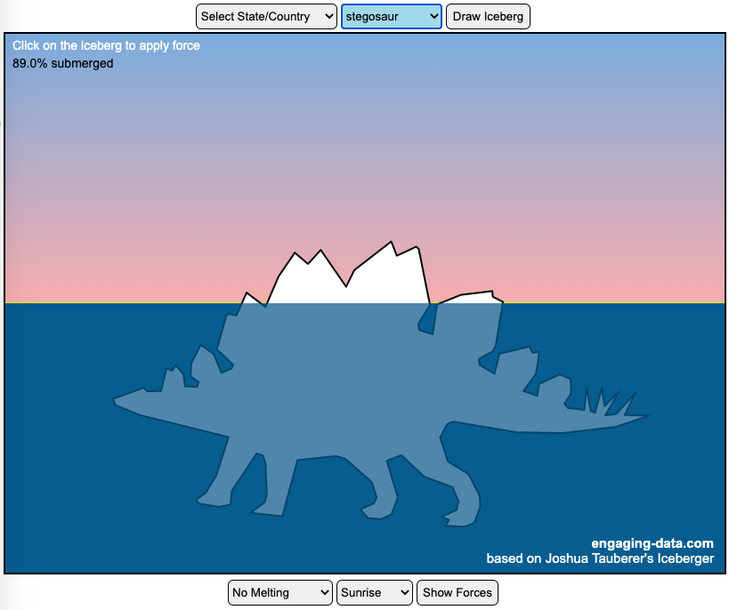
- Click on the Iceberg – This lets you push on the left side of the iceberg to induce some rotation and see if there are multiple stable orientations. Click it several times in a row if you want to flip the iceberg over. If you push on the right size it will rotate the iceberg clockwise and if you push on the left size, it will rotate counter clockwise. if you push in the middle third of the iceberg, it will push it straight down.
- Melting – You can select between different options – No melting, slow medium and fast. This took awhile to code correctly. Previously, I’d just scale parts of the iceberg but this new code actually takes material away from the surface of the iceberg in a uniform way. It works more like you would expect melting ice to behave.
- Changing the Sky – You can change the colors of the sky between sunrise, midday and sunset colors.
- Showing forces – You can toggle whether to show the center of buoyancy (B) and center of gravity (B) of the iceberg.
Some Physics – no equations
The force of gravity (G) affects the entire body regardless of where it is or how it is oriented. If you show the forces, the red dot labeled G shows where the center of mass of the iceberg is. The blue dot labeled B shows where the center of buoyancy is. This is the center of mass of the part of the iceberg that is submerged. The force acting on the submerged part is equal to the volume of water displaced. If the center of buoyancy is below the center of gravity, then the forces will be equal and object will be in stable equilibrium. If the center of buoyancy is somewhere other than under the center of gravity, then the buoyant force will be pushing up on a different place than the gravity force and this will induce a rotation until they are directly over one another.
The code has been updated so that multiple icebergs are now allowed. Melting can separate a single piece of iceberg into multiple pieces, just as in real life. The melting process was a bit difficult to program because of the complexity of shapes that could be produced.
If you have additional suggestions for shapes or countries to add to the list or other improvements to make, let me know in the comments. Also if you are using this as a teaching tool, I’d love to hear how you are incorporating it into your curriculum.
Sources and Tools:
This visualization uses HTML/CSS/Javascript code from the Iceberger app to simulate the buoyancy of icebergs. Melting was accomplished with the help of code from the turf.js, polygon-offset and simplify.js javascript libraries. Additional elements of the UI and other features are also made using HTML, CSS and javascript.
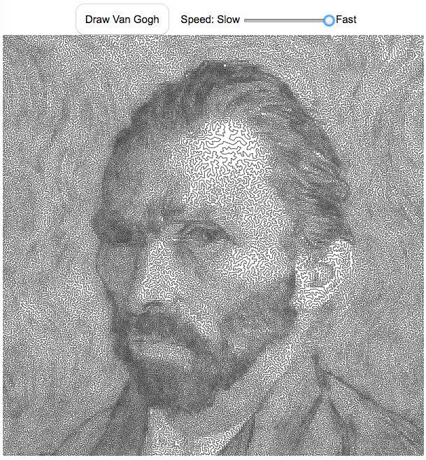
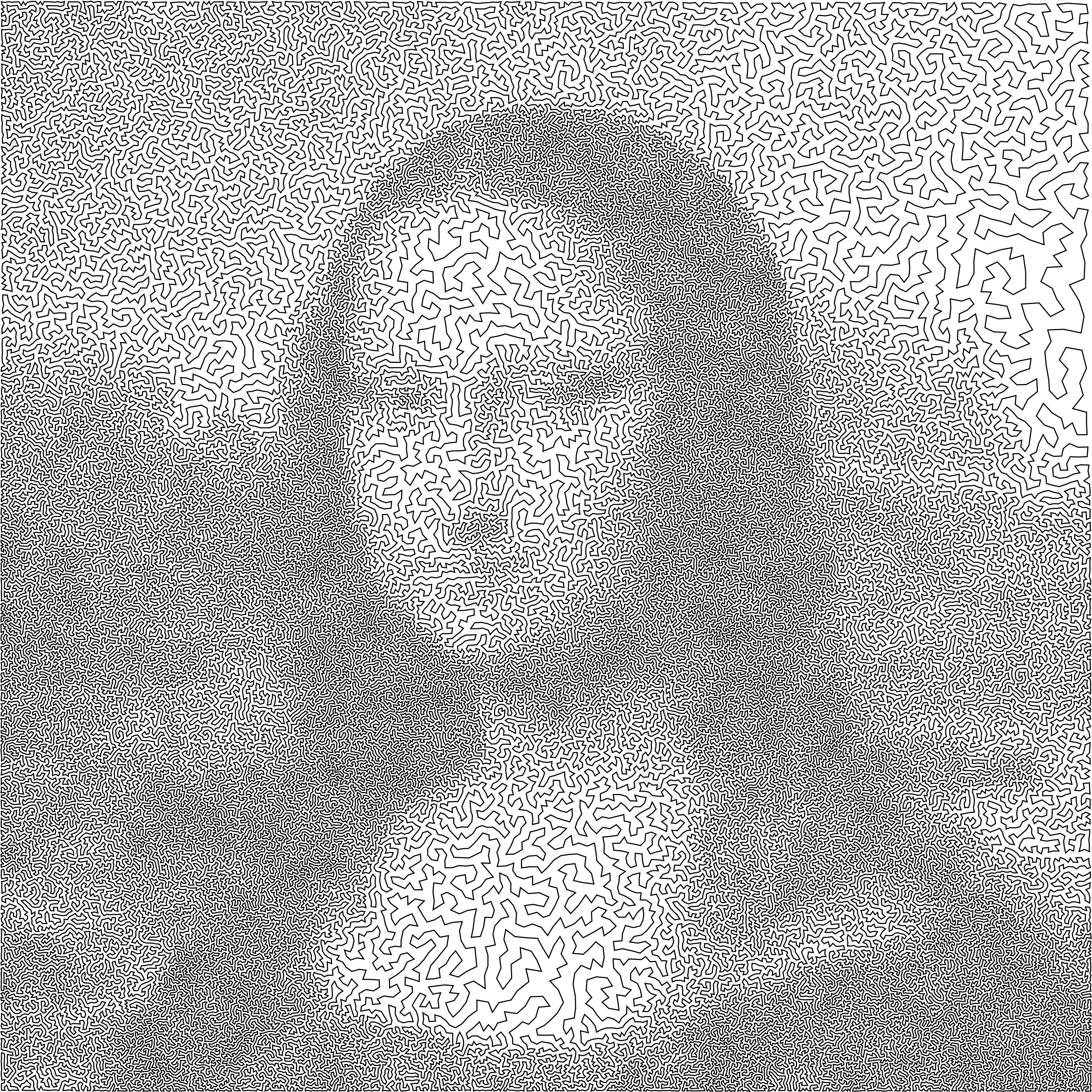
Van Gogh As Drawn By A Traveling Salesman

This “art project”, like the Mona Lisa one, draws a portrait of Vincent Van Gogh as a single continuous line. When it’s on the slow setting, is oddly satisfying and calming to watch the picture get drawn.
Click the “Draw Van Gogh” button below to see his famous self portrait drawn with a single continuous line with 120,000 segments.
The traveling salesman problem (TSP) is a classic problem in operations research and mathematical programming. It seeks to answer the question, given a set of destinations, what is the shortest possible travel route someone could take to visit them all. It is a notoriously challenging problem to solve when the number of destinations grows. A picture of the famous Van Gogh self-portrait was converted to 120,000 dots and a challenge was created to find the most optimal solution to visiting each of these 120 thousand points (i.e. drawing the shortest continuous line that goes through each and every point.
The current most-optimal solution that has been found to this Van Gogh self-portrait challenge was calculated in 2013 by Honda, Nagata and Ono. I used the order of destinations (also called the “tour) that he developed and animated the line segments to create an animated drawing of the portrait as a single continuous line.
Here an analogous TSP drawing for the Mona Lisa.
Each time you click on the “Draw Van Gogh” button, it chooses a different starting point but follows the same order of destination points, looping around until all the points are visited.
You can also change the speed at which the individual line segments are drawn. It is surprisingly relaxing and satisfying to watch the line wind its way around the screen to fill in the famous Van Gogh self-portrait.
For a very high res version of the entire photo click here (around 4 MB file size).
Data and Tools:
I downloaded the 120,000 points and the tour from Honda, Nagata and Ono that is currently the shortest that has so far been calculated from the TSP Art website and the University of Waterloo.
Javascript was used to draw on the HTML canvas and animate the process.
The Mona Lisa As Drawn By A Traveling Salesman
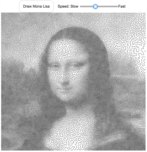
The traveling salesman problem (TSP) is a classic problem in operations research and mathematical programming. It seeks to answer the question, given a set of destinations, what is the shortest possible travel route someone could take to visit them all. It is a notoriously challenging problem to solve when the number of destinations grows. A picture of the famous Mona Lisa was converted to 100,000 dots and a challenge was created to find the most optimal solution to visiting each of these 100 thousand points (i.e. drawing the shortest continuous line that goes through each and every point.
The current most-optimal solution that has been found to this Mona Lisa challenge was calculated in 2009 by Yuichi Nagata. This art is created using the order of destinations (also called the “tour) that he developed.
Click the “Draw Mona Lisa” button below to see the famous painting drawn with a single continuous line with 100,000 segments.
Each time you click on the “Draw Mona Lisa” button, it chooses a different starting point but follows the same order of destination points, looping around until all the points are visited.
You can also change the speed at which the individual line segments are drawn. It is surprisingly relaxing and satisfying to watch the line wind its way around the screen to fill in the famous picture of the Mona Lisa.
For a very high res version of the entire photo click here (around 4 MB file size).
Data and Tools:
I downloaded the 100,000 points and optimal tour from Yuichi Nagata from the TSP Art website and the University of Waterloo.
Javascript was used to draw on the HTML canvas and animate the process.

Planetary Art – Inner Planet Orbital Spirograph
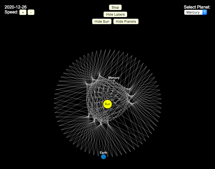
Earlier, I had made a visualization showing that Mercury is the closest planet to Earth (on average) and not Venus or Mars. To make that, I downloaded a bunch of NASA ephemeris (orbital) data. I realized I could use the same data to make some cool orbital art inspired by a spirograph – a planetary spirograph.
Basically, you get to choose a planet and the visualization will draw a line connecting that planet and Earth every few days. These lines will then build up into a cool pattern over 40 earth years of orbital cycles. Each planet (Mercury, Venus and Mars) has a different orbital period around the sun than Earth does and as a result, interesting patterns emerges.
Orbital periods of the four inner rocky planets:
- Mercury: 88 days
- Venus: 225 days
- Earth:365 days
- Mars: 687 days
Also evident is that the orbits of some of the planets are not quite circular so the pattern isn’t quite centered on the sun. Venus has the most regular pattern, creating a distinctive 5-lobed design. The other planets also have visually stunning patterns, though they do not repeat perfectly over time.
You can change the planets using the drop down menu as well as change the speed of the spirograph, and hide the planets and the sun.
Data and Tools:
I had thought about simulating the planets but there are plenty of tools out there that generate this orbital data so instead just downloaded 40 years of ephemeris data (data related to positions of astronomical bodies) from NASA website.. I processed the data using javascript and drew the picture using HTML canvas tools.

Rubik’s Cube World Records for 3×3 Puzzles (Regular, feet, blindfolded, one-handed)
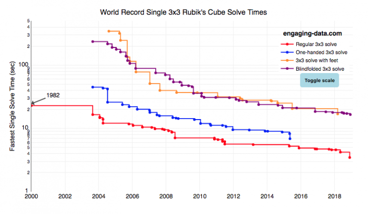
I recently taught my daughter how to solve the rubik’s cube using “the beginner method”. She’s getting decently fast, but when we watched some youtube videos about really fast speed cubers, we were blown away by how fast people can solve the cube. The world record time is under 4 seconds! I thought it’d be fun to document the progression of world records since the cube was introduced in 1980.
What was interesting in looking through the records are the strange events that people compete in and post amazing times in. Blindfolded! With Feet! One-handed! Feet or one-handed is at least in the realm of possibility, though it would slow down my already slow solves, but blindfolded is next-level stuff.
Hover over the different data series for the events to see the record-holder’s name, country, solve time and competition for each world record. You can also toggle the y-axis scale from linear to log scale in order to distinguish between the latest world records as they tend to converge and have very small changes.
Not sure if it’s motivating or discouraging to see these ridiculously fast solve times. Knowing that we’ll never be able to beat people who solve the cube blindfolded is a bit humbling.
Data and Tools:
Data was downloaded from cubecomps.com, a speed cubing website and the data was plotted using the open-sourced Plot.ly javascript engine.
Antipodes map: What’s on the other side of the Earth?
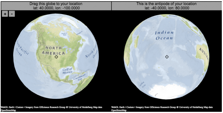
What is an antipode?
An antipode is a point that is on the exact opposite side of the earth (or other sphere) from a given location. If you drew a line (vector) from your location to the center of the earth and continued that line until it emerged from the other side of the earth’s surface, that point of intersection on the other side is the antipode. When I was a kid, people occasionally mentioned “digging a hole to China”. While this is currently impossible for many reasons1Earth’s core is about 6000 degrees C, China is not the antipode for North America (where I grew up). If you grew up in Argentina or Chile, then maybe that would make a little more sense.
The antipodes for most of North America and Europe are in the Indian and South Pacific oceans respectively.
Other examples of antipodes that are both on land:
Instructions:
It should be relatively explanatory, but you find your location by dragging the globe on the left side so that your location is in the center crosshair. The other globe (on the right) will show you the antipode to your location.
You can zoom in and out with the +/- buttons or pinch to zoom on mobile. If you zoom in enough, it will look like a normal two-dimensional web map (like google maps).
Tools:
This interactive visualization is made using the awesome webglearth javascript library. I just discovered this recently after making a number of 2D maps.

Footnotes
| ↑1 | Earth’s core is about 6000 degrees C |
|---|
Recent Comments