Archive for the ‘Environment’ Category:
Current Bay Area Air Quality
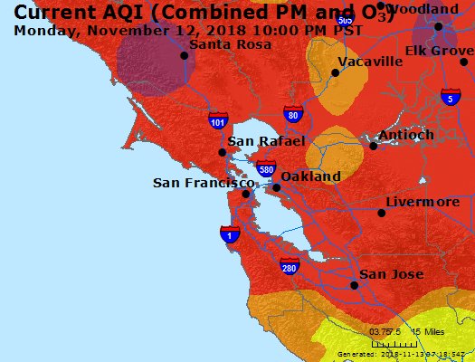
Fires are once again raging in California and air quality in one of the most populated metropolitan areas in the country (the San Francisco Bay Area) is quite poor. This map show current air quality in the Bay Area. For more information see the EPA’s Air Quality website.

AQI colors
EPA has assigned a specific color to each AQI category to make it easier for people to understand quickly whether air pollution is reaching unhealthy levels in their communities. For example, the color orange means that conditions are "unhealthy for sensitive groups," while red means that conditions may be "unhealthy for everyone," and so on.
For more information and additional maps see the EPA’s Air Quality website.
Bay Area Air Quality from Napa and Santa Rosa Fires
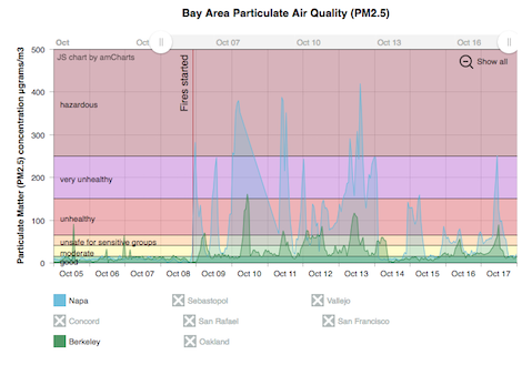
The fires in Napa and Santa Rosa California have been burning for about a week and a half so far and these fires have resulted in numerous deaths (with many more missing), significant property damage (over 4000 buildings), and forced the evacuation of tens of thousands from their homes. Luckily, these fires are mostly contained at this point with incredible work from firefighters and as well as from the weather (link to fire status on the CalFire’s websites on the Tubbs, Atlas, Nuns fires).
Recent Comments