Posts for Tag: wealth
How much wealth do the world’s richest billionaires have?
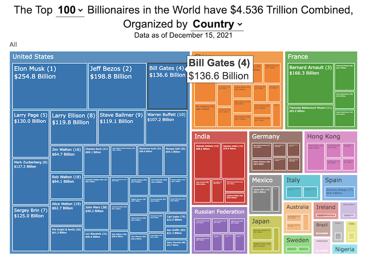
This dataviz compares how rich the world’s top billionaires are, showing their wealth as a treemap. The treemap is used to show the relative size of their wealth as boxes and is organized in order from largest to smallest.
User controls let you change the number of billionaires shown on the graph as well as group each person by their country or industry. If you group by country or industry, you can also click on a specific grouping to isolate that group and zoom in to see the contents more clearly. Hovering over each of the boxes (especially the smaller ones) will give you a popup that lets you see their name, ranking and net worth more clearly.
The popup shows how much total wealth the top billionaires control and for context compare it to the wealth of a certain number of households in the US. The comparison isn’t ideal as many of the billionaires are not from the US, but I think it still provides a useful point of comparison.
This visualization uses the same data that I needed in order to create my “How Rich is Elon Musk?” visualization. Since I had all this data, I figured I could crank out another related graph.
Sources and Tools:
Data from Bloomberg’s Billionaire’s index is downloaded regularly using a python script. Data on US household net worth is from DQYDJ’s net worth percentile calculator.
The treemap is created using the open-source Plotly javascript visualization library, as well as HTML, CSS and Javascript code to create interactivity and UI.

How Rich is Elon Musk? – Visualization of Extreme Wealth
See related visualization: How much wealth do the world’s richest billionaires have?
Visualizing Elon Musk net worth in 2024
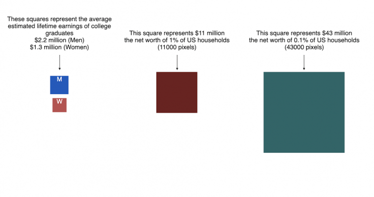
This visualization attempts to represent how much money Elon Musk, the richest person in the world, has. It gives context on this extreme amount of wealth by showing other very large sums of money that are somehow less than his net worth.
Each pixel on the screen represents a very modest amount of money (from $ 500 to $ 4000). As you scroll to the right, you will start to understand how incredibly large one billion dollars is, let alone hundreds of billions. You can change the amount of scrolling needed to get to the end of the visualization by selecting the amount represented by one pixel in the drop down menu.
This visualization was inspired heavily by a similar visualization made by Matt Korostoff for Jeff Bezos (when he was the richest person in the world) called “Wealth shown to scale”.
If you have any ideas about other items that could be added to the money chart, please leave them in the comments, and I will see if I can add it.
Mega-billionaires such as Musk or Jeff Bezos are not just extremely rich, the wealth they possess is unimaginably large. There are some extremely rich folks shown in the visualization who can buy pretty much whatever they could ever possibly need and yet their wealth is closer to that of the average person than they are to that of Elon Musk.
Sources and Tools:
The full list of data sources for the various money amounts are listed below. Most data is from 2021 though networth data for billionaires is updated regularly. The visualization was made using HTML, CSS and Javascript code to create interactivity and UI. Data from Bloomberg’s Billionaire’s index , which is the source of Musk’s (and others) estimated wealth, is updated regularly.
Full List of Data Sources:
- Cost of a supertanker’s worth of oil (at $70/barrel): https://en.wikipedia.org/wiki/Oil_tanker
- Cost of a Boeing 777-200ER Airplane: https://en.wikipedia.org/wiki/Boeing_777
- Lebron James and Cristiano Ronaldo Net Worth: https://wealthygorilla.com/top-20-richest-athletes-world/
- Tiger Woods Net Worth: https://wealthygorilla.com/top-20-richest-athletes-world/
- It’s alot of money, but we’ve still got a long way to go:
- Cost of building the Burj Khalifa (world’s tallest building in Dubai): https://en.wikipedia.org/wiki/Burj_Khalifa
- Total Ad Revenue for CNN, Fox News and MSNBC: https://www.pewresearch.org/journalism/fact-sheet/cable-news/
- Ophrah Winfrey Net Worth: https://www.celebritynetworth.com/richest-celebrities/actors/oprah-net-worth/
- Tuition for all 280,000 University of California Students: https://www.ucop.edu/operating-budget/_files/rbudget/2021-22-budget-detail.pdf
- One 40-Foot Shipping Container Full of $100 Bills: self-calculation
- Net Worth of Bottom 33% of Americans: https://dqydj.com/average-median-top-net-worth-percentiles/
- George Lucas Net Worth: https://www.bloomberg.com/billionaires/
- Cost of 2020 Tokyo Olympics: https://www.usnews.com/news/business/articles/2021-08-06/tokyo-olympics-cost-154-billion-what-else-could-that-buy
- Annual Budget of the US Department of Energy: https://en.wikipedia.org/wiki/United_States_Department_of_Energy
- Worldwide Box Office Revenue for Marvel Cinematic Universe (2008-2021): https://www.the-numbers.com/movies/franchise/Marvel-Cinematic-Universe#tab=summary
- Total Amount Spent of Gasoline in the State of Texas in one year: https://www.eia.gov/state/seds/data.php?incfile=/state/seds/sep_fuel/html/fuel_mg.html&sid=US
- Size of Harvard University’s Endowment: https://www.thecrimson.com/article/2021/10/15/endowment-returns-soar-2021/
- Annual Budget of the US Department of Transportation: https://en.wikipedia.org/wiki/United_States_Department_of_Transportation
- Total Gross State Product of Hawaii in 2021: https://en.wikipedia.org/wiki/List_of_states_and_territories_of_the_United_States_by_GDP
- Warren Buffet Net Worth: https://www.bloomberg.com/billionaires/
- State of Texas Operating Budget: https://en.wikipedia.org/wiki/List_of_U.S._state_budgets
- Total Value of all National Football League (NFL) Teams: https://www.profootballnetwork.com/nfl-franchise-values/
- Total Annual Income of 2 Million Residents of Silicon Valley (San Jose-Sunnyvale-Santa Clara CA Metro Area): https://censusreporter.org/profiles/31000US41940-san-jose-sunnyvale-santa-clara-ca-metro-area/
- Total Dollar Value of All US Agricultural Production: https://www.ers.usda.gov/data-products/ag-and-food-statistics-charting-the-essentials/ag-and-food-sectors-and-the-economy/
- Bill Gates Net Worth: https://www.bloomberg.com/billionaires/
- Total Tesla Revenue Since Founding (2008-2021): https://www.statista.com/statistics/272120/revenue-of-tesla/
- Annual Advertising Revenue for Google: https://www.cnbc.com/2021/05/18/how-does-google-make-money-advertising-business-breakdown-.html
- Total Amount Spent on US Residential Electricity In A Year: https://www.eia.gov/state/seds/data.php?incfile=/state/seds/sep_fuel/html/fuel_pr_es.html&sid=US
- Jeff Bezos Net Worth: https://www.bloomberg.com/billionaires/
- Annual Federal Taxes paid in Florida: https://en.wikipedia.org/wiki/Federal_tax_revenue_by_state
- Global Electric Vehicle Market Size in 2020: https://www.globenewswire.com/en/news-release/2021/09/06/2291730/0/en/Electric-Vehicle-Market-Size-Is-Anticipated-to-Grow-USD-1-318-22-Billion-in-2028-at-a-CAGR-of-24-3.html
- Value (i.e. Market Capitalization) of Walt Disney Company: https://www.google.com/finance/quote/DIS:NYSE
- Annual Revenue of Toyota Motor Corporation: https://money.cnn.com/quote/financials/financials.html?symb=TM
- Annual Health Care Expenditures for the entire State of California: https://www.kff.org/other/state-indicator/health-care-expenditures-by-state-of-residence-in-millions/?currentTimeframe=0&sortModel=%7B%22colId%22:%22Location%22,%22sort%22:%22asc%22%7D
- Total Annual Income for 100,000 Average US Households: https://www.census.gov/library/publications/2021/demo/p60-273.html
- Cost of one Gerald Ford Class Aircraft Carrier: https://en.wikipedia.org/wiki/Gerald_R._Ford-class_aircraft_carrier
- Cost to Build California High Speed Rail System: https://en.wikipedia.org/wiki/California_High-Speed_Rail
- Inflation Adjusted Cost of NASA’s Apollo Program: https://www.forbes.com/sites/alexknapp/2019/07/20/apollo-11-facts-figures-business/
- Total Annual Housing and Utilities Expenditures For All 6.6 Million Households in Los Angeles Metro Area: https://www.bls.gov/cex/tables/geographic/mean/cu-msa-west-2-year-average-2020.pdf
- Annual Amount Spent on the Purchase of iPhones: https://www.businessofapps.com/data/apple-statistics/
- Annual Aggregate Salaries of US Workers in 2023 (various occupations): BLS Website: https://www.bls.gov/oes/current/oes_nat.htm
- Consumer Purchases: BEA Website: https://apps.bea.gov/
- Welfare Spending: Pew Research: https://www.pewresearch.org/short-reads/2023/07/19/what-the-data-says-about-food-stamps-in-the-u-s/
- Market Cap or Revenue for large companies : Stock Analysis: https://stockanalysis.com/list/sp-500-stocks/
- Elon Musk Net Worth: https://www.bloomberg.com/billionaires/

How much wealth do the world’s richest billionaires have?
This dataviz compares how rich the world’s top billionaires are, showing their wealth as a treemap. The treemap is used to show the relative size of their wealth as boxes and is organized in order from largest to smallest.
User controls let you change the number of billionaires shown on the graph as well as group each person by their country or industry. If you group by country or industry, you can also click on a specific grouping to isolate that group and zoom in to see the contents more clearly. Hovering over each of the boxes (especially the smaller ones) will give you a popup that lets you see their name, ranking and net worth more clearly.
The popup shows how much total wealth the top billionaires control and for context compare it to the wealth of a certain number of households in the US. The comparison isn’t ideal as many of the billionaires are not from the US, but I think it still provides a useful point of comparison.
This visualization uses the same data that I needed in order to create my “How Rich is Elon Musk?” visualization. Since I had all this data, I figured I could crank out another related graph.
Sources and Tools:
Data from Bloomberg’s Billionaire’s index is downloaded regularly using a python script. Data on US household net worth is from DQYDJ’s net worth percentile calculator.
The treemap is created using the open-source Plotly javascript visualization library, as well as HTML, CSS and Javascript code to create interactivity and UI.
How Rich is Elon Musk? – Visualization of Extreme Wealth
See related visualization: How much wealth do the world’s richest billionaires have?
Visualizing Elon Musk net worth in 2024
This visualization attempts to represent how much money Elon Musk, the richest person in the world, has. It gives context on this extreme amount of wealth by showing other very large sums of money that are somehow less than his net worth.
Each pixel on the screen represents a very modest amount of money (from
This visualization was inspired heavily by a similar visualization made by Matt Korostoff for Jeff Bezos (when he was the richest person in the world) called “Wealth shown to scale”.
If you have any ideas about other items that could be added to the money chart, please leave them in the comments, and I will see if I can add it.
Mega-billionaires such as Musk or Jeff Bezos are not just extremely rich, the wealth they possess is unimaginably large. There are some extremely rich folks shown in the visualization who can buy pretty much whatever they could ever possibly need and yet their wealth is closer to that of the average person than they are to that of Elon Musk.
Sources and Tools:
The full list of data sources for the various money amounts are listed below. Most data is from 2021 though networth data for billionaires is updated regularly. The visualization was made using HTML, CSS and Javascript code to create interactivity and UI. Data from Bloomberg’s Billionaire’s index , which is the source of Musk’s (and others) estimated wealth, is updated regularly.
Full List of Data Sources:
- Cost of a supertanker’s worth of oil (at $70/barrel): https://en.wikipedia.org/wiki/Oil_tanker
- Cost of a Boeing 777-200ER Airplane: https://en.wikipedia.org/wiki/Boeing_777
- Lebron James and Cristiano Ronaldo Net Worth: https://wealthygorilla.com/top-20-richest-athletes-world/
- Tiger Woods Net Worth: https://wealthygorilla.com/top-20-richest-athletes-world/
- It’s alot of money, but we’ve still got a long way to go:
- Cost of building the Burj Khalifa (world’s tallest building in Dubai): https://en.wikipedia.org/wiki/Burj_Khalifa
- Total Ad Revenue for CNN, Fox News and MSNBC: https://www.pewresearch.org/journalism/fact-sheet/cable-news/
- Ophrah Winfrey Net Worth: https://www.celebritynetworth.com/richest-celebrities/actors/oprah-net-worth/
- Tuition for all 280,000 University of California Students: https://www.ucop.edu/operating-budget/_files/rbudget/2021-22-budget-detail.pdf
- One 40-Foot Shipping Container Full of $100 Bills: self-calculation
- Net Worth of Bottom 33% of Americans: https://dqydj.com/average-median-top-net-worth-percentiles/
- George Lucas Net Worth: https://www.bloomberg.com/billionaires/
- Cost of 2020 Tokyo Olympics: https://www.usnews.com/news/business/articles/2021-08-06/tokyo-olympics-cost-154-billion-what-else-could-that-buy
- Annual Budget of the US Department of Energy: https://en.wikipedia.org/wiki/United_States_Department_of_Energy
- Worldwide Box Office Revenue for Marvel Cinematic Universe (2008-2021): https://www.the-numbers.com/movies/franchise/Marvel-Cinematic-Universe#tab=summary
- Total Amount Spent of Gasoline in the State of Texas in one year: https://www.eia.gov/state/seds/data.php?incfile=/state/seds/sep_fuel/html/fuel_mg.html&sid=US
- Size of Harvard University’s Endowment: https://www.thecrimson.com/article/2021/10/15/endowment-returns-soar-2021/
- Annual Budget of the US Department of Transportation: https://en.wikipedia.org/wiki/United_States_Department_of_Transportation
- Total Gross State Product of Hawaii in 2021: https://en.wikipedia.org/wiki/List_of_states_and_territories_of_the_United_States_by_GDP
- Warren Buffet Net Worth: https://www.bloomberg.com/billionaires/
- State of Texas Operating Budget: https://en.wikipedia.org/wiki/List_of_U.S._state_budgets
- Total Value of all National Football League (NFL) Teams: https://www.profootballnetwork.com/nfl-franchise-values/
- Total Annual Income of 2 Million Residents of Silicon Valley (San Jose-Sunnyvale-Santa Clara CA Metro Area): https://censusreporter.org/profiles/31000US41940-san-jose-sunnyvale-santa-clara-ca-metro-area/
- Total Dollar Value of All US Agricultural Production: https://www.ers.usda.gov/data-products/ag-and-food-statistics-charting-the-essentials/ag-and-food-sectors-and-the-economy/
- Bill Gates Net Worth: https://www.bloomberg.com/billionaires/
- Total Tesla Revenue Since Founding (2008-2021): https://www.statista.com/statistics/272120/revenue-of-tesla/
- Annual Advertising Revenue for Google: https://www.cnbc.com/2021/05/18/how-does-google-make-money-advertising-business-breakdown-.html
- Total Amount Spent on US Residential Electricity In A Year: https://www.eia.gov/state/seds/data.php?incfile=/state/seds/sep_fuel/html/fuel_pr_es.html&sid=US
- Jeff Bezos Net Worth: https://www.bloomberg.com/billionaires/
- Annual Federal Taxes paid in Florida: https://en.wikipedia.org/wiki/Federal_tax_revenue_by_state
- Global Electric Vehicle Market Size in 2020: https://www.globenewswire.com/en/news-release/2021/09/06/2291730/0/en/Electric-Vehicle-Market-Size-Is-Anticipated-to-Grow-USD-1-318-22-Billion-in-2028-at-a-CAGR-of-24-3.html
- Value (i.e. Market Capitalization) of Walt Disney Company: https://www.google.com/finance/quote/DIS:NYSE
- Annual Revenue of Toyota Motor Corporation: https://money.cnn.com/quote/financials/financials.html?symb=TM
- Annual Health Care Expenditures for the entire State of California: https://www.kff.org/other/state-indicator/health-care-expenditures-by-state-of-residence-in-millions/?currentTimeframe=0&sortModel=%7B%22colId%22:%22Location%22,%22sort%22:%22asc%22%7D
- Total Annual Income for 100,000 Average US Households: https://www.census.gov/library/publications/2021/demo/p60-273.html
- Cost of one Gerald Ford Class Aircraft Carrier: https://en.wikipedia.org/wiki/Gerald_R._Ford-class_aircraft_carrier
- Cost to Build California High Speed Rail System: https://en.wikipedia.org/wiki/California_High-Speed_Rail
- Inflation Adjusted Cost of NASA’s Apollo Program: https://www.forbes.com/sites/alexknapp/2019/07/20/apollo-11-facts-figures-business/
- Total Annual Housing and Utilities Expenditures For All 6.6 Million Households in Los Angeles Metro Area: https://www.bls.gov/cex/tables/geographic/mean/cu-msa-west-2-year-average-2020.pdf
- Annual Amount Spent on the Purchase of iPhones: https://www.businessofapps.com/data/apple-statistics/
- Annual Aggregate Salaries of US Workers in 2023 (various occupations): BLS Website: https://www.bls.gov/oes/current/oes_nat.htm
- Consumer Purchases: BEA Website: https://apps.bea.gov/
- Welfare Spending: Pew Research: https://www.pewresearch.org/short-reads/2023/07/19/what-the-data-says-about-food-stamps-in-the-u-s/
- Market Cap or Revenue for large companies : Stock Analysis: https://stockanalysis.com/list/sp-500-stocks/
- Elon Musk Net Worth: https://www.bloomberg.com/billionaires/
Recent Comments