Each state has two senators in the Senate, even though there is a great disparity in the populations of the states. This was a compromise that the framers of the Constitution dealt with in creating the framework of the US government. While the US House of Representatives is based on proportional representation, the Senate was designed to have two senators per state regardless of population. This leads to some interesting variations in the number of votes that some senators get relative to other senators (and how many people they represent).
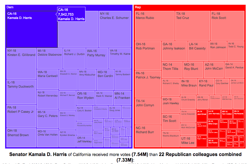
Graph of Total Votes for Each Current Senator (2014, 2016 and 2018)
This graph is called a treemap and shows the total number of votes cast for the winner of each senate race of the current sitting senators. They are shown in order from largest to smallest vote totals, where the area of the rectangle is proportional to the number of votes. The treemap can be organized by party if desired. This graph does not show the number of votes that their opponents got.
If you hover over (click, on mobile) one of the boxes in the treemap, you can compare the number of votes received by that senator to the number of senators that received the same number of votes combined. This helps highlight the disparities in the representation of voters in large states in the Senate relative to that of voters in states with low populations.
For example, Kamala Harris, Democratic senator of my home state of California, received 7.5 million votes when she won her senate race in 2016. This large number of votes is larger than the combined votes for 22 of her Republican colleagues in small states. This is even more impressive since, as noted before, she ran against another Democrat Loretta Sanchez, in the election.
Note that some of the recently elected senators shown in the table are no longer serving in the Senate:
John McCain’s seat is currently held by Martha McSally
Johnny Isakson’s seat is currently held by Kelly Loeffler
Because of the large variation in population sizes and a tendency for more populous states to vote for democrats, Democratic Senators received many more votes in their elections than their Republican colleagues did, despite having fewer numbers. The 47 Democratic (and Independent) senators received a total of 67.5 million votes while the 53 Republican senators received 59.5 million votes.
Graph of Margin of Victory over Opposing Party for Each Current Senator (2014, 2016 and 2018)
This graph shows a slightly different set of data. Instead of total votes for the winning candidate, it shows the vote margin (i.e. the number of votes the winner received vs the opponent of a different party). The reason I specify it this way is that the two Democratic California senators defeated other democrats to win their elections (i.e. no republican was on the ballot in the general election because no republican got enough votes in the primary). This comparison is interesting because not only do some senators receive very few votes (because they live in small states), but they may only win by a small margin over their opponents. Comparing margins of victory, shows how few votes it would take to “flip” a Senate seat between the two parties.
If you take Kamala Harris’s margin of victory over Republicans to be her vote total (7.5 million votes) since there was no Republican running against her, her margin of victory is greater than the margin of victory of 43 of her Republican Senate colleagues combined.
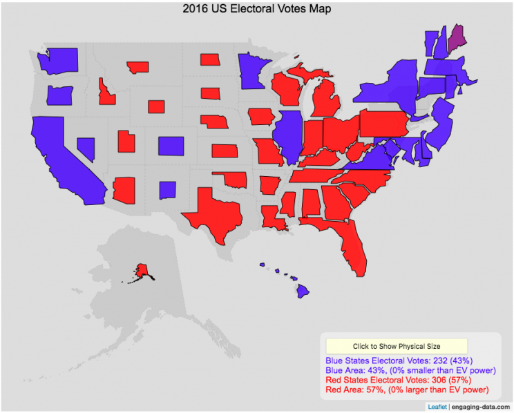
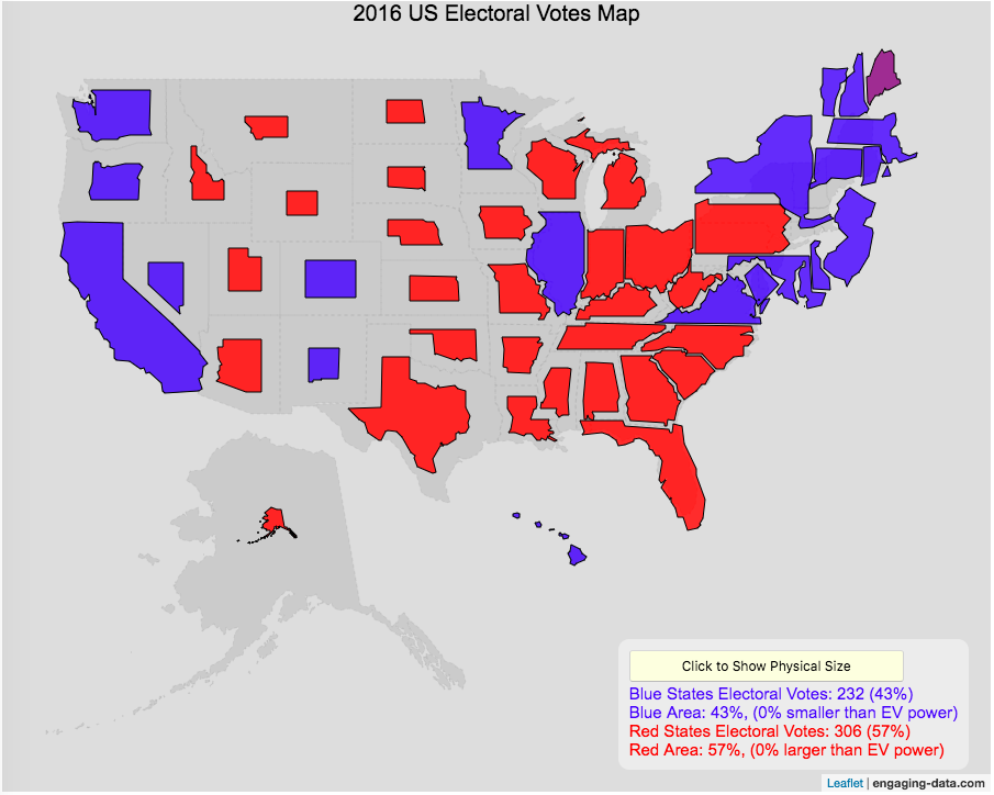
Electoral Vote maps give more visual power to states with large areas but few electoral votes
This map shows the electoral outcome of the 2016 and 2020 US Presidential Election and is color coded red if the state was won by Donald Trump (R) and blue if the state was won by Hilary Clinton or Joe Biden. When looking at the map, red states tend to be larger in area than blue states, but also generally have lower populations. This gives a misleading impression that the electoral share is “redder” than it actually is. For 2016, we can see that Trump won 306 electoral votes or (57% of the total electoral votes), but the map is shaded such that 73% of the area of the US is colored red. Similarly, Clinton won 232 electoral votes, but the map is shaded such that only 27% of the map is colored blue. For 2020, we can see that Biden won 306 electoral votes or (57% of the total electoral votes), but the map is shaded such that 38% of the area of the US is colored blue. Trump won 232 electoral votes, but the map is shaded such that 62% of the map is colored red.
The map shrinks the states with low electoral votes relative to its area and increases the size of states with large numbers of electoral votes relative to its area. On average blue states grow as they are under-represented visually, while red states tend to shrink quite a bit because they are over-represented visually. Alaska is the state that shrinks the most and DC and New Jersey are the areas that grow the most in the new map.
I think this gives a more accurate picture of how the states voted because it also gives a sense of the relative weight of those states votes.
Data and Tools:
Data on electoral votes is from Wikipedia. The map was made using the leaflet open source mapping library. Data was compiled and calculations on resizing states were made using javascript.

Recent Comments