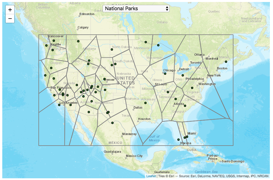
This map divides up the Continental United States into different regions depending on which National Park (or other National Park Service site) is closest to it. It is based on a straight-line (‘as the crow flies’) distance between locations rather than along road networks. It is an example of a Voronoi Diagram, which is subdivided into different regions based upon the distance between points of interest. Everything within a subregion is closer to the point defining the region than any other point.
Hover over the circle points to see the name of the park. The map has a dropdown menu that lets you choose between the following types of locations in the National Park Service:
National Parks
National Historic Sites
National Memorial Sites
National Monuments
National Seashores/Lakeshores
National Recreation Areas
National Battlefields
National Military Sites
National Scenic Areas
For National Parks, there is a high concentration of National Parks in the Western US, especially around the Southwestern US and running up the Pacific Coast. As a result, in these areas, the Voronoi regions are fairly small. The Southwest is also home to a high concentration of National Monuments. There are only few parks in the Eastern US and so the Voronoi regions are correspondingly large. Looking at National Historic Sites, the situation is flipped somewhat, with a high concentration of historic sites in the eastern US, and specifically the Northeast.
Let me know in the comments which park you are closest to and which park you last visited.
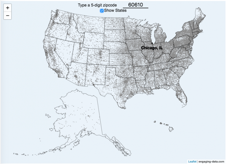
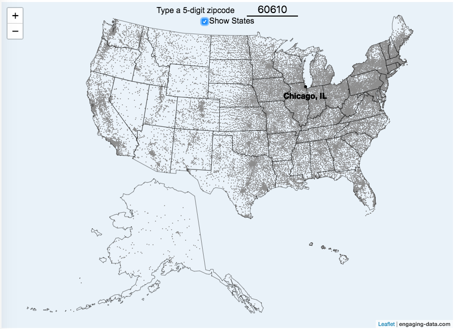
This zip code map of the United States visualizes over 42,000 zip codes in the 50 states. Zip codes are five digit postal codes used for mail delivery in the US. The points on the map show the geographic center of each zip code. The interactive visualization lets you type in a zip code and will show you where that zip code lies on the map. As you begin to type in the zip code, the map will highlight all the zip codes that begin with those numbers.
For example, if you type in “0”, you will highlight all zip codes that start with the zero in the Northeastern US. This will represent about 10% of the zip codes in the US. When you type in another number, it will narrow down the zip codes that begin with those two digits (approximately 1% of zip codes). It will progressively narrow down the number of zip codes as you type in more numbers, until you get to a full 5 digit zip code that represents 1 out of almost 43,000 zip codes (0.002% of zip codes). The map will then tell you the name of the city that that zip code is in.
You can explore how zip codes are distributed across the US by typing in different 1 and 2 digit numbers. You can also click on the check box to show or hide the outlines of the states.
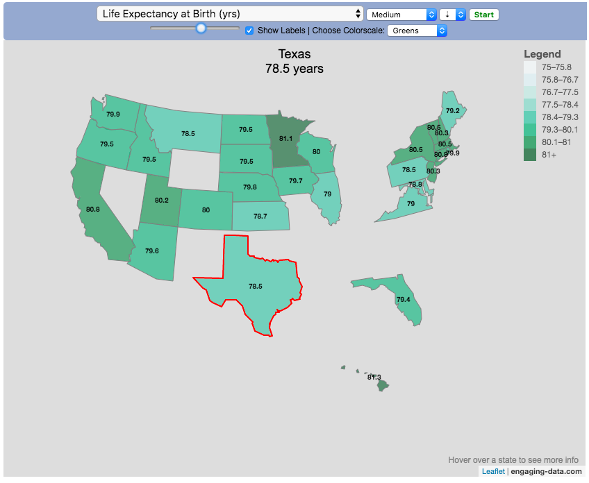
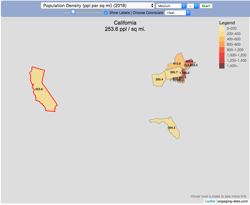
Watch the United States assemble state by state based on statistics of interest
Based on earlier popularity of the country-by-country animation, this map lets you watch as the world is built-up one state at a time. This can be done along a large range of statistical dimensions:
Name (alphabetical)
abbreviation
Date of entry to the United States
State Population (2018)
Population per Electoral Vote (2018)
Population per House Seat (2018)
Land Area (square miles)
Population Density (ppl per sq mi) (2018)
State’s Highest Point
Highest Elevation (ft)
Mean Elevation (ft)
State’s Lowest Point
Lowest Point (ft)
Life Expectancy at Birth (yrs)
Median Age (yrs)
Percent with High School Education
Percent with Bachelor’s Degree
Residential Electricity Price (cents per kWh) (2018)
Gasoline Price ($/gal) Regular unleaded (2019)
State Gross Domestic Product GDP ($Million) (2018)
GDP per capita ($/capita)
Number of Counties (or subdivisions)
Average Daily Solar Radiation (kWh/m2)
Birth rate (per thousand population)
Avg Age of Mother at Birth
Annual Precipitation (in/yr)
Average Temperature (deg F)
These statistics can be sorted from small to large or vice versa to get a view of the US and its constituent states plus DC in a unique and interesting way. It’s a bit hypnotic to watch as the states appear and add to the country one by one.
You can use this map to display all the states that have higher life expectancy than the Texas: select “Life expectancy”, sort from “high to low” and use the scroll bar to move to the Texax and you’ll get a picture like this:
or this map to display all the states that have higher population density than California: select “Population density, sort from “high to low” and use the scroll bar to move to the United States and you’ll get a picture like this:
I hope you enjoy exploring the United States through a number of different demographic, economic and physical characteristics through this data viz tool. And if you have ideas for other statistics to add, I will try to do so.
Data and tools: Data was downloaded from a variety of sources:
Population https://en.wikipedia.org/wiki/List_of_states_and_territories_of_the_United_States_by_population
Admission to union https://simple.wikipedia.org/wiki/List_of_U.S._states_by_date_of_admission_to_the_Union
Sunlight North America Land Data Assimilation System (NLDAS) Daily Sunlight (insolation) for years 1979-2011 on CDC WONDER Online Database, released 2013. Accessed at http://wonder.cdc.gov/NASA-INSOLAR.html on Jun 14, 2019 1:37:15 PM
Births United States Department of Health and Human Services (US DHHS), Centers for Disease Control and Prevention (CDC), National Center for Health Statistics (NCHS), Division of Vital Statistics, Natality public-use data 2007-2017, on CDC WONDER Online Database, October 2018. Accessed at http://wonder.cdc.gov/natality-current.html on Jun 14, 2019 1:53:58 PM
Precipitation North America Land Data Assimilation System (NLDAS) Daily Precipitation for years 1979-2011 on CDC WONDER Online Database, released 2013. Accessed at http://wonder.cdc.gov/NASA-Precipitation.html on Jun 26, 2019 3:30:40 PM
Temperature http://www.usa.com/rank/us–average-temperature–state-rank.htm
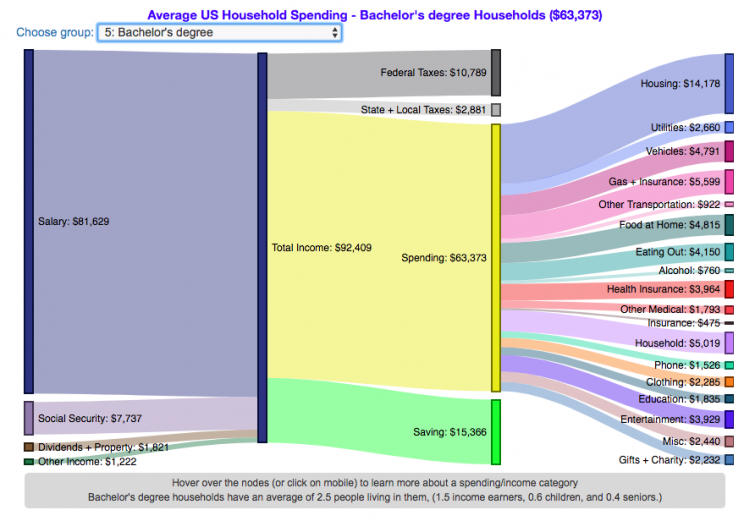
How much do US households spend and how does it change with education level?
This visualization is one of a series of visualizations that present US household spending data from the US Bureau of Labor Statistics. This one looks at the education level of the primary resident.
This visualization focuses on the education level of the primary resident. This is defined in the BLS documentation as the person who is first mentioned when the survey respondent is asked who in the household rents or owns the home.
I obtained data from the US Bureau of Labor Statistics (BLS), based upon a survey of consumer households and their spending habits. This data breaks down spending and income into many categories that are aggregated and plotted in a Sankey graph.
One of the key factors in financial health of an individual or household is making sure that household spending is equal to or below household income. If your spending is higher than income, you will be drawing down your savings (if you have any) or borrowing money. If your spending is lower than your income, you will presumably be saving money which can provide flexibility in the future, fund your retirement (maybe even early) and generally give you peace of mind.
Instructions:
Hover (or on mobile click) on a link to get more information on the definition of a particular spending or income category.
Use the dropdown menu to look at averages for different groups of households based on the education level of the primary resident. This data breaks households into the following groups:
All
Less than HS graduate
High school graduate
HS grad + some college
Associate’s degree
Bachelor’s degree
Master’s, professional, doctoral degree
The composition of households and income change as the education level of the primary resident changes, which in turn affects spending totals and individual categories.
As stated before, one of the keys to financial security is spending less than your income. We can see that on average, income tends to increase with education level. Those with the highest incomes and greatest spending have advanced degrees, but they also save the most money.
The group with the lowest education level (not finishing high school) have the lowest income and on average needs to borrow or draw down on savings to live their lifestyle.
How does your overall spending compare with those that have the same education level as you? How about spending in individual categories like housing, vehicles, food, clothing, etc…?
Probably one of the best things you can do from a financial perspective is to go through your spending and understand where your money is going. These sankey diagrams are one way to do it and see it visually, but of course, you can also make a table or pie chart (Honestly, whatever gets you to look at your income and expenses is a good thing).
The main thing is to understand where your money is going. Once you’ve done this you can be more conscious of what you are spending your money on, and then decide if you are spending too much (or too little) in certain categories. Having context of what other people spend money on is helpful as well, and why it is useful to compare to these averages, even though the income level, regional cost of living, and household composition won’t look exactly the same as your household.
Here is more information about the Consumer Expenditure Surveys from the BLS website:
The Consumer Expenditure Surveys (CE) collect information from the US households and families on their spending habits (expenditures), income, and household characteristics. The strength of the surveys is that it allows data users to relate the expenditures and income of consumers to the characteristics of those consumers. The surveys consist of two components, a quarterly Interview Survey and a weekly Diary Survey, each with its own questionnaire and sample.
Data and Tools:
Data on consumer spending was obtained from the BLS Consumer Expenditure Surveys, and aggregation and calculations were done using javascript and code modified from the Sankeymatic plotting website. I aggregated many of the survey output categories so as to make the graph legible, otherwise there’d be 4x as many spending categories and all very small and difficult to read.
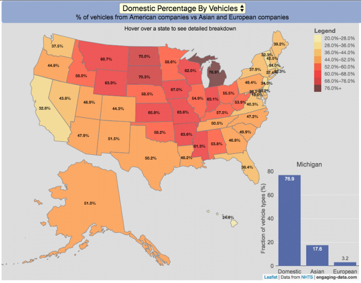
Americans are known for loving cars and driving quite a bit. Drivers in the United States own more cars and drive more than those in any other country. So what kinds of vehicles do Americans drive? This visualization looks at the types of vehicles (by body type and country of origin) across the 50 States and Washington DC.
You can view two different attributes about the types of vehicles in use in the United States:
Body type of passenger vehicles
Manufacturer/Brand region of origin
The different categories of passenger vehicles include:
Cars – includes sedans, hatchbacks, wagons and sports cars
Pickup trucks
SUVs
Vans – includes Minivans and full-size vans
Classification of the vehicles manufacturer (US, Asia or Europe) is based on the company’s headquarters and not the place of vehicle manufacturing. So a Toyota here is an Asian vehicle even if it was assembled in Mississippi.
It is pretty interesting to see the regional differences in vehicle types (cars vs trucks and SUVs) and vehicle brand (domestic vs foreign). Michigan, especially, stands out with their very high domestic ownership. It makes sense as Detroit is the home of the big three US auto manufacturers (Ford, GM and Chrysler). And I hear there’s a very strong culture of owning American cars there (and employee, friends and family discounts as well).
The data is derived from a survey by the US Department of Transportation called the National Household Travel Survey (NHTS) released in 2017. The following is a quote from the NHTS webpage:
The National Household Travel Survey (NHTS) is the source of the Nation’s information about travel by U.S. residents in all 50 States and Washington, DC. This inventory of travel behavior includes trips made by all modes of travel (i.e., private vehicle, public transportation, pedestrian, and cycling) and for all purposes (e.g., travel to work, school, recreation, and personal/family trips). It provides information to assist transportation planners and policymakers who need comprehensive data on travel and transportation patterns in the United States.
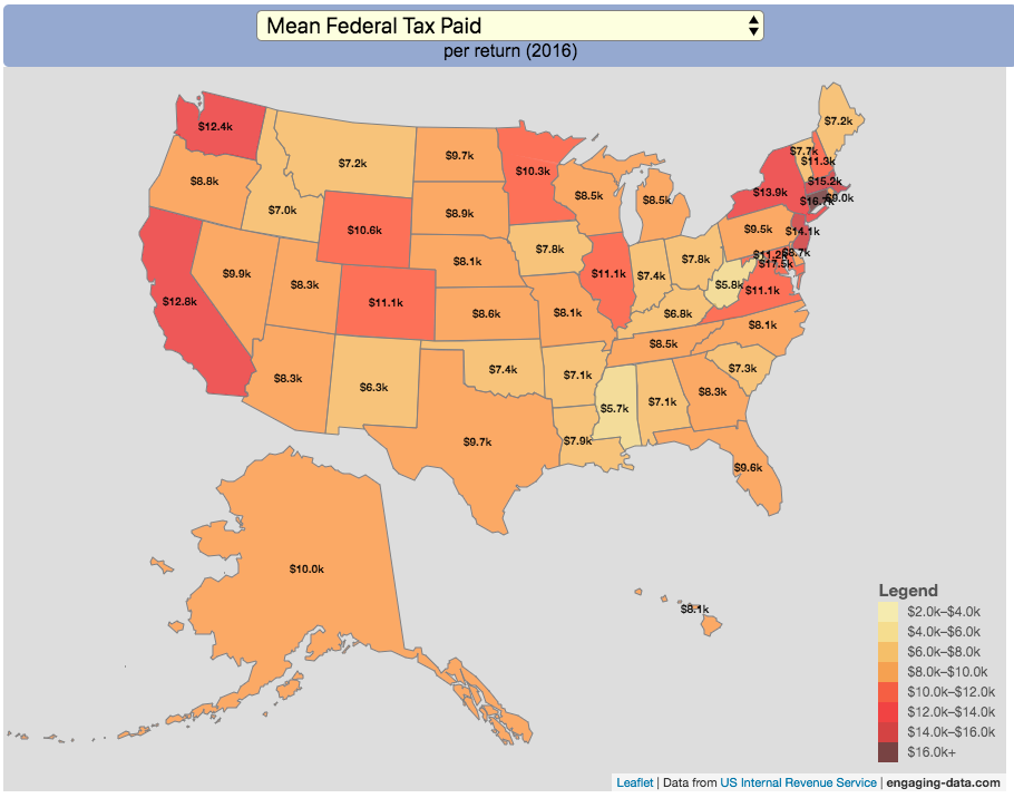
Given that tax day has just passed, I thought it would be good to check out some data on taxes. The IRS provides a great resource on tax data that I’ve only just gotten into. I think I’ll be able to do more with this in the future. This one looks at how taxes paid varies by state and presents it as a choropleth map (coloring states based on certain categories of tax data).
You can choose from a number of different categories:
Mean Federal Tax Paid
Mean Adjusted Gross Income
Mean State/Local Tax
Mean Combined (Fed/State/Local) Tax
Percent Income from Dividends and Capital Gains
Percent of Returns with Itemized Deductions
Number of Tax Returns
Mean Federal Tax Rate
Mean State/Local Tax Rate
Mean Combined (Fed/State/Local) Rate
Total Federal Tax Liability
I may add more categories in the future, so if you have ideas of tax data you want to see visualized let me know and I’ll see what I can do.
Data on tax returns by state is from the IRS website in an excel format. The map was made using the leaflet open source mapping library. Data was compiled in excel and calculations made using javascript.


Recent Comments