Posts for Tag: planets
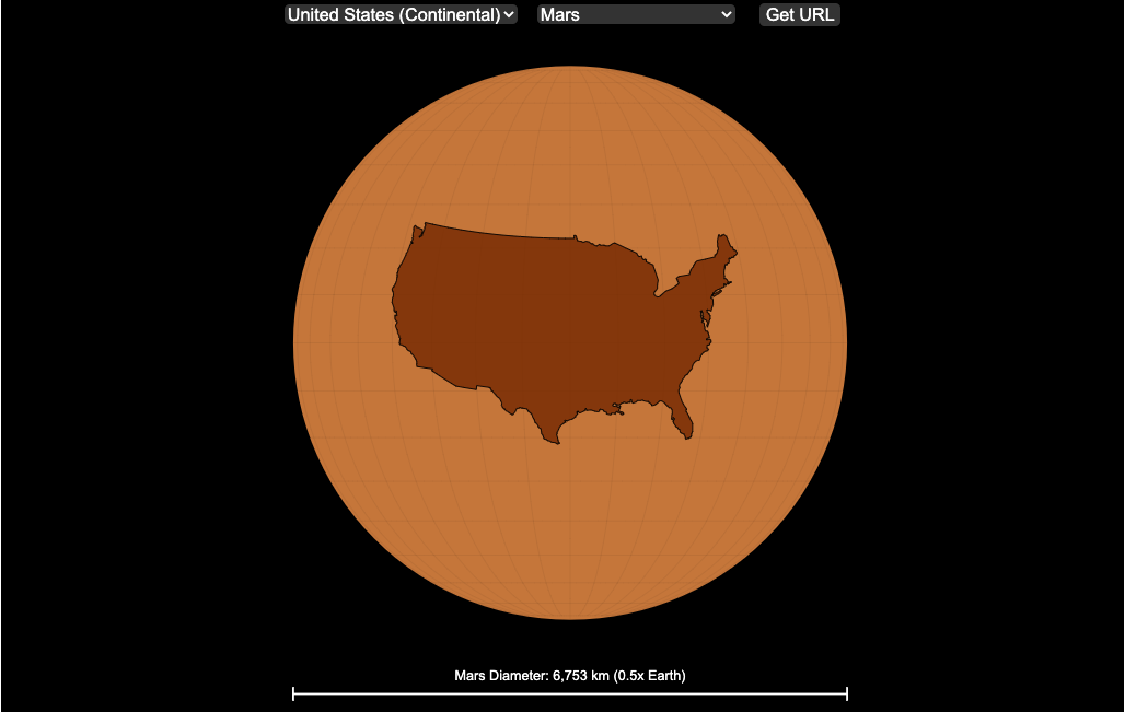
Countries Mapped onto Solar System Bodies
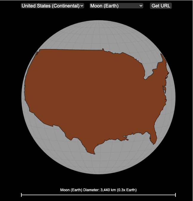
We can compare the sizes of countries and continents to planets and moons by projecting a map of a specific country onto another planet. Select a country and planet or moon to find out.
In one of my kid’s favorite books, there’s a picture demonstrating how Pluto is the same size as Australia. It has a satellite image of the country and an image of the former ninth planet superimposed on top as if it were hovering above the country. That image has stuck with me and I thought it would be interesting to see how other countries would compare with other planets and bodies in our solar system. As I’ve been working with javascript graphing/mapping library, D3.js and making maps/globes, I realized I should try to “project” individual countries onto these planets to see what they looked like.
Instructions
This visualization should be pretty self explanatory. You can select a country or continent and a planet or moon (or the sun) in the solar system. The visualization will then project the land onto the body and you have a simple visual comparison of the size of the country/continent and the planet or moon. You can drag on the visualization to rotate the planet.
There are some combinations that are not possible because the country/continent is too large to be projected onto the body without overlap. In these cases, the planet or country will be greyed out in the selection menu. You can click the “Get URL” button and share a specific map combination (country and planet) by copying the address in the url address bar.
The visualization also displays the area of the country/continent and the surface area of the planet or body. In some cases, the percentage may not look correct but remember that you can only see half of the planet surface and that it’s actually a hemisphere (half a sphere and not just a circle). It becomes clearer if you draw the surface of the planet around.
Calculations
The calculations to project a country onto another body involves starting with a set of coordinates (made up of longitude and latitude values) which define the border of the country, in the geojson format. To display them on Earth, the coordinates are modified so that the center of the country is centered at the intersection between the equator and prime meridian [0 deg latitude, 0 deg longitude].
To display them projected on a different planet or moon, it is necessary to change the latitude and longitude values of each point of the polygon country border so that it represents the same distance away from the polygon center. I used the Haversine formula to calculate the distance and bearing between two points on a sphere and then used the inverse to find the coordinates that were that distance and bearing from the center point on a sphere of a different size. These formulas can be found here. The main idea is that the distance representing one degree of latitude on Earth will be half as large on a planet that is half the size of Earth (like Mars). Thus, the distance between the center of a country and a point on the border will be a different number of degrees latitude and longitude from the center point on a different planet than on Earth. And this calculatin is done using these formulae.
Sources and Tools:
This visualization was made using the open-source, d3 javascript dataviz library and UI are made using HTML, CSS and javascript.
Planetary Art – Inner Planet Orbital Spirograph
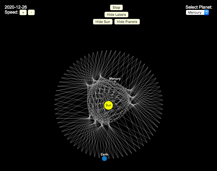
Earlier, I had made a visualization showing that Mercury is the closest planet to Earth (on average) and not Venus or Mars. To make that, I downloaded a bunch of NASA ephemeris (orbital) data. I realized I could use the same data to make some cool orbital art inspired by a spirograph – a planetary spirograph.
Basically, you get to choose a planet and the visualization will draw a line connecting that planet and Earth every few days. These lines will then build up into a cool pattern over 40 earth years of orbital cycles. Each planet (Mercury, Venus and Mars) has a different orbital period around the sun than Earth does and as a result, interesting patterns emerges.
Orbital periods of the four inner rocky planets:
- Mercury: 88 days
- Venus: 225 days
- Earth:365 days
- Mars: 687 days
Also evident is that the orbits of some of the planets are not quite circular so the pattern isn’t quite centered on the sun. Venus has the most regular pattern, creating a distinctive 5-lobed design. The other planets also have visually stunning patterns, though they do not repeat perfectly over time.
You can change the planets using the drop down menu as well as change the speed of the spirograph, and hide the planets and the sun.
Data and Tools:
I had thought about simulating the planets but there are plenty of tools out there that generate this orbital data so instead just downloaded 40 years of ephemeris data (data related to positions of astronomical bodies) from NASA website.. I processed the data using javascript and drew the picture using HTML canvas tools.

Mercury is the closest planet to Earth (on average)
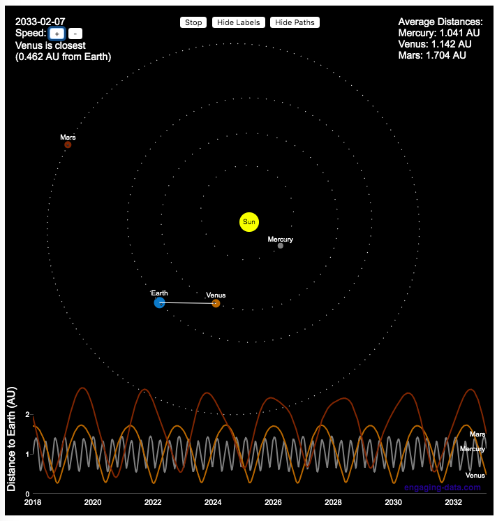
We all learned the order of planets in school. In my case using the mnemonic, My Very Excellent Mother Just Served Us Nine Pizzas (MVEMJSUNP) for Mercury, Venus, Earth, Mars Jupiter Saturn, Uranus, Neptune, and Pluto. Since Pluto has been demoted to a dwarf planet, you could change the Nine Pizzas to Noodles or something else.
And in terms of distances, Venus’s orbit (0.72 AU, or Astronomical Units (i.e. 1 AU is the distance from the Earth to the Sun) is closer to Earth’s orbit (1 AU by definition) than Mercury’s (varies between 0.31 and 0.47 AU because of it’s more elliptical orbit) or Mars’ (1.5 AU).
However, I saw an article, stating that Mercury might in fact be the closest planet to Earth (on average) so I thought I’d whip up a visualization that shows which planet is closest as a function of the planetary orbits around the sun.
Because of where the planets are on these orbital paths, and specifically the time it takes Mercury to orbit the sun, Mercury is the planet that is closest to Earth more often and has an average distance to Earth that is lower than the other 2 inner planets. Mars is occasionally the closest as well, but on average much further than Mercury or Venus. Also interesting is that Mercury is, on average, about 1 AU away from Earth, which is the same as the distance to the Sun.
This simulation shows how the planet positions vary each day over a 30 year period and the regularity with which the distance between Earth and the other varies over time. Mercury has the shortest period while Mars has the longest. You can change the speed of the simulation to speed up or slow down the orbits of the planets.
Data and Tools:
I thought about simulating the planets but there are plenty of tools out there that generate this orbital data so instead just downloaded ephemeris data (data related to positions of astronomical bodies) from NASA website.. I processed the data using javascript and drew the picture using HTML canvas tools and made the distance vs time plot with the Plotly open source plotting javascript library.

Countries Mapped onto Solar System Bodies
We can compare the sizes of countries and continents to planets and moons by projecting a map of a specific country onto another planet. Select a country and planet or moon to find out.
In one of my kid’s favorite books, there’s a picture demonstrating how Pluto is the same size as Australia. It has a satellite image of the country and an image of the former ninth planet superimposed on top as if it were hovering above the country. That image has stuck with me and I thought it would be interesting to see how other countries would compare with other planets and bodies in our solar system. As I’ve been working with javascript graphing/mapping library, D3.js and making maps/globes, I realized I should try to “project” individual countries onto these planets to see what they looked like.
Instructions
This visualization should be pretty self explanatory. You can select a country or continent and a planet or moon (or the sun) in the solar system. The visualization will then project the land onto the body and you have a simple visual comparison of the size of the country/continent and the planet or moon. You can drag on the visualization to rotate the planet.
There are some combinations that are not possible because the country/continent is too large to be projected onto the body without overlap. In these cases, the planet or country will be greyed out in the selection menu. You can click the “Get URL” button and share a specific map combination (country and planet) by copying the address in the url address bar.
The visualization also displays the area of the country/continent and the surface area of the planet or body. In some cases, the percentage may not look correct but remember that you can only see half of the planet surface and that it’s actually a hemisphere (half a sphere and not just a circle). It becomes clearer if you draw the surface of the planet around.
Calculations
The calculations to project a country onto another body involves starting with a set of coordinates (made up of longitude and latitude values) which define the border of the country, in the geojson format. To display them on Earth, the coordinates are modified so that the center of the country is centered at the intersection between the equator and prime meridian [0 deg latitude, 0 deg longitude].
To display them projected on a different planet or moon, it is necessary to change the latitude and longitude values of each point of the polygon country border so that it represents the same distance away from the polygon center. I used the Haversine formula to calculate the distance and bearing between two points on a sphere and then used the inverse to find the coordinates that were that distance and bearing from the center point on a sphere of a different size. These formulas can be found here. The main idea is that the distance representing one degree of latitude on Earth will be half as large on a planet that is half the size of Earth (like Mars). Thus, the distance between the center of a country and a point on the border will be a different number of degrees latitude and longitude from the center point on a different planet than on Earth. And this calculatin is done using these formulae.
Sources and Tools:
This visualization was made using the open-source, d3 javascript dataviz library and UI are made using HTML, CSS and javascript.
Planetary Art – Inner Planet Orbital Spirograph
Earlier, I had made a visualization showing that Mercury is the closest planet to Earth (on average) and not Venus or Mars. To make that, I downloaded a bunch of NASA ephemeris (orbital) data. I realized I could use the same data to make some cool orbital art inspired by a spirograph – a planetary spirograph.
Basically, you get to choose a planet and the visualization will draw a line connecting that planet and Earth every few days. These lines will then build up into a cool pattern over 40 earth years of orbital cycles. Each planet (Mercury, Venus and Mars) has a different orbital period around the sun than Earth does and as a result, interesting patterns emerges.
Orbital periods of the four inner rocky planets:
- Mercury: 88 days
- Venus: 225 days
- Earth:365 days
- Mars: 687 days
Also evident is that the orbits of some of the planets are not quite circular so the pattern isn’t quite centered on the sun. Venus has the most regular pattern, creating a distinctive 5-lobed design. The other planets also have visually stunning patterns, though they do not repeat perfectly over time.
You can change the planets using the drop down menu as well as change the speed of the spirograph, and hide the planets and the sun.
Data and Tools:
I had thought about simulating the planets but there are plenty of tools out there that generate this orbital data so instead just downloaded 40 years of ephemeris data (data related to positions of astronomical bodies) from NASA website.. I processed the data using javascript and drew the picture using HTML canvas tools.
Mercury is the closest planet to Earth (on average)
We all learned the order of planets in school. In my case using the mnemonic, My Very Excellent Mother Just Served Us Nine Pizzas (MVEMJSUNP) for Mercury, Venus, Earth, Mars Jupiter Saturn, Uranus, Neptune, and Pluto. Since Pluto has been demoted to a dwarf planet, you could change the Nine Pizzas to Noodles or something else.
And in terms of distances, Venus’s orbit (0.72 AU, or Astronomical Units (i.e. 1 AU is the distance from the Earth to the Sun) is closer to Earth’s orbit (1 AU by definition) than Mercury’s (varies between 0.31 and 0.47 AU because of it’s more elliptical orbit) or Mars’ (1.5 AU).
However, I saw an article, stating that Mercury might in fact be the closest planet to Earth (on average) so I thought I’d whip up a visualization that shows which planet is closest as a function of the planetary orbits around the sun.
Because of where the planets are on these orbital paths, and specifically the time it takes Mercury to orbit the sun, Mercury is the planet that is closest to Earth more often and has an average distance to Earth that is lower than the other 2 inner planets. Mars is occasionally the closest as well, but on average much further than Mercury or Venus. Also interesting is that Mercury is, on average, about 1 AU away from Earth, which is the same as the distance to the Sun.
This simulation shows how the planet positions vary each day over a 30 year period and the regularity with which the distance between Earth and the other varies over time. Mercury has the shortest period while Mars has the longest. You can change the speed of the simulation to speed up or slow down the orbits of the planets.
Data and Tools:
I thought about simulating the planets but there are plenty of tools out there that generate this orbital data so instead just downloaded ephemeris data (data related to positions of astronomical bodies) from NASA website.. I processed the data using javascript and drew the picture using HTML canvas tools and made the distance vs time plot with the Plotly open source plotting javascript library.
Recent Comments