Posts for Tag: map
Current Bay Area Air Quality
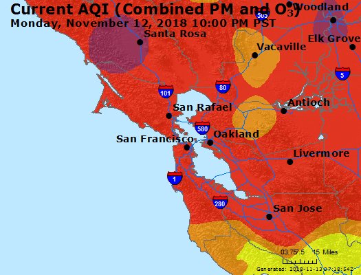
Fires are once again raging in California and air quality in one of the most populated metropolitan areas in the country (the San Francisco Bay Area) is quite poor. This map show current air quality in the Bay Area. For more information see the EPA’s Air Quality website.

AQI colors
EPA has assigned a specific color to each AQI category to make it easier for people to understand quickly whether air pollution is reaching unhealthy levels in their communities. For example, the color orange means that conditions are "unhealthy for sensitive groups," while red means that conditions may be "unhealthy for everyone," and so on.
For more information and additional maps see the EPA’s Air Quality website.
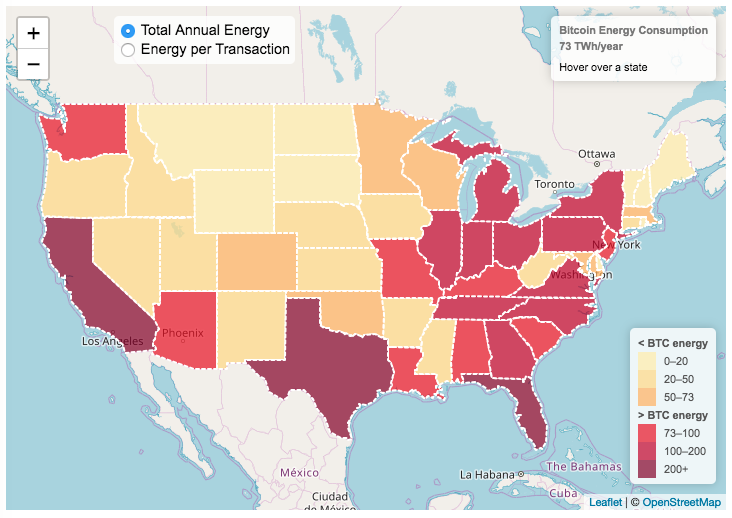
Bitcoin Energy Consumption – Does It Consume More Electricity Than Your State?

This visualization looks at the staggeringly high energy use of Bitcoin and puts it into context: comparing it to electricity usage of US states. Unfortunately for Bitcoin, high energy usage is an intended feature of the system, rather than an unintended consequence. This is because mining is an increasingly energy intensive process, based upon increasingly computationally intensive calculations that are performed on high powered computers and graphical processing units.
Currently, 28 out of 50 states plus the District of Columbia all have lower electricity consumption than estimated annual bitcoin electricity consumption (~73 TWh per year). These states are highlighted in variations of yellow. This is approximately equal to the average annual electricity usage across all US States. States with higher electricity consumption than bitcoin are highlighted in shades of red.
When dividing the total energy use (73 TWh) by the current number of transactions (93 million), we get an average energy consumption of 783 kWh per transaction. Click on the “Energy per Transaction” button to see this visualization. What’s crazy is that a transaction is simply a transfer of bitcoin between “wallets”, recording the transaction, and a validation of the process. There’s no good reason why verifying digital transactions should take this much energy, except that it was built into the fundamental process of validating and mining bitcoin. 783 kWh is larger than the monthly per capita electricity consumption in 10 US states. It could also drive you and your family over 2000 miles in an electric car (e.g. Tesla Model S).
I’m not expert enough in this area to know how much more energy consumption will rise into the future, but if crypto advocates’ predictions come true and bitcoin is used extensively, millions of transactions will occur per hour instead of per year and the price of bitcoin may rise much higher than it currently is. If the price rises, then miners will be willing to expend more energy to “mine” the more valuable bitcoin. Needless to say, this sounds like a very bad idea from an energy consumption and sustainability standpoint.
Data and Tools:
State energy data comes from the US Department of Energy. Estimates of Bitcoin energy use come from Digiconomist’s Bitcoin Energy Consumption Index. The choropleth map is visualized using javascript and the Leaflet.js library with Open Street Map tiles.
Solar (Sun) Intensity By Location and Time
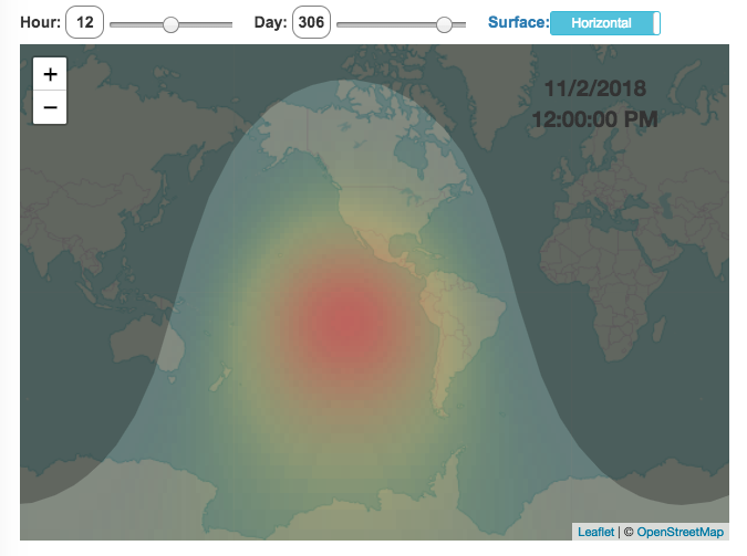
This visualization shows the amount of solar intensity (also called solar insolation and measured in watts per square meter) all across the globe as a function of time of day and day of year. This is an idealized calculation as it does not take into account reductions in solar intensity due to cloud cover or other things that might block the sun from reaching the earth (e.g dust and pollution).
As would be expected, the highest amount of solar intensity occurs on the globe right where the sun is overhead and as the angle of the sun lowers, the solar intensity declines. This is why the area around the equator and up through the tropics is so sunny, the sun is overhead here the most. If you click on the map you should see a popup of the intensity of sunlight at that location.
As the earth rotates over the course of a day, the angle of the sun changes and eventually the angle is so low, the sun is blocked by the horizon (this is sunset).
Instructions
- The default is to show the sunlight intensity for the current date and time but you can change it by moving the sliders for hour or day.
- You can also toggle between the orientation of the surface that you measure the sunlight on. The default shows the intensity of sunlight on a horizontal surface. The other option shows the intensity on a surface that is oriented to face the sun (i.e. perpendicular)
Again, the intensity will depend on the angle it makes with the sun and so it depends on your location on earth (i.e. latitude). Latitudes around the equator will receive more sunlight because their angle is closer to perpendicular.
Shifting through the days of the year, you can start to see the cause of the seasons as the amount of sunlight changes and more or less sunlight goes to each of the northern and southern hemispheres.
Calculations and Tools:
The calculations for solar intensity are based on equations from “Renewable and Efficient Electric Power Systems” by Gilbert Masters Chapter 7. Calculations were made using javascript and visualized using the Leaflet.js library with Open Street Map tiles.
This was a fun project for me to learn online mapping tools and programming.

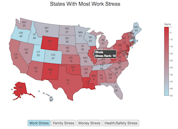
Most Stressed States

Long-term stress has been shown to be detrimental for your health. While it’s probably not possible to completely eliminate stress from people’s lives, there are many individual choices and decisions that can influence the amount of stress that people experience, including where they live, what job they have, their socio-economic conditions etc. . . One interesting bit of data analysis looks at an aggregate level to understand how stress differs from state to state depending on specific economic, demographic and other geographic factors.
This post shows a map of the most stressed states in the United States. The map is color coded from red (most stress) to blue (least stress) as a ranked list. Stress is divided into several categories including:
- Work Stress is calculated from data on work hours, commute times, job security, unemployment rate, income growth and other metrics.
- Money Stress is calculated from data on income, debt, credit scores, bankruptcy, housing affordability, poverty levels and other metrics.
- Family Stress is calculated from data on divorce rates, single parents, childcare costs, parental leave policies and other metrics.
- Health and Safety Stress is calculated from data on adult health, depression, mental health, health insurance, physical activity rate, crime rate, and other metrics.
Click on the buttons below the map to switch between the different categories.
Data and tools: The data comes from Wallethub’s analysis of data from a wide range of sources including the US Census, BLS, CDC etc.. Unfortunately the data used is a ranked list rather than a set of scores. The ranking doesn’t tell you if a state is 10% more stressful or 10 times more stressful, just that one is higher than the other. Click the link for a full description of their methodology and data sources. The choropleth map was created using javascript to parse the data and the plot.ly open source graphing library to visualize it.
Health Insurances Losses from Senate Bill by State
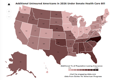
The Congressional Budget Office (CBO) released a report that analyzed the impacts of the Senate health care bill and estimated that 22 million Americans would lose health care by 2026 (see previous post). 22 million amounts to almost 7% of the US population (about 1 in 15 Americans). I wondered how the impacts of these changes would be distributed across different states.
Current Bay Area Air Quality
Fires are once again raging in California and air quality in one of the most populated metropolitan areas in the country (the San Francisco Bay Area) is quite poor. This map show current air quality in the Bay Area. For more information see the EPA’s Air Quality website.
AQI colors
EPA has assigned a specific color to each AQI category to make it easier for people to understand quickly whether air pollution is reaching unhealthy levels in their communities. For example, the color orange means that conditions are "unhealthy for sensitive groups," while red means that conditions may be "unhealthy for everyone," and so on.
For more information and additional maps see the EPA’s Air Quality website.
Bitcoin Energy Consumption – Does It Consume More Electricity Than Your State?
This visualization looks at the staggeringly high energy use of Bitcoin and puts it into context: comparing it to electricity usage of US states. Unfortunately for Bitcoin, high energy usage is an intended feature of the system, rather than an unintended consequence. This is because mining is an increasingly energy intensive process, based upon increasingly computationally intensive calculations that are performed on high powered computers and graphical processing units.
Currently, 28 out of 50 states plus the District of Columbia all have lower electricity consumption than estimated annual bitcoin electricity consumption (~73 TWh per year). These states are highlighted in variations of yellow. This is approximately equal to the average annual electricity usage across all US States. States with higher electricity consumption than bitcoin are highlighted in shades of red.
When dividing the total energy use (73 TWh) by the current number of transactions (93 million), we get an average energy consumption of 783 kWh per transaction. Click on the “Energy per Transaction” button to see this visualization. What’s crazy is that a transaction is simply a transfer of bitcoin between “wallets”, recording the transaction, and a validation of the process. There’s no good reason why verifying digital transactions should take this much energy, except that it was built into the fundamental process of validating and mining bitcoin. 783 kWh is larger than the monthly per capita electricity consumption in 10 US states. It could also drive you and your family over 2000 miles in an electric car (e.g. Tesla Model S).
I’m not expert enough in this area to know how much more energy consumption will rise into the future, but if crypto advocates’ predictions come true and bitcoin is used extensively, millions of transactions will occur per hour instead of per year and the price of bitcoin may rise much higher than it currently is. If the price rises, then miners will be willing to expend more energy to “mine” the more valuable bitcoin. Needless to say, this sounds like a very bad idea from an energy consumption and sustainability standpoint.
Data and Tools:
State energy data comes from the US Department of Energy. Estimates of Bitcoin energy use come from Digiconomist’s Bitcoin Energy Consumption Index. The choropleth map is visualized using javascript and the Leaflet.js library with Open Street Map tiles.
Solar (Sun) Intensity By Location and Time
This visualization shows the amount of solar intensity (also called solar insolation and measured in watts per square meter) all across the globe as a function of time of day and day of year. This is an idealized calculation as it does not take into account reductions in solar intensity due to cloud cover or other things that might block the sun from reaching the earth (e.g dust and pollution).
As would be expected, the highest amount of solar intensity occurs on the globe right where the sun is overhead and as the angle of the sun lowers, the solar intensity declines. This is why the area around the equator and up through the tropics is so sunny, the sun is overhead here the most. If you click on the map you should see a popup of the intensity of sunlight at that location.
As the earth rotates over the course of a day, the angle of the sun changes and eventually the angle is so low, the sun is blocked by the horizon (this is sunset).
Instructions
- The default is to show the sunlight intensity for the current date and time but you can change it by moving the sliders for hour or day.
- You can also toggle between the orientation of the surface that you measure the sunlight on. The default shows the intensity of sunlight on a horizontal surface. The other option shows the intensity on a surface that is oriented to face the sun (i.e. perpendicular)
Again, the intensity will depend on the angle it makes with the sun and so it depends on your location on earth (i.e. latitude). Latitudes around the equator will receive more sunlight because their angle is closer to perpendicular.
Shifting through the days of the year, you can start to see the cause of the seasons as the amount of sunlight changes and more or less sunlight goes to each of the northern and southern hemispheres.
Calculations and Tools:
The calculations for solar intensity are based on equations from “Renewable and Efficient Electric Power Systems” by Gilbert Masters Chapter 7. Calculations were made using javascript and visualized using the Leaflet.js library with Open Street Map tiles.
This was a fun project for me to learn online mapping tools and programming.
Most Stressed States
Long-term stress has been shown to be detrimental for your health. While it’s probably not possible to completely eliminate stress from people’s lives, there are many individual choices and decisions that can influence the amount of stress that people experience, including where they live, what job they have, their socio-economic conditions etc. . . One interesting bit of data analysis looks at an aggregate level to understand how stress differs from state to state depending on specific economic, demographic and other geographic factors.
- Work Stress is calculated from data on work hours, commute times, job security, unemployment rate, income growth and other metrics.
- Money Stress is calculated from data on income, debt, credit scores, bankruptcy, housing affordability, poverty levels and other metrics.
- Family Stress is calculated from data on divorce rates, single parents, childcare costs, parental leave policies and other metrics.
- Health and Safety Stress is calculated from data on adult health, depression, mental health, health insurance, physical activity rate, crime rate, and other metrics.
Click on the buttons below the map to switch between the different categories.
Data and tools: The data comes from Wallethub’s analysis of data from a wide range of sources including the US Census, BLS, CDC etc.. Unfortunately the data used is a ranked list rather than a set of scores. The ranking doesn’t tell you if a state is 10% more stressful or 10 times more stressful, just that one is higher than the other. Click the link for a full description of their methodology and data sources. The choropleth map was created using javascript to parse the data and the plot.ly open source graphing library to visualize it.
Health Insurances Losses from Senate Bill by State
The Congressional Budget Office (CBO) released a report that analyzed the impacts of the Senate health care bill and estimated that 22 million Americans would lose health care by 2026 (see previous post). 22 million amounts to almost 7% of the US population (about 1 in 15 Americans). I wondered how the impacts of these changes would be distributed across different states.
Recent Comments