Posts for Tag: graph
Most COVID-19 deaths in the US could have been avoided
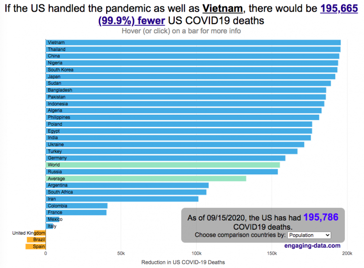
The US coronavirus death rate is quite high compared to other countries (on a population-corrected basis)
US coronavirus deaths have surpassed 300,000. Many of these deaths could have been avoided if swift action had been taken in February and March, as many other countries did. This graph shows an rough estimate of the number of US deaths that could have been avoided if the US had acted similar to other countries.
This graph takes the rate of coronavirus deaths by country (normalized to their population size) and imagines what would happen if the US had had that death rate, instead of its own. It then applies that reduction (or increase) in death rate to the total number of deaths that the US has experienced. The US death rate is about 600/million people in September 2020 and if a country has a death rate of 60/million people, then 90% of US deaths (about 180,000 people) could have been avoided if the US had matched their death rate. The government response to the pandemic is one of several important factors that determine the number of cases and deaths in a country. This means proper messaging about the need to wear masks and socially distance as well as providing payments to citizens and business to help them during the economic shutdown. Other important factors can include the overall health of the population, the population structure (i.e. age distribution of population), ease of controlling borders to prevent cases from entering the country, presence of universal or low-cost health care system, and relative wealth and education of the population.
The graph lets you compare the potential reduction in US deaths when looking at 30 different countries. You can choose those 30 countries based on total population, GDP or GDP per capita. These give somewhat different sets of countries to compare death rates, which is an indication of the effectiveness of the coronavirus response.
A valid criticism of this graph is that testing and data collection is very different in each of the countries shown and the comparisons are not always valid. This is definitely a problem with all coronavirus data but for the most part, the very large differences between death rates would still exist even if data collection were totally standardized. Some of the data from the poorest countries is less reliable, because they have less testing capabilities.
Source and Tools:
Data on coronavirus deaths by country is from covid19api.com and downloaded and cleaned with a python script. Graph is made using the plotly open source javascript library.

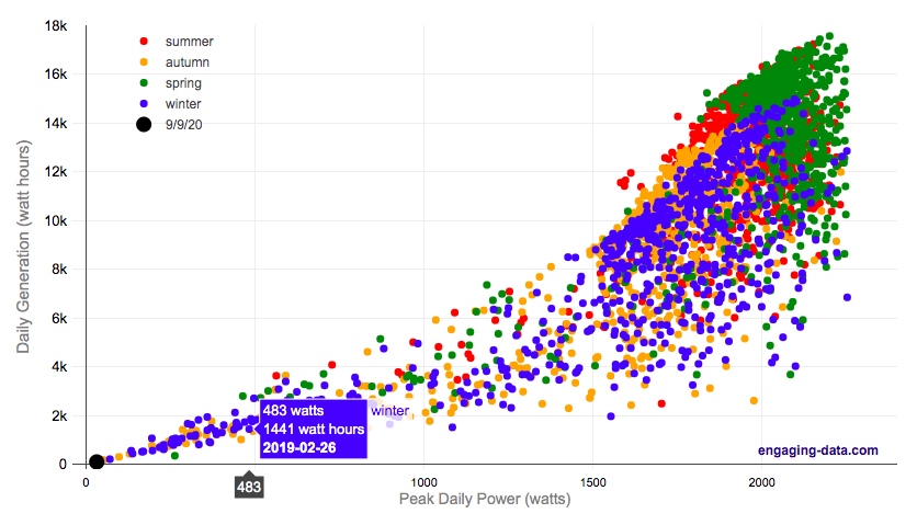
Wildfire smoke impacts solar panel generation

On September 9th, 2020, the entire San Francisco Bay Area, we had a crazy combination of wildfire smoke and low clouds that darkened the sky and turned everything orange. At 9am, it looked like it was nighttime and at noon, it was so dark, that it looked like dusk.
Here is a plot of 8+ years of solar panel generation from our panels. If you click on the legend, you can toggle whether that data is shown. Total generation for the day was only 93 watt hours (as opposed to a summer median of 13300 watt hours, 13.3 kWh) and peak power was only 32 watts (vs a median summer peak of 2000 watts (2.0 kW)).
The solar generation was even worse than the next worst day in winter (typically when it rains all day). Clicking on the legend will toggle whether certain seasons are shown and you can view how solar generation varies by season.
Here is a google image search of photos showing the crazy, apocalyptic scenes with the orange color.
Source and Tools:
Data on solar generation is downloaded from our solar panel inverter provider (enphase) and cleaned with a python script. Graph is made using the plotly open source javascript library.
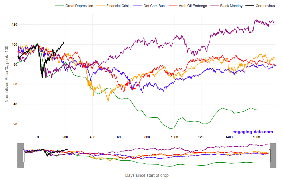
2020 Stock Market Drop Compared to other Bear Markets
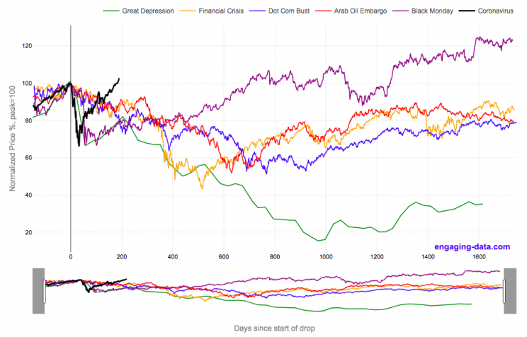
2020’s stock market drop was unprecedented for the speed of the drop and also the speed of the recovery
This graph shows the stock market drops from the 2020 and other bear markets normalized so that the peak is at 100% at day 0. This lets you see the severity and duration of different bear markets from the Great Depression (1929), the Dot Com Bust (2000), and the Financial Crisis (2008) and other drops over 30%.
The coronavirus pandemic has significantly disrupted the global economy. Q2 GDP in the United States declined at an annualized rate of 32% and US unemployment reaching 15% due to coronavirus induced business shutdowns.
However, the stock market drop (represented by the S&P500 index) in late February and early March 2020 has somewhat surprisingly rebounded and reached a new all-time-high in August 2020, even as unemployment and GDP output has continued to falter. There certainly seems to be a disconnect between the fundamentals of the economy and the stock market.
Will the recovery in the stock markets continue or will it begin to align more closely with the fundamentals of the economy?
There are many proposed reasons why this disconnect is happening. The Federal Reserve actions to increase liquidity and prop up the stock market. The heavy weighting of tech in the S&P500 and the pandemic’s boost to many tech company’s business (i.e. Amazon, Zoom, Apple). Whatever the reason, the question of whether the market can continue at this pace or will have a correction is important and one to watch.
Data for the S&P500 price is daily from 1950 onward but before 1950, the data I had available was on a monthly basis. I interpolated this monthly data to create daily data, so not all the data is 100% accurate for any given day before 1950. Data for 2020 will continue to be updated daily.
Source and Tools:
Data on historical S&P500 prices is from Yahoo! Finance and downloaded and cleaned with a python script. Graph is made using the plotly open source javascript library.
US Postal Service vs Private Delivery
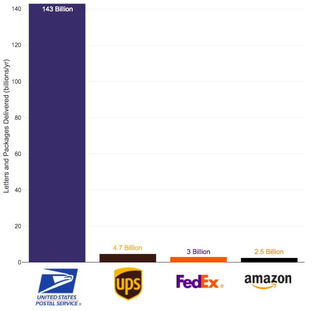
The US Postal Service mail volume is enormous and can’t easily be replaced by private delivery services
The US Postal Service (USPS) has been getting a good deal of press recently because of Trump’s attacks on the security of mail in voting and recent moves by political appointees to reduce the capability of the agency to delivery mail in a timely fashion. These changes reportedly include removing mail sorting equipment and changing overtime hours.
Some have suggested privatizing the postal service but currently the volume of mail and packages through private delivery services is far smaller than that carried by the federal agency.
Note that the USPS carries about 55 billion pieces of first class mail annually out of the reported 143 billion pieces of total mail.
Source and Tools:
Data on Fedex, UPS and Amazon deliveries is from this theverge.com article. Data for the USPS comes from usps.com. Graph is made using the plotly open source javascript library.

How much will masks reduce coronavirus transmission rate R0?
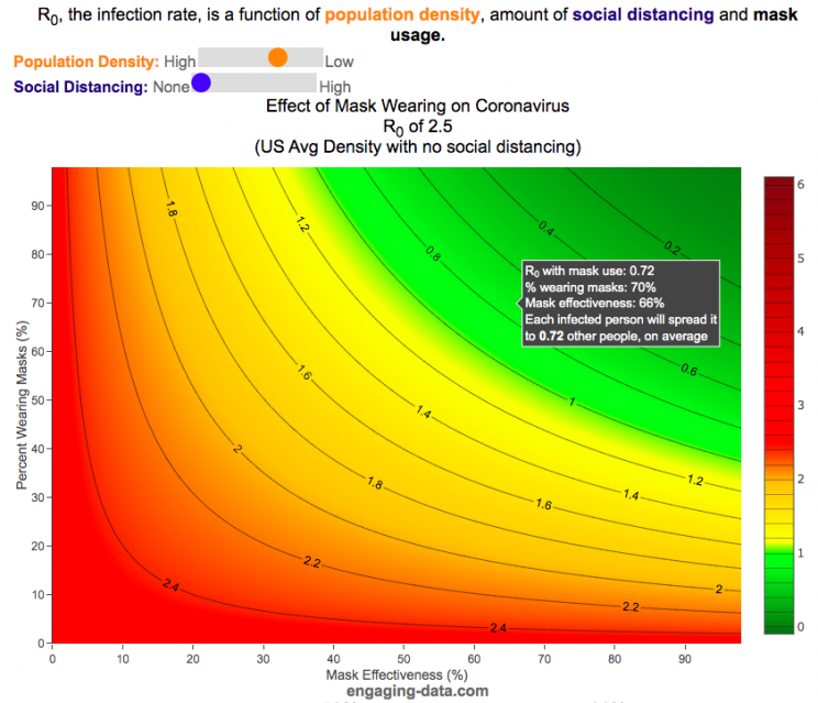
It depends on their effectiveness and how many people wear them
R0 is the transmission rate which is defined as the average number of cases that are expected to be produced from a single case in an uninfected population. R0 is dependent on a number of different factors that include transmissibility of a disease (how infectious it is), the amount of social contact and the duration of social contact. We have learned that variants of the coronavirus (such as delta or omicron) can greatly influence the transmissibility of the disease.
A baseline level of social contact is related to the population density (how often you come into contact with other people) and social distancing (limiting gatherings, not going in to work or school, etc) will reduce the amount of social contact with different people. Given what we know about coronavirus and its transmission, the amount of “contact” can also be influenced by mask wearing. This interactive graph shows the effect of mask wearing and effectiveness on reducing R0 even further. Because the effectiveness of existing vaccines is as of yet unknown against Omicron, this visualization does not take into account vaccines and their effectiveness of reducing R0, which is a very important limitation.
A very important caveat to this visualization: This visualization was initially created before COVID-19 vaccines were available and does not currently take their ability to prevent infection (and lower R0) into account because the effectiveness of each vaccines differs and the protection against infection wanes over time
This graph is a work-in-progress so please feel free to provide suggestions and feedback on issues of scientific concepts as well as for improvements in conveying the concepts/ideas.
Methodology
R0 values for different regions and population densities are estimated from Youyang Gu’s machine learning model for spread in Feb and early-March (i.e. before social distancing and mask wearing).
Baseline R0,variant based on variant transmissibility – R0 value ranges from an early estimate of 8 for Omicron to 5 for Delta and 2.5 for the original Alpha strain.
Population density factor (PDF) – this can increase or decrease the R0 value based on how much close contact you have. It ranges from about 2.4 in very high density places like New York City with lots of transit use where you are in close contact with other people for long periods of time to 0.8 in rural areas with much less contact. A value of 1 represents average US population density.
Social distancing factor (SDF) – this is simply a reduction on the baseline R0 based on the amount of social distancing (ranges from 100% (no social distancing) to 33% (high levels of social distancing). This is a reduction in the amount of time and number of people the average person is exposed to compared to baseline levels.
Mask effectiveness (Kmaskeff) – is defined as the percentage reduction in transmission of coronavirus that mask wearing can provide. An N95 mask is at least 95% effective at blocking most particles, but because it also reduces the speed at which your exhalation can travel outward (providing more time for droplets and aerosols to spread and diffuse to low concentration), an N95 can be much more than 95% effective in reducing coronavirus droplet and aerosol spread compared to the unmasked case. I’ve seen estimates for things like bandanas and homemade cloth mask having lower effectiveness maybe around 50% but I don’t know how scientifically they were estimated/calculated. Also depending on how mask are worn, this can also affect the effectiveness parameter. For example if an N95 mask does not fit tightly against the face and there are large gaps for air to flow, this will reduce the effectiveness of the mask. This parameter is shown on the x-axis.
Percent wearing masks (Kmaskfreq) – is simply the percentage of people wearing masks (varies from 0% to 100%). This parameter is shown on the y-axis.
The formula for effective Reffective is:
$R_\mathit{eff}=R_0,variant \times PDF \times SDF \times (1-K_{mask\mathit{eff}} \times K_{maskfreq})^2$
where $R_\mathit{eff}$ is the final average transmission value, $R_0,variant$ is the $R_0$ value based on the coronavirus variant type, PDF is the population density factor, SDF is the social distancing factor, $K_{mask\mathit{eff}}$ is the average mask effectiveness and $K_{maskfreq}$ is the percentage of people wearing masks. The squared parameter on the right side of the equation is essentially the average reduction in transmission that is likely due to mask usage and is from a preprint from Howard et al.
As you move up and to the right of the graph, mask use and effectiveness become very high and the transmission of coronavirus declines significantly. If you hover over the graph (on a desktop) or click on the graph (on mobile) you will see a popup that shows the Reff value that results. The lower the Reff value is the better as it dramatically affects the rate of transmission. High numbers will lead to explosive exponential growth while values below 1.0 will eventually reduce coronavirus transmissions to near 0.
For example at R0 of 6 and no social distancing or mask usage, one initial case can lead to approximately 56,000 cases in only 30 days. Whereas an Reff of 0.5 will only lead to a total of ~1 additional case in 30 days.
I am not an epidemiologist so some of the linear relationships and assumptions may be incorrect. Please let me know if I got anything terribly wrong or if you have any questions or suggestions on how the tool works, is structured or presented.
Source and Tools:
The reduction in R0 due to mask effectiveness and usage based on a model from a preprint from Howard et al. Baseline R0 are from Youyang Gu’s machine learning model. Calculations are done in javascript and visualization is done with the open source Plotly javascript graphing library.

Visualizing the outcome of Eeny Meeny Miney Moe
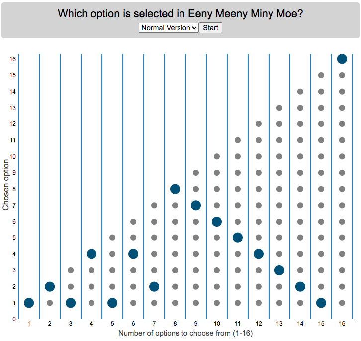
Who is selected when kids do Eeny Meeny Miney Moe?
I was watching my kids try to pick who got go first by doing the kids rhyme,
“Eeny, meeny, miny, moe, catch a tiger by the toe, if he hollers let him go, eeny, meeny, miny moe.”
Since there were only two of them, it got me thinking, if you knew which one it would fall on at the end, you could decide who to start counting with to ensure that you select who you want. For each set with different numbers of options, you will get a different individual from that set chosen so I thought I’d visualize who gets selected.
Click “Start” to see which option gets selected when there are different numbers of options. Hover over the graph to see which option is chosen.
There are multiple variants of the rhyme, but the primary one mentioned above has 16 counting elements. The math is such that you take the modulo (which is equivalent to a remainder in long division). For example, if you have 15 choices for the 16 element phrase, you’ll count through all 15 and then go back to the first option and end on it (i.e. item number 1 is chosen). 16 divided by 15 has a remainder of 1. In the case that the remainder is zero, you choose the last item. I.e. if there are 16 items/people to choose among, the last option is chosen and the remainder will be 0.
Longer variants will have more words, which are also shown on the dropdown menu. If you know of other variations, let me know in the comments and I can add them.
Primary: “Eeny, meeny, miny, moe, catch a tiger by the toe, if he hollers let him go, eeny, meeny, miny moe.” – 16 counting elements (“catch a” is one element, “by the” is another, etc)
Variation#1: “Eeny, meeny, miny, moe, catch a tiger by the toe, if he hollers let him go, eeny, meeny, miny moe My mother told me to pick the very best one and that is Y O U” – 31 counting elements
Variation#2: “Eeny, meeny, miny, moe, catch a tiger by the toe, if he hollers let him go, eeny, meeny, miny moe My mother told me to pick the very best one and you are it” – 29 counting elements
Source and Tools:
The rhymes come from my childhood and my kids helped me remember some of the variants. Calculations are done in javascript and visualization is done with the open source Plotly javascript graphing library.

Most COVID-19 deaths in the US could have been avoided
The US coronavirus death rate is quite high compared to other countries (on a population-corrected basis)
US coronavirus deaths have surpassed 300,000. Many of these deaths could have been avoided if swift action had been taken in February and March, as many other countries did. This graph shows an rough estimate of the number of US deaths that could have been avoided if the US had acted similar to other countries.
This graph takes the rate of coronavirus deaths by country (normalized to their population size) and imagines what would happen if the US had had that death rate, instead of its own. It then applies that reduction (or increase) in death rate to the total number of deaths that the US has experienced. The US death rate is about 600/million people in September 2020 and if a country has a death rate of 60/million people, then 90% of US deaths (about 180,000 people) could have been avoided if the US had matched their death rate. The government response to the pandemic is one of several important factors that determine the number of cases and deaths in a country. This means proper messaging about the need to wear masks and socially distance as well as providing payments to citizens and business to help them during the economic shutdown. Other important factors can include the overall health of the population, the population structure (i.e. age distribution of population), ease of controlling borders to prevent cases from entering the country, presence of universal or low-cost health care system, and relative wealth and education of the population.
The graph lets you compare the potential reduction in US deaths when looking at 30 different countries. You can choose those 30 countries based on total population, GDP or GDP per capita. These give somewhat different sets of countries to compare death rates, which is an indication of the effectiveness of the coronavirus response.
A valid criticism of this graph is that testing and data collection is very different in each of the countries shown and the comparisons are not always valid. This is definitely a problem with all coronavirus data but for the most part, the very large differences between death rates would still exist even if data collection were totally standardized. Some of the data from the poorest countries is less reliable, because they have less testing capabilities.
Source and Tools:
Data on coronavirus deaths by country is from covid19api.com and downloaded and cleaned with a python script. Graph is made using the plotly open source javascript library.
Wildfire smoke impacts solar panel generation
On September 9th, 2020, the entire San Francisco Bay Area, we had a crazy combination of wildfire smoke and low clouds that darkened the sky and turned everything orange. At 9am, it looked like it was nighttime and at noon, it was so dark, that it looked like dusk.
Here is a plot of 8+ years of solar panel generation from our panels. If you click on the legend, you can toggle whether that data is shown. Total generation for the day was only 93 watt hours (as opposed to a summer median of 13300 watt hours, 13.3 kWh) and peak power was only 32 watts (vs a median summer peak of 2000 watts (2.0 kW)).
The solar generation was even worse than the next worst day in winter (typically when it rains all day). Clicking on the legend will toggle whether certain seasons are shown and you can view how solar generation varies by season.
Here is a google image search of photos showing the crazy, apocalyptic scenes with the orange color.
Source and Tools:
Data on solar generation is downloaded from our solar panel inverter provider (enphase) and cleaned with a python script. Graph is made using the plotly open source javascript library.
2020 Stock Market Drop Compared to other Bear Markets
2020’s stock market drop was unprecedented for the speed of the drop and also the speed of the recovery
This graph shows the stock market drops from the 2020 and other bear markets normalized so that the peak is at 100% at day 0. This lets you see the severity and duration of different bear markets from the Great Depression (1929), the Dot Com Bust (2000), and the Financial Crisis (2008) and other drops over 30%.
The coronavirus pandemic has significantly disrupted the global economy. Q2 GDP in the United States declined at an annualized rate of 32% and US unemployment reaching 15% due to coronavirus induced business shutdowns.
However, the stock market drop (represented by the S&P500 index) in late February and early March 2020 has somewhat surprisingly rebounded and reached a new all-time-high in August 2020, even as unemployment and GDP output has continued to falter. There certainly seems to be a disconnect between the fundamentals of the economy and the stock market.
Will the recovery in the stock markets continue or will it begin to align more closely with the fundamentals of the economy?
There are many proposed reasons why this disconnect is happening. The Federal Reserve actions to increase liquidity and prop up the stock market. The heavy weighting of tech in the S&P500 and the pandemic’s boost to many tech company’s business (i.e. Amazon, Zoom, Apple). Whatever the reason, the question of whether the market can continue at this pace or will have a correction is important and one to watch.
Data for the S&P500 price is daily from 1950 onward but before 1950, the data I had available was on a monthly basis. I interpolated this monthly data to create daily data, so not all the data is 100% accurate for any given day before 1950. Data for 2020 will continue to be updated daily.
Source and Tools:
Data on historical S&P500 prices is from Yahoo! Finance and downloaded and cleaned with a python script. Graph is made using the plotly open source javascript library.
US Postal Service vs Private Delivery
The US Postal Service mail volume is enormous and can’t easily be replaced by private delivery services
The US Postal Service (USPS) has been getting a good deal of press recently because of Trump’s attacks on the security of mail in voting and recent moves by political appointees to reduce the capability of the agency to delivery mail in a timely fashion. These changes reportedly include removing mail sorting equipment and changing overtime hours.
Some have suggested privatizing the postal service but currently the volume of mail and packages through private delivery services is far smaller than that carried by the federal agency.
Note that the USPS carries about 55 billion pieces of first class mail annually out of the reported 143 billion pieces of total mail.
Source and Tools:
Data on Fedex, UPS and Amazon deliveries is from this theverge.com article. Data for the USPS comes from usps.com. Graph is made using the plotly open source javascript library.
How much will masks reduce coronavirus transmission rate R0?
It depends on their effectiveness and how many people wear them
R0 is the transmission rate which is defined as the average number of cases that are expected to be produced from a single case in an uninfected population. R0 is dependent on a number of different factors that include transmissibility of a disease (how infectious it is), the amount of social contact and the duration of social contact. We have learned that variants of the coronavirus (such as delta or omicron) can greatly influence the transmissibility of the disease.
A baseline level of social contact is related to the population density (how often you come into contact with other people) and social distancing (limiting gatherings, not going in to work or school, etc) will reduce the amount of social contact with different people. Given what we know about coronavirus and its transmission, the amount of “contact” can also be influenced by mask wearing. This interactive graph shows the effect of mask wearing and effectiveness on reducing R0 even further. Because the effectiveness of existing vaccines is as of yet unknown against Omicron, this visualization does not take into account vaccines and their effectiveness of reducing R0, which is a very important limitation.
A very important caveat to this visualization: This visualization was initially created before COVID-19 vaccines were available and does not currently take their ability to prevent infection (and lower R0) into account because the effectiveness of each vaccines differs and the protection against infection wanes over time
This graph is a work-in-progress so please feel free to provide suggestions and feedback on issues of scientific concepts as well as for improvements in conveying the concepts/ideas.
Methodology
R0 values for different regions and population densities are estimated from Youyang Gu’s machine learning model for spread in Feb and early-March (i.e. before social distancing and mask wearing).
Baseline R0,variant based on variant transmissibility – R0 value ranges from an early estimate of 8 for Omicron to 5 for Delta and 2.5 for the original Alpha strain.
Population density factor (PDF) – this can increase or decrease the R0 value based on how much close contact you have. It ranges from about 2.4 in very high density places like New York City with lots of transit use where you are in close contact with other people for long periods of time to 0.8 in rural areas with much less contact. A value of 1 represents average US population density.
Social distancing factor (SDF) – this is simply a reduction on the baseline R0 based on the amount of social distancing (ranges from 100% (no social distancing) to 33% (high levels of social distancing). This is a reduction in the amount of time and number of people the average person is exposed to compared to baseline levels.
Mask effectiveness (Kmaskeff) – is defined as the percentage reduction in transmission of coronavirus that mask wearing can provide. An N95 mask is at least 95% effective at blocking most particles, but because it also reduces the speed at which your exhalation can travel outward (providing more time for droplets and aerosols to spread and diffuse to low concentration), an N95 can be much more than 95% effective in reducing coronavirus droplet and aerosol spread compared to the unmasked case. I’ve seen estimates for things like bandanas and homemade cloth mask having lower effectiveness maybe around 50% but I don’t know how scientifically they were estimated/calculated. Also depending on how mask are worn, this can also affect the effectiveness parameter. For example if an N95 mask does not fit tightly against the face and there are large gaps for air to flow, this will reduce the effectiveness of the mask. This parameter is shown on the x-axis.
Percent wearing masks (Kmaskfreq) – is simply the percentage of people wearing masks (varies from 0% to 100%). This parameter is shown on the y-axis.
The formula for effective Reffective is:
$R_\mathit{eff}=R_0,variant \times PDF \times SDF \times (1-K_{mask\mathit{eff}} \times K_{maskfreq})^2$
where $R_\mathit{eff}$ is the final average transmission value, $R_0,variant$ is the $R_0$ value based on the coronavirus variant type, PDF is the population density factor, SDF is the social distancing factor, $K_{mask\mathit{eff}}$ is the average mask effectiveness and $K_{maskfreq}$ is the percentage of people wearing masks. The squared parameter on the right side of the equation is essentially the average reduction in transmission that is likely due to mask usage and is from a preprint from Howard et al.
As you move up and to the right of the graph, mask use and effectiveness become very high and the transmission of coronavirus declines significantly. If you hover over the graph (on a desktop) or click on the graph (on mobile) you will see a popup that shows the Reff value that results. The lower the Reff value is the better as it dramatically affects the rate of transmission. High numbers will lead to explosive exponential growth while values below 1.0 will eventually reduce coronavirus transmissions to near 0.
For example at R0 of 6 and no social distancing or mask usage, one initial case can lead to approximately 56,000 cases in only 30 days. Whereas an Reff of 0.5 will only lead to a total of ~1 additional case in 30 days.
I am not an epidemiologist so some of the linear relationships and assumptions may be incorrect. Please let me know if I got anything terribly wrong or if you have any questions or suggestions on how the tool works, is structured or presented.
Source and Tools:
The reduction in R0 due to mask effectiveness and usage based on a model from a preprint from Howard et al. Baseline R0 are from Youyang Gu’s machine learning model. Calculations are done in javascript and visualization is done with the open source Plotly javascript graphing library.
Visualizing the outcome of Eeny Meeny Miney Moe
Who is selected when kids do Eeny Meeny Miney Moe?
I was watching my kids try to pick who got go first by doing the kids rhyme,
“Eeny, meeny, miny, moe, catch a tiger by the toe, if he hollers let him go, eeny, meeny, miny moe.”
Since there were only two of them, it got me thinking, if you knew which one it would fall on at the end, you could decide who to start counting with to ensure that you select who you want. For each set with different numbers of options, you will get a different individual from that set chosen so I thought I’d visualize who gets selected.
Click “Start” to see which option gets selected when there are different numbers of options. Hover over the graph to see which option is chosen.
There are multiple variants of the rhyme, but the primary one mentioned above has 16 counting elements. The math is such that you take the modulo (which is equivalent to a remainder in long division). For example, if you have 15 choices for the 16 element phrase, you’ll count through all 15 and then go back to the first option and end on it (i.e. item number 1 is chosen). 16 divided by 15 has a remainder of 1. In the case that the remainder is zero, you choose the last item. I.e. if there are 16 items/people to choose among, the last option is chosen and the remainder will be 0.
Longer variants will have more words, which are also shown on the dropdown menu. If you know of other variations, let me know in the comments and I can add them.
Primary: “Eeny, meeny, miny, moe, catch a tiger by the toe, if he hollers let him go, eeny, meeny, miny moe.” – 16 counting elements (“catch a” is one element, “by the” is another, etc)
Variation#1: “Eeny, meeny, miny, moe, catch a tiger by the toe, if he hollers let him go, eeny, meeny, miny moe My mother told me to pick the very best one and that is Y O U” – 31 counting elements
Variation#2: “Eeny, meeny, miny, moe, catch a tiger by the toe, if he hollers let him go, eeny, meeny, miny moe My mother told me to pick the very best one and you are it” – 29 counting elements
Source and Tools:
The rhymes come from my childhood and my kids helped me remember some of the variants. Calculations are done in javascript and visualization is done with the open source Plotly javascript graphing library.
Recent Comments