Posts for Tag: graph
Counting to One Million, One Billion or One Trillion in Spanish
There was lots of interest in the calculator to estimate counting time (in English) to one million, one billion and up to one trillion. I decided to do the same for other popular languages (Spanish). Here is the calculator that will calculate how long it takes to count to one million (or larger numbers) in Spanish. If you’d like to see this in Spanish click here.
(more…)
Counting to One Million in Different Languages (Chinese, English and Spanish)
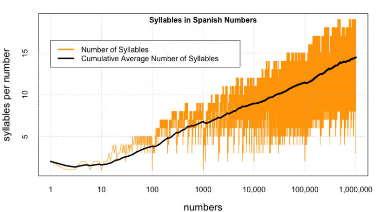
Updated: Lots of folks on Reddit pointed out some mistakes in the Spanish calculations, and helped me figure out the solutions, so the Spanish graphs are now updated. The Spanish calculator is now live!
Building off of the last post about Counting to One Million in English, I received some comments about looking at other languages. That seemed like a very good idea, so I looked at a list of the world’s most popular languages and saw Chinese and Spanish listed with English in the Top 3. Having a little experience with both of those, I set out to compare how long it’d take to count in each of these languages, if you had to pronounce every single number from one to one million.
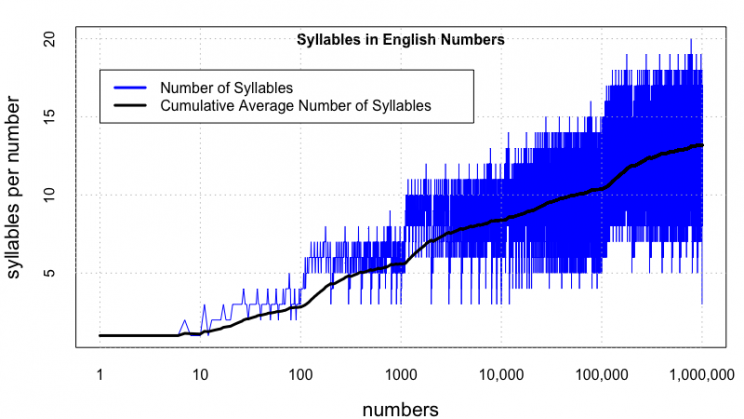
Again, here’s the plot of the number of syllables per number for English. The longest word is seven hundred seventy seven thousand seven hundred seventy seven (20 syllables).
March Madness Matchup Visualizer
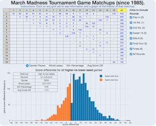
It’s March and for those who follow sports, that means college basketball and March Madness. The tournament is mainly interesting because of two reasons: (1) filling out brackets and (2) watching and hoping for upsets . This interactive March Madness matchup visualizer helps do both of these things by showing you the history of the tournament (since 1985 when the tournament expanded to 64 teams) in terms of matchups between teams with different seeds (1 through 16 in four regions).
(more…)
Tesla Model 3 Sales Tracker
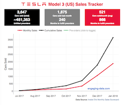
Tesla has been building innovative and industry-leading battery-powered cars for about a decade, starting with the Roadster, and then the Model S and Model X. The company unveiled the Model 3 (their first mass-market electric car with 220 miles of range, priced at “$35,000″), in early 2017 and hundreds of thousands of people put down a $1000 deposit within a few days. Overall, the number of these pre-orders total about half a million! It was impressive for a car most people have not driven or even seen.
The company also has had optimistic timeframes for producing and shipping these vehicle: they had originally estimated production rates of 5000 cars/week by the end of 2017 and 10,000 cars/week(!) in 2018. That’s Civic or Camry levels. These have since been delayed due to reports of “production hell” in scaling up mass production for the vehicles. Given the unprecedented demand and production challenges as Tesla transitions from niche automaker to mass-market production, I thought it would be worthwhile to track the sales of Model 3s as they are built and shipped to customers with the Model 3 Sales Tracker. Average sales price has been far above the $35,000 price initially announced. Production has reportedly passed 5000 cars/week intermittently, if not continuously, in the summer of 2018.
How Fast Are California Reservoirs Filling Up?
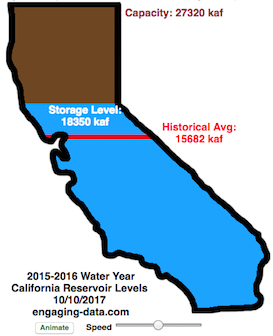
Update: I added a date slider to let you scrub through dates as well as the ability to pause the animation.
In my California water levels visualization, I presented a “bar graph” showing the amount of water currently in California’s reservoirs. However, I thought it’d be interesting to see how this has changed over the course of the last few months, since the state has gotten alot of rain and snow recently.
This visualizations “animates” the graph for recent history (going back to October 1, 2015) showing how the recent rains (or lack thereof) has been caused the levels of the reservoirs in California to rise (and fall).
The historical average represents a daily average reservoir level. It changes for each day of the water year to represent seasonality of precipitation and runoff.
Click the “animate” button below the figure and you can use the slider to change the speed of animation as it cycles through the days. I added a Date slider which lets you scrub through all the dates and animate from different points. (more…)
Counting to One Million, One Billion or One Trillion in Spanish
There was lots of interest in the calculator to estimate counting time (in English) to one million, one billion and up to one trillion. I decided to do the same for other popular languages (Spanish). Here is the calculator that will calculate how long it takes to count to one million (or larger numbers) in Spanish. If you’d like to see this in Spanish click here.
(more…)
Counting to One Million in Different Languages (Chinese, English and Spanish)
Updated: Lots of folks on Reddit pointed out some mistakes in the Spanish calculations, and helped me figure out the solutions, so the Spanish graphs are now updated. The Spanish calculator is now live!
Building off of the last post about Counting to One Million in English, I received some comments about looking at other languages. That seemed like a very good idea, so I looked at a list of the world’s most popular languages and saw Chinese and Spanish listed with English in the Top 3. Having a little experience with both of those, I set out to compare how long it’d take to count in each of these languages, if you had to pronounce every single number from one to one million.
Again, here’s the plot of the number of syllables per number for English. The longest word is seven hundred seventy seven thousand seven hundred seventy seven (20 syllables).

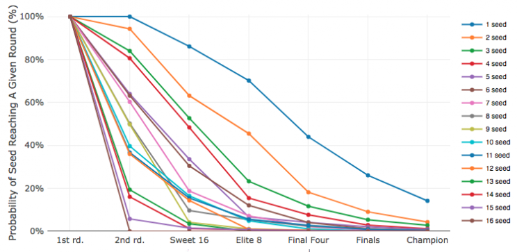
March Madness Matchup Visualizer
It’s March and for those who follow sports, that means college basketball and March Madness. The tournament is mainly interesting because of two reasons: (1) filling out brackets and (2) watching and hoping for upsets . This interactive March Madness matchup visualizer helps do both of these things by showing you the history of the tournament (since 1985 when the tournament expanded to 64 teams) in terms of matchups between teams with different seeds (1 through 16 in four regions).
(more…)
Tesla Model 3 Sales Tracker
Tesla has been building innovative and industry-leading battery-powered cars for about a decade, starting with the Roadster, and then the Model S and Model X. The company unveiled the Model 3 (their first mass-market electric car with 220 miles of range, priced at “$35,000″), in early 2017 and hundreds of thousands of people put down a $1000 deposit within a few days. Overall, the number of these pre-orders total about half a million! It was impressive for a car most people have not driven or even seen.
The company also has had optimistic timeframes for producing and shipping these vehicle: they had originally estimated production rates of 5000 cars/week by the end of 2017 and 10,000 cars/week(!) in 2018. That’s Civic or Camry levels. These have since been delayed due to reports of “production hell” in scaling up mass production for the vehicles. Given the unprecedented demand and production challenges as Tesla transitions from niche automaker to mass-market production, I thought it would be worthwhile to track the sales of Model 3s as they are built and shipped to customers with the Model 3 Sales Tracker. Average sales price has been far above the $35,000 price initially announced. Production has reportedly passed 5000 cars/week intermittently, if not continuously, in the summer of 2018.
How Fast Are California Reservoirs Filling Up?
Update: I added a date slider to let you scrub through dates as well as the ability to pause the animation.
In my California water levels visualization, I presented a “bar graph” showing the amount of water currently in California’s reservoirs. However, I thought it’d be interesting to see how this has changed over the course of the last few months, since the state has gotten alot of rain and snow recently.
This visualizations “animates” the graph for recent history (going back to October 1, 2015) showing how the recent rains (or lack thereof) has been caused the levels of the reservoirs in California to rise (and fall).
The historical average represents a daily average reservoir level. It changes for each day of the water year to represent seasonality of precipitation and runoff.
Click the “animate” button below the figure and you can use the slider to change the speed of animation as it cycles through the days. I added a Date slider which lets you scrub through all the dates and animate from different points. (more…)
Recent Comments