Posts for Tag: graph
FIRE Calculator: When can I retire early?
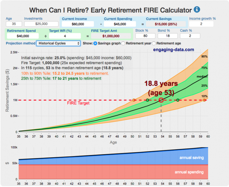
When can I retire and how long do I need to save before I can retire?
That’s the key question! This interactive fire calculator was built to let you play with the inputs and help you understand how savings rate and retirement spending strongly determine how long it will take you to save up for retirement. Note: it does not simulate the post-retirement period when you start to draw down your savings. That can be done on this post-retirement fire calculator (Rich, Broke or Dead) which compares the frequency of various outcomes in retirement (running out of money, ending up with way too much money, and life-expectancy).
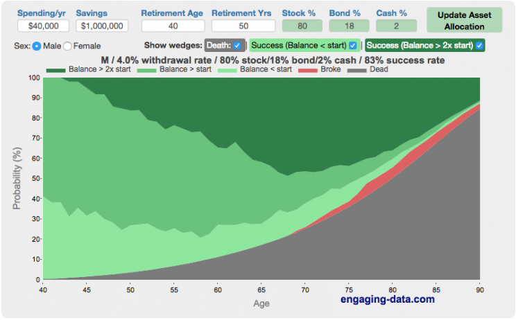
Rich, Broke or Dead? Post-Retirement FIRE Calculator: Visualizing Early Retirement Success and Longevity Risk
Update: June 2025 – bug fix in how tax rate on additional income is applied. If you have a lot of additional income, your success rate will likely go down.
Updated Shiller returns and inflation dataset through beginning of 2024
Rich, Broke or Dead?
One of the key issues with retiring is ensuring that the money you have saved will not be exhausted during your retirement. This is also known as Longevity Risk and is especially important if you want to retire early, since your retirement could be 50 years long (or more). This interactive post-retirement fire calculator and visualization looks at the question of whether your retirement savings can last long enough to support your retirement spending and combines it with average US life expectancy values to get a fuller picture of the likelihood of running out of money before you die.
It helps to answer the question: If I start out with $X dollars at the beginning of my retirement, will I run out of money before I die?
Should You Invest Or Wait When The Stock Market Is At An All-Time-High?
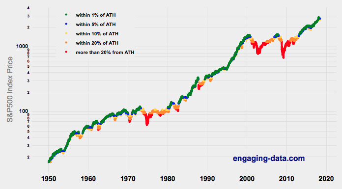
Whenever there’s been an extended bull run, one question that comes to mind “Should I invest in the market now, or wait until a pullback?” The question comes about because of fear and loss aversion: fear that the market will drop right after they invest and the observation that people want to avoid losses more than they value gains. However, historically, the correct answer, at least over the last 70+ years, has been to invest and not to try to time the market.
This was also demonstrated in the Market Timing Game; that people are pretty bad at predicting the direction of the markets and given the upward trend of the market, it’s simpler and more likely than not, better to just stay invested in the market. The corollary to this is that when you have additional money to invest (e.g. from regular savings from your paycheck or a one-time event like the sale of a house), it makes sense to invest the money and not worry about whether the market is at a high or low point. Some graphs that look at the distribution of returns when the market is at an all time high (ATH) can help answer this question of whether you expect to see worse returns than investing at other times.
(more…)
Shall We Play A (Market Timing) Game?
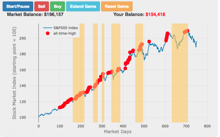

The Market Timing Game simulation is premised on the idea that buying-and-holding index investing and index funds are a no-brainer investment strategy and market timing (i.e. trying to predict market direction and trading accordingly) is a less than optimal strategy. The saying goes “Time in the market not timing the market”. In this simulation, you are given a 3-year market period from sometime in history (data starts January 1, 1950 and goes through the most recent market price, as prices are updated daily) or you can run in Monte Carlo mode (which picks randomly from daily returns in this period) and you start fully invested in the market and can trade out of (and into) the market if you feel like the market will fall (or rise). The goal is to see if you can beat the market index returns.
(more…)
¿Cuánto tardarías en contar hasta un millón?
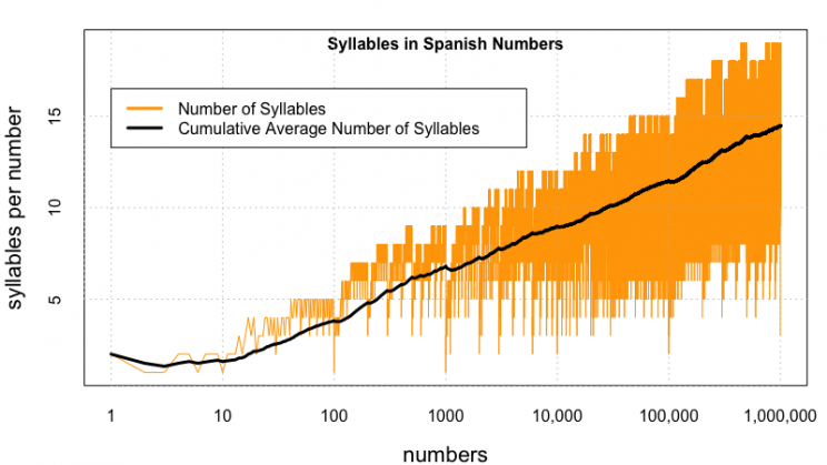
Disculpe(n) mi pobre español. Utilicé google translate para escribir esto en español.
Aquí está la calculadora que calculará cuánto tiempo lleva contar un millón (o números mayores) en español.
(more…)
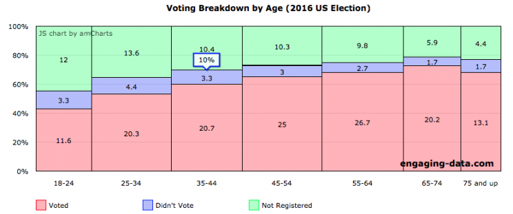
Demographic Characteristics of US Voters (2016)
If you need to register to vote, please visit Rock the Vote to get registered in your state.
US politics has more than a few issues, which have been highlighted by the current situation in Washington DC. The protests and greater political awareness from high school students and young adults is a positive sign for democracy, but it needs to be accompanied by increased rates of voting from this demographic. I thought it would be interesting to explore rates of voting in the US across different demographic groups (age, education, income, race). This data is from the 2016 US presidential election.
Total eligible US voting population was about 224 million in 2016 and the overall rate of voting among this population was 61.4%.
The first graph shows the distribution by age. As we can see, the rate of registration and voting increases with age. It is hard to engage young people to be interested in voting but hopefully they will do so in greater numbers this upcoming election.
FIRE Calculator: When can I retire early?
When can I retire and how long do I need to save before I can retire?
That’s the key question! This interactive fire calculator was built to let you play with the inputs and help you understand how savings rate and retirement spending strongly determine how long it will take you to save up for retirement. Note: it does not simulate the post-retirement period when you start to draw down your savings. That can be done on this post-retirement fire calculator (Rich, Broke or Dead) which compares the frequency of various outcomes in retirement (running out of money, ending up with way too much money, and life-expectancy).
Rich, Broke or Dead? Post-Retirement FIRE Calculator: Visualizing Early Retirement Success and Longevity Risk
Update: June 2025 – bug fix in how tax rate on additional income is applied. If you have a lot of additional income, your success rate will likely go down.
Updated Shiller returns and inflation dataset through beginning of 2024
Rich, Broke or Dead?
One of the key issues with retiring is ensuring that the money you have saved will not be exhausted during your retirement. This is also known as Longevity Risk and is especially important if you want to retire early, since your retirement could be 50 years long (or more). This interactive post-retirement fire calculator and visualization looks at the question of whether your retirement savings can last long enough to support your retirement spending and combines it with average US life expectancy values to get a fuller picture of the likelihood of running out of money before you die.
It helps to answer the question: If I start out with $X dollars at the beginning of my retirement, will I run out of money before I die?
Should You Invest Or Wait When The Stock Market Is At An All-Time-High?
Whenever there’s been an extended bull run, one question that comes to mind “Should I invest in the market now, or wait until a pullback?” The question comes about because of fear and loss aversion: fear that the market will drop right after they invest and the observation that people want to avoid losses more than they value gains. However, historically, the correct answer, at least over the last 70+ years, has been to invest and not to try to time the market.
This was also demonstrated in the Market Timing Game; that people are pretty bad at predicting the direction of the markets and given the upward trend of the market, it’s simpler and more likely than not, better to just stay invested in the market. The corollary to this is that when you have additional money to invest (e.g. from regular savings from your paycheck or a one-time event like the sale of a house), it makes sense to invest the money and not worry about whether the market is at a high or low point. Some graphs that look at the distribution of returns when the market is at an all time high (ATH) can help answer this question of whether you expect to see worse returns than investing at other times.
(more…)
Shall We Play A (Market Timing) Game?
The Market Timing Game simulation is premised on the idea that buying-and-holding index investing and index funds are a no-brainer investment strategy and market timing (i.e. trying to predict market direction and trading accordingly) is a less than optimal strategy. The saying goes “Time in the market not timing the market”. In this simulation, you are given a 3-year market period from sometime in history (data starts January 1, 1950 and goes through the most recent market price, as prices are updated daily) or you can run in Monte Carlo mode (which picks randomly from daily returns in this period) and you start fully invested in the market and can trade out of (and into) the market if you feel like the market will fall (or rise). The goal is to see if you can beat the market index returns.
(more…)
¿Cuánto tardarías en contar hasta un millón?
Disculpe(n) mi pobre español. Utilicé google translate para escribir esto en español.
Aquí está la calculadora que calculará cuánto tiempo lleva contar un millón (o números mayores) en español.
(more…)
Demographic Characteristics of US Voters (2016)
If you need to register to vote, please visit Rock the Vote to get registered in your state.
US politics has more than a few issues, which have been highlighted by the current situation in Washington DC. The protests and greater political awareness from high school students and young adults is a positive sign for democracy, but it needs to be accompanied by increased rates of voting from this demographic. I thought it would be interesting to explore rates of voting in the US across different demographic groups (age, education, income, race). This data is from the 2016 US presidential election.
Total eligible US voting population was about 224 million in 2016 and the overall rate of voting among this population was 61.4%.
The first graph shows the distribution by age. As we can see, the rate of registration and voting increases with age. It is hard to engage young people to be interested in voting but hopefully they will do so in greater numbers this upcoming election.
Recent Comments