Posts for Tag: data
Visualizing The Growth of Atmospheric CO2 Concentration
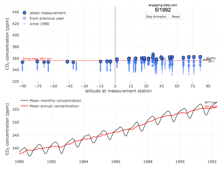
The current CO2 concentration in the atmosphere is over 400 parts per million (ppm). This has grown about 46% since pre-industrial levels (~280 ppm) in the early 1800s. The growing concentration of CO2 is a big concern because it is the most prevalent greenhouse gas, which is increasing the temperature of the planet and leading to substantial changes in the Earth’s climate patterns.
This graph visualizes the growth in CO2 concentration in the atmosphere (mainly from CO2 emissions due to human activities, such as burning fossil fuels for energy production, deforestation and other industrial processes). The graph starts at 1980 when CO2 concentration in the atmosphere was around 340ppm. It has grown significantly since then.
One of the interesting aspects of CO2 concentration is that it is not identical all around the globe, as it takes awhile for the atmosphere to mix. The graph shows geographic differences in CO2 concentration as well as seasonal ups and downs, that underly an overall growing trend in annual average (mean) concentration.
Seasonal trends in CO2 concentration occur due to differences in the amount of plant growth across different months. Spring and summer plant growth in the northern hemisphere causes a significant amount of photosynthesis, and CO2 absorption, relative to the fall and winter. This plant growth causes a very large amount of CO2 to be absorbed by plants and a noticeable reduction in the amount of CO2 in the atmosphere. The southern hemisphere spring and summer (northern hemisphere fall and winter) aren’t as obvious because there is much less land in the southern hemisphere and the land that is there is close to the tropics and green all year round.
CO2 concentration can change by about 4-5 ppm due to the “breathing” of plants, which is pretty significant. The total weight of CO2 in the atmosphere is about 3 trillion tonnes of CO2, so 4-5 ppm is about 1% of this or 30 billion tons of CO2 removed by plant life each spring/summer.
Data and Tools:
Data comes from the US National Oceanic and Atmospheric Administration (NOAA). Data was downloaded using an automated python script and the graphs were made using javascript and the open-sourced Plot.ly javascript engine.
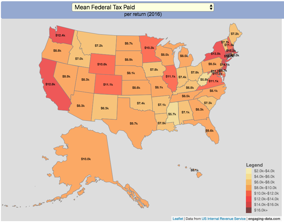
How Much Does Each State Pay In Taxes?

Given that tax day has just passed, I thought it would be good to check out some data on taxes. The IRS provides a great resource on tax data that I’ve only just gotten into. I think I’ll be able to do more with this in the future. This one looks at how taxes paid varies by state and presents it as a choropleth map (coloring states based on certain categories of tax data).
You can choose from a number of different categories:
- Mean Federal Tax Paid
- Mean Adjusted Gross Income
- Mean State/Local Tax
- Mean Combined (Fed/State/Local) Tax
- Percent Income from Dividends and Capital Gains
- Percent of Returns with Itemized Deductions
- Number of Tax Returns
- Mean Federal Tax Rate
- Mean State/Local Tax Rate
- Mean Combined (Fed/State/Local) Rate
- Total Federal Tax Liability
I may add more categories in the future, so if you have ideas of tax data you want to see visualized let me know and I’ll see what I can do.
For other tax-related tools and visualizations see my tax bracket calculator and visualization of marginal tax rates.
**Click Here to view other financial-related tools and data visualizations from engaging-data**
Data and Tools:
Data on tax returns by state is from the IRS website in an excel format. The map was made using the leaflet open source mapping library. Data was compiled in excel and calculations made using javascript.
Electric Vehicle Sales By State
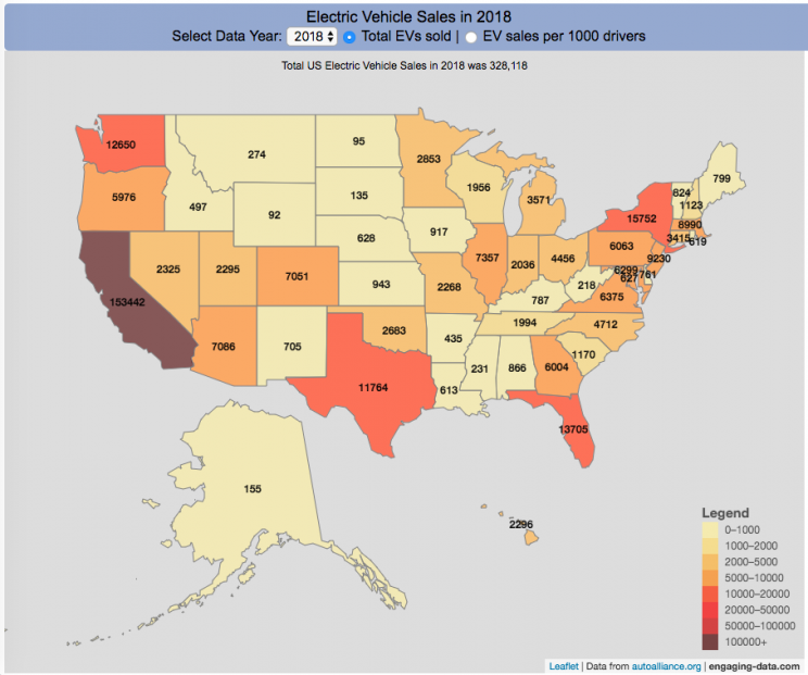
Where are electric vehicles being sold in the United States?
Electric vehicles are any vehicle that can be plugged in to recharge a battery that provides power to move the vehicle. Two broad classes are battery electric vehicles (BEVs) which only have batteries as their power source and plug-in hybrid electric vehicles (PHEVs) which have an alternative or parallel power source, typically a gasoline engine. PHEVs are built so that when the battery is depleted, the car can still run on gasoline and operate like a hybrid vehicle similar to a regular Toyota Prius (which is not plugged in at all).
Electric vehicles (EVs) have been sold in the US since 2011 (a few commercial models were sold previous to that but not in any significant numbers) and some conversions were also available. Since then, the number of EVs sold has increased pretty significantly. I wanted to look at the distribution of where those vehicles were located. What is interesting is that California accounts for around 50% of the electric vehicles sold in the United States. Other states have lower rates of EV adoption (in some cases much, much lower). There are many reasons for this, including beneficial policies, public awareness, a large number of potential early adopters and a mild climate. Even so, the EV heatmap of California done early shows that sales are mostly limited to the Bay Area, and LA areas.
The map shows data for total electric vehicle sales by state for years 2016, 2017 or 2018 and also the number of EV sales per 1000 licensed drivers (this is all people in the state with a drivers license, not drivers of EVs). If you hover over a state, you can see both data points for that state.
It will be interesting to see how the next generation of electric vehicles continues to improve, lower in price and become more popular with drivers outside of early adopters.
Click here to see other Energy-Related visualizations
Data and Tools:
Data on electric vehicle sales is from the Auto Alliance website. Licensed driver data was downloaded from the US Department of Transportation’s Bureau of Transportation Statistics website. The map was made using the leaflet open source mapping library. Data was compiled and calculated using javascript.

Assembling the World Country-By-Country

Watch the world assemble country-by-country based on a specific statistic
This map lets you watch as the world is built-up one country at a time. This can be done along the following statistical dimensions:
- Country name
- Population – from United Nations (2017)
- GDP – from United Nations (2017)
- GDP per capita
- GDP per area
- Land Area – from CIA factbook (2016)
- Population density
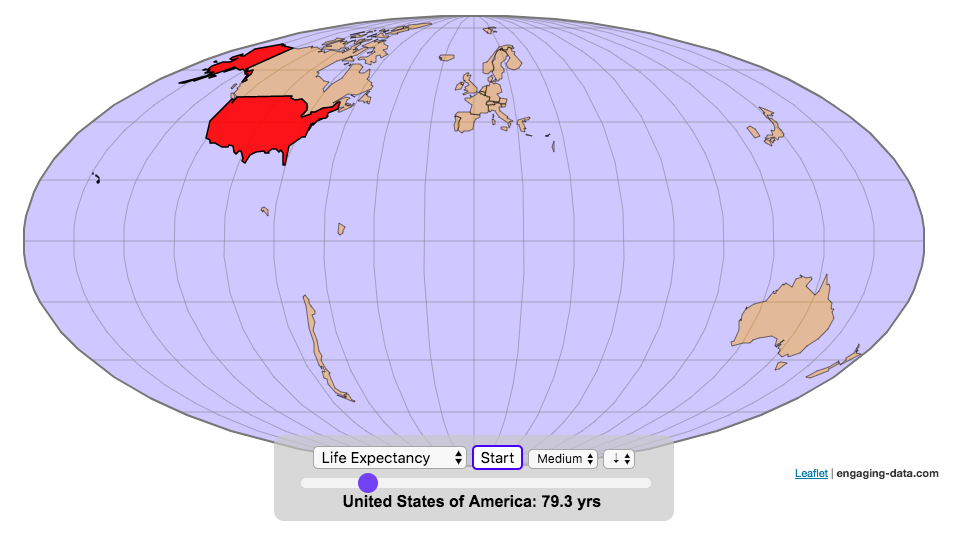
- Life expectancy – from World Health Organization (2015)
- or a random order
These statistics can be sorted from small to large or vice versa to get a view of the globe and its constituent countries in a unique and interesting way. It’s a bit hypnotic to watch as the countries appear and add to the world one by one.
You can use this map to display all the countries that have higher life expectancy than the United States:
select “Life expectancy”, sort from “high to low” and use the scroll bar to move to the United States and you’ll get a picture like this:
or this map to display all the countries that have higher population density than the United States:
select “Population density, sort from “high to low” and use the scroll bar to move to the United States and you’ll get a picture like this:

I hope you enjoy exploring the countries of the world through this data viz tool. And if you have ideas for other statistics to add, I will try to do so.
Data and tools: Data was downloaded primarily from Wikipedia: Life expectancy from World Health Organization (2015) | GDP from United Nations (2017) | Population from United Nations (2017) | Land Area from CIA factbook (2016)
The map was created with the help of the open source leaflet javascript mapping library
World Population Distribution by Latitude and Longitude
How is population distributed by latitude and longitude
This interactive map shows how population is distributed by latitude or longitude. It animates the creation of a bar graph by shifting population from its location on the map to aggregate population levels by latitude or longitude increments. Each “block” of the bar graph represents 1 million people. Population is highest in the northern hemisphere at 25-26 degrees North latitude and 77-78 degrees East Longitude.
Instructions:
It should be relatively explanatory. Press the “Aggregate Population by Latitude” button to make a plot of population by line of latitude (i.e. rows of the map).
Press the “Aggregate Population by Longitude” button to make a plot of population by line of longitude (i.e. columns of the map). To see the population distributed across the map, press the “Show Population Grid” button.
This map was inspired by some mapping work done by neilrkaye on twitter and reddit.
Data Sources and Tools:
This map projection is an equirectangular projection. Data on population density comes from NASA’s Socioeconomic Data and Applications Center (SEDAC) site and is displayed at the 1 degree resolution. This interactive visualization is made using the awesome leaflet.js javascript library.

Size of California Economy Compared to Rest of US
California is one of the world’s largest economies (as measured by gross domestic product), currently ranking 5th in the world (if it were judged as it’s own country). This map divides the rest of the US economy into 6 more or less equal parts (each the size of California’s) and they are all within about 10% of each other.
Instructions:
You can hover over a state with your cursor to get more information about the GDP of that state and the group of states that equal California’s economy.
Gross domestic product is a measurement of the size of a region’s economy. It is the sum of gross value added from all entities in the region or state. It measures the monetary value of the goods produced and services provided in a year.
The main sectors of the California economy are agriculture, technology, tourism, media (movies and TV) and trade. Some of the world’s largest and most famous companies contribute to the California economy, like Apple, Google, Facebook, Disney, and Chevron.
Data and Tools:
Data for state level GDP is obtained from Wikipedia for the year 2017. The map data is processed in javascript and then plotted using the leaflet.js mapping library.
Visualizing The Growth of Atmospheric CO2 Concentration
The current CO2 concentration in the atmosphere is over 400 parts per million (ppm). This has grown about 46% since pre-industrial levels (~280 ppm) in the early 1800s. The growing concentration of CO2 is a big concern because it is the most prevalent greenhouse gas, which is increasing the temperature of the planet and leading to substantial changes in the Earth’s climate patterns.
This graph visualizes the growth in CO2 concentration in the atmosphere (mainly from CO2 emissions due to human activities, such as burning fossil fuels for energy production, deforestation and other industrial processes). The graph starts at 1980 when CO2 concentration in the atmosphere was around 340ppm. It has grown significantly since then.
One of the interesting aspects of CO2 concentration is that it is not identical all around the globe, as it takes awhile for the atmosphere to mix. The graph shows geographic differences in CO2 concentration as well as seasonal ups and downs, that underly an overall growing trend in annual average (mean) concentration.
Seasonal trends in CO2 concentration occur due to differences in the amount of plant growth across different months. Spring and summer plant growth in the northern hemisphere causes a significant amount of photosynthesis, and CO2 absorption, relative to the fall and winter. This plant growth causes a very large amount of CO2 to be absorbed by plants and a noticeable reduction in the amount of CO2 in the atmosphere. The southern hemisphere spring and summer (northern hemisphere fall and winter) aren’t as obvious because there is much less land in the southern hemisphere and the land that is there is close to the tropics and green all year round.
CO2 concentration can change by about 4-5 ppm due to the “breathing” of plants, which is pretty significant. The total weight of CO2 in the atmosphere is about 3 trillion tonnes of CO2, so 4-5 ppm is about 1% of this or 30 billion tons of CO2 removed by plant life each spring/summer.
Data and Tools:
Data comes from the US National Oceanic and Atmospheric Administration (NOAA). Data was downloaded using an automated python script and the graphs were made using javascript and the open-sourced Plot.ly javascript engine.
How Much Does Each State Pay In Taxes?
Given that tax day has just passed, I thought it would be good to check out some data on taxes. The IRS provides a great resource on tax data that I’ve only just gotten into. I think I’ll be able to do more with this in the future. This one looks at how taxes paid varies by state and presents it as a choropleth map (coloring states based on certain categories of tax data).
- Mean Federal Tax Paid
- Mean Adjusted Gross Income
- Mean State/Local Tax
- Mean Combined (Fed/State/Local) Tax
- Percent Income from Dividends and Capital Gains
- Percent of Returns with Itemized Deductions
- Number of Tax Returns
- Mean Federal Tax Rate
- Mean State/Local Tax Rate
- Mean Combined (Fed/State/Local) Rate
- Total Federal Tax Liability
I may add more categories in the future, so if you have ideas of tax data you want to see visualized let me know and I’ll see what I can do.
For other tax-related tools and visualizations see my tax bracket calculator and visualization of marginal tax rates.
**Click Here to view other financial-related tools and data visualizations from engaging-data**
Data and Tools:
Data on tax returns by state is from the IRS website in an excel format. The map was made using the leaflet open source mapping library. Data was compiled in excel and calculations made using javascript.
Electric Vehicle Sales By State
Where are electric vehicles being sold in the United States?
Electric vehicles are any vehicle that can be plugged in to recharge a battery that provides power to move the vehicle. Two broad classes are battery electric vehicles (BEVs) which only have batteries as their power source and plug-in hybrid electric vehicles (PHEVs) which have an alternative or parallel power source, typically a gasoline engine. PHEVs are built so that when the battery is depleted, the car can still run on gasoline and operate like a hybrid vehicle similar to a regular Toyota Prius (which is not plugged in at all).
Electric vehicles (EVs) have been sold in the US since 2011 (a few commercial models were sold previous to that but not in any significant numbers) and some conversions were also available. Since then, the number of EVs sold has increased pretty significantly. I wanted to look at the distribution of where those vehicles were located. What is interesting is that California accounts for around 50% of the electric vehicles sold in the United States. Other states have lower rates of EV adoption (in some cases much, much lower). There are many reasons for this, including beneficial policies, public awareness, a large number of potential early adopters and a mild climate. Even so, the EV heatmap of California done early shows that sales are mostly limited to the Bay Area, and LA areas.
The map shows data for total electric vehicle sales by state for years 2016, 2017 or 2018 and also the number of EV sales per 1000 licensed drivers (this is all people in the state with a drivers license, not drivers of EVs). If you hover over a state, you can see both data points for that state.
It will be interesting to see how the next generation of electric vehicles continues to improve, lower in price and become more popular with drivers outside of early adopters.
Click here to see other Energy-Related visualizations
Data and Tools:
Data on electric vehicle sales is from the Auto Alliance website. Licensed driver data was downloaded from the US Department of Transportation’s Bureau of Transportation Statistics website. The map was made using the leaflet open source mapping library. Data was compiled and calculated using javascript.
Assembling the World Country-By-Country
Watch the world assemble country-by-country based on a specific statistic
- Country name
- Population – from United Nations (2017)
- GDP – from United Nations (2017)
- GDP per capita
- GDP per area
- Land Area – from CIA factbook (2016)
- Population density
- Life expectancy – from World Health Organization (2015)
- or a random order
These statistics can be sorted from small to large or vice versa to get a view of the globe and its constituent countries in a unique and interesting way. It’s a bit hypnotic to watch as the countries appear and add to the world one by one.
You can use this map to display all the countries that have higher life expectancy than the United States:
select “Life expectancy”, sort from “high to low” and use the scroll bar to move to the United States and you’ll get a picture like this:
or this map to display all the countries that have higher population density than the United States:
select “Population density, sort from “high to low” and use the scroll bar to move to the United States and you’ll get a picture like this:
I hope you enjoy exploring the countries of the world through this data viz tool. And if you have ideas for other statistics to add, I will try to do so.
Data and tools: Data was downloaded primarily from Wikipedia: Life expectancy from World Health Organization (2015) | GDP from United Nations (2017) | Population from United Nations (2017) | Land Area from CIA factbook (2016)
The map was created with the help of the open source leaflet javascript mapping library
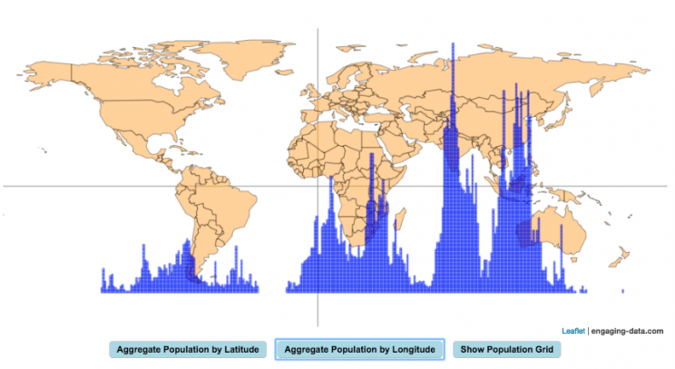
World Population Distribution by Latitude and Longitude
How is population distributed by latitude and longitude
This interactive map shows how population is distributed by latitude or longitude. It animates the creation of a bar graph by shifting population from its location on the map to aggregate population levels by latitude or longitude increments. Each “block” of the bar graph represents 1 million people. Population is highest in the northern hemisphere at 25-26 degrees North latitude and 77-78 degrees East Longitude.
Instructions:
It should be relatively explanatory. Press the “Aggregate Population by Latitude” button to make a plot of population by line of latitude (i.e. rows of the map).
Press the “Aggregate Population by Longitude” button to make a plot of population by line of longitude (i.e. columns of the map). To see the population distributed across the map, press the “Show Population Grid” button.
This map was inspired by some mapping work done by neilrkaye on twitter and reddit.
Data Sources and Tools:
This map projection is an equirectangular projection. Data on population density comes from NASA’s Socioeconomic Data and Applications Center (SEDAC) site and is displayed at the 1 degree resolution. This interactive visualization is made using the awesome leaflet.js javascript library.
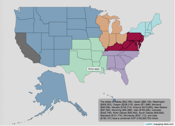
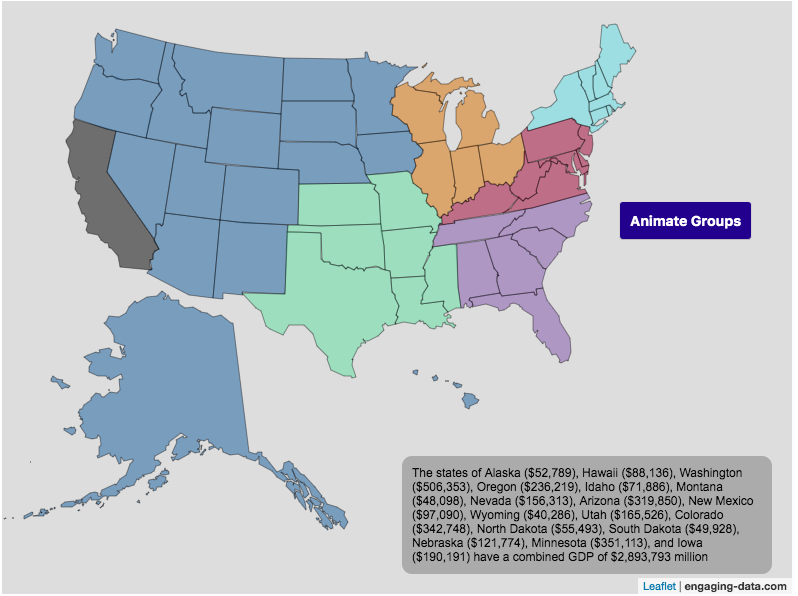
Size of California Economy Compared to Rest of US
California is one of the world’s largest economies (as measured by gross domestic product), currently ranking 5th in the world (if it were judged as it’s own country). This map divides the rest of the US economy into 6 more or less equal parts (each the size of California’s) and they are all within about 10% of each other.
Instructions:
You can hover over a state with your cursor to get more information about the GDP of that state and the group of states that equal California’s economy.
Gross domestic product is a measurement of the size of a region’s economy. It is the sum of gross value added from all entities in the region or state. It measures the monetary value of the goods produced and services provided in a year.
The main sectors of the California economy are agriculture, technology, tourism, media (movies and TV) and trade. Some of the world’s largest and most famous companies contribute to the California economy, like Apple, Google, Facebook, Disney, and Chevron.
Data and Tools:
Data for state level GDP is obtained from Wikipedia for the year 2017. The map data is processed in javascript and then plotted using the leaflet.js mapping library.
Recent Comments