Posts for Tag: projection
Country Centered Map Projections

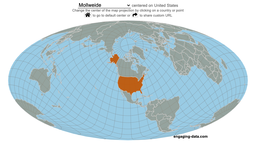
What does it look like if you center a map on a specific country? Click on a country to find out.
World maps are used to show the geographic relationships between the countries and regions of the world. Their design shapes our perception of the world and those relationships. Two of the important aspects of map design are the choice of map projection and what is centered in the map. The idea for this map dataviz is to let users create their own country centered map by centering the map where you choose (on a country of your choice or a specific point) and the map projection.
As discussed in my real country size mercator map, there aren’t any perfect map projections as you try to represent the 3-dimensional surface of a sphere on a 2-dimensional map. Each map projection has advantages and disadvantages.
Instructions
- Click on a country or point on the ocean to center the map projection onto this area
You can choose between the following map projections:
- Orthographic (globe) – a map projection that looks like a globe
- Mercator – a very common cylindrical map projection used in many web maps which expands sizes of land near the top and bottom edges
- Mollweide – a pseudocylindrical projection that maintains equal area of land masses. Areas near the top and bottom edges can be distorted
- Equirectangular – another cylindrical projection but latitude lines are kept equidistant. Areas near top and bottom edges of map are wider than in reality.
- Gall Peters – an equal area cylindrical projection that stretches shapes vertically at the equator and shrinks shapes vertically at the poles.
In addition, you can:
- Rotate the map in increments of 45 degrees using the ⟲ and ⟳ buttons.
- Share maps of your home country, chosen map projection and rotation by clicking on the share button (and copying the URL).
The number of different maps you can create is quite large and will give you a different and often unusual perspective on the world. If you choose the cylindrical projections (Mercator, equirectangular, Gall Peters) you will see some interesting distortions when you focus on different countries or regions. The reasoning is that because the map is rectangular (i.e. the longitude lines are kept parallel on the map, while in reality longitude lines converge at the poles), land masses near the top and bottom of the map will grow as they are widened (and in the case of the Mercator, made taller) to accommodate the map projection. Because the Orthographic and Mollweide projections have converging longitude lines, they do not exhibit the same level of distortion.
If you are interested in map projections, they are described in this wikipedia article. For a cylindrical projections, you can think of it as encircling the globe with a rolled surface which forms the side of a cylinder. See this image from wikipedia.

In the standard projection, the globe is touching this cylinder at the equator, but this map lets you move any country or point to the place where it intersects the cylinder and then projects the land masses onto the cylinder. Land masses at the top and bottom of the sphere in this orientation will be more distorted at top and bottom of the map projections in these cylindrical projections.
Sources and Tools:
This map was made using the open-source, d3 javascript dataviz library and based on Mike Bostock’s observable maps notebook.

Country Centered Map Projections

What does it look like if you center a map on a specific country? Click on a country to find out.
World maps are used to show the geographic relationships between the countries and regions of the world. Their design shapes our perception of the world and those relationships. Two of the important aspects of map design are the choice of map projection and what is centered in the map. The idea for this map dataviz is to let users create their own country centered map by centering the map where you choose (on a country of your choice or a specific point) and the map projection.
As discussed in my real country size mercator map, there aren’t any perfect map projections as you try to represent the 3-dimensional surface of a sphere on a 2-dimensional map. Each map projection has advantages and disadvantages.
Instructions
- Click on a country or point on the ocean to center the map projection onto this area
You can choose between the following map projections:
- Orthographic (globe) – a map projection that looks like a globe
- Mercator – a very common cylindrical map projection used in many web maps which expands sizes of land near the top and bottom edges
- Mollweide – a pseudocylindrical projection that maintains equal area of land masses. Areas near the top and bottom edges can be distorted
- Equirectangular – another cylindrical projection but latitude lines are kept equidistant. Areas near top and bottom edges of map are wider than in reality.
- Gall Peters – an equal area cylindrical projection that stretches shapes vertically at the equator and shrinks shapes vertically at the poles.
In addition, you can:
- Rotate the map in increments of 45 degrees using the ⟲ and ⟳ buttons.
- Share maps of your home country, chosen map projection and rotation by clicking on the share button (and copying the URL).
The number of different maps you can create is quite large and will give you a different and often unusual perspective on the world. If you choose the cylindrical projections (Mercator, equirectangular, Gall Peters) you will see some interesting distortions when you focus on different countries or regions. The reasoning is that because the map is rectangular (i.e. the longitude lines are kept parallel on the map, while in reality longitude lines converge at the poles), land masses near the top and bottom of the map will grow as they are widened (and in the case of the Mercator, made taller) to accommodate the map projection. Because the Orthographic and Mollweide projections have converging longitude lines, they do not exhibit the same level of distortion.
If you are interested in map projections, they are described in this wikipedia article. For a cylindrical projections, you can think of it as encircling the globe with a rolled surface which forms the side of a cylinder. See this image from wikipedia.
In the standard projection, the globe is touching this cylinder at the equator, but this map lets you move any country or point to the place where it intersects the cylinder and then projects the land masses onto the cylinder. Land masses at the top and bottom of the sphere in this orientation will be more distorted at top and bottom of the map projections in these cylindrical projections.
Sources and Tools:
This map was made using the open-source, d3 javascript dataviz library and based on Mike Bostock’s observable maps notebook.

Recent Comments