Posts for Tag: president
Election Results and Population Density

How do 2020 presidential election results correlate with population density?
The visualization I made about county election results and comparing land area to population size was very popular around the time of the 2020 presidential election. As the counties were represented by population, it was clear that democratic-leaning areas on that map tended to grow in size, while republican-leaning areas tended to shrink. This raised the question of exactly how population density correlates with election results.
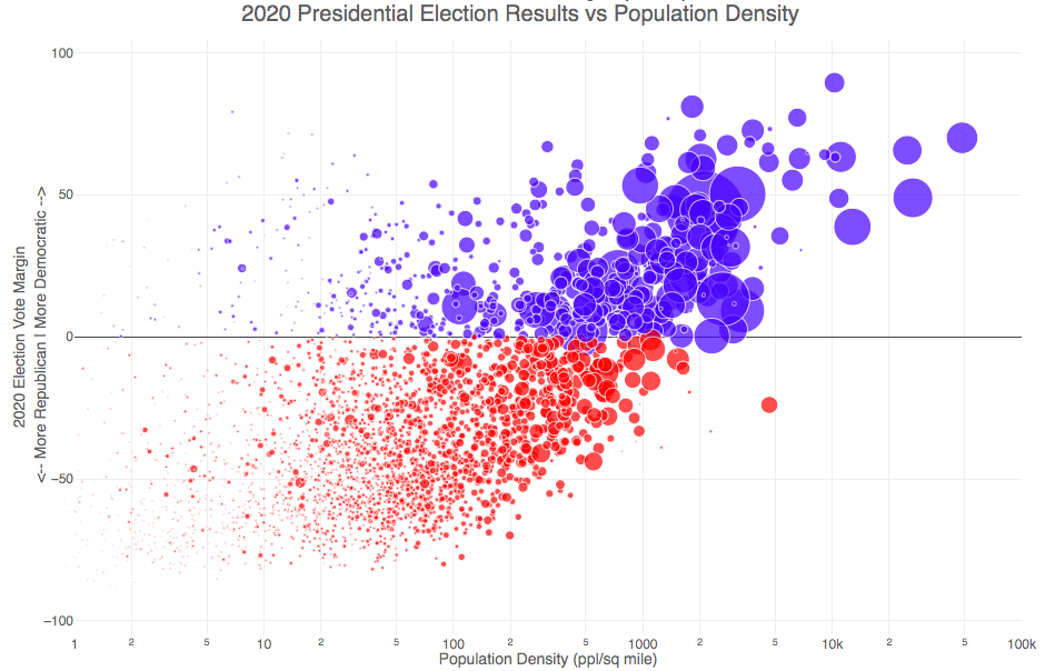
Hover over (or click on) the bubbles to see information about the county.
It’s clear there is a very strong correlation between the vote margin and population density. Vote margin is the percentage amount that one candidate beat the other candidate by in the county (0% means a tie while 50% means that one candidate got 75% and the other got 25% of the voteshare). Population density is calculated as people per square mile in the county and is shown in the graph on a log scale, where each major grid line is 10 time greater than the previous one. This is done because there is one to two orders of magnitude difference in the densest counties (in New York City) and even moderately dense counties. There are also several counties with population density below 1 person per square mile (several in Alaska because of the size of their counties) but these are excluded from the graph.
Richmond County, NY (i.e. the Borough of Staten Island) is the densest county (17th densest) in the country that Trump won. The densest counties favored Biden quite heavily as he won 45 of the 50 densest counties in the country, which also tend to have a fairly high population.
This second graph is a histogram that specifically categorizes counties into discreet bins by population density. Note that they are on a log scale as well. You can toggle the graph to show the number of counties won by each candidate or the number of votes won in each of the population density bins. The black line shows the percentage of counties (or votes) won by the democratic candidate (Joe Biden) in each of those bins.
Hover over (or click on) the bars to see information about each county bin.
It’s pretty clear in these graphs that low population density areas clearly favor the republican while the denser areas favor the democrat.
Data and Tools
The 2020 county-level election data is downloaded from the New York Times county election data API and processed using a python script. Population data used is for 2018. The visualization was created using the open-source plotly javascript graphing library.
Election Results and Population Density
How do 2020 presidential election results correlate with population density?
The visualization I made about county election results and comparing land area to population size was very popular around the time of the 2020 presidential election. As the counties were represented by population, it was clear that democratic-leaning areas on that map tended to grow in size, while republican-leaning areas tended to shrink. This raised the question of exactly how population density correlates with election results.
Hover over (or click on) the bubbles to see information about the county.
It’s clear there is a very strong correlation between the vote margin and population density. Vote margin is the percentage amount that one candidate beat the other candidate by in the county (0% means a tie while 50% means that one candidate got 75% and the other got 25% of the voteshare). Population density is calculated as people per square mile in the county and is shown in the graph on a log scale, where each major grid line is 10 time greater than the previous one. This is done because there is one to two orders of magnitude difference in the densest counties (in New York City) and even moderately dense counties. There are also several counties with population density below 1 person per square mile (several in Alaska because of the size of their counties) but these are excluded from the graph.
Richmond County, NY (i.e. the Borough of Staten Island) is the densest county (17th densest) in the country that Trump won. The densest counties favored Biden quite heavily as he won 45 of the 50 densest counties in the country, which also tend to have a fairly high population.
This second graph is a histogram that specifically categorizes counties into discreet bins by population density. Note that they are on a log scale as well. You can toggle the graph to show the number of counties won by each candidate or the number of votes won in each of the population density bins. The black line shows the percentage of counties (or votes) won by the democratic candidate (Joe Biden) in each of those bins.
Hover over (or click on) the bars to see information about each county bin.
It’s pretty clear in these graphs that low population density areas clearly favor the republican while the denser areas favor the democrat.
Data and Tools
The 2020 county-level election data is downloaded from the New York Times county election data API and processed using a python script. Population data used is for 2018. The visualization was created using the open-source plotly javascript graphing library.
Recent Comments