Posts for Tag: gdp
Most COVID-19 deaths in the US could have been avoided
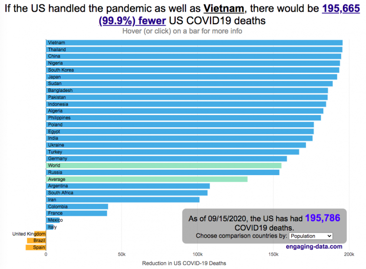
The US coronavirus death rate is quite high compared to other countries (on a population-corrected basis)
US coronavirus deaths have surpassed 300,000. Many of these deaths could have been avoided if swift action had been taken in February and March, as many other countries did. This graph shows an rough estimate of the number of US deaths that could have been avoided if the US had acted similar to other countries.
This graph takes the rate of coronavirus deaths by country (normalized to their population size) and imagines what would happen if the US had had that death rate, instead of its own. It then applies that reduction (or increase) in death rate to the total number of deaths that the US has experienced. The US death rate is about 600/million people in September 2020 and if a country has a death rate of 60/million people, then 90% of US deaths (about 180,000 people) could have been avoided if the US had matched their death rate. The government response to the pandemic is one of several important factors that determine the number of cases and deaths in a country. This means proper messaging about the need to wear masks and socially distance as well as providing payments to citizens and business to help them during the economic shutdown. Other important factors can include the overall health of the population, the population structure (i.e. age distribution of population), ease of controlling borders to prevent cases from entering the country, presence of universal or low-cost health care system, and relative wealth and education of the population.
The graph lets you compare the potential reduction in US deaths when looking at 30 different countries. You can choose those 30 countries based on total population, GDP or GDP per capita. These give somewhat different sets of countries to compare death rates, which is an indication of the effectiveness of the coronavirus response.
A valid criticism of this graph is that testing and data collection is very different in each of the countries shown and the comparisons are not always valid. This is definitely a problem with all coronavirus data but for the most part, the very large differences between death rates would still exist even if data collection were totally standardized. Some of the data from the poorest countries is less reliable, because they have less testing capabilities.
Source and Tools:
Data on coronavirus deaths by country is from covid19api.com and downloaded and cleaned with a python script. Graph is made using the plotly open source javascript library.

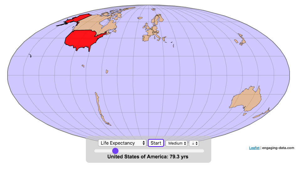
Assembling the World Country-By-Country

Watch the world assemble country-by-country based on a specific statistic
This map lets you watch as the world is built-up one country at a time. This can be done along the following statistical dimensions:
- Country name
- Population – from United Nations (2017)
- GDP – from United Nations (2017)
- GDP per capita
- GDP per area
- Land Area – from CIA factbook (2016)
- Population density
- Life expectancy – from World Health Organization (2015)
- or a random order
These statistics can be sorted from small to large or vice versa to get a view of the globe and its constituent countries in a unique and interesting way. It’s a bit hypnotic to watch as the countries appear and add to the world one by one.
You can use this map to display all the countries that have higher life expectancy than the United States:
select “Life expectancy”, sort from “high to low” and use the scroll bar to move to the United States and you’ll get a picture like this:
or this map to display all the countries that have higher population density than the United States:
select “Population density, sort from “high to low” and use the scroll bar to move to the United States and you’ll get a picture like this:

I hope you enjoy exploring the countries of the world through this data viz tool. And if you have ideas for other statistics to add, I will try to do so.
Data and tools: Data was downloaded primarily from Wikipedia: Life expectancy from World Health Organization (2015) | GDP from United Nations (2017) | Population from United Nations (2017) | Land Area from CIA factbook (2016)
The map was created with the help of the open source leaflet javascript mapping library
Most COVID-19 deaths in the US could have been avoided
The US coronavirus death rate is quite high compared to other countries (on a population-corrected basis)
US coronavirus deaths have surpassed 300,000. Many of these deaths could have been avoided if swift action had been taken in February and March, as many other countries did. This graph shows an rough estimate of the number of US deaths that could have been avoided if the US had acted similar to other countries.
This graph takes the rate of coronavirus deaths by country (normalized to their population size) and imagines what would happen if the US had had that death rate, instead of its own. It then applies that reduction (or increase) in death rate to the total number of deaths that the US has experienced. The US death rate is about 600/million people in September 2020 and if a country has a death rate of 60/million people, then 90% of US deaths (about 180,000 people) could have been avoided if the US had matched their death rate. The government response to the pandemic is one of several important factors that determine the number of cases and deaths in a country. This means proper messaging about the need to wear masks and socially distance as well as providing payments to citizens and business to help them during the economic shutdown. Other important factors can include the overall health of the population, the population structure (i.e. age distribution of population), ease of controlling borders to prevent cases from entering the country, presence of universal or low-cost health care system, and relative wealth and education of the population.
The graph lets you compare the potential reduction in US deaths when looking at 30 different countries. You can choose those 30 countries based on total population, GDP or GDP per capita. These give somewhat different sets of countries to compare death rates, which is an indication of the effectiveness of the coronavirus response.
A valid criticism of this graph is that testing and data collection is very different in each of the countries shown and the comparisons are not always valid. This is definitely a problem with all coronavirus data but for the most part, the very large differences between death rates would still exist even if data collection were totally standardized. Some of the data from the poorest countries is less reliable, because they have less testing capabilities.
Source and Tools:
Data on coronavirus deaths by country is from covid19api.com and downloaded and cleaned with a python script. Graph is made using the plotly open source javascript library.
Assembling the World Country-By-Country
Watch the world assemble country-by-country based on a specific statistic
- Country name
- Population – from United Nations (2017)
- GDP – from United Nations (2017)
- GDP per capita
- GDP per area
- Land Area – from CIA factbook (2016)
- Population density
- Life expectancy – from World Health Organization (2015)
- or a random order
These statistics can be sorted from small to large or vice versa to get a view of the globe and its constituent countries in a unique and interesting way. It’s a bit hypnotic to watch as the countries appear and add to the world one by one.
You can use this map to display all the countries that have higher life expectancy than the United States:
select “Life expectancy”, sort from “high to low” and use the scroll bar to move to the United States and you’ll get a picture like this:
or this map to display all the countries that have higher population density than the United States:
select “Population density, sort from “high to low” and use the scroll bar to move to the United States and you’ll get a picture like this:
I hope you enjoy exploring the countries of the world through this data viz tool. And if you have ideas for other statistics to add, I will try to do so.
Data and tools: Data was downloaded primarily from Wikipedia: Life expectancy from World Health Organization (2015) | GDP from United Nations (2017) | Population from United Nations (2017) | Land Area from CIA factbook (2016)
The map was created with the help of the open source leaflet javascript mapping library
Recent Comments