Posts for Tag: US
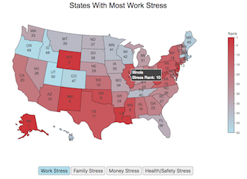
Most Stressed States

Long-term stress has been shown to be detrimental for your health. While it’s probably not possible to completely eliminate stress from people’s lives, there are many individual choices and decisions that can influence the amount of stress that people experience, including where they live, what job they have, their socio-economic conditions etc. . . One interesting bit of data analysis looks at an aggregate level to understand how stress differs from state to state depending on specific economic, demographic and other geographic factors.
This post shows a map of the most stressed states in the United States. The map is color coded from red (most stress) to blue (least stress) as a ranked list. Stress is divided into several categories including:
- Work Stress is calculated from data on work hours, commute times, job security, unemployment rate, income growth and other metrics.
- Money Stress is calculated from data on income, debt, credit scores, bankruptcy, housing affordability, poverty levels and other metrics.
- Family Stress is calculated from data on divorce rates, single parents, childcare costs, parental leave policies and other metrics.
- Health and Safety Stress is calculated from data on adult health, depression, mental health, health insurance, physical activity rate, crime rate, and other metrics.
Click on the buttons below the map to switch between the different categories.
Data and tools: The data comes from Wallethub’s analysis of data from a wide range of sources including the US Census, BLS, CDC etc.. Unfortunately the data used is a ranked list rather than a set of scores. The ranking doesn’t tell you if a state is 10% more stressful or 10 times more stressful, just that one is higher than the other. Click the link for a full description of their methodology and data sources. The choropleth map was created using javascript to parse the data and the plot.ly open source graphing library to visualize it.
Demographic Characteristics of US Voters (2016)
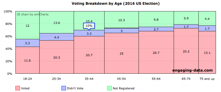
If you need to register to vote, please visit Rock the Vote to get registered in your state.
US politics has more than a few issues, which have been highlighted by the current situation in Washington DC. The protests and greater political awareness from high school students and young adults is a positive sign for democracy, but it needs to be accompanied by increased rates of voting from this demographic. I thought it would be interesting to explore rates of voting in the US across different demographic groups (age, education, income, race). This data is from the 2016 US presidential election.
Total eligible US voting population was about 224 million in 2016 and the overall rate of voting among this population was 61.4%.
The first graph shows the distribution by age. As we can see, the rate of registration and voting increases with age. It is hard to engage young people to be interested in voting but hopefully they will do so in greater numbers this upcoming election.
Health Insurances Losses from Senate Bill by State
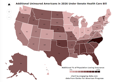
The Congressional Budget Office (CBO) released a report that analyzed the impacts of the Senate health care bill and estimated that 22 million Americans would lose health care by 2026 (see previous post). 22 million amounts to almost 7% of the US population (about 1 in 15 Americans). I wondered how the impacts of these changes would be distributed across different states.
Most Stressed States
Long-term stress has been shown to be detrimental for your health. While it’s probably not possible to completely eliminate stress from people’s lives, there are many individual choices and decisions that can influence the amount of stress that people experience, including where they live, what job they have, their socio-economic conditions etc. . . One interesting bit of data analysis looks at an aggregate level to understand how stress differs from state to state depending on specific economic, demographic and other geographic factors.
- Work Stress is calculated from data on work hours, commute times, job security, unemployment rate, income growth and other metrics.
- Money Stress is calculated from data on income, debt, credit scores, bankruptcy, housing affordability, poverty levels and other metrics.
- Family Stress is calculated from data on divorce rates, single parents, childcare costs, parental leave policies and other metrics.
- Health and Safety Stress is calculated from data on adult health, depression, mental health, health insurance, physical activity rate, crime rate, and other metrics.
Click on the buttons below the map to switch between the different categories.
Data and tools: The data comes from Wallethub’s analysis of data from a wide range of sources including the US Census, BLS, CDC etc.. Unfortunately the data used is a ranked list rather than a set of scores. The ranking doesn’t tell you if a state is 10% more stressful or 10 times more stressful, just that one is higher than the other. Click the link for a full description of their methodology and data sources. The choropleth map was created using javascript to parse the data and the plot.ly open source graphing library to visualize it.
Demographic Characteristics of US Voters (2016)
If you need to register to vote, please visit Rock the Vote to get registered in your state.
US politics has more than a few issues, which have been highlighted by the current situation in Washington DC. The protests and greater political awareness from high school students and young adults is a positive sign for democracy, but it needs to be accompanied by increased rates of voting from this demographic. I thought it would be interesting to explore rates of voting in the US across different demographic groups (age, education, income, race). This data is from the 2016 US presidential election.
Total eligible US voting population was about 224 million in 2016 and the overall rate of voting among this population was 61.4%.
The first graph shows the distribution by age. As we can see, the rate of registration and voting increases with age. It is hard to engage young people to be interested in voting but hopefully they will do so in greater numbers this upcoming election.
Health Insurances Losses from Senate Bill by State
The Congressional Budget Office (CBO) released a report that analyzed the impacts of the Senate health care bill and estimated that 22 million Americans would lose health care by 2026 (see previous post). 22 million amounts to almost 7% of the US population (about 1 in 15 Americans). I wondered how the impacts of these changes would be distributed across different states.
Recent Comments