Posts for Tag: taxes
Visual Guide to Understanding Marginal Tax Rates
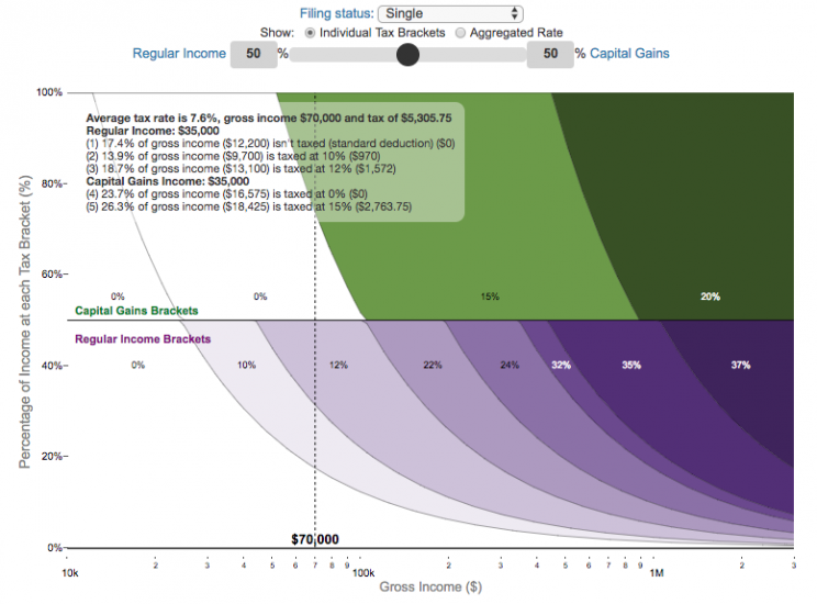
What is a marginal tax rate?
There is a fair amount of confusion about what a marginal tax rate is and how it affects how much tax you would owe the government on a certain amount of income. These graphs are here to help you better understand the difference between a marginal and average tax rate and to easily calculate these rates for specific examples in the US context. This tool only looks at US Federal Income taxes and ignores state, local and Social Security/Medicare taxes.
Marginal tax rates are the rate at which an additional dollar of income will be taxed at. There are different tax brackets (each with its own marginal rate) depending on which dollar of income you are looking at. This is very different from the Average (or effective) tax rate that is the result of applying these marginal tax rates across all of your income.
**Click Here to view other financial-related tools and data visualizations from engaging-data**
Instructions for using the visual tax calculator:
- Select filing status: Single, Married Filing Jointly or Head of Household. For more info on these filing categories see the IRS website
- Select percentage of regular income vs capital gains income. Regular income is wage or employment income and is taxed at a higher rate than capital gains income. Capital gains income is typically investment income from the sale of stocks or dividends and taxed at a lower rate than regular income.
- Move your cursor or click on the graph to select a specific income Make sure you note that the x-axis is a logarithmic-scale, meaning that income grows exponentially as you move to the right.
- Choose your graph preference One graph (Individual Tax Brackets) shows the individual tax brackets and how much of your income is taxed at the different marginal rates. The other graph (Aggregate Rates) shows the net result of applying the different rates to get your effective rate.
One of the most interesting things is to vary the proportion of regular income vs capital gains taxes. Generally, wealthier households earn a greater fraction of their income from capital gains and as a result of the lower tax rates on capital gains, these household pay a lower effective tax rate than those making an order of magnitude less in overall income.
Here are two tables that lists the marginal tax brackets in the United States in 2019 that form the basis of the calculations in the calculator. 2018’s numbers are pretty similar.
US Tax Brackets and Rates for 2019
Rate
Single
Taxable Income Over
Married Filing Joint
Taxable Income Over
Heads of Households
Taxable Income Over
10%
$0
$0
$0
12%
$9,700
$19,400
$13,850
22%
$39,475
$78,950
$52,850
24%
$84,200
$168,400
$84,200
32%
$160,725
$321,450
$160,700
35%
$204,100
$408,200
$204,100
37%
$510,300
$612,350
$510,300
You can see that tax rates are much lower for capital gains in the table below than for regular income (table above).
Capital Gains Brackets for 2019
Single
Capital Gains Over
Married Filing Jointly
Capital Gains Over
Heads of Households
Capital Gains Over
0%
$0
$0
$0
15%
$39,375
$78,750
$52,750
20%
$434,550
$488,850
$461,700
For those not visually inclined, here is a written description of how to apply marginal tax rates. The first thing to note is that the income shown here in the graphs is taxable income, which simply speaking is your gross income with deductions removed. The standard deduction for 2019 range from $12,200 for Single filers to $24,400 for Married filers.
- If you are single, all of your regular taxable income between 0 and $9,700 is taxed at a 10% rate. This means that your all of your gross income below $12,200 is not taxed and your gross income between $12,200 and $21,900 is taxed at 10%.
- If you have more income, you move up a marginal tax bracket. Any taxable income in excess of $9,700 but below $39,475 will be taxed at the 12% rate. It is important to note that not all of your income is taxed at the marginal rate, just the income between these amounts.
- Income between $39,475 and $84,200 is taxed at 24% and so on until you have income over $510,300 and are in the 37% marginal tax rate . . .
- Thus, different parts of your income are taxed at different rates and you can calculate an average or effective rate (which is shown in the aggregate rates graph).
- Capital gains income complicates things slightly as it is taxed after regular income. Thus any amount of capital gains taxes you make are taxed at a rate that corresponds to starting after you regular income. If you made $100,000 in regular income, and only $100 in capital gains income, that $100 dollars would be taxed at the 15% rate and not at the 0% rate, because the $100,000 in regular income pushes you into the 2nd marginal tax bracket for capital gains (between $39,375 and $434,550).
Data and Tools:
Tax brackets and rates were obtained from the IRS website and calculations were made using javascript and plotted using the plot.ly open source javascript plotting library.
Visual Guide to Understanding Marginal Tax Rates
What is a marginal tax rate?
There is a fair amount of confusion about what a marginal tax rate is and how it affects how much tax you would owe the government on a certain amount of income. These graphs are here to help you better understand the difference between a marginal and average tax rate and to easily calculate these rates for specific examples in the US context. This tool only looks at US Federal Income taxes and ignores state, local and Social Security/Medicare taxes.
Marginal tax rates are the rate at which an additional dollar of income will be taxed at. There are different tax brackets (each with its own marginal rate) depending on which dollar of income you are looking at. This is very different from the Average (or effective) tax rate that is the result of applying these marginal tax rates across all of your income.
**Click Here to view other financial-related tools and data visualizations from engaging-data**
Instructions for using the visual tax calculator:
- Select filing status: Single, Married Filing Jointly or Head of Household. For more info on these filing categories see the IRS website
- Select percentage of regular income vs capital gains income. Regular income is wage or employment income and is taxed at a higher rate than capital gains income. Capital gains income is typically investment income from the sale of stocks or dividends and taxed at a lower rate than regular income.
- Move your cursor or click on the graph to select a specific income Make sure you note that the x-axis is a logarithmic-scale, meaning that income grows exponentially as you move to the right.
- Choose your graph preference One graph (Individual Tax Brackets) shows the individual tax brackets and how much of your income is taxed at the different marginal rates. The other graph (Aggregate Rates) shows the net result of applying the different rates to get your effective rate.
Here are two tables that lists the marginal tax brackets in the United States in 2019 that form the basis of the calculations in the calculator. 2018’s numbers are pretty similar.
| Rate | Single Taxable Income Over |
Married Filing Joint Taxable Income Over |
Heads of Households Taxable Income Over |
|---|---|---|---|
| 10% | $0 | $0 | $0 |
| 12% | $9,700 | $19,400 | $13,850 |
| 22% | $39,475 | $78,950 | $52,850 |
| 24% | $84,200 | $168,400 | $84,200 |
| 32% | $160,725 | $321,450 | $160,700 |
| 35% | $204,100 | $408,200 | $204,100 |
| 37% | $510,300 | $612,350 | $510,300 |
You can see that tax rates are much lower for capital gains in the table below than for regular income (table above).
| Single Capital Gains Over |
Married Filing Jointly Capital Gains Over |
Heads of Households Capital Gains Over |
|
|---|---|---|---|
| 0% | $0 | $0 | $0 |
| 15% | $39,375 | $78,750 | $52,750 |
| 20% | $434,550 | $488,850 | $461,700 |
For those not visually inclined, here is a written description of how to apply marginal tax rates. The first thing to note is that the income shown here in the graphs is taxable income, which simply speaking is your gross income with deductions removed. The standard deduction for 2019 range from $12,200 for Single filers to $24,400 for Married filers.
- If you are single, all of your regular taxable income between 0 and $9,700 is taxed at a 10% rate. This means that your all of your gross income below $12,200 is not taxed and your gross income between $12,200 and $21,900 is taxed at 10%.
- If you have more income, you move up a marginal tax bracket. Any taxable income in excess of $9,700 but below $39,475 will be taxed at the 12% rate. It is important to note that not all of your income is taxed at the marginal rate, just the income between these amounts.
- Income between $39,475 and $84,200 is taxed at 24% and so on until you have income over $510,300 and are in the 37% marginal tax rate . . .
- Thus, different parts of your income are taxed at different rates and you can calculate an average or effective rate (which is shown in the aggregate rates graph).
- Capital gains income complicates things slightly as it is taxed after regular income. Thus any amount of capital gains taxes you make are taxed at a rate that corresponds to starting after you regular income. If you made $100,000 in regular income, and only $100 in capital gains income, that $100 dollars would be taxed at the 15% rate and not at the 0% rate, because the $100,000 in regular income pushes you into the 2nd marginal tax bracket for capital gains (between $39,375 and $434,550).
Data and Tools:
Tax brackets and rates were obtained from the IRS website and calculations were made using javascript and plotted using the plot.ly open source javascript plotting library.
Recent Comments