Posts for Tag: simulation
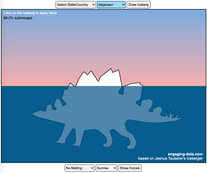
Iceberger Remixed and Improved – Iceberg Simulator
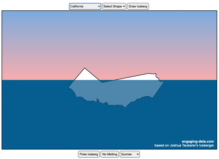
The melting algorithm has been updated so that melting below water is faster than melting above the waterline. It’s fun to try to get the iceberg pieces to radically change orientation when the iceberg breaks apart due to melting.
Draw (or choose) an iceberg and visualize how it will float and melt
I was so impressed with the interactive Iceberger tool that Josh Tauberer (@JoshData) made that I had to modify it and add some additional features. Click here to see the original. My additions allow you to conjure up pre-made “icebergs” to see how they float and also allow some interaction. Try “poking” the icebergs you make.
Josh and I were both inspired by a tweet by Megan Thompson-Munson (@GlacialMeg).
Today I channeled my energy into this very unofficial but passionate petition for scientists to start drawing icebergs in their stable orientations. I went to the trouble of painting a stable iceberg with my watercolors, so plz hear me out.
(1/4) pic.twitter.com/rtkCYub38b
— Megan Thompson-Munson (@GlacialMeg) February 19, 2021
Instructions
You can choose between 3 different iceberg creation options:
- Draw Iceberg – the original Iceberger option. Choose this option and draw any shape you want and see how it floats.
- Select State – Choose this option and select from one of the states of the United States to see how it will float.
- Select Shape = Choose this option and select from one of the premade shapes to see how it will float.
Once the iceberg has been created, you can also affect it in a couple of different ways:
- Click on the Iceberg – This lets you push on the left side of the iceberg to induce some rotation and see if there are multiple stable orientations. Click it several times in a row if you want to flip the iceberg over. If you push on the right size it will rotate the iceberg clockwise and if you push on the left size, it will rotate counter clockwise. if you push in the middle third of the iceberg, it will push it straight down.
- Melting – You can select between different options – No melting, slow medium and fast. This took awhile to code correctly. Previously, I’d just scale parts of the iceberg but this new code actually takes material away from the surface of the iceberg in a uniform way. It works more like you would expect melting ice to behave. Also melting occurs more quickly underwater than in the air.
- Changing the Sky – You can change the colors of the sky between sunrise, midday and sunset colors.
- Showing forces – You can toggle whether to show the center of buoyancy (B) and center of gravity (B) of the iceberg.
Some Physics – no equations
The force of gravity (G) affects the entire body regardless of where it is or how it is oriented. If you show the forces, the red dot labeled G shows where the center of mass of the iceberg is. The blue dot labeled B shows where the center of buoyancy is. This is the center of mass of the part of the iceberg that is submerged. The force acting on the submerged part is equal to the volume of water displaced. If the center of buoyancy is below the center of gravity, then the forces will be equal and object will be in stable equilibrium. If the center of buoyancy is somewhere other than under the center of gravity, then the buoyant force will be pushing up on a different place than the gravity force and this will induce a rotation until they are directly over one another.
The code has been updated so that multiple icebergs are now allowed. Melting can separate a single piece of iceberg into multiple pieces, just as in real life. The melting process was a bit difficult to program because of the complexity of shapes that could be produced.
If you have additional suggestions for shapes or countries to add to the list or other improvements to make, let me know in the comments. Also if you are using this as a teaching tool, I’d love to hear how you are incorporating it into your curriculum.
Sources and Tools:
This visualization uses HTML/CSS/Javascript code from the Iceberger app to simulate the buoyancy of icebergs. Melting was accomplished with the help of code from the turf.js, polygon-offset and simplify.js javascript libraries. Additional elements of the UI and other features are also made using HTML, CSS and javascript.
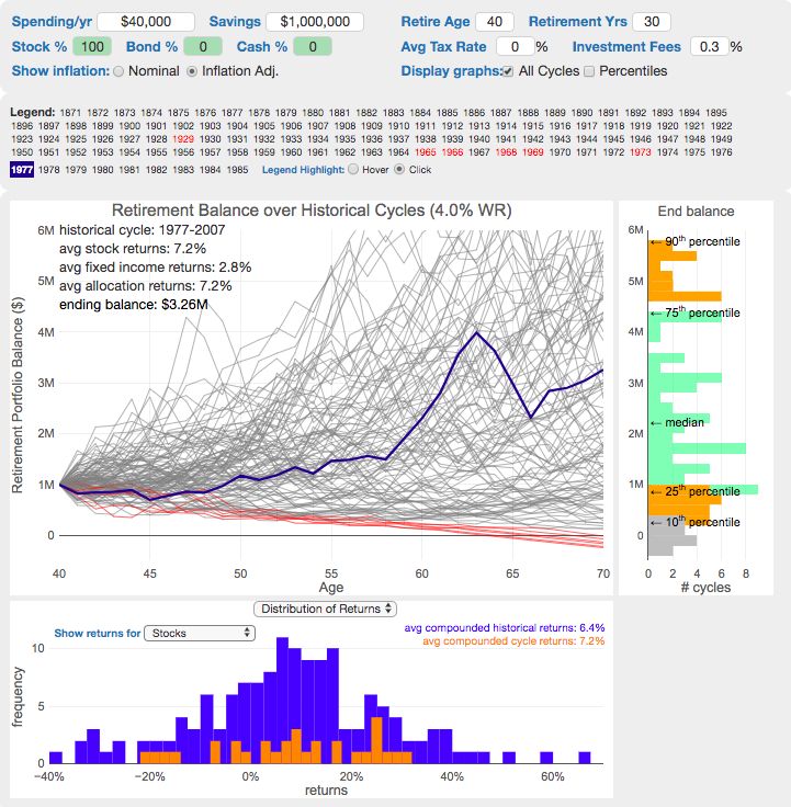
The 4% Rule, Trinity Study and Safe Withdrawal Rates Calculator

This 4% rule early retirement calculator is designed to help you learn about safe withdrawal rates for early retirement withdrawals and the 4% rule. Use it with your own numbers to determine how much money you can withdraw in retirement and how long your money will last.
UPDATE: I’ve updated the market data to include annual data up to and including 2023.
Instructions for using the calculator:
This calculator is designed to let you learn as you play with it. Tweaking inputs and assumptions and hovering and clicking on results will help you to really gain a feel for how withdrawal rates and market returns affect your chance of retirement success (i.e. making it through without running out of money).
Inputs You Can Adjust:
- Spending and initial balance – This will affect your withdrawal rate. The withdrawal rate is really the only thing that is important (doubling spending and retirement savings will still yield the same success rate).
- Asset allocation – Raise or lower your risk tolerance by holding more or less stock vs bonds
- Adjust retirement length – This affects the number of historical cycles that are used in the simulation, but also increases risk of failure.
- Add tax rates and investment fees – these will put a drag (i.e. lower) market returns and lower success rates
Options for Visualization:
- Display all cycles – this is the mess of spaghetti like curves that show all historical cycle simulations
- Display percentiles – this aggregates the simulations into percentiles to show most likely outcomes
- Hover/Click on legend years – this will allow you to highlight a single historical cycle (you can also use the arrow keys to step through historical cycles)
- Bottom graph can show either the sequence of returns (with average returns in 5 year periods) for a single historical cycle or distributions of returns in our historical data (1871 to 2016) and a single historical cycle. You can choose to look at returns for stocks, bonds or your specific asset allocation.
- The graph on the right shows a histogram of the ending balance of each historical cycle and color codes them to show percentiles.
What is the 4% Rule?
The 4% rule is a “rule of thumb” relating to safe retirement withdrawals. It states that if 4% of your retirement savings can cover one years worth of retirement spending (an alternative way to phrase it is if you have saved up 25 times your annual retirement spending), you have a high likelihood of having enough money to last a 30+ year retirement. A key point is that the probabilities shown here are just historical frequencies and not a guarantee of the future. However, if your plan has a high success rate (95+%) in these simulations, this implies that retirement plan should be okay unless future returns are on par with some of the worst in history.
The overall goal of this rule and analysis is identifying a “safe withdrawal rate” or SWR for retirement. A withdrawal rate is the percentage of your money that you withdraw from your retirement savings each year. If you’ve saved up $1 million and withdraw $100,000 each year, that is a 10% withdrawal rate.
The “safe” part of the withdrawal rate relates to the fact that if your investments generally grow by more than your annual spending, then your retirement savings should last over the length of your retirement. But average returns do not tell the whole story as the sequence of returns also plays a very important role, as will be discussed later.
One way to test this is through a backtesting simulation which forms the basis for the “Trinity Study”.
What is the Trinity Study?
The “Trinity Study” is a paper and analysis of this topic entitled “Retirement Spending: Choosing a Sustainable Withdrawal Rate,” by Philip L. Cooley, Carl M. Hubbard, and Daniel T. Walz, three professors at Trinity University. This study is a backtesting simulation that uses historical data to see if a retirement plan (i.e. a withdrawal rate) would have survived under past economic conditions. The approach is to take a “historical cycle”, i.e. a series of years from the past and test your retirement plan and see if it runs out of money (“fails”) or not (“survives”).
How do you test withdrawal rate?
Given modern equity and bond market data only stretches back about 150 years, there is some, but not a huge amount of data to use in this simulation. One example of a 30 year historical cycle would be 1900 to 1930, and another is 1970 to 2000. The Trinity study and this calculator tests withdrawal rates against all historical periods from 1871 until the present (e.g. 1871 to 1901, 1872 to 1902, 1873 to 1903, . . . . 1986 to 2016). Then across this 115 different historical cycles, it determines how many of these survived and how many failed.
The thinking is that if your retirement plan can survive periods that include recessions, depressions, world wars, and periods of high inflation, then perhaps it can survive the next 30-50 years.
The 4% rule that comes out of these studies basically states that a 4% withdrawal rate (e.g. $40,000 annual spending on a $1,000,000 retirement portfolio) will survive the vast majority of historical cycles (~96%). If you raise your withdrawal rate, the rate of failure increases, while if you lower your withdrawal rate, your rate of failure decreases.
The goal of this tool is to help you understand the mechanics of the a historical cycle simulation like was used in the Trinity Study and how the 4% rule came to be. This understanding can help you better plan for retirement with the uncertainty that goes along with planning 30+ years into the future. If you want to also see how longevity and life expectancy play a role in retirement planning, you can take a look at the Rich, Broke and Dead calculator.
This post and tool is a work in progress. I have a number of ideas that I will implement and add to it to help improve the visualization and clarity of these concepts.
If 4% is a conservative rate, what is the maximum withdrawal rate?
The future is unlikely to be identical to any of the set of historical cycles that are used in this simulation. And yet, there are enough years of data that there are a fairly large set of possible outcomes from running a simulation with this input data. One way to understand this variation is to see in the main graph above that the ending balance can potentially vary by more than $5 million dollars on an inflation adjusted basis on a starting balance of $1 million.
Another way to see this same variation in market returns is by looking at maximum withdrawal rate. This is the highest amount that you could withdraw annually over your retirement and (just barely) not run out of money by the end of your retirement.
This graph shows the maximum withdrawal rate for a given historical cycle (i.e. 1871 to 1901). For example, in the 1871 to 1901 30 year historical cycle, you could have used an 8.8% withdrawal rate (inflation adjusted $80,000 withdrawal annually on a $1 million initial investment balance) and not run out of money. This is because the sequence of market (stock and bond) returns in this historical cycle were able to (barely) outpace the rate of withdrawals at the end of the 30 year retirement period. Many other cycles show lower successful withdrawal rates, because those cycles had poorer sequences of returns, while some had higher maximum withdrawal rates.
The graph also highlights those cycles that show a maximum withdrawal rate below 4% in red, while all others are shown in green. Most of these withdrawal rates are well over 4%, with some quite a bit higher. This again shows that if the future is somewhat like one of these historical cycles, most likely a 4% withdrawal rate will be enough for you to retire without running out of money and that it is likely that you could end up with more money than you started.
Data source and Tools Historical Stock/Bond and Inflation data comes from Prof. Robert Shiller. Javascript is used to create the interactive calculator tool and the create the code in the simulations to test each historical cycle and aggregate the results, and graphed using Plot.ly open-source, javascript graphing library.
Iceberger Remixed and Improved – Iceberg Simulator
The melting algorithm has been updated so that melting below water is faster than melting above the waterline. It’s fun to try to get the iceberg pieces to radically change orientation when the iceberg breaks apart due to melting.
Draw (or choose) an iceberg and visualize how it will float and melt
I was so impressed with the interactive Iceberger tool that Josh Tauberer (@JoshData) made that I had to modify it and add some additional features. Click here to see the original. My additions allow you to conjure up pre-made “icebergs” to see how they float and also allow some interaction. Try “poking” the icebergs you make.
Josh and I were both inspired by a tweet by Megan Thompson-Munson (@GlacialMeg).
Today I channeled my energy into this very unofficial but passionate petition for scientists to start drawing icebergs in their stable orientations. I went to the trouble of painting a stable iceberg with my watercolors, so plz hear me out.
(1/4) pic.twitter.com/rtkCYub38b
— Megan Thompson-Munson (@GlacialMeg) February 19, 2021
Instructions
You can choose between 3 different iceberg creation options:
- Draw Iceberg – the original Iceberger option. Choose this option and draw any shape you want and see how it floats.
- Select State – Choose this option and select from one of the states of the United States to see how it will float.
- Select Shape = Choose this option and select from one of the premade shapes to see how it will float.
Once the iceberg has been created, you can also affect it in a couple of different ways:
- Click on the Iceberg – This lets you push on the left side of the iceberg to induce some rotation and see if there are multiple stable orientations. Click it several times in a row if you want to flip the iceberg over. If you push on the right size it will rotate the iceberg clockwise and if you push on the left size, it will rotate counter clockwise. if you push in the middle third of the iceberg, it will push it straight down.
- Melting – You can select between different options – No melting, slow medium and fast. This took awhile to code correctly. Previously, I’d just scale parts of the iceberg but this new code actually takes material away from the surface of the iceberg in a uniform way. It works more like you would expect melting ice to behave. Also melting occurs more quickly underwater than in the air.
- Changing the Sky – You can change the colors of the sky between sunrise, midday and sunset colors.
- Showing forces – You can toggle whether to show the center of buoyancy (B) and center of gravity (B) of the iceberg.
Some Physics – no equations
The force of gravity (G) affects the entire body regardless of where it is or how it is oriented. If you show the forces, the red dot labeled G shows where the center of mass of the iceberg is. The blue dot labeled B shows where the center of buoyancy is. This is the center of mass of the part of the iceberg that is submerged. The force acting on the submerged part is equal to the volume of water displaced. If the center of buoyancy is below the center of gravity, then the forces will be equal and object will be in stable equilibrium. If the center of buoyancy is somewhere other than under the center of gravity, then the buoyant force will be pushing up on a different place than the gravity force and this will induce a rotation until they are directly over one another.
The code has been updated so that multiple icebergs are now allowed. Melting can separate a single piece of iceberg into multiple pieces, just as in real life. The melting process was a bit difficult to program because of the complexity of shapes that could be produced.
If you have additional suggestions for shapes or countries to add to the list or other improvements to make, let me know in the comments. Also if you are using this as a teaching tool, I’d love to hear how you are incorporating it into your curriculum.
Sources and Tools:
This visualization uses HTML/CSS/Javascript code from the Iceberger app to simulate the buoyancy of icebergs. Melting was accomplished with the help of code from the turf.js, polygon-offset and simplify.js javascript libraries. Additional elements of the UI and other features are also made using HTML, CSS and javascript.
The 4% Rule, Trinity Study and Safe Withdrawal Rates Calculator
This 4% rule early retirement calculator is designed to help you learn about safe withdrawal rates for early retirement withdrawals and the 4% rule. Use it with your own numbers to determine how much money you can withdraw in retirement and how long your money will last.
UPDATE: I’ve updated the market data to include annual data up to and including 2023.
Instructions for using the calculator:
This calculator is designed to let you learn as you play with it. Tweaking inputs and assumptions and hovering and clicking on results will help you to really gain a feel for how withdrawal rates and market returns affect your chance of retirement success (i.e. making it through without running out of money).
Inputs You Can Adjust:
- Spending and initial balance – This will affect your withdrawal rate. The withdrawal rate is really the only thing that is important (doubling spending and retirement savings will still yield the same success rate).
- Asset allocation – Raise or lower your risk tolerance by holding more or less stock vs bonds
- Adjust retirement length – This affects the number of historical cycles that are used in the simulation, but also increases risk of failure.
- Add tax rates and investment fees – these will put a drag (i.e. lower) market returns and lower success rates
Options for Visualization:
- Display all cycles – this is the mess of spaghetti like curves that show all historical cycle simulations
- Display percentiles – this aggregates the simulations into percentiles to show most likely outcomes
- Hover/Click on legend years – this will allow you to highlight a single historical cycle (you can also use the arrow keys to step through historical cycles)
- Bottom graph can show either the sequence of returns (with average returns in 5 year periods) for a single historical cycle or distributions of returns in our historical data (1871 to 2016) and a single historical cycle. You can choose to look at returns for stocks, bonds or your specific asset allocation.
- The graph on the right shows a histogram of the ending balance of each historical cycle and color codes them to show percentiles.
What is the 4% Rule?
The 4% rule is a “rule of thumb” relating to safe retirement withdrawals. It states that if 4% of your retirement savings can cover one years worth of retirement spending (an alternative way to phrase it is if you have saved up 25 times your annual retirement spending), you have a high likelihood of having enough money to last a 30+ year retirement. A key point is that the probabilities shown here are just historical frequencies and not a guarantee of the future. However, if your plan has a high success rate (95+%) in these simulations, this implies that retirement plan should be okay unless future returns are on par with some of the worst in history.
The overall goal of this rule and analysis is identifying a “safe withdrawal rate” or SWR for retirement. A withdrawal rate is the percentage of your money that you withdraw from your retirement savings each year. If you’ve saved up $1 million and withdraw $100,000 each year, that is a 10% withdrawal rate.
The “safe” part of the withdrawal rate relates to the fact that if your investments generally grow by more than your annual spending, then your retirement savings should last over the length of your retirement. But average returns do not tell the whole story as the sequence of returns also plays a very important role, as will be discussed later.
One way to test this is through a backtesting simulation which forms the basis for the “Trinity Study”.
What is the Trinity Study?
The “Trinity Study” is a paper and analysis of this topic entitled “Retirement Spending: Choosing a Sustainable Withdrawal Rate,” by Philip L. Cooley, Carl M. Hubbard, and Daniel T. Walz, three professors at Trinity University. This study is a backtesting simulation that uses historical data to see if a retirement plan (i.e. a withdrawal rate) would have survived under past economic conditions. The approach is to take a “historical cycle”, i.e. a series of years from the past and test your retirement plan and see if it runs out of money (“fails”) or not (“survives”).
How do you test withdrawal rate?
Given modern equity and bond market data only stretches back about 150 years, there is some, but not a huge amount of data to use in this simulation. One example of a 30 year historical cycle would be 1900 to 1930, and another is 1970 to 2000. The Trinity study and this calculator tests withdrawal rates against all historical periods from 1871 until the present (e.g. 1871 to 1901, 1872 to 1902, 1873 to 1903, . . . . 1986 to 2016). Then across this 115 different historical cycles, it determines how many of these survived and how many failed.
The thinking is that if your retirement plan can survive periods that include recessions, depressions, world wars, and periods of high inflation, then perhaps it can survive the next 30-50 years.
The 4% rule that comes out of these studies basically states that a 4% withdrawal rate (e.g. $40,000 annual spending on a $1,000,000 retirement portfolio) will survive the vast majority of historical cycles (~96%). If you raise your withdrawal rate, the rate of failure increases, while if you lower your withdrawal rate, your rate of failure decreases.
The goal of this tool is to help you understand the mechanics of the a historical cycle simulation like was used in the Trinity Study and how the 4% rule came to be. This understanding can help you better plan for retirement with the uncertainty that goes along with planning 30+ years into the future. If you want to also see how longevity and life expectancy play a role in retirement planning, you can take a look at the Rich, Broke and Dead calculator.
This post and tool is a work in progress. I have a number of ideas that I will implement and add to it to help improve the visualization and clarity of these concepts.
If 4% is a conservative rate, what is the maximum withdrawal rate?
The future is unlikely to be identical to any of the set of historical cycles that are used in this simulation. And yet, there are enough years of data that there are a fairly large set of possible outcomes from running a simulation with this input data. One way to understand this variation is to see in the main graph above that the ending balance can potentially vary by more than $5 million dollars on an inflation adjusted basis on a starting balance of $1 million.
Another way to see this same variation in market returns is by looking at maximum withdrawal rate. This is the highest amount that you could withdraw annually over your retirement and (just barely) not run out of money by the end of your retirement.
This graph shows the maximum withdrawal rate for a given historical cycle (i.e. 1871 to 1901). For example, in the 1871 to 1901 30 year historical cycle, you could have used an 8.8% withdrawal rate (inflation adjusted $80,000 withdrawal annually on a $1 million initial investment balance) and not run out of money. This is because the sequence of market (stock and bond) returns in this historical cycle were able to (barely) outpace the rate of withdrawals at the end of the 30 year retirement period. Many other cycles show lower successful withdrawal rates, because those cycles had poorer sequences of returns, while some had higher maximum withdrawal rates.
The graph also highlights those cycles that show a maximum withdrawal rate below 4% in red, while all others are shown in green. Most of these withdrawal rates are well over 4%, with some quite a bit higher. This again shows that if the future is somewhat like one of these historical cycles, most likely a 4% withdrawal rate will be enough for you to retire without running out of money and that it is likely that you could end up with more money than you started.
Data source and Tools Historical Stock/Bond and Inflation data comes from Prof. Robert Shiller. Javascript is used to create the interactive calculator tool and the create the code in the simulations to test each historical cycle and aggregate the results, and graphed using Plot.ly open-source, javascript graphing library.
Recent Comments