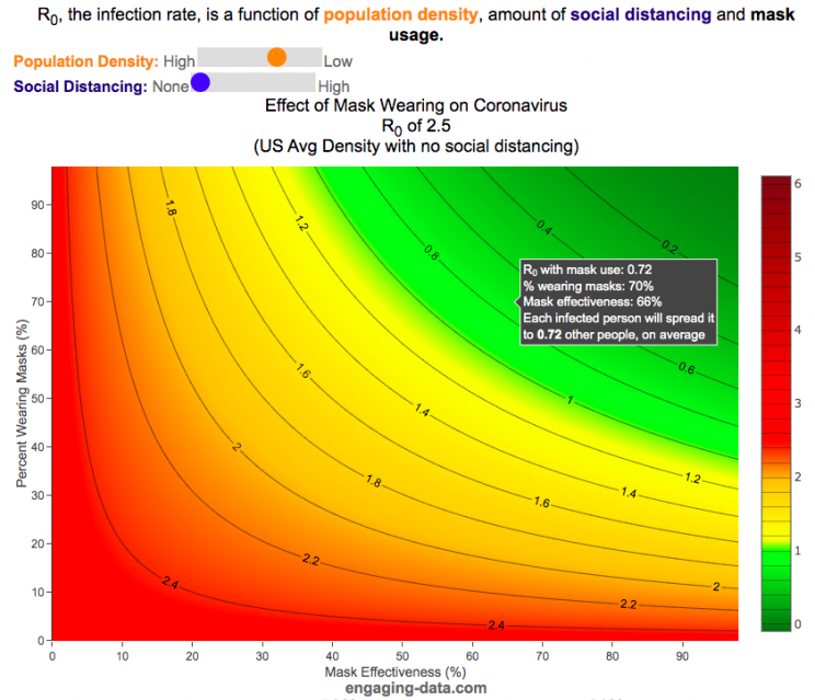
It depends on their effectiveness and how many people wear them
R0 is the transmission rate which is defined as the average number of cases that are expected to be produced from a single case in an uninfected population. R0 is dependent on a number of different factors that include transmissibility of a disease (how infectious it is), the amount of social contact and the duration of social contact. We have learned that variants of the coronavirus (such as delta or omicron) can greatly influence the transmissibility of the disease.
A baseline level of social contact is related to the population density (how often you come into contact with other people) and social distancing (limiting gatherings, not going in to work or school, etc) will reduce the amount of social contact with different people. Given what we know about coronavirus and its transmission, the amount of “contact” can also be influenced by mask wearing. This interactive graph shows the effect of mask wearing and effectiveness on reducing R0 even further. Because the effectiveness of existing vaccines is as of yet unknown against Omicron, this visualization does not take into account vaccines and their effectiveness of reducing R0, which is a very important limitation.
A very important caveat to this visualization: This visualization was initially created before COVID-19 vaccines were available and does not currently take their ability to prevent infection (and lower R0) into account because the effectiveness of each vaccines differs and the protection against infection wanes over time
This graph is a work-in-progress so please feel free to provide suggestions and feedback on issues of scientific concepts as well as for improvements in conveying the concepts/ideas.
Methodology
R0 values for different regions and population densities are estimated from Youyang Gu’s machine learning model for spread in Feb and early-March (i.e. before social distancing and mask wearing).
Baseline R0,variant based on variant transmissibility – R0 value ranges from an early estimate of 8 for Omicron to 5 for Delta and 2.5 for the original Alpha strain.
Population density factor (PDF) – this can increase or decrease the R0 value based on how much close contact you have. It ranges from about 2.4 in very high density places like New York City with lots of transit use where you are in close contact with other people for long periods of time to 0.8 in rural areas with much less contact. A value of 1 represents average US population density.
Social distancing factor (SDF) – this is simply a reduction on the baseline R0 based on the amount of social distancing (ranges from 100% (no social distancing) to 33% (high levels of social distancing). This is a reduction in the amount of time and number of people the average person is exposed to compared to baseline levels.
Mask effectiveness (Kmaskeff) – is defined as the percentage reduction in transmission of coronavirus that mask wearing can provide. An N95 mask is at least 95% effective at blocking most particles, but because it also reduces the speed at which your exhalation can travel outward (providing more time for droplets and aerosols to spread and diffuse to low concentration), an N95 can be much more than 95% effective in reducing coronavirus droplet and aerosol spread compared to the unmasked case. I’ve seen estimates for things like bandanas and homemade cloth mask having lower effectiveness maybe around 50% but I don’t know how scientifically they were estimated/calculated. Also depending on how mask are worn, this can also affect the effectiveness parameter. For example if an N95 mask does not fit tightly against the face and there are large gaps for air to flow, this will reduce the effectiveness of the mask. This parameter is shown on the x-axis.
Percent wearing masks (Kmaskfreq) – is simply the percentage of people wearing masks (varies from 0% to 100%). This parameter is shown on the y-axis.
The formula for effective Reffective is:
$R_\mathit{eff}=R_0,variant \times PDF \times SDF \times (1-K_{mask\mathit{eff}} \times K_{maskfreq})^2$
where $R_\mathit{eff}$ is the final average transmission value, $R_0,variant$ is the $R_0$ value based on the coronavirus variant type, PDF is the population density factor, SDF is the social distancing factor, $K_{mask\mathit{eff}}$ is the average mask effectiveness and $K_{maskfreq}$ is the percentage of people wearing masks. The squared parameter on the right side of the equation is essentially the average reduction in transmission that is likely due to mask usage and is from a preprint from Howard et al.
As you move up and to the right of the graph, mask use and effectiveness become very high and the transmission of coronavirus declines significantly. If you hover over the graph (on a desktop) or click on the graph (on mobile) you will see a popup that shows the Reff value that results. The lower the Reff value is the better as it dramatically affects the rate of transmission. High numbers will lead to explosive exponential growth while values below 1.0 will eventually reduce coronavirus transmissions to near 0.
For example at R0 of 6 and no social distancing or mask usage, one initial case can lead to approximately 56,000 cases in only 30 days. Whereas an Reff of 0.5 will only lead to a total of ~1 additional case in 30 days.
I am not an epidemiologist so some of the linear relationships and assumptions may be incorrect. Please let me know if I got anything terribly wrong or if you have any questions or suggestions on how the tool works, is structured or presented.
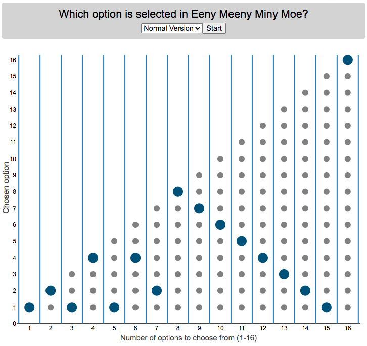
Who is selected when kids do Eeny Meeny Miney Moe?
I was watching my kids try to pick who got go first by doing the kids rhyme,
“Eeny, meeny, miny, moe, catch a tiger by the toe, if he hollers let him go, eeny, meeny, miny moe.”
Since there were only two of them, it got me thinking, if you knew which one it would fall on at the end, you could decide who to start counting with to ensure that you select who you want. For each set with different numbers of options, you will get a different individual from that set chosen so I thought I’d visualize who gets selected.
Click “Start” to see which option gets selected when there are different numbers of options. Hover over the graph to see which option is chosen.
There are multiple variants of the rhyme, but the primary one mentioned above has 16 counting elements. The math is such that you take the modulo (which is equivalent to a remainder in long division). For example, if you have 15 choices for the 16 element phrase, you’ll count through all 15 and then go back to the first option and end on it (i.e. item number 1 is chosen). 16 divided by 15 has a remainder of 1. In the case that the remainder is zero, you choose the last item. I.e. if there are 16 items/people to choose among, the last option is chosen and the remainder will be 0.
Longer variants will have more words, which are also shown on the dropdown menu. If you know of other variations, let me know in the comments and I can add them.
Primary: “Eeny, meeny, miny, moe, catch a tiger by the toe, if he hollers let him go, eeny, meeny, miny moe.” – 16 counting elements (“catch a” is one element, “by the” is another, etc)
Variation#1: “Eeny, meeny, miny, moe, catch a tiger by the toe, if he hollers let him go, eeny, meeny, miny moe My mother told me to pick the very best one and that is Y O U” – 31 counting elements
Variation#2: “Eeny, meeny, miny, moe, catch a tiger by the toe, if he hollers let him go, eeny, meeny, miny moe My mother told me to pick the very best one and you are it” – 29 counting elements
Source and Tools:
The rhymes come from my childhood and my kids helped me remember some of the variants. Calculations are done in javascript and visualization is done with the open source Plotly javascript graphing library.
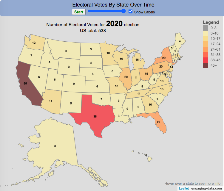
How many electoral votes did each state have across two centuries of elections?
This animation shows the number of electoral votes each state had during each of the 59 presidential elections in US history between 1788 and 2020. It’s interesting to see the number of US states and their relative population sizes (in terms of electoral votes) over many different presidential elections. The population is counted every 10 years in the census so if a presidential election occurs between a census, it likely will not see any difference in numbers of electoral votes, unless something else happens (such as addition of a new state to the country).
Instructions
You can use the slider to control the election year to focus on a specific election and toggle the animation by hitting the Start/Stop button. Hovering over each state will tell you the number of electoral votes and the percentage of the total number of electoral votes in that election.
In the elections during and immediately after the US Civil War, we also see some states whose electoral votes for president are not counted (shown in purple). Wyoming, the state with the lowest population in the US, has the highest number of electoral votes per person in the state, while the three most populous states, California, Florida and Texas have the least number of electoral votes per person. Wyoming has four times the number of electors per capita than these 3 states have (i.e. accounting for their population sizes). That will be the subject of another map dataviz.
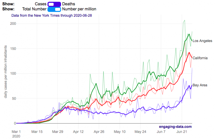
Compare the Bay Area coronavirus cases with Los Angeles and the rest of California
I wanted to better understand the coronavirus situation in my home region, the Bay Area, and I hadn’t seen any good resources that compared what was happening here to other regions in California. So I decided to make this graph. This page will be updated daily so you can come back regularly to see how the situation is changing (and hopefully improving sometime soon).
The coronavirus lockdowns began in mid-March 2020 and things have been opening up in late May, which corresponded to an uptick in coronavirus cases in the Bay Area and throughout California. While the cases in the Bay Area are increasing, it’s clear that there’s a big difference between the Bay Area and much of the rest of California. Los Angeles is currently leading the state with a large increase in the number of new cases in June as the economy tries to reopen restaurants, bars, gyms and other businesses.
You can toggle between coronavirus cases and deaths and look at the absolute numbers or on a per capita basis (per one million inhabitants). California has 39.5 million residents, while greater LA has 18.7 million residents and the Bay Area has 7.7 million residents. The daily data is shown as well as a five day moving average so you can get a better sense of the trends.
The San Francisco Bay Area was among the first regions to impose restrictions on gatherings and encourage people to stay home to fight the virus. In late February, the city of San Francisco declared an emergency in preparation for the upcoming pandemic and by early March, things became clear that life would not continue on as before.
The Bay Area is defined as the nine-county region consisting of Alameda, Contra Costa, Marin, Napa, San Francisco, San Mateo, Santa Clara, Solano and Sonoma counties.
Greater Los Angeles is defined as the 5 county region consisting of Los Angeles, Orange, Ventura, San Bernardino and Riverside counties.
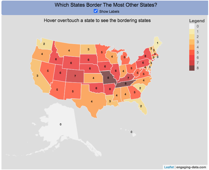
Interactive Choropleth of the Number of States That Border Each State
This is a fun little map that shows the number of states that border each state. I’m working on improving the interactivity of maps and this was a good project to try this with. The base map is a choropleth map which color codes each state by the number of states it shares a border with. If you hover over (or touch on mobile) a state, it will highlight the state and show you (and list) the bordering states.
It’s important to note that officially New York and Rhode Island share a water border (between Rhode Island and Long Island, NY) and that Michigan and Minnesota also share a border (in Lake Superior).
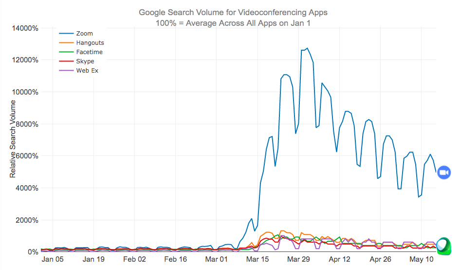
Zoom has become the primary video conferencing app over the last few months as schools and workplaces increasingly turned to remote learning and meetings.
Since the shelter-in-place orders across the United States due to the coronavirus in early to mid-March, many things have changed about our daily lives. One of the main ones is that schooling and work is being done remotely through video conferencing apps on our computers, tablets and smartphones. Our kids have zoom meetings with their teachers, parents have zoom meetings with our work colleagues and we all have facetime and google hangouts chats with our friends and family.
I remembered just a few year ago Skype was a very popular app to use for video chats, so I wanted to see how Zoom came to be the most popular app. The animated graph above shows the relative search volumes for 5 popular video conferencing apps from January 1 to May 15th (before and during the coronavirus restrictions on travel and gatherings).
This article implies that the reason Zoom had taken over so much is because it is free and easy to use for consumers. Even my tech-challenged mother is doing zoom calls for friends and classes.
Data and Tools:
Data is from google trends analysis of videoconferencing apps. Data is processed in javascript and graphed using the plotly open source graphing library.


Recent Comments