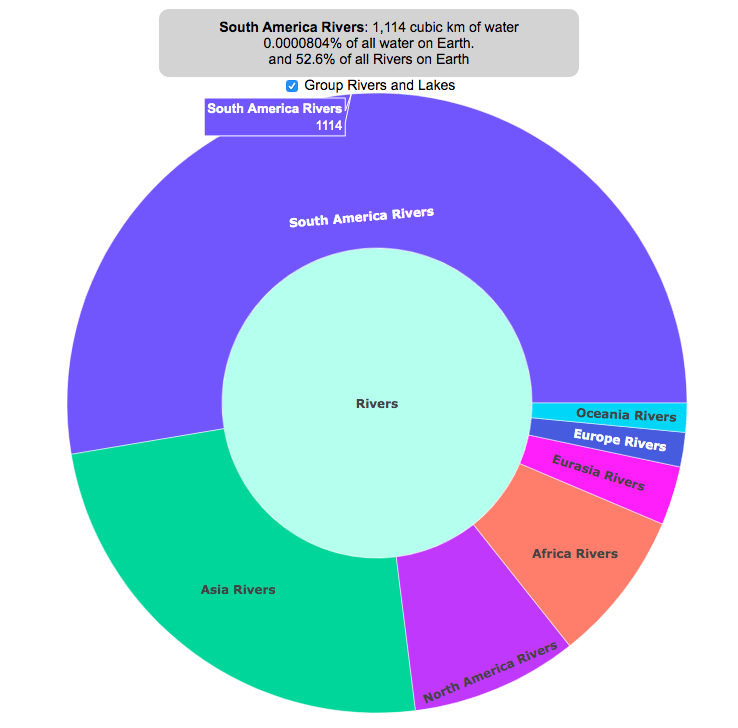
Earth is known as the blue planet, because it’s covered with quite a bit of water. But do you know where all that water on Earth is located? This interactive visualization will show the various amounts of water in its many forms on Earth: Oceans, Lakes, Rivers, Ice, Groundwater, etc….
If you hover over a part of the circular, sunburst graph, it will show you the amount of water that is in each of the various forms shown. If the label for that form is bolded, you can click on it and see further subdivisions beyond that broad category. For example, if you click on Oceans, it will show you how the water in the oceans is distributed among the five main oceans on Earth. As you move towards more focused views on the graph, you can click on the center of the circle to move back out to larger categories and see the big picture again.
As you can see, most of the water on Earth is found in a salty form, and most of that is in the oceans. It can be hard to click through to see freshwater lakes and rivers, as you have to be very precise to expand the “Surface Water” wedge, when you are looking at all “Freshwater”.
Even smaller, on that same visualization, is the “Living things” wedge is basically invisible. You can further explore the details of the living things category by clicking on the button that appears on the freshwater graph.
Checking the Group Rivers and Lakes checkbox will group rivers by continent and lakes by major groups.
It is interesting to see how much water there is on Earth (about 1.4 billion cubic kilometers of water), but how little of it is non-salty, liquid freshwater at the surface (about 100,000 cubic kilometers, though that is still quite a lot) but it only makes up about 0.008% of all water on Earth. That means for every 10,000 gallons of water on Earth, only one of those gallons is freshwater in a lake or river that we can easily access.
It is also believed that there is more water deep in the Earth’s interior (i.e. the mantle) than on the surface or near-subsurface, but estimates of that are highly uncertain and are not included in this graph.
If you click out past Earth’s water to look at water in the solar system, the estimates shown in this visualization are only including liquid water and do not include estimates of ice (which I haven’t been able to find estimates of). The amount of water in living things is estimated assuming that the ratio of organic carbon to liquid water is more or less the same across all different types of living things (i.e. viruses, bacteria, fungi, plants, animals, etc.). This isn’t a great assumption but the estimates, which come from estimates of the dry carbon weight of these organisms, vary across many orders of magnitude so being off in liquid water weight/volume by a factor of two or so isn’t a huge problem.
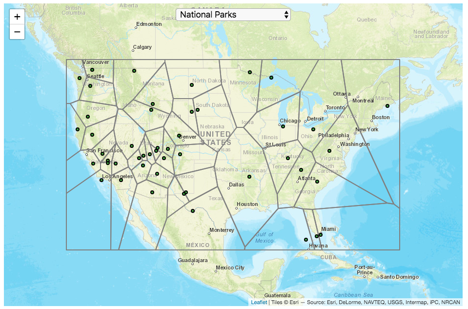
This map divides up the Continental United States into different regions depending on which National Park (or other National Park Service site) is closest to it. It is based on a straight-line (‘as the crow flies’) distance between locations rather than along road networks. It is an example of a Voronoi Diagram, which is subdivided into different regions based upon the distance between points of interest. Everything within a subregion is closer to the point defining the region than any other point.
Hover over the circle points to see the name of the park. The map has a dropdown menu that lets you choose between the following types of locations in the National Park Service:
National Parks
National Historic Sites
National Memorial Sites
National Monuments
National Seashores/Lakeshores
National Recreation Areas
National Battlefields
National Military Sites
National Scenic Areas
For National Parks, there is a high concentration of National Parks in the Western US, especially around the Southwestern US and running up the Pacific Coast. As a result, in these areas, the Voronoi regions are fairly small. The Southwest is also home to a high concentration of National Monuments. There are only few parks in the Eastern US and so the Voronoi regions are correspondingly large. Looking at National Historic Sites, the situation is flipped somewhat, with a high concentration of historic sites in the eastern US, and specifically the Northeast.
Let me know in the comments which park you are closest to and which park you last visited.
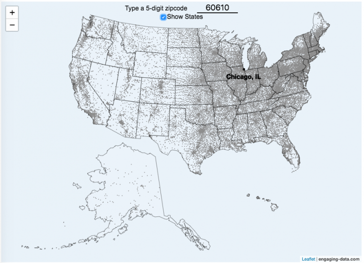
This zip code map of the United States visualizes over 42,000 zip codes in the 50 states. Zip codes are five digit postal codes used for mail delivery in the US. The points on the map show the geographic center of each zip code. The interactive visualization lets you type in a zip code and will show you where that zip code lies on the map. As you begin to type in the zip code, the map will highlight all the zip codes that begin with those numbers.
For example, if you type in “0”, you will highlight all zip codes that start with the zero in the Northeastern US. This will represent about 10% of the zip codes in the US. When you type in another number, it will narrow down the zip codes that begin with those two digits (approximately 1% of zip codes). It will progressively narrow down the number of zip codes as you type in more numbers, until you get to a full 5 digit zip code that represents 1 out of almost 43,000 zip codes (0.002% of zip codes). The map will then tell you the name of the city that that zip code is in.
You can explore how zip codes are distributed across the US by typing in different 1 and 2 digit numbers. You can also click on the check box to show or hide the outlines of the states.
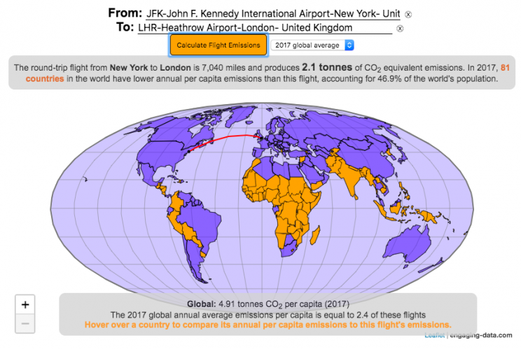
Traveling by airplane produces significant greenhouse gas emissions
Flying in an airplane is likely the most greenhouse gas intensive activity you can do. In a few short hours, you can can travel thousands of miles across the continent or ocean. It takes a large amount of fossil-fuel energy (oil) to lift an 80+ ton airplane off the ground and propel it at 600 miles per hour through the air. Every hour of travel (in a Boeing 737) consumes around 750 gallons of jet fuel.
Even when dividing the fuel usage across all of the passengers (and cargo) of an aircraft, airplane travel consumes a significant amount of fuel per passenger. The fuel economy is estimated to be about the same as a fairly efficient hybrid car driven by one person (60-70 passenger miles per gallon). However, because you can go 10 times faster and much further more easily than you would in a car, airline travel can, on an absolute basis, emit larger amounts of greenhouse gases. In fact, an individual passenger’s share of emissions from a single airplane flight can exceed the annual average greenhouse gas emissions per capita from a number of countries (and the global average).
The following flight calculator and data visualization shows the miles and emissions produced per passenger by a airplane trip that you can specify. Choose two airports that you are interested in and click the “Calculate Flight Emissions” button to see the emissions associated with a round-trip flight between these two cities. The map will show you the flight route and also shows you the countries in the world where this one single round-trip flight produces more emissions per passenger than the average resident does in one year from all sources (annual per capita emissions).
In addition to individual countries, the tool also compares the flight’s per passenger emissions to the global average emissions per capita in 2017 (4.91 tonnes) and the emissions required to achieve a 22℃ climate stabilization in 2030 (3.08 tonnes) and in 2050 (1.37 tonnes). These 2030 and 2050 numbers are based on an International Energy Agency scenario.
Calculations of Airplane Emissions
The emissions calculated by this calculator are based on calculations from myclimate.org, a non-profit environmental organization.
The fuel consumption of a jet depends on the size of the aircraft and distance traveled, but takeoff and climbing to cruising altitude are particularly fuel-intensive. On shorter flights, the takeoff and initial climb will constitute a greater proportion of the total flight time so fuel consumption per mile will be higher than on longer (e.g. international) flights.
In addition to emissions of CO2 from the burning of jet fuel, jets also emit other gases (including methane, NOx, and water vapor) which can also contribute to warming (also known as “radiative forcing”). Because the emissions are occurring at high altitude, these gases can have different impacts than those at lower altitude. A number of studies have estimated the impact of these other gases can significantly contribute to the overall radiative forcing and have somewhere between 1.5 and 3 times the impact that the CO2 alone would. A number of studies, including the myclimate calculator use a factor of 2 to account for these non-CO2 gases and their warming impact, and that is what is used in this calculator as well.
In order to achieve climate stabilization at 2 degrees C, global emissions need to basically go to zero over the next 40 years. With a growing global population, this means that the allowable emissions per person will shrink rapidly over these coming decades.
Ultimately, while aviation is a small part of global greenhouse gas emissions, it is a larger part of emissions in richer countries (i.e. if you are reading/viewing this post). And there are many in these richer countries who fly a disproportionate amount and therefore contribute a disproportionate amount of emissions. Hopefully, putting airplane travel in this context can help us better understand the impact of our actions and choices and maybe even change behavior for some.
Watch the United States assemble state by state based on statistics of interest
Based on earlier popularity of the country-by-country animation, this map lets you watch as the world is built-up one state at a time. This can be done along a large range of statistical dimensions:
Name (alphabetical)
abbreviation
Date of entry to the United States
State Population (2018)
Population per Electoral Vote (2018)
Population per House Seat (2018)
Land Area (square miles)
Population Density (ppl per sq mi) (2018)
State’s Highest Point
Highest Elevation (ft)
Mean Elevation (ft)
State’s Lowest Point
Lowest Point (ft)
Life Expectancy at Birth (yrs)
Median Age (yrs)
Percent with High School Education
Percent with Bachelor’s Degree
Residential Electricity Price (cents per kWh) (2018)
Gasoline Price ($/gal) Regular unleaded (2019)
State Gross Domestic Product GDP ($Million) (2018)
GDP per capita ($/capita)
Number of Counties (or subdivisions)
Average Daily Solar Radiation (kWh/m2)
Birth rate (per thousand population)
Avg Age of Mother at Birth
Annual Precipitation (in/yr)
Average Temperature (deg F)
These statistics can be sorted from small to large or vice versa to get a view of the US and its constituent states plus DC in a unique and interesting way. It’s a bit hypnotic to watch as the states appear and add to the country one by one.
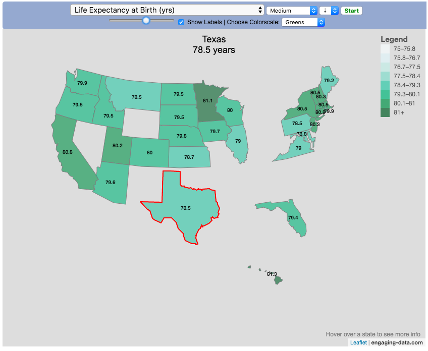
You can use this map to display all the states that have higher life expectancy than the Texas: select “Life expectancy”, sort from “high to low” and use the scroll bar to move to the Texax and you’ll get a picture like this:
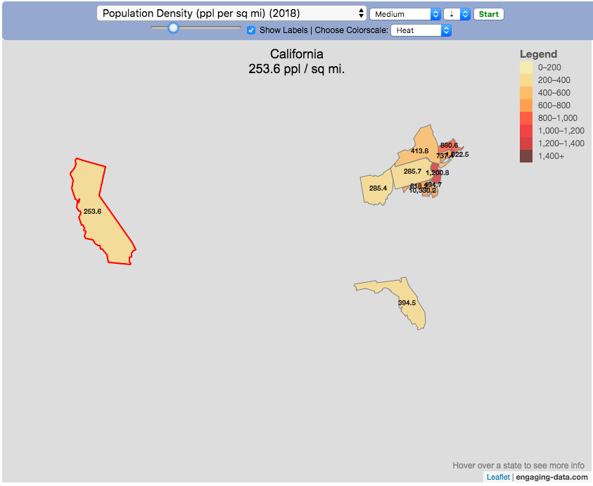
or this map to display all the states that have higher population density than California: select “Population density, sort from “high to low” and use the scroll bar to move to the United States and you’ll get a picture like this:
I hope you enjoy exploring the United States through a number of different demographic, economic and physical characteristics through this data viz tool. And if you have ideas for other statistics to add, I will try to do so.
Data and tools: Data was downloaded from a variety of sources:
Population https://en.wikipedia.org/wiki/List_of_states_and_territories_of_the_United_States_by_population
Admission to union https://simple.wikipedia.org/wiki/List_of_U.S._states_by_date_of_admission_to_the_Union
Sunlight North America Land Data Assimilation System (NLDAS) Daily Sunlight (insolation) for years 1979-2011 on CDC WONDER Online Database, released 2013. Accessed at http://wonder.cdc.gov/NASA-INSOLAR.html on Jun 14, 2019 1:37:15 PM
Births United States Department of Health and Human Services (US DHHS), Centers for Disease Control and Prevention (CDC), National Center for Health Statistics (NCHS), Division of Vital Statistics, Natality public-use data 2007-2017, on CDC WONDER Online Database, October 2018. Accessed at http://wonder.cdc.gov/natality-current.html on Jun 14, 2019 1:53:58 PM
Precipitation North America Land Data Assimilation System (NLDAS) Daily Precipitation for years 1979-2011 on CDC WONDER Online Database, released 2013. Accessed at http://wonder.cdc.gov/NASA-Precipitation.html on Jun 26, 2019 3:30:40 PM
Temperature http://www.usa.com/rank/us–average-temperature–state-rank.htm
This 4% rule early retirement calculator is designed to help you learn about safe withdrawal rates for early retirement withdrawals and the 4% rule. Use it with your own numbers to determine how much money you can withdraw in retirement and how long your money will last.
UPDATE: I’ve updated the market data to include annual data up to and including 2023.
Instructions for using the calculator:
This calculator is designed to let you learn as you play with it. Tweaking inputs and assumptions and hovering and clicking on results will help you to really gain a feel for how withdrawal rates and market returns affect your chance of retirement success (i.e. making it through without running out of money).
Inputs You Can Adjust:
Spending and initial balance – This will affect your withdrawal rate. The withdrawal rate is really the only thing that is important (doubling spending and retirement savings will still yield the same success rate).
Asset allocation – Raise or lower your risk tolerance by holding more or less stock vs bonds
Adjust retirement length – This affects the number of historical cycles that are used in the simulation, but also increases risk of failure.
Add tax rates and investment fees – these will put a drag (i.e. lower) market returns and lower success rates
Options for Visualization:
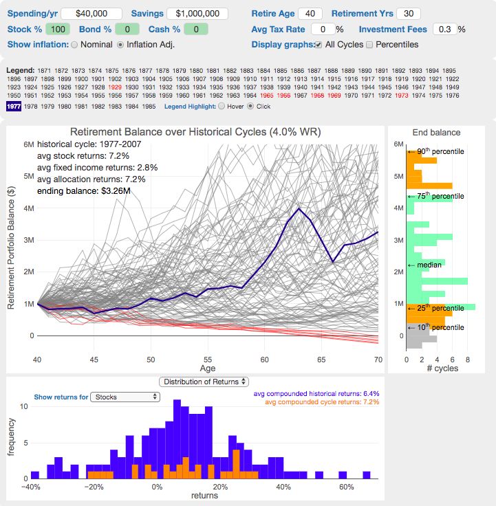
Display all cycles – this is the mess of spaghetti like curves that show all historical cycle simulations
Display percentiles – this aggregates the simulations into percentiles to show most likely outcomes
Hover/Click on legend years – this will allow you to highlight a single historical cycle (you can also use the arrow keys to step through historical cycles)
Bottom graph can show either the sequence of returns (with average returns in 5 year periods) for a single historical cycle or distributions of returns in our historical data (1871 to 2016) and a single historical cycle. You can choose to look at returns for stocks, bonds or your specific asset allocation.
The graph on the right shows a histogram of the ending balance of each historical cycle and color codes them to show percentiles.
What is the 4% Rule?
The 4% rule is a “rule of thumb” relating to safe retirement withdrawals. It states that if 4% of your retirement savings can cover one years worth of retirement spending (an alternative way to phrase it is if you have saved up 25 times your annual retirement spending), you have a high likelihood of having enough money to last a 30+ year retirement. A key point is that the probabilities shown here are just historical frequencies and not a guarantee of the future. However, if your plan has a high success rate (95+%) in these simulations, this implies that retirement plan should be okay unless future returns are on par with some of the worst in history.
The overall goal of this rule and analysis is identifying a “safe withdrawal rate” or SWR for retirement. A withdrawal rate is the percentage of your money that you withdraw from your retirement savings each year. If you’ve saved up $1 million and withdraw $100,000 each year, that is a 10% withdrawal rate.
The “safe” part of the withdrawal rate relates to the fact that if your investments generally grow by more than your annual spending, then your retirement savings should last over the length of your retirement. But average returns do not tell the whole story as the sequence of returns also plays a very important role, as will be discussed later.
One way to test this is through a backtesting simulation which forms the basis for the “Trinity Study”.
What is the Trinity Study?
The “Trinity Study” is a paper and analysis of this topic entitled “Retirement Spending: Choosing a Sustainable Withdrawal Rate,” by Philip L. Cooley, Carl M. Hubbard, and Daniel T. Walz, three professors at Trinity University. This study is a backtesting simulation that uses historical data to see if a retirement plan (i.e. a withdrawal rate) would have survived under past economic conditions. The approach is to take a “historical cycle”, i.e. a series of years from the past and test your retirement plan and see if it runs out of money (“fails”) or not (“survives”).
How do you test withdrawal rate?
Given modern equity and bond market data only stretches back about 150 years, there is some, but not a huge amount of data to use in this simulation. One example of a 30 year historical cycle would be 1900 to 1930, and another is 1970 to 2000. The Trinity study and this calculator tests withdrawal rates against all historical periods from 1871 until the present (e.g. 1871 to 1901, 1872 to 1902, 1873 to 1903, . . . . 1986 to 2016). Then across this 115 different historical cycles, it determines how many of these survived and how many failed.
The thinking is that if your retirement plan can survive periods that include recessions, depressions, world wars, and periods of high inflation, then perhaps it can survive the next 30-50 years.
The 4% rule that comes out of these studies basically states that a 4% withdrawal rate (e.g. $40,000 annual spending on a $1,000,000 retirement portfolio) will survive the vast majority of historical cycles (~96%). If you raise your withdrawal rate, the rate of failure increases, while if you lower your withdrawal rate, your rate of failure decreases.
The goal of this tool is to help you understand the mechanics of the a historical cycle simulation like was used in the Trinity Study and how the 4% rule came to be. This understanding can help you better plan for retirement with the uncertainty that goes along with planning 30+ years into the future. If you want to also see how longevity and life expectancy play a role in retirement planning, you can take a look at the Rich, Broke and Dead calculator.
This post and tool is a work in progress. I have a number of ideas that I will implement and add to it to help improve the visualization and clarity of these concepts.
If 4% is a conservative rate, what is the maximum withdrawal rate?
The future is unlikely to be identical to any of the set of historical cycles that are used in this simulation. And yet, there are enough years of data that there are a fairly large set of possible outcomes from running a simulation with this input data. One way to understand this variation is to see in the main graph above that the ending balance can potentially vary by more than $5 million dollars on an inflation adjusted basis on a starting balance of $1 million.
Another way to see this same variation in market returns is by looking at maximum withdrawal rate. This is the highest amount that you could withdraw annually over your retirement and (just barely) not run out of money by the end of your retirement.
This graph shows the maximum withdrawal rate for a given historical cycle (i.e. 1871 to 1901). For example, in the 1871 to 1901 30 year historical cycle, you could have used an 8.8% withdrawal rate (inflation adjusted $80,000 withdrawal annually on a $1 million initial investment balance) and not run out of money. This is because the sequence of market (stock and bond) returns in this historical cycle were able to (barely) outpace the rate of withdrawals at the end of the 30 year retirement period. Many other cycles show lower successful withdrawal rates, because those cycles had poorer sequences of returns, while some had higher maximum withdrawal rates.
The graph also highlights those cycles that show a maximum withdrawal rate below 4% in red, while all others are shown in green. Most of these withdrawal rates are well over 4%, with some quite a bit higher. This again shows that if the future is somewhat like one of these historical cycles, most likely a 4% withdrawal rate will be enough for you to retire without running out of money and that it is likely that you could end up with more money than you started.


Recent Comments