Posts for Tag: electricity
California Electricity Generation

What are the main sources of California’s electricity?
I added the option to view the graph for any day or monthly average from April 2018 to the present using the calendar picker and a daily generation summary
In the United States, electric power plant emissions account for about 25% of greenhouse gas emissions. However, California has been a leader in the transition to clean and renewable energy, driven by ambitious climate policies and a commitment to reducing greenhouse gas emissions. The state has set an electricity target for the state of 60% renewables by 2030 and 100% zero-carbon, clean electricity by 2045. To meet these targets, the state has been investing heavily into solar and wind energy sources. Solar is the largest proportion of California’s electricity grid and California now generates more solar energy than any other state.
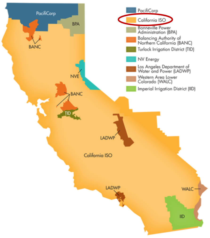
The California Independent System Operator manages the grid for around 32 million Californians or about 80% of the total demand in the state. Here is a map showing the service area and the other electricity districts in the state, the main exceptions include the city of LA and the Sacramento area.
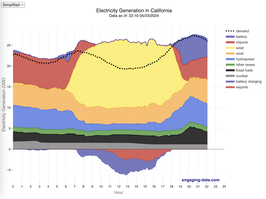
How to read the graph of California’s electricity
The graphs shown here allow us to visualize how electricity generation in the California Independent System Operator (CAISO) region varies over the course of the day. We can see how solar ramps up to be a huge contributor in the middle of the day. And overall, the vast majority of the generation in the state is one form of renewable electricity or another (e.g. solar, wind, hydro, geothermal, biomass and biogas). Add in a small contribution from zero-carbon nuclear energy and we can see that a large majority of power generation comes from zero-carbon sources. It also shows the total electricity demand, which should always be less than the total electricity supply in the state.
Because of the intermittent nature of some renewables, like wind and solar, there are times where the demand for electricity is not able to be met by these sources, and other options are needed to maintain supply demand balance on the state’s grid. To address this issue, the state relies on importing power from outside of the state as well as energy storage (primarily batteries) to meet electricity demand when renewable energy supply is low. If demand is much less than supply, then likely there will be power exported or some charging of batteries. And if demand is less than total generation in the state, power will be imported and/or batteries will be discharged to make up for the power shortfall.
On the graph, positive values from batteries and imports is when those sources are supplying power to the California grid. Negative values for batteries and exports are when there is excess power in the state and batteries are being charged up or power is being exported to neighboring states.
You can view the graph in two forms:
- Detailed – shows all of the power plant fuel types that is provided in the CAISO data: Solar, Wind, Nuclear, Coal, Other, Natural Gas, Large Hydropower, Small Hydropower, Geothermal, Biomass and Biogas. In addition, it shows aggregated net imports into the state from other regions as well as battery discharging or charging.
- Simplified – I aggregated the categories from CAISO into Solar, Wind, Nuclear, Fossil Fuel (including Coal, Other and Natural Gas), Hydro (Large and Small Hydropower), and Other Renewable (Geothermal, Biomass and Biogas). In addition, it shows aggregated net imports into the state from other regions as well as battery discharging or charging.
Also, I added the ability to see yesterday’s data as well. In the future, I will add the ability to see other dates as well.
Data Sources and Tools
Data for electricity sources for California grid comes from the California Independent System Operator (CAISO). This data from this site is downloaded and processed using a python script and updated every 5 minutes. The graph is made using the open source Plotly javascript graphing library.
Renewable Electricity Generation in US is Now Greater Than Coal

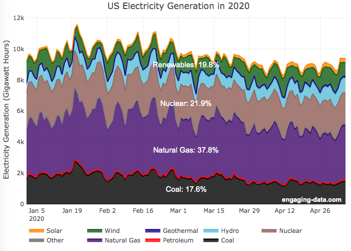
A remarkable thing is happening in the United States and in other places around the world. Partly due to the coronavirus pandemic and partly due to changes in natural gas and renewable energy prices, renewable electricity is now a larger fraction of the US electricity grid than coal. As of early May 2020, the fraction of coal generation of US electricity is about 18% while renewables (hydroelectric, wind, solar and geothermal) account for nearly 20%.
For the entire year of 2019, coal accounted for about 24.2% of US electricity generation, while renewables accounted for 17%.4. And in 2018, coal was 28.4% and renewables were 16.8%. When you include nuclear (not technically a renewable resource, but zero emissions of greenhouse gases), about 42% of US electricity generation in 2020 comes from zero carbon sources, while fossil fuels make up the remaining 68%.
This is good news because renewables produce little to no pollution that contributes to urban air quality, health issues and climate change. Coal is by far the worst electricity generation source when it comes to air pollution that impacts human health and climate change. So this shift away from coal and towards renewables is very good news.
Here’s the same graph but showing instead the fraction of electricity from each source (you can hover over the graph to get daily values).
Source and Tools
Data is downloaded from the US Department of Energy’s Energy Information Agency (EIA).. The graph is made using the open source, javascript Plot.ly graphing library.
Bitcoin Energy Consumption – Does It Consume More Electricity Than Your State?

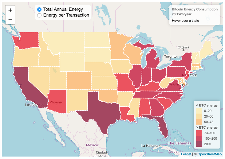
This visualization looks at the staggeringly high energy use of Bitcoin and puts it into context: comparing it to electricity usage of US states. Unfortunately for Bitcoin, high energy usage is an intended feature of the system, rather than an unintended consequence. This is because mining is an increasingly energy intensive process, based upon increasingly computationally intensive calculations that are performed on high powered computers and graphical processing units.
Currently, 28 out of 50 states plus the District of Columbia all have lower electricity consumption than estimated annual bitcoin electricity consumption (~73 TWh per year). These states are highlighted in variations of yellow. This is approximately equal to the average annual electricity usage across all US States. States with higher electricity consumption than bitcoin are highlighted in shades of red.
When dividing the total energy use (73 TWh) by the current number of transactions (93 million), we get an average energy consumption of 783 kWh per transaction. Click on the “Energy per Transaction” button to see this visualization. What’s crazy is that a transaction is simply a transfer of bitcoin between “wallets”, recording the transaction, and a validation of the process. There’s no good reason why verifying digital transactions should take this much energy, except that it was built into the fundamental process of validating and mining bitcoin. 783 kWh is larger than the monthly per capita electricity consumption in 10 US states. It could also drive you and your family over 2000 miles in an electric car (e.g. Tesla Model S).
I’m not expert enough in this area to know how much more energy consumption will rise into the future, but if crypto advocates’ predictions come true and bitcoin is used extensively, millions of transactions will occur per hour instead of per year and the price of bitcoin may rise much higher than it currently is. If the price rises, then miners will be willing to expend more energy to “mine” the more valuable bitcoin. Needless to say, this sounds like a very bad idea from an energy consumption and sustainability standpoint.
Data and Tools:
State energy data comes from the US Department of Energy. Estimates of Bitcoin energy use come from Digiconomist’s Bitcoin Energy Consumption Index. The choropleth map is visualized using javascript and the Leaflet.js library with Open Street Map tiles.
California Electricity Generation
What are the main sources of California’s electricity?
I added the option to view the graph for any day or monthly average from April 2018 to the present using the calendar picker and a daily generation summary
In the United States, electric power plant emissions account for about 25% of greenhouse gas emissions. However, California has been a leader in the transition to clean and renewable energy, driven by ambitious climate policies and a commitment to reducing greenhouse gas emissions. The state has set an electricity target for the state of 60% renewables by 2030 and 100% zero-carbon, clean electricity by 2045. To meet these targets, the state has been investing heavily into solar and wind energy sources. Solar is the largest proportion of California’s electricity grid and California now generates more solar energy than any other state.
The California Independent System Operator manages the grid for around 32 million Californians or about 80% of the total demand in the state. Here is a map showing the service area and the other electricity districts in the state, the main exceptions include the city of LA and the Sacramento area.
How to read the graph of California’s electricity
The graphs shown here allow us to visualize how electricity generation in the California Independent System Operator (CAISO) region varies over the course of the day. We can see how solar ramps up to be a huge contributor in the middle of the day. And overall, the vast majority of the generation in the state is one form of renewable electricity or another (e.g. solar, wind, hydro, geothermal, biomass and biogas). Add in a small contribution from zero-carbon nuclear energy and we can see that a large majority of power generation comes from zero-carbon sources. It also shows the total electricity demand, which should always be less than the total electricity supply in the state.
Because of the intermittent nature of some renewables, like wind and solar, there are times where the demand for electricity is not able to be met by these sources, and other options are needed to maintain supply demand balance on the state’s grid. To address this issue, the state relies on importing power from outside of the state as well as energy storage (primarily batteries) to meet electricity demand when renewable energy supply is low. If demand is much less than supply, then likely there will be power exported or some charging of batteries. And if demand is less than total generation in the state, power will be imported and/or batteries will be discharged to make up for the power shortfall.
On the graph, positive values from batteries and imports is when those sources are supplying power to the California grid. Negative values for batteries and exports are when there is excess power in the state and batteries are being charged up or power is being exported to neighboring states.
You can view the graph in two forms:
- Detailed – shows all of the power plant fuel types that is provided in the CAISO data: Solar, Wind, Nuclear, Coal, Other, Natural Gas, Large Hydropower, Small Hydropower, Geothermal, Biomass and Biogas. In addition, it shows aggregated net imports into the state from other regions as well as battery discharging or charging.
- Simplified – I aggregated the categories from CAISO into Solar, Wind, Nuclear, Fossil Fuel (including Coal, Other and Natural Gas), Hydro (Large and Small Hydropower), and Other Renewable (Geothermal, Biomass and Biogas). In addition, it shows aggregated net imports into the state from other regions as well as battery discharging or charging.
Also, I added the ability to see yesterday’s data as well. In the future, I will add the ability to see other dates as well.
Data Sources and Tools
Data for electricity sources for California grid comes from the California Independent System Operator (CAISO). This data from this site is downloaded and processed using a python script and updated every 5 minutes. The graph is made using the open source Plotly javascript graphing library.
Renewable Electricity Generation in US is Now Greater Than Coal
A remarkable thing is happening in the United States and in other places around the world. Partly due to the coronavirus pandemic and partly due to changes in natural gas and renewable energy prices, renewable electricity is now a larger fraction of the US electricity grid than coal. As of early May 2020, the fraction of coal generation of US electricity is about 18% while renewables (hydroelectric, wind, solar and geothermal) account for nearly 20%.
For the entire year of 2019, coal accounted for about 24.2% of US electricity generation, while renewables accounted for 17%.4. And in 2018, coal was 28.4% and renewables were 16.8%. When you include nuclear (not technically a renewable resource, but zero emissions of greenhouse gases), about 42% of US electricity generation in 2020 comes from zero carbon sources, while fossil fuels make up the remaining 68%.
This is good news because renewables produce little to no pollution that contributes to urban air quality, health issues and climate change. Coal is by far the worst electricity generation source when it comes to air pollution that impacts human health and climate change. So this shift away from coal and towards renewables is very good news.
Here’s the same graph but showing instead the fraction of electricity from each source (you can hover over the graph to get daily values).
Source and Tools
Data is downloaded from the US Department of Energy’s Energy Information Agency (EIA).. The graph is made using the open source, javascript Plot.ly graphing library.
Bitcoin Energy Consumption – Does It Consume More Electricity Than Your State?
This visualization looks at the staggeringly high energy use of Bitcoin and puts it into context: comparing it to electricity usage of US states. Unfortunately for Bitcoin, high energy usage is an intended feature of the system, rather than an unintended consequence. This is because mining is an increasingly energy intensive process, based upon increasingly computationally intensive calculations that are performed on high powered computers and graphical processing units.
Currently, 28 out of 50 states plus the District of Columbia all have lower electricity consumption than estimated annual bitcoin electricity consumption (~73 TWh per year). These states are highlighted in variations of yellow. This is approximately equal to the average annual electricity usage across all US States. States with higher electricity consumption than bitcoin are highlighted in shades of red.
When dividing the total energy use (73 TWh) by the current number of transactions (93 million), we get an average energy consumption of 783 kWh per transaction. Click on the “Energy per Transaction” button to see this visualization. What’s crazy is that a transaction is simply a transfer of bitcoin between “wallets”, recording the transaction, and a validation of the process. There’s no good reason why verifying digital transactions should take this much energy, except that it was built into the fundamental process of validating and mining bitcoin. 783 kWh is larger than the monthly per capita electricity consumption in 10 US states. It could also drive you and your family over 2000 miles in an electric car (e.g. Tesla Model S).
I’m not expert enough in this area to know how much more energy consumption will rise into the future, but if crypto advocates’ predictions come true and bitcoin is used extensively, millions of transactions will occur per hour instead of per year and the price of bitcoin may rise much higher than it currently is. If the price rises, then miners will be willing to expend more energy to “mine” the more valuable bitcoin. Needless to say, this sounds like a very bad idea from an energy consumption and sustainability standpoint.
Data and Tools:
State energy data comes from the US Department of Energy. Estimates of Bitcoin energy use come from Digiconomist’s Bitcoin Energy Consumption Index. The choropleth map is visualized using javascript and the Leaflet.js library with Open Street Map tiles.
Recent Comments