Posts for Tag: orbits
Planetary Art – Inner Planet Orbital Spirograph

Earlier, I had made a visualization showing that Mercury is the closest planet to Earth (on average) and not Venus or Mars. To make that, I downloaded a bunch of NASA ephemeris (orbital) data. I realized I could use the same data to make some cool orbital art inspired by a spirograph – a planetary spirograph.
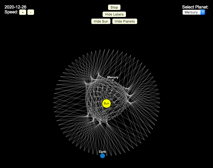
Basically, you get to choose a planet and the visualization will draw a line connecting that planet and Earth every few days. These lines will then build up into a cool pattern over 40 earth years of orbital cycles. Each planet (Mercury, Venus and Mars) has a different orbital period around the sun than Earth does and as a result, interesting patterns emerges.
Orbital periods of the four inner rocky planets:
- Mercury: 88 days
- Venus: 225 days
- Earth:365 days
- Mars: 687 days
Also evident is that the orbits of some of the planets are not quite circular so the pattern isn’t quite centered on the sun. Venus has the most regular pattern, creating a distinctive 5-lobed design. The other planets also have visually stunning patterns, though they do not repeat perfectly over time.
You can change the planets using the drop down menu as well as change the speed of the spirograph, and hide the planets and the sun.
Data and Tools:
I had thought about simulating the planets but there are plenty of tools out there that generate this orbital data so instead just downloaded 40 years of ephemeris data (data related to positions of astronomical bodies) from NASA website.. I processed the data using javascript and drew the picture using HTML canvas tools.

Mercury is the closest planet to Earth (on average)

We all learned the order of planets in school. In my case using the mnemonic, My Very Excellent Mother Just Served Us Nine Pizzas (MVEMJSUNP) for Mercury, Venus, Earth, Mars Jupiter Saturn, Uranus, Neptune, and Pluto. Since Pluto has been demoted to a dwarf planet, you could change the Nine Pizzas to Noodles or something else.
And in terms of distances, Venus’s orbit (0.72 AU, or Astronomical Units (i.e. 1 AU is the distance from the Earth to the Sun) is closer to Earth’s orbit (1 AU by definition) than Mercury’s (varies between 0.31 and 0.47 AU because of it’s more elliptical orbit) or Mars’ (1.5 AU).
However, I saw an article, stating that Mercury might in fact be the closest planet to Earth (on average) so I thought I’d whip up a visualization that shows which planet is closest as a function of the planetary orbits around the sun.
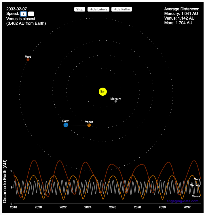
Because of where the planets are on these orbital paths, and specifically the time it takes Mercury to orbit the sun, Mercury is the planet that is closest to Earth more often and has an average distance to Earth that is lower than the other 2 inner planets. Mars is occasionally the closest as well, but on average much further than Mercury or Venus. Also interesting is that Mercury is, on average, about 1 AU away from Earth, which is the same as the distance to the Sun.
This simulation shows how the planet positions vary each day over a 30 year period and the regularity with which the distance between Earth and the other varies over time. Mercury has the shortest period while Mars has the longest. You can change the speed of the simulation to speed up or slow down the orbits of the planets.
Data and Tools:
I thought about simulating the planets but there are plenty of tools out there that generate this orbital data so instead just downloaded ephemeris data (data related to positions of astronomical bodies) from NASA website.. I processed the data using javascript and drew the picture using HTML canvas tools and made the distance vs time plot with the Plotly open source plotting javascript library.

Planetary Art – Inner Planet Orbital Spirograph

Earlier, I had made a visualization showing that Mercury is the closest planet to Earth (on average) and not Venus or Mars. To make that, I downloaded a bunch of NASA ephemeris (orbital) data. I realized I could use the same data to make some cool orbital art inspired by a spirograph – a planetary spirograph.
Basically, you get to choose a planet and the visualization will draw a line connecting that planet and Earth every few days. These lines will then build up into a cool pattern over 40 earth years of orbital cycles. Each planet (Mercury, Venus and Mars) has a different orbital period around the sun than Earth does and as a result, interesting patterns emerges.
Orbital periods of the four inner rocky planets:
- Mercury: 88 days
- Venus: 225 days
- Earth:365 days
- Mars: 687 days
Also evident is that the orbits of some of the planets are not quite circular so the pattern isn’t quite centered on the sun. Venus has the most regular pattern, creating a distinctive 5-lobed design. The other planets also have visually stunning patterns, though they do not repeat perfectly over time.
You can change the planets using the drop down menu as well as change the speed of the spirograph, and hide the planets and the sun.
Data and Tools:
I had thought about simulating the planets but there are plenty of tools out there that generate this orbital data so instead just downloaded 40 years of ephemeris data (data related to positions of astronomical bodies) from NASA website.. I processed the data using javascript and drew the picture using HTML canvas tools.

Mercury is the closest planet to Earth (on average)

We all learned the order of planets in school. In my case using the mnemonic, My Very Excellent Mother Just Served Us Nine Pizzas (MVEMJSUNP) for Mercury, Venus, Earth, Mars Jupiter Saturn, Uranus, Neptune, and Pluto. Since Pluto has been demoted to a dwarf planet, you could change the Nine Pizzas to Noodles or something else.
And in terms of distances, Venus’s orbit (0.72 AU, or Astronomical Units (i.e. 1 AU is the distance from the Earth to the Sun) is closer to Earth’s orbit (1 AU by definition) than Mercury’s (varies between 0.31 and 0.47 AU because of it’s more elliptical orbit) or Mars’ (1.5 AU).
However, I saw an article, stating that Mercury might in fact be the closest planet to Earth (on average) so I thought I’d whip up a visualization that shows which planet is closest as a function of the planetary orbits around the sun.
Because of where the planets are on these orbital paths, and specifically the time it takes Mercury to orbit the sun, Mercury is the planet that is closest to Earth more often and has an average distance to Earth that is lower than the other 2 inner planets. Mars is occasionally the closest as well, but on average much further than Mercury or Venus. Also interesting is that Mercury is, on average, about 1 AU away from Earth, which is the same as the distance to the Sun.
This simulation shows how the planet positions vary each day over a 30 year period and the regularity with which the distance between Earth and the other varies over time. Mercury has the shortest period while Mars has the longest. You can change the speed of the simulation to speed up or slow down the orbits of the planets.
Data and Tools:
I thought about simulating the planets but there are plenty of tools out there that generate this orbital data so instead just downloaded ephemeris data (data related to positions of astronomical bodies) from NASA website.. I processed the data using javascript and drew the picture using HTML canvas tools and made the distance vs time plot with the Plotly open source plotting javascript library.

Recent Comments