Posts for Tag: life expectancy
Assembling the World Country-By-Country

Watch the world assemble country-by-country based on a specific statistic
This map lets you watch as the world is built-up one country at a time. This can be done along the following statistical dimensions:
- Country name
- Population – from United Nations (2017)
- GDP – from United Nations (2017)
- GDP per capita
- GDP per area
- Land Area – from CIA factbook (2016)
- Population density
- Life expectancy – from World Health Organization (2015)
- or a random order
These statistics can be sorted from small to large or vice versa to get a view of the globe and its constituent countries in a unique and interesting way. It’s a bit hypnotic to watch as the countries appear and add to the world one by one.
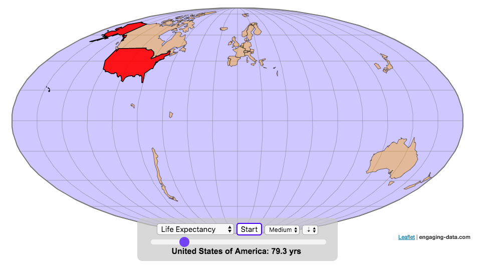
You can use this map to display all the countries that have higher life expectancy than the United States:
select “Life expectancy”, sort from “high to low” and use the scroll bar to move to the United States and you’ll get a picture like this:
or this map to display all the countries that have higher population density than the United States:
select “Population density, sort from “high to low” and use the scroll bar to move to the United States and you’ll get a picture like this:

I hope you enjoy exploring the countries of the world through this data viz tool. And if you have ideas for other statistics to add, I will try to do so.
Data and tools: Data was downloaded primarily from Wikipedia: Life expectancy from World Health Organization (2015) | GDP from United Nations (2017) | Population from United Nations (2017) | Land Area from CIA factbook (2016)
The map was created with the help of the open source leaflet javascript mapping library
Assembling the World Country-By-Country
Watch the world assemble country-by-country based on a specific statistic
- Country name
- Population – from United Nations (2017)
- GDP – from United Nations (2017)
- GDP per capita
- GDP per area
- Land Area – from CIA factbook (2016)
- Population density
- Life expectancy – from World Health Organization (2015)
- or a random order
These statistics can be sorted from small to large or vice versa to get a view of the globe and its constituent countries in a unique and interesting way. It’s a bit hypnotic to watch as the countries appear and add to the world one by one.
You can use this map to display all the countries that have higher life expectancy than the United States:
select “Life expectancy”, sort from “high to low” and use the scroll bar to move to the United States and you’ll get a picture like this:
or this map to display all the countries that have higher population density than the United States:
select “Population density, sort from “high to low” and use the scroll bar to move to the United States and you’ll get a picture like this:
I hope you enjoy exploring the countries of the world through this data viz tool. And if you have ideas for other statistics to add, I will try to do so.
Data and tools: Data was downloaded primarily from Wikipedia: Life expectancy from World Health Organization (2015) | GDP from United Nations (2017) | Population from United Nations (2017) | Land Area from CIA factbook (2016)
The map was created with the help of the open source leaflet javascript mapping library
Recent Comments