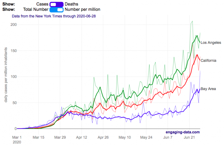
Compare the Bay Area coronavirus cases with Los Angeles and the rest of California
I wanted to better understand the coronavirus situation in my home region, the Bay Area, and I hadn’t seen any good resources that compared what was happening here to other regions in California. So I decided to make this graph. This page will be updated daily so you can come back regularly to see how the situation is changing (and hopefully improving sometime soon).
The coronavirus lockdowns began in mid-March 2020 and things have been opening up in late May, which corresponded to an uptick in coronavirus cases in the Bay Area and throughout California. While the cases in the Bay Area are increasing, it’s clear that there’s a big difference between the Bay Area and much of the rest of California. Los Angeles is currently leading the state with a large increase in the number of new cases in June as the economy tries to reopen restaurants, bars, gyms and other businesses.
You can toggle between coronavirus cases and deaths and look at the absolute numbers or on a per capita basis (per one million inhabitants). California has 39.5 million residents, while greater LA has 18.7 million residents and the Bay Area has 7.7 million residents. The daily data is shown as well as a five day moving average so you can get a better sense of the trends.
The San Francisco Bay Area was among the first regions to impose restrictions on gatherings and encourage people to stay home to fight the virus. In late February, the city of San Francisco declared an emergency in preparation for the upcoming pandemic and by early March, things became clear that life would not continue on as before.
The Bay Area is defined as the nine-county region consisting of Alameda, Contra Costa, Marin, Napa, San Francisco, San Mateo, Santa Clara, Solano and Sonoma counties.
Greater Los Angeles is defined as the 5 county region consisting of Los Angeles, Orange, Ventura, San Bernardino and Riverside counties.
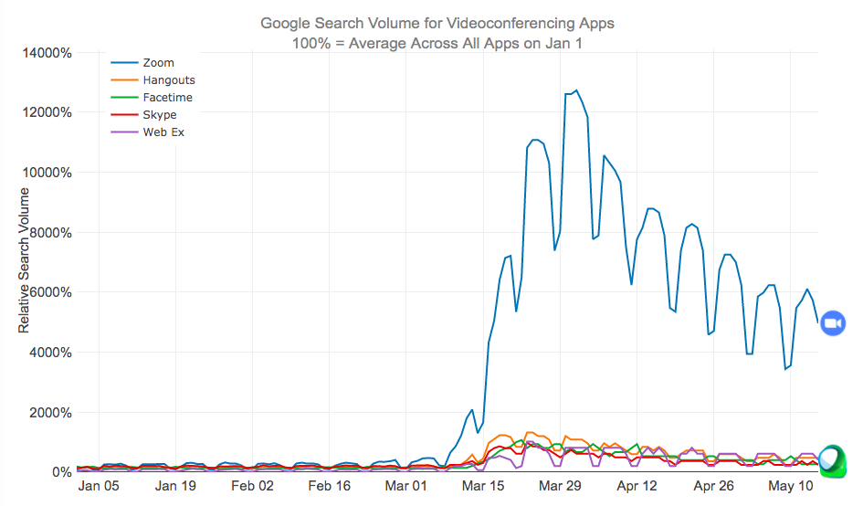
Zoom has become the primary video conferencing app over the last few months as schools and workplaces increasingly turned to remote learning and meetings.
Since the shelter-in-place orders across the United States due to the coronavirus in early to mid-March, many things have changed about our daily lives. One of the main ones is that schooling and work is being done remotely through video conferencing apps on our computers, tablets and smartphones. Our kids have zoom meetings with their teachers, parents have zoom meetings with our work colleagues and we all have facetime and google hangouts chats with our friends and family.
I remembered just a few year ago Skype was a very popular app to use for video chats, so I wanted to see how Zoom came to be the most popular app. The animated graph above shows the relative search volumes for 5 popular video conferencing apps from January 1 to May 15th (before and during the coronavirus restrictions on travel and gatherings).
This article implies that the reason Zoom had taken over so much is because it is free and easy to use for consumers. Even my tech-challenged mother is doing zoom calls for friends and classes.
Data and Tools:
Data is from google trends analysis of videoconferencing apps. Data is processed in javascript and graphed using the plotly open source graphing library.
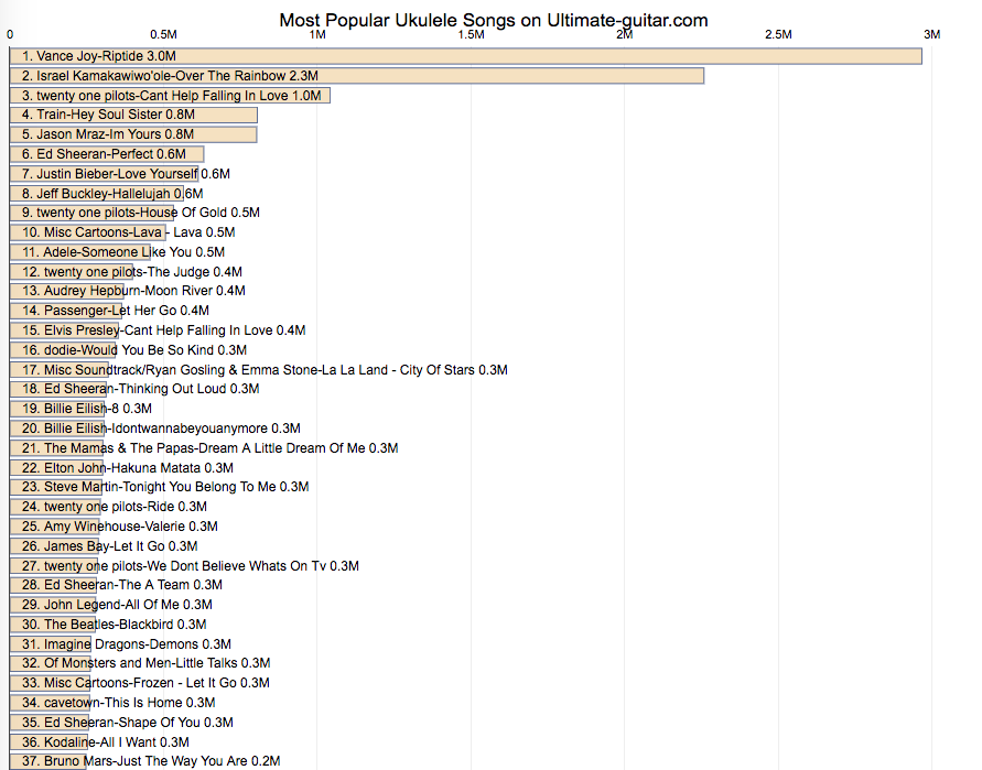
Here are the most popular ukulele songs on ultimate-guitar.com, a site dedicated to helping guitar and ukulele players learn to play new songs.
Since sheltering-in-place for the last few months, I’ve been playing guitar and ukulele more often than I used to. ultimate-guitar.com is a website I visit frequently in order to learn the chords and lyrics to new songs and also keep a “notebook” of songs that I like to play. I thought I’d check to see what songs are most popular on the website.
These songs are mostly user submitted and voted on. Many popular songs may have many different user submitted versions. I downloaded the most popular songs and aggregated across the different versions of the same song to get this list of the 200 most viewed ukulele songs on the website.
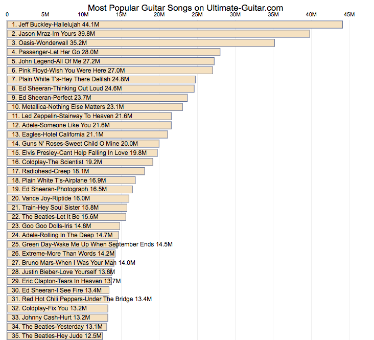
Here are the most popular songs on ultimate-guitar.com, a site dedicated to helping guitar players learn to play guitar songs.
Since sheltering-in-place for the last few months, I’ve been playing guitar more often than I used to. ultimate-guitar.com is a website I visit frequently in order to learn the chords and lyrics to new songs and also keep a “notebook” of songs that I like to play. I thought I’d check to see what songs are most popular on the website.
These songs are mostly user submitted and voted on. Many popular songs may have many different user submitted versions. I downloaded the most popular songs and aggregated across the different versions of the same song to get this list of the 500 most viewed songs on the website.
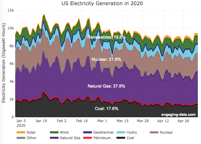
A remarkable thing is happening in the United States and in other places around the world. Partly due to the coronavirus pandemic and partly due to changes in natural gas and renewable energy prices, renewable electricity is now a larger fraction of the US electricity grid than coal. As of early May 2020, the fraction of coal generation of US electricity is about 18% while renewables (hydroelectric, wind, solar and geothermal) account for nearly 20%.
For the entire year of 2019, coal accounted for about 24.2% of US electricity generation, while renewables accounted for 17%.4. And in 2018, coal was 28.4% and renewables were 16.8%. When you include nuclear (not technically a renewable resource, but zero emissions of greenhouse gases), about 42% of US electricity generation in 2020 comes from zero carbon sources, while fossil fuels make up the remaining 68%.
This is good news because renewables produce little to no pollution that contributes to urban air quality, health issues and climate change. Coal is by far the worst electricity generation source when it comes to air pollution that impacts human health and climate change. So this shift away from coal and towards renewables is very good news.
Here’s the same graph but showing instead the fraction of electricity from each source (you can hover over the graph to get daily values).
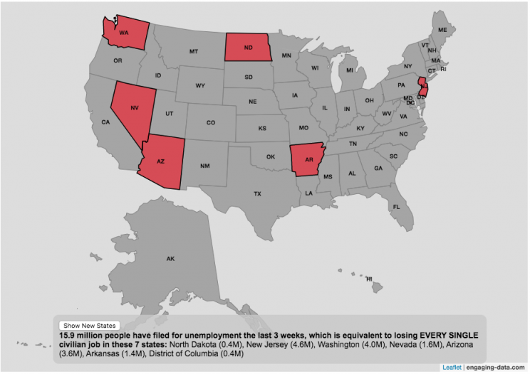
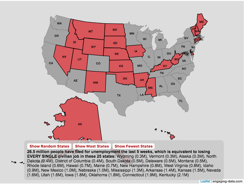
The number of Americans who have recently filed for unemployment due to the coronavirus pandemic is equal to the entire labor force of several states put together.
click on the button below to see a new set of states.
A record 16 million Americans just filed for unemployment due to the coronavirus pandemic at the end of March and early April 2020. This is an amazingly large number of people and I wanted to visualize how many people this actually is. For context, the US Department of Labor statistics states that in February 2020 (before the pandemic hit the United State) there were 164.2 million workers in the Civilian Labor Force.
The Bureau of Labor Statistics (BLS) site defines “Civilian Labor Force” as such:
“The labor force includes all people age 16 and older who are classified as either employed and unemployed, as defined below. Conceptually, the labor force level is the number of people who are either working or actively looking for work.”
This basically means that approximately 10% of the entire workforce of people (both employed and unemployed in Feb 2020) are now out of a job. While 10% is a large, unprecedented number in our lifetimes, comparing these number to the size of the workforce in several states helps to provide more context. The visualization shows a random collection of states whose total labor force is equal to the latest unemployment numbers. If you click the button you can see a different set of states that have the same total labor force.
Predictions are that the number of unemployed will grow as the shutdowns and social distancing measures to contain the virus continue through April and into May. I will update this graph to reflect new numbers as they come out.
And we can only hope that people will be able to manage these tough economic times until we contain the virus and the economy rebounds.
Stay safe out there: stay away from people and wash your hands!


Recent Comments