Posts for Tag: globe
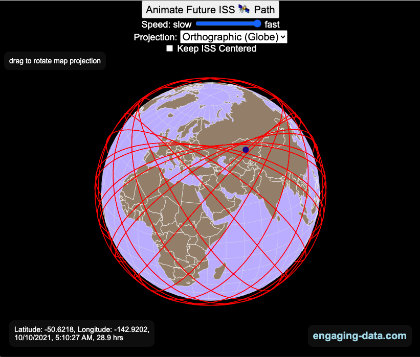
Visualizing the Orbit of the International Space Station (ISS)
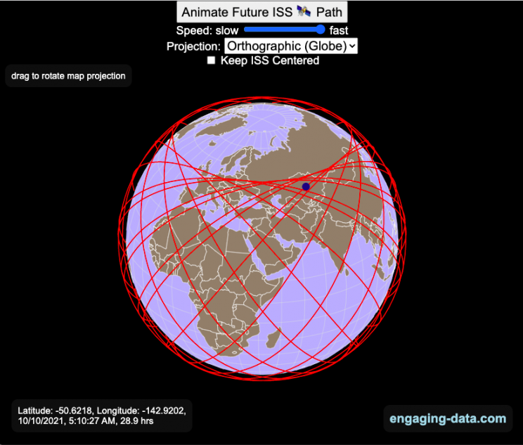
Where is the International Space Station currently? And what pattern does it make as it orbits around the Earth?
This visualization shows the current location of the International Space Station (ISS), actually the point above the Earth that the station is closest to. It is approximately 260 miles (420 km) above the Earth’s surface The station began construction in 1998 and had its first long term residents in 2000.
The visualization can also show the animated future orbital path of the ISS using ephemeris calculations, which makes a nice, cool pattern over an approximately 3.9 day cycle, where it starts to repeat. The animation allows you to view the orbital patterns on the globe (orthographic projection) or a mercator or equirectangular projection.
One of the cooler features is to drag and rotate the globe view while the orbital paths are being drawn. You can also adjust the speed of the orbit as well as keep the ISS centered in your view while the globe spins around underneath it. If you select the “rotate earth” checkbox, it becomes apparent that the ISS is in a circular orbit around the earth and that the pattern being made is simply a function of the earth’s rotation underneath the orbit.
This visualization only shows the approximate location of the ISS as there are several confounding factors that are not represented here. The speed of the ISS changes somewhat over time as the station experiences a small amount of atmospheric drag, which slows the station over time. But it still goes over 7000 meters per second or about 17000 miles per hour. As it slows, its orbit decays so it falls closer to earth and it experiences even more atmospheric drag. Occasionally, the station is boosted up to a higher orbit to counteract this decay. Secondly the earth is not a perfect sphere and this also causes the calculations to be only approximately correct.
Some other cool facts about the International Space Station:
- the angle the orbit makes relative to the equator is 51.6 degrees (i.e. this means the highest and lowest latitudes it will reach are 51.6 degrees North and South and doesn’t orbit over the poles
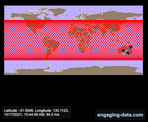
- the circular orbit around the earth makes a sin wave pattern on 2D map projections (shown on the mercator and equirectangular projections
- one orbit takes about 90 minutes. This means there are approximately 16 orbits per day and astronauts aboard the ISS will see 16 sunrises and sunsets
Other cool space-related orbital art can be seen at the inner planet spirographs.
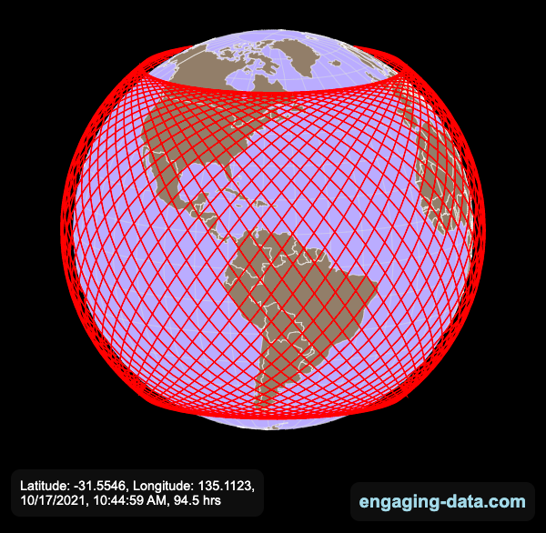
Here are a couple of images showing the final pattern made by the ISS on different map projections.
Sources and Tools:
I used the satellite.js javascript package and the ISS TLE file to calculate the position of the ISS.
The visualization was made using the d3.js open source graphing library and HTML/CSS/Javascript code for the interactivity and UI.
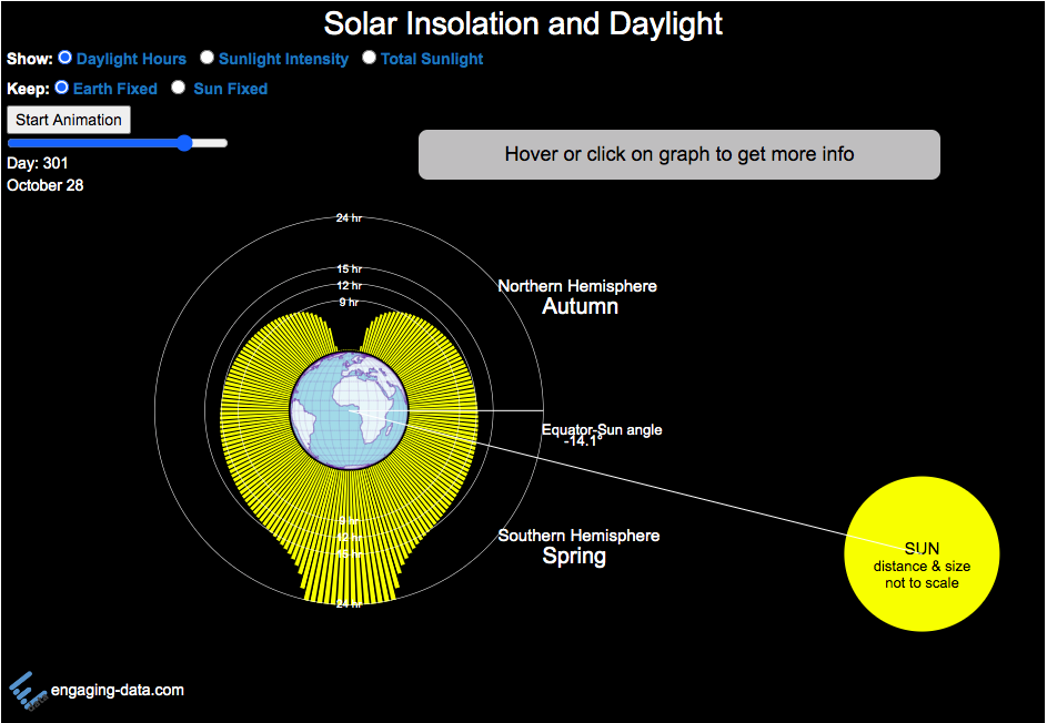
Visualizing the Variation in Sunlight by Latitude and Time of Year

How does the Earth’s tilt affect sunlight and seasons by latitude?
This visualization looks at the variation in the amount of sunlight different latitudes receive over the different days of the year. The amount of sunlight can be classified in 3 different categories:
- The number of hours of sunlight received each day
- The average sunlight intensity (in watts per square meter)
- The total amount of sunlight received across an entire latitude band (in gigawatt hours)
The default view is to see the number of hours of sunlight received by latitude on the current date, shown by the yellow bars. The sunlight hours range from 0 to 24 hours per day while most latitudes range from 9 to 15 hours.
If you hover over the yellow bars (or click on mobile), you will see the exact number of hours for that latitude band for that date.
Pressing the ‘Start Animation’ button, will change the angle of the sun relative to the Earth (as the earth rotates around the sun) and change the distribution of sunlight across the globe. You can view this animation with the earth fixed and the sun angle changing (the default view) or with the sun location fixed and the earth’s tilt changing.
This visualization helps to show how the seasons come about. When the Northern Hemisphere is tilted towards the sun, the amount of sunlight it receives increases (hours of daylight, average sun intensity and total amount of sunlight received). As the hemisphere tilts away from the sun, the amount of sunlight it receives decreases. The amount of sunlight a region receives causes the seasons that we experience.
Interestingly, when you are at the equator, the amount of sunlight per day does not really vary too significantly over the course of the year, whereas if you are near the poles, the difference between summer and winter is very dramatic. When looking at total sunlight received, the poles generally have lower sunlight because even in their summer, there is much lower land area relative to the middle latitudes (close to the equator)
The second visualization shown here shows how the tilt of the Earth’s axis is changed over the course of the Earth’s revolution around the sun. The Earth’s axis is tilted at 23.5 degrees relative to the plane of the Earth’s orbit around the sun. Like the last visualization, you can look at Earth the way we normally do (without the tilted axis) or from the perspective of the sun (with a tilted axis). This makes it a bit clearer why the tilt of the Earth’s axis can change from the north pole angled away to angled towards the sun.
Sources and Tools:
The equations for average daily solar insolation come from online lecture notes from University of Albany. The equations for number of hours of daylight comes from Wikipedia. The visualizations are made using the javascript d3 data visualization library and the interface and animation are made using javascript.
Antipodes map: What’s on the other side of the Earth?
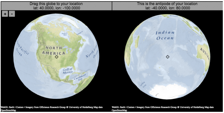
What is an antipode?
An antipode is a point that is on the exact opposite side of the earth (or other sphere) from a given location. If you drew a line (vector) from your location to the center of the earth and continued that line until it emerged from the other side of the earth’s surface, that point of intersection on the other side is the antipode. When I was a kid, people occasionally mentioned “digging a hole to China”. While this is currently impossible for many reasons1Earth’s core is about 6000 degrees C, China is not the antipode for North America (where I grew up). If you grew up in Argentina or Chile, then maybe that would make a little more sense.
The antipodes for most of North America and Europe are in the Indian and South Pacific oceans respectively.
Other examples of antipodes that are both on land:
Instructions:
It should be relatively explanatory, but you find your location by dragging the globe on the left side so that your location is in the center crosshair. The other globe (on the right) will show you the antipode to your location.
You can zoom in and out with the +/- buttons or pinch to zoom on mobile. If you zoom in enough, it will look like a normal two-dimensional web map (like google maps).
Tools:
This interactive visualization is made using the awesome webglearth javascript library. I just discovered this recently after making a number of 2D maps.

Footnotes
Footnotes
↑1 Earth’s core is about 6000 degrees C
Visualizing the Orbit of the International Space Station (ISS)
Where is the International Space Station currently? And what pattern does it make as it orbits around the Earth?
This visualization shows the current location of the International Space Station (ISS), actually the point above the Earth that the station is closest to. It is approximately 260 miles (420 km) above the Earth’s surface The station began construction in 1998 and had its first long term residents in 2000.
The visualization can also show the animated future orbital path of the ISS using ephemeris calculations, which makes a nice, cool pattern over an approximately 3.9 day cycle, where it starts to repeat. The animation allows you to view the orbital patterns on the globe (orthographic projection) or a mercator or equirectangular projection.
One of the cooler features is to drag and rotate the globe view while the orbital paths are being drawn. You can also adjust the speed of the orbit as well as keep the ISS centered in your view while the globe spins around underneath it. If you select the “rotate earth” checkbox, it becomes apparent that the ISS is in a circular orbit around the earth and that the pattern being made is simply a function of the earth’s rotation underneath the orbit.
This visualization only shows the approximate location of the ISS as there are several confounding factors that are not represented here. The speed of the ISS changes somewhat over time as the station experiences a small amount of atmospheric drag, which slows the station over time. But it still goes over 7000 meters per second or about 17000 miles per hour. As it slows, its orbit decays so it falls closer to earth and it experiences even more atmospheric drag. Occasionally, the station is boosted up to a higher orbit to counteract this decay. Secondly the earth is not a perfect sphere and this also causes the calculations to be only approximately correct.
Some other cool facts about the International Space Station:
- the angle the orbit makes relative to the equator is 51.6 degrees (i.e. this means the highest and lowest latitudes it will reach are 51.6 degrees North and South and doesn’t orbit over the poles
- the circular orbit around the earth makes a sin wave pattern on 2D map projections (shown on the mercator and equirectangular projections
- one orbit takes about 90 minutes. This means there are approximately 16 orbits per day and astronauts aboard the ISS will see 16 sunrises and sunsets
Other cool space-related orbital art can be seen at the inner planet spirographs.
Here are a couple of images showing the final pattern made by the ISS on different map projections.
Sources and Tools:
I used the satellite.js javascript package and the ISS TLE file to calculate the position of the ISS.
The visualization was made using the d3.js open source graphing library and HTML/CSS/Javascript code for the interactivity and UI.
Visualizing the Variation in Sunlight by Latitude and Time of Year
How does the Earth’s tilt affect sunlight and seasons by latitude?
This visualization looks at the variation in the amount of sunlight different latitudes receive over the different days of the year. The amount of sunlight can be classified in 3 different categories:
- The number of hours of sunlight received each day
- The average sunlight intensity (in watts per square meter)
- The total amount of sunlight received across an entire latitude band (in gigawatt hours)
The default view is to see the number of hours of sunlight received by latitude on the current date, shown by the yellow bars. The sunlight hours range from 0 to 24 hours per day while most latitudes range from 9 to 15 hours.
If you hover over the yellow bars (or click on mobile), you will see the exact number of hours for that latitude band for that date.
Pressing the ‘Start Animation’ button, will change the angle of the sun relative to the Earth (as the earth rotates around the sun) and change the distribution of sunlight across the globe. You can view this animation with the earth fixed and the sun angle changing (the default view) or with the sun location fixed and the earth’s tilt changing.
This visualization helps to show how the seasons come about. When the Northern Hemisphere is tilted towards the sun, the amount of sunlight it receives increases (hours of daylight, average sun intensity and total amount of sunlight received). As the hemisphere tilts away from the sun, the amount of sunlight it receives decreases. The amount of sunlight a region receives causes the seasons that we experience.
Interestingly, when you are at the equator, the amount of sunlight per day does not really vary too significantly over the course of the year, whereas if you are near the poles, the difference between summer and winter is very dramatic. When looking at total sunlight received, the poles generally have lower sunlight because even in their summer, there is much lower land area relative to the middle latitudes (close to the equator)
The second visualization shown here shows how the tilt of the Earth’s axis is changed over the course of the Earth’s revolution around the sun. The Earth’s axis is tilted at 23.5 degrees relative to the plane of the Earth’s orbit around the sun. Like the last visualization, you can look at Earth the way we normally do (without the tilted axis) or from the perspective of the sun (with a tilted axis). This makes it a bit clearer why the tilt of the Earth’s axis can change from the north pole angled away to angled towards the sun.
Sources and Tools:
The equations for average daily solar insolation come from online lecture notes from University of Albany. The equations for number of hours of daylight comes from Wikipedia. The visualizations are made using the javascript d3 data visualization library and the interface and animation are made using javascript.
Antipodes map: What’s on the other side of the Earth?
What is an antipode?
An antipode is a point that is on the exact opposite side of the earth (or other sphere) from a given location. If you drew a line (vector) from your location to the center of the earth and continued that line until it emerged from the other side of the earth’s surface, that point of intersection on the other side is the antipode. When I was a kid, people occasionally mentioned “digging a hole to China”. While this is currently impossible for many reasons1Earth’s core is about 6000 degrees C, China is not the antipode for North America (where I grew up). If you grew up in Argentina or Chile, then maybe that would make a little more sense.
The antipodes for most of North America and Europe are in the Indian and South Pacific oceans respectively.
Other examples of antipodes that are both on land:
Instructions:
It should be relatively explanatory, but you find your location by dragging the globe on the left side so that your location is in the center crosshair. The other globe (on the right) will show you the antipode to your location.
You can zoom in and out with the +/- buttons or pinch to zoom on mobile. If you zoom in enough, it will look like a normal two-dimensional web map (like google maps).
Tools:
This interactive visualization is made using the awesome webglearth javascript library. I just discovered this recently after making a number of 2D maps.
Footnotes
| ↑1 | Earth’s core is about 6000 degrees C |
|---|
Recent Comments