Posts for Tag: earth science
Where on Earth is all the water? From the solar system to living things

Earth is known as the blue planet, because it’s covered with quite a bit of water. But do you know where all that water on Earth is located? This interactive visualization will show the various amounts of water in its many forms on Earth: Oceans, Lakes, Rivers, Ice, Groundwater, etc….
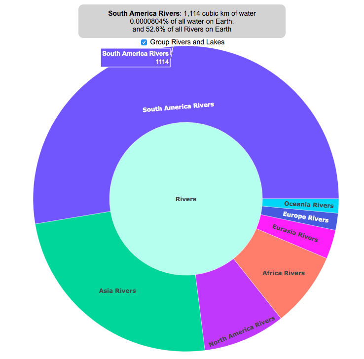
If you hover over a part of the circular, sunburst graph, it will show you the amount of water that is in each of the various forms shown. If the label for that form is bolded, you can click on it and see further subdivisions beyond that broad category. For example, if you click on Oceans, it will show you how the water in the oceans is distributed among the five main oceans on Earth. As you move towards more focused views on the graph, you can click on the center of the circle to move back out to larger categories and see the big picture again.
As you can see, most of the water on Earth is found in a salty form, and most of that is in the oceans. It can be hard to click through to see freshwater lakes and rivers, as you have to be very precise to expand the “Surface Water” wedge, when you are looking at all “Freshwater”.
Even smaller, on that same visualization, is the “Living things” wedge is basically invisible. You can further explore the details of the living things category by clicking on the button that appears on the freshwater graph.
Checking the Group Rivers and Lakes checkbox will group rivers by continent and lakes by major groups.
It is interesting to see how much water there is on Earth (about 1.4 billion cubic kilometers of water), but how little of it is non-salty, liquid freshwater at the surface (about 100,000 cubic kilometers, though that is still quite a lot) but it only makes up about 0.008% of all water on Earth. That means for every 10,000 gallons of water on Earth, only one of those gallons is freshwater in a lake or river that we can easily access.
It is also believed that there is more water deep in the Earth’s interior (i.e. the mantle) than on the surface or near-subsurface, but estimates of that are highly uncertain and are not included in this graph.
If you click out past Earth’s water to look at water in the solar system, the estimates shown in this visualization are only including liquid water and do not include estimates of ice (which I haven’t been able to find estimates of). The amount of water in living things is estimated assuming that the ratio of organic carbon to liquid water is more or less the same across all different types of living things (i.e. viruses, bacteria, fungi, plants, animals, etc.). This isn’t a great assumption but the estimates, which come from estimates of the dry carbon weight of these organisms, vary across many orders of magnitude so being off in liquid water weight/volume by a factor of two or so isn’t a huge problem.
Tools and Data Sources
The sunburst chart is made using the open source, javascript Plot.ly graphing library. Data on water distributions is primarily from Wikipedia – Distribution of Water – List of Rivers by Discharge – List of Lakes – Weight of Living Biomass – Extra-terrestrial water estimates

Where on Earth is all the water? From the solar system to living things

Earth is known as the blue planet, because it’s covered with quite a bit of water. But do you know where all that water on Earth is located? This interactive visualization will show the various amounts of water in its many forms on Earth: Oceans, Lakes, Rivers, Ice, Groundwater, etc….
If you hover over a part of the circular, sunburst graph, it will show you the amount of water that is in each of the various forms shown. If the label for that form is bolded, you can click on it and see further subdivisions beyond that broad category. For example, if you click on Oceans, it will show you how the water in the oceans is distributed among the five main oceans on Earth. As you move towards more focused views on the graph, you can click on the center of the circle to move back out to larger categories and see the big picture again.
As you can see, most of the water on Earth is found in a salty form, and most of that is in the oceans. It can be hard to click through to see freshwater lakes and rivers, as you have to be very precise to expand the “Surface Water” wedge, when you are looking at all “Freshwater”.
Even smaller, on that same visualization, is the “Living things” wedge is basically invisible. You can further explore the details of the living things category by clicking on the button that appears on the freshwater graph.
Checking the Group Rivers and Lakes checkbox will group rivers by continent and lakes by major groups.
It is interesting to see how much water there is on Earth (about 1.4 billion cubic kilometers of water), but how little of it is non-salty, liquid freshwater at the surface (about 100,000 cubic kilometers, though that is still quite a lot) but it only makes up about 0.008% of all water on Earth. That means for every 10,000 gallons of water on Earth, only one of those gallons is freshwater in a lake or river that we can easily access.
It is also believed that there is more water deep in the Earth’s interior (i.e. the mantle) than on the surface or near-subsurface, but estimates of that are highly uncertain and are not included in this graph.
If you click out past Earth’s water to look at water in the solar system, the estimates shown in this visualization are only including liquid water and do not include estimates of ice (which I haven’t been able to find estimates of). The amount of water in living things is estimated assuming that the ratio of organic carbon to liquid water is more or less the same across all different types of living things (i.e. viruses, bacteria, fungi, plants, animals, etc.). This isn’t a great assumption but the estimates, which come from estimates of the dry carbon weight of these organisms, vary across many orders of magnitude so being off in liquid water weight/volume by a factor of two or so isn’t a huge problem.
Tools and Data Sources
The sunburst chart is made using the open source, javascript Plot.ly graphing library. Data on water distributions is primarily from Wikipedia – Distribution of Water – List of Rivers by Discharge – List of Lakes – Weight of Living Biomass – Extra-terrestrial water estimates

Recent Comments