Posts for Tag: art
Interactive Spirograph
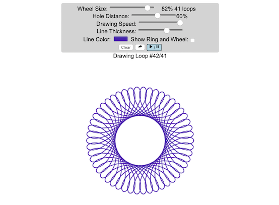
Play with an interactive spirograph and share your creations with your friends. Just play around with the controls at the top and see what interesting designs you can come up with.
Instructions
– Wheel Size controls the size of the wheel inside the ring
– Hole Distance controls the distance from the center of the wheel and the edge
– Drawing Speed controls the speed at which the spirograph is spins
– Line Thickness controls the thickness of the line on the drawing
– Line Color is a color picker letting you change the color of the lines
– Show Ring and Wheel lets you toggle whether the Ring and Wheel are showing
– Clear erases the design
– generates a custom URL and copies it to the clipboard so you can share this exact design with your friends.
– / allows you to start and stop the spirograph animation
Equations
The spirographs shown here are hypotrochoids, which is described as a curve generated by tracing a point attached to a circle that rolls around the interior of a larger circle. The equations for the curve are:
\begin{aligned}&x(\theta )=(R-r)\cos \theta +d\cos \left({R-r \over r}\theta \right)\\&y(\theta )=(R-r)\sin \theta -d\sin \left({R-r \over r}\theta \right)\end{aligned}
Sources and Tools
The equations for the spirograph hypotrochoids are from Wikipedia. The drawings and UI are made using canvas and HTML/Javascript and CSS.

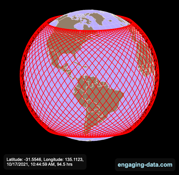
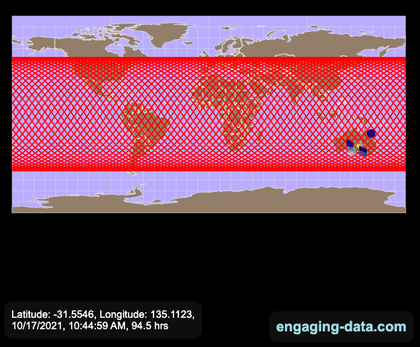
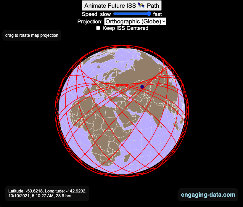
Visualizing the Orbit of the International Space Station (ISS)
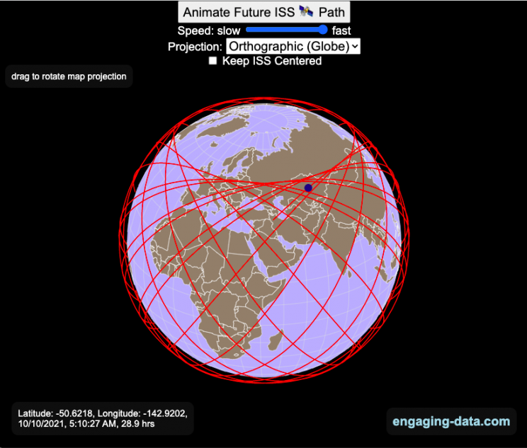
Where is the International Space Station currently? And what pattern does it make as it orbits around the Earth?
This visualization shows the current location of the International Space Station (ISS), actually the point above the Earth that the station is closest to. It is approximately 260 miles (420 km) above the Earth’s surface The station began construction in 1998 and had its first long term residents in 2000.
The visualization can also show the animated future orbital path of the ISS using ephemeris calculations, which makes a nice, cool pattern over an approximately 3.9 day cycle, where it starts to repeat. The animation allows you to view the orbital patterns on the globe (orthographic projection) or a mercator or equirectangular projection.
One of the cooler features is to drag and rotate the globe view while the orbital paths are being drawn. You can also adjust the speed of the orbit as well as keep the ISS centered in your view while the globe spins around underneath it. If you select the “rotate earth” checkbox, it becomes apparent that the ISS is in a circular orbit around the earth and that the pattern being made is simply a function of the earth’s rotation underneath the orbit.
This visualization only shows the approximate location of the ISS as there are several confounding factors that are not represented here. The speed of the ISS changes somewhat over time as the station experiences a small amount of atmospheric drag, which slows the station over time. But it still goes over 7000 meters per second or about 17000 miles per hour. As it slows, its orbit decays so it falls closer to earth and it experiences even more atmospheric drag. Occasionally, the station is boosted up to a higher orbit to counteract this decay. Secondly the earth is not a perfect sphere and this also causes the calculations to be only approximately correct.
Some other cool facts about the International Space Station:
- the angle the orbit makes relative to the equator is 51.6 degrees (i.e. this means the highest and lowest latitudes it will reach are 51.6 degrees North and South and doesn’t orbit over the poles
- the circular orbit around the earth makes a sin wave pattern on 2D map projections (shown on the mercator and equirectangular projections
- one orbit takes about 90 minutes. This means there are approximately 16 orbits per day and astronauts aboard the ISS will see 16 sunrises and sunsets
Other cool space-related orbital art can be seen at the inner planet spirographs.
Here are a couple of images showing the final pattern made by the ISS on different map projections.
Sources and Tools:
I used the satellite.js javascript package and the ISS TLE file to calculate the position of the ISS.
The visualization was made using the d3.js open source graphing library and HTML/CSS/Javascript code for the interactivity and UI.
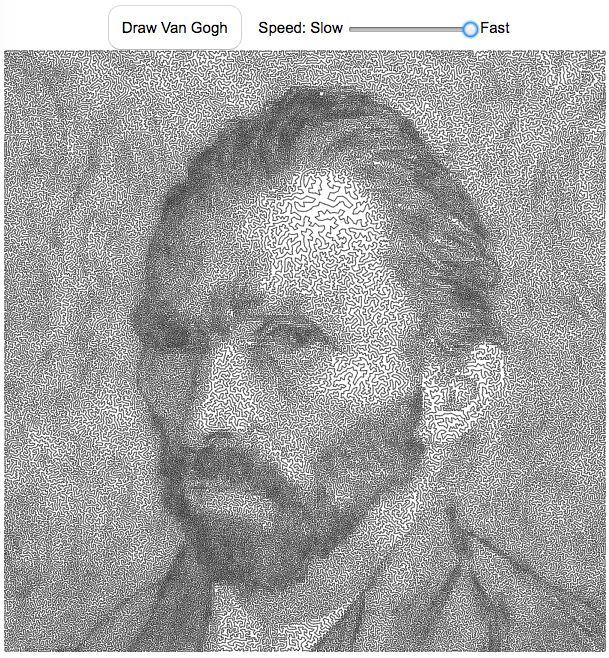
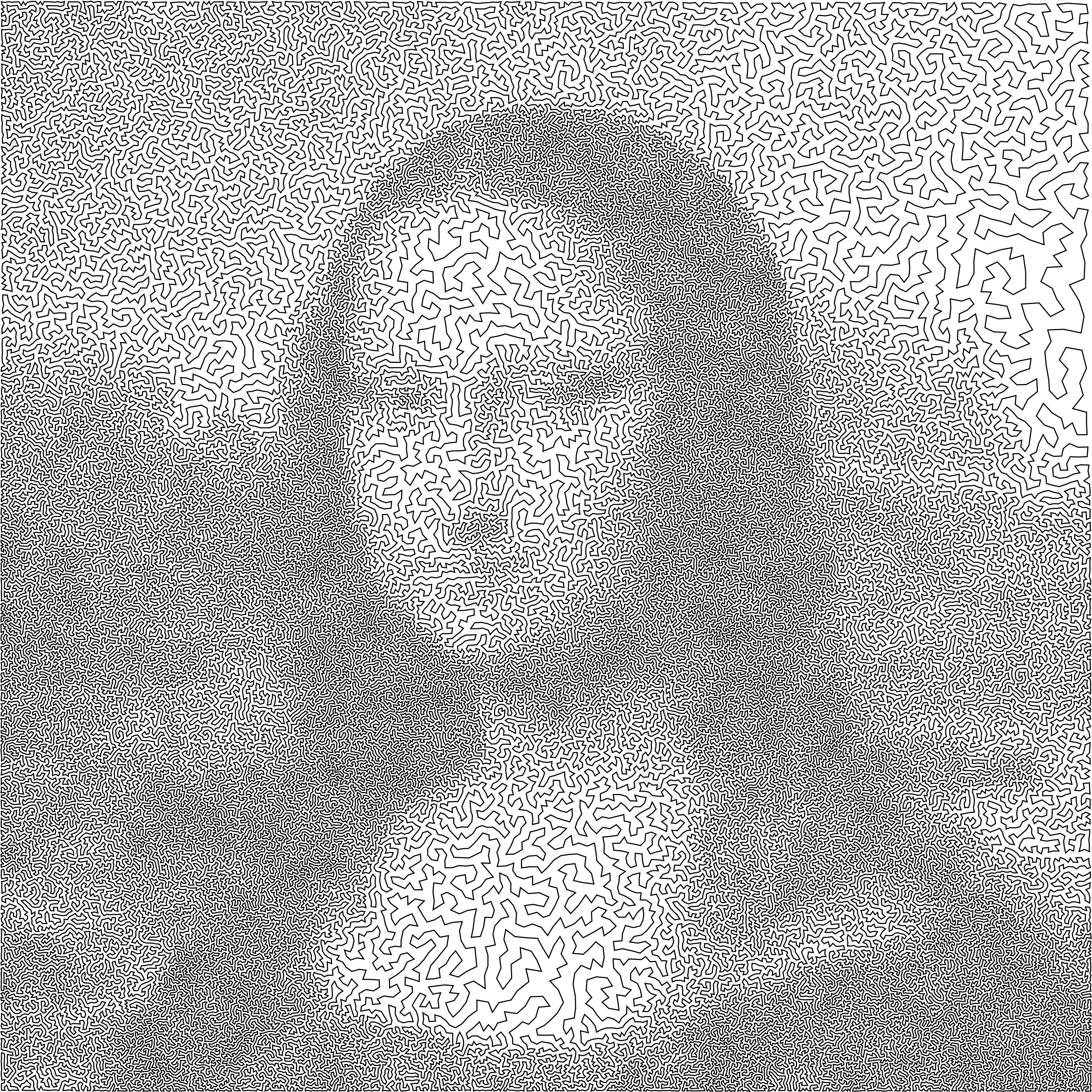
Van Gogh As Drawn By A Traveling Salesman

This “art project”, like the Mona Lisa one, draws a portrait of Vincent Van Gogh as a single continuous line. When it’s on the slow setting, is oddly satisfying and calming to watch the picture get drawn.
Click the “Draw Van Gogh” button below to see his famous self portrait drawn with a single continuous line with 120,000 segments.
The traveling salesman problem (TSP) is a classic problem in operations research and mathematical programming. It seeks to answer the question, given a set of destinations, what is the shortest possible travel route someone could take to visit them all. It is a notoriously challenging problem to solve when the number of destinations grows. A picture of the famous Van Gogh self-portrait was converted to 120,000 dots and a challenge was created to find the most optimal solution to visiting each of these 120 thousand points (i.e. drawing the shortest continuous line that goes through each and every point.
The current most-optimal solution that has been found to this Van Gogh self-portrait challenge was calculated in 2013 by Honda, Nagata and Ono. I used the order of destinations (also called the “tour) that he developed and animated the line segments to create an animated drawing of the portrait as a single continuous line.
Here an analogous TSP drawing for the Mona Lisa.
Each time you click on the “Draw Van Gogh” button, it chooses a different starting point but follows the same order of destination points, looping around until all the points are visited.
You can also change the speed at which the individual line segments are drawn. It is surprisingly relaxing and satisfying to watch the line wind its way around the screen to fill in the famous Van Gogh self-portrait.
For a very high res version of the entire photo click here (around 4 MB file size).
Data and Tools:
I downloaded the 120,000 points and the tour from Honda, Nagata and Ono that is currently the shortest that has so far been calculated from the TSP Art website and the University of Waterloo.
Javascript was used to draw on the HTML canvas and animate the process.
The Mona Lisa As Drawn By A Traveling Salesman
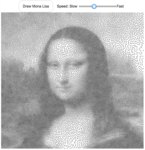
The traveling salesman problem (TSP) is a classic problem in operations research and mathematical programming. It seeks to answer the question, given a set of destinations, what is the shortest possible travel route someone could take to visit them all. It is a notoriously challenging problem to solve when the number of destinations grows. A picture of the famous Mona Lisa was converted to 100,000 dots and a challenge was created to find the most optimal solution to visiting each of these 100 thousand points (i.e. drawing the shortest continuous line that goes through each and every point.
The current most-optimal solution that has been found to this Mona Lisa challenge was calculated in 2009 by Yuichi Nagata. This art is created using the order of destinations (also called the “tour) that he developed.
Click the “Draw Mona Lisa” button below to see the famous painting drawn with a single continuous line with 100,000 segments.
Each time you click on the “Draw Mona Lisa” button, it chooses a different starting point but follows the same order of destination points, looping around until all the points are visited.
You can also change the speed at which the individual line segments are drawn. It is surprisingly relaxing and satisfying to watch the line wind its way around the screen to fill in the famous picture of the Mona Lisa.
For a very high res version of the entire photo click here (around 4 MB file size).
Data and Tools:
I downloaded the 100,000 points and optimal tour from Yuichi Nagata from the TSP Art website and the University of Waterloo.
Javascript was used to draw on the HTML canvas and animate the process.

Planetary Art – Inner Planet Orbital Spirograph
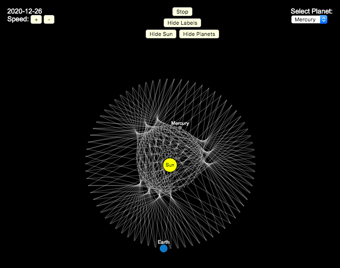
Earlier, I had made a visualization showing that Mercury is the closest planet to Earth (on average) and not Venus or Mars. To make that, I downloaded a bunch of NASA ephemeris (orbital) data. I realized I could use the same data to make some cool orbital art inspired by a spirograph – a planetary spirograph.
Basically, you get to choose a planet and the visualization will draw a line connecting that planet and Earth every few days. These lines will then build up into a cool pattern over 40 earth years of orbital cycles. Each planet (Mercury, Venus and Mars) has a different orbital period around the sun than Earth does and as a result, interesting patterns emerges.
Orbital periods of the four inner rocky planets:
- Mercury: 88 days
- Venus: 225 days
- Earth:365 days
- Mars: 687 days
Also evident is that the orbits of some of the planets are not quite circular so the pattern isn’t quite centered on the sun. Venus has the most regular pattern, creating a distinctive 5-lobed design. The other planets also have visually stunning patterns, though they do not repeat perfectly over time.
You can change the planets using the drop down menu as well as change the speed of the spirograph, and hide the planets and the sun.
Data and Tools:
I had thought about simulating the planets but there are plenty of tools out there that generate this orbital data so instead just downloaded 40 years of ephemeris data (data related to positions of astronomical bodies) from NASA website.. I processed the data using javascript and drew the picture using HTML canvas tools.

Interactive Spirograph
Play with an interactive spirograph and share your creations with your friends. Just play around with the controls at the top and see what interesting designs you can come up with.
Instructions
– Wheel Size controls the size of the wheel inside the ring
– Hole Distance controls the distance from the center of the wheel and the edge
– Drawing Speed controls the speed at which the spirograph is spins
– Line Thickness controls the thickness of the line on the drawing
– Line Color is a color picker letting you change the color of the lines
– Show Ring and Wheel lets you toggle whether the Ring and Wheel are showing
– Clear erases the design
– generates a custom URL and copies it to the clipboard so you can share this exact design with your friends.
– / allows you to start and stop the spirograph animation
Equations
The spirographs shown here are hypotrochoids, which is described as a curve generated by tracing a point attached to a circle that rolls around the interior of a larger circle. The equations for the curve are:
\begin{aligned}&x(\theta )=(R-r)\cos \theta +d\cos \left({R-r \over r}\theta \right)\\&y(\theta )=(R-r)\sin \theta -d\sin \left({R-r \over r}\theta \right)\end{aligned}
Sources and Tools
The equations for the spirograph hypotrochoids are from Wikipedia. The drawings and UI are made using canvas and HTML/Javascript and CSS.
Visualizing the Orbit of the International Space Station (ISS)
Where is the International Space Station currently? And what pattern does it make as it orbits around the Earth?
This visualization shows the current location of the International Space Station (ISS), actually the point above the Earth that the station is closest to. It is approximately 260 miles (420 km) above the Earth’s surface The station began construction in 1998 and had its first long term residents in 2000.
The visualization can also show the animated future orbital path of the ISS using ephemeris calculations, which makes a nice, cool pattern over an approximately 3.9 day cycle, where it starts to repeat. The animation allows you to view the orbital patterns on the globe (orthographic projection) or a mercator or equirectangular projection.
One of the cooler features is to drag and rotate the globe view while the orbital paths are being drawn. You can also adjust the speed of the orbit as well as keep the ISS centered in your view while the globe spins around underneath it. If you select the “rotate earth” checkbox, it becomes apparent that the ISS is in a circular orbit around the earth and that the pattern being made is simply a function of the earth’s rotation underneath the orbit.
This visualization only shows the approximate location of the ISS as there are several confounding factors that are not represented here. The speed of the ISS changes somewhat over time as the station experiences a small amount of atmospheric drag, which slows the station over time. But it still goes over 7000 meters per second or about 17000 miles per hour. As it slows, its orbit decays so it falls closer to earth and it experiences even more atmospheric drag. Occasionally, the station is boosted up to a higher orbit to counteract this decay. Secondly the earth is not a perfect sphere and this also causes the calculations to be only approximately correct.
Some other cool facts about the International Space Station:
- the angle the orbit makes relative to the equator is 51.6 degrees (i.e. this means the highest and lowest latitudes it will reach are 51.6 degrees North and South and doesn’t orbit over the poles
- the circular orbit around the earth makes a sin wave pattern on 2D map projections (shown on the mercator and equirectangular projections
- one orbit takes about 90 minutes. This means there are approximately 16 orbits per day and astronauts aboard the ISS will see 16 sunrises and sunsets
Other cool space-related orbital art can be seen at the inner planet spirographs.
Here are a couple of images showing the final pattern made by the ISS on different map projections.
Sources and Tools:
I used the satellite.js javascript package and the ISS TLE file to calculate the position of the ISS.
The visualization was made using the d3.js open source graphing library and HTML/CSS/Javascript code for the interactivity and UI.
Van Gogh As Drawn By A Traveling Salesman
This “art project”, like the Mona Lisa one, draws a portrait of Vincent Van Gogh as a single continuous line. When it’s on the slow setting, is oddly satisfying and calming to watch the picture get drawn.
Click the “Draw Van Gogh” button below to see his famous self portrait drawn with a single continuous line with 120,000 segments.
The traveling salesman problem (TSP) is a classic problem in operations research and mathematical programming. It seeks to answer the question, given a set of destinations, what is the shortest possible travel route someone could take to visit them all. It is a notoriously challenging problem to solve when the number of destinations grows. A picture of the famous Van Gogh self-portrait was converted to 120,000 dots and a challenge was created to find the most optimal solution to visiting each of these 120 thousand points (i.e. drawing the shortest continuous line that goes through each and every point.
The current most-optimal solution that has been found to this Van Gogh self-portrait challenge was calculated in 2013 by Honda, Nagata and Ono. I used the order of destinations (also called the “tour) that he developed and animated the line segments to create an animated drawing of the portrait as a single continuous line.
Here an analogous TSP drawing for the Mona Lisa.
Each time you click on the “Draw Van Gogh” button, it chooses a different starting point but follows the same order of destination points, looping around until all the points are visited.
You can also change the speed at which the individual line segments are drawn. It is surprisingly relaxing and satisfying to watch the line wind its way around the screen to fill in the famous Van Gogh self-portrait.
For a very high res version of the entire photo click here (around 4 MB file size).
Data and Tools:
I downloaded the 120,000 points and the tour from Honda, Nagata and Ono that is currently the shortest that has so far been calculated from the TSP Art website and the University of Waterloo.
Javascript was used to draw on the HTML canvas and animate the process.
The Mona Lisa As Drawn By A Traveling Salesman
The traveling salesman problem (TSP) is a classic problem in operations research and mathematical programming. It seeks to answer the question, given a set of destinations, what is the shortest possible travel route someone could take to visit them all. It is a notoriously challenging problem to solve when the number of destinations grows. A picture of the famous Mona Lisa was converted to 100,000 dots and a challenge was created to find the most optimal solution to visiting each of these 100 thousand points (i.e. drawing the shortest continuous line that goes through each and every point.
The current most-optimal solution that has been found to this Mona Lisa challenge was calculated in 2009 by Yuichi Nagata. This art is created using the order of destinations (also called the “tour) that he developed.
Click the “Draw Mona Lisa” button below to see the famous painting drawn with a single continuous line with 100,000 segments.
Each time you click on the “Draw Mona Lisa” button, it chooses a different starting point but follows the same order of destination points, looping around until all the points are visited.
You can also change the speed at which the individual line segments are drawn. It is surprisingly relaxing and satisfying to watch the line wind its way around the screen to fill in the famous picture of the Mona Lisa.
For a very high res version of the entire photo click here (around 4 MB file size).
Data and Tools:
I downloaded the 100,000 points and optimal tour from Yuichi Nagata from the TSP Art website and the University of Waterloo.
Javascript was used to draw on the HTML canvas and animate the process.
Planetary Art – Inner Planet Orbital Spirograph
Earlier, I had made a visualization showing that Mercury is the closest planet to Earth (on average) and not Venus or Mars. To make that, I downloaded a bunch of NASA ephemeris (orbital) data. I realized I could use the same data to make some cool orbital art inspired by a spirograph – a planetary spirograph.
Basically, you get to choose a planet and the visualization will draw a line connecting that planet and Earth every few days. These lines will then build up into a cool pattern over 40 earth years of orbital cycles. Each planet (Mercury, Venus and Mars) has a different orbital period around the sun than Earth does and as a result, interesting patterns emerges.
Orbital periods of the four inner rocky planets:
- Mercury: 88 days
- Venus: 225 days
- Earth:365 days
- Mars: 687 days
Also evident is that the orbits of some of the planets are not quite circular so the pattern isn’t quite centered on the sun. Venus has the most regular pattern, creating a distinctive 5-lobed design. The other planets also have visually stunning patterns, though they do not repeat perfectly over time.
You can change the planets using the drop down menu as well as change the speed of the spirograph, and hide the planets and the sun.
Data and Tools:
I had thought about simulating the planets but there are plenty of tools out there that generate this orbital data so instead just downloaded 40 years of ephemeris data (data related to positions of astronomical bodies) from NASA website.. I processed the data using javascript and drew the picture using HTML canvas tools.
Recent Comments