Posts for Tag: stock market
Compound Interest and Stock Returns Calculator
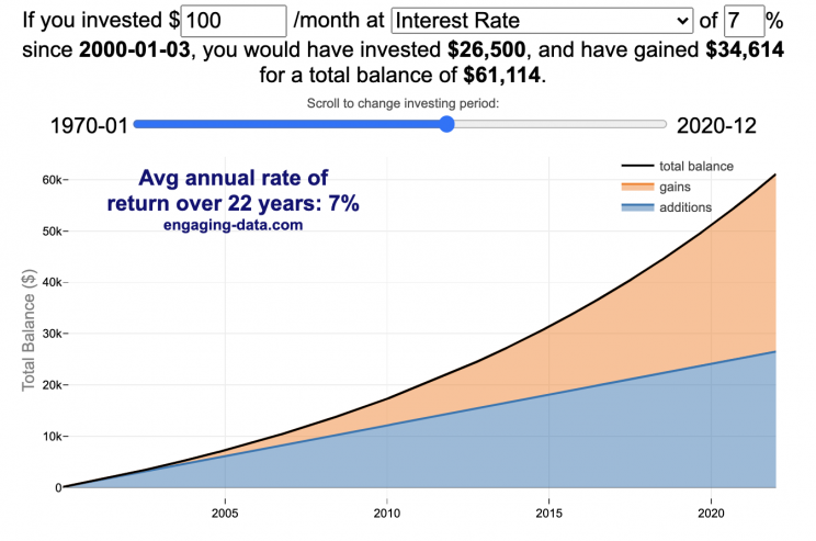
Calculate returns on regular, periodic investments
This calculator lets you visualize the value of investing regularly. It lets you calculate the compounding from a simple interest rate or looking at specific returns from the stock market indexes or a few different individual stocks.
Instructions
- Enter the amount of money to be invested monthly
- Choose to use an interest rate (and enter a specific rate) or
- Choose a stock market index or individual stock
- Use the slider to change the initial starting date of your periodic investments – You can go as far back as 1970 or the IPO date of the stock if it is later than that.
- Use the “Generate URL to Share” button to create a special URL with the specific parameters of your choice to share with others – the URL will appear in your browser’s address bar.
You can hover over the graph to see the split between the money you invested and the gains from the investment. In most cases (unless returns are very high), initially the investments are the large majority of the total balance, but over time the gains compound and eventually, it is those gains rather than the initial investments that become the majority of the total.
Some of the tech stocks included in the dropdown list have very high annualized returns and thus the gains quickly overtake the additions as the dominant component of the balance and you can make a great deal of money fairly quickly.
It becomes clearer as you move the slider around, that longer investing time periods are the key to increasing your balance, so building financial prosperity through investing is generally more of a marathon and not really a sprint. However, if you invest in individual stocks and pick a good one, you can speed up that process, though it’s not necessarily the most advisable way to proceed. Lots of people underperform the market (i.e. index funds) or even lose money by trying to pick big winners.
Understanding the Calculations
Calculating compound returns is relatively easy and is just a matter of consecutively multiplying the return. If the return is 7% for 5 years, that is equal to multiplying 1.07 five times, i.e. 1.075 = 1.402 (or a 40.2% gain).
In this case, we are adding additional investments each month but the idea is the same. Take the amount of money (or value of shares) and multiply by the return (>1 if positive or <1 for negative returns) after each period of the analysis.
Sources and Tools:
Stock and index monthly data is downloaded from Yahoo! finance is downloaded regularly using a python script.
The graph is created using the open-source Plotly javascript visualization library, as well as HTML, CSS and Javascript code to create interactivity and UI.

Early Retirement Calculators and Tools
Interested in Early Retirement or FIRE (Financial Independence to Retire Early)?
Here are some interactive and educational planning tools that I developed to help you understand the concepts of FIRE and calculate how long it will take to achieve retirement and how likely you are to survive retirement. Click on the tools below to try them out.
Financial Independence Calculators
Regardless of where you are on your path to FIRE, there are several types of tools that are useful:
Planning to get to retirement
How long and how safe will your retirement be?
Rich, Broke or Dead? Will your Money Last Through Early Retirement?
Simulating retirement portfolio survival probability and human longevity
Determining the appropriate withdrawal rate (i.e. is 4% best?)
Understanding portfolio simulations and historical cycles
Interactive tool lets you explore the concept of historical simulations and understand how to determine a safe withdrawal rate
Tracking Progress to Retirement Target
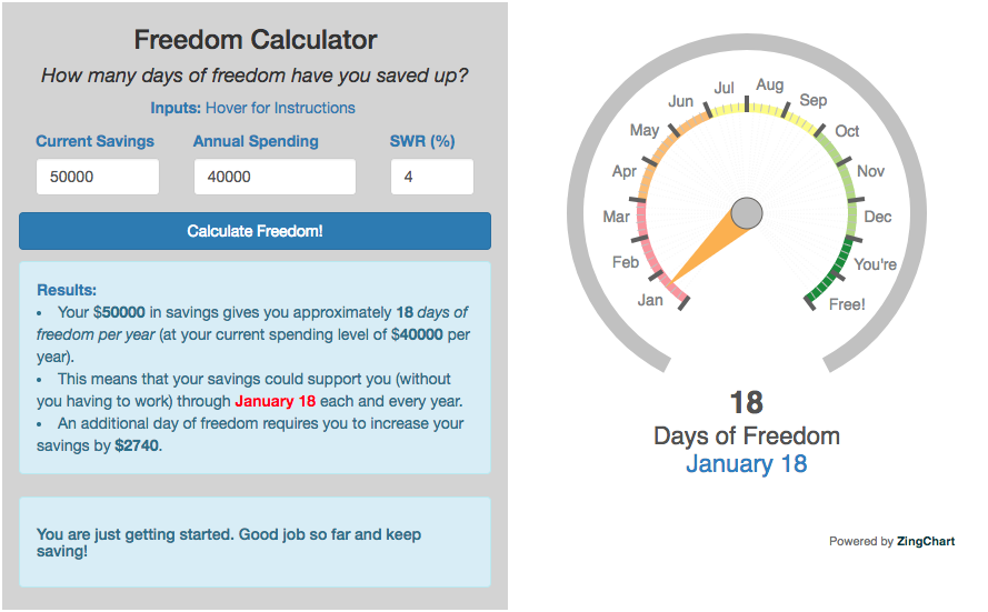
Financial freedom calculator / calendar
Track your progress to retirement by calculating days of “freedom”, the number of days your savings could support you per year
These tools all focus on the concept of FIRE. FIRE is the concept that revolves around saving and investing to achieve Financial Independence (FI) and to potentially Retire Early (RE). One of the core concepts is that once you can save up enough money, you can retire by withdrawing a fraction of this money annually to cover your living expenses. Other important topics related to this core concept have to do with reducing spending so you can save money and investing so your money can grow and sustain your retirement over many decades.
Other visualizations and tools related to Financial Independence
These tools relate to taxes and stock market returns.
Calculating Returns from Periodic Investments
Visualizing Market Returns
Understanding Market Timing
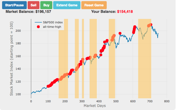
Market Timing Game
How difficult is it to time the stock market?
Income Taxes
Income Tax Bracket Calculator
Tax bracket calculator to visualize how income and capital gains taxed
Data Sources and Tools:
See the individual tool to learn more about how it was made.
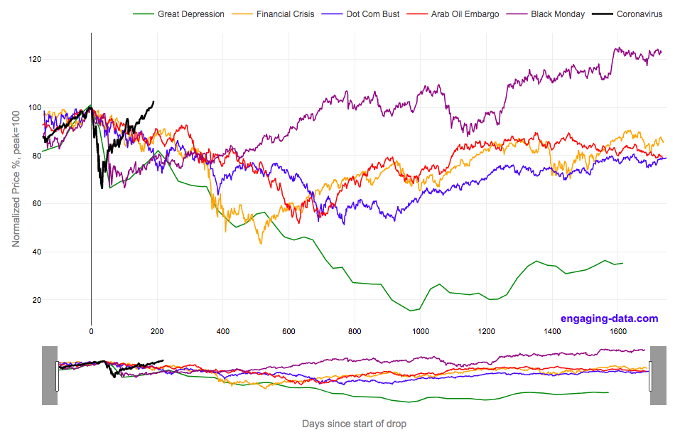
2020 Stock Market Drop Compared to other Bear Markets
2020’s stock market drop was unprecedented for the speed of the drop and also the speed of the recovery
This graph shows the stock market drops from the 2020 and other bear markets normalized so that the peak is at 100% at day 0. This lets you see the severity and duration of different bear markets from the Great Depression (1929), the Dot Com Bust (2000), and the Financial Crisis (2008) and other drops over 30%.
The coronavirus pandemic has significantly disrupted the global economy. Q2 GDP in the United States declined at an annualized rate of 32% and US unemployment reaching 15% due to coronavirus induced business shutdowns.
However, the stock market drop (represented by the S&P500 index) in late February and early March 2020 has somewhat surprisingly rebounded and reached a new all-time-high in August 2020, even as unemployment and GDP output has continued to falter. There certainly seems to be a disconnect between the fundamentals of the economy and the stock market.
Will the recovery in the stock markets continue or will it begin to align more closely with the fundamentals of the economy?
There are many proposed reasons why this disconnect is happening. The Federal Reserve actions to increase liquidity and prop up the stock market. The heavy weighting of tech in the S&P500 and the pandemic’s boost to many tech company’s business (i.e. Amazon, Zoom, Apple). Whatever the reason, the question of whether the market can continue at this pace or will have a correction is important and one to watch.
Data for the S&P500 price is daily from 1950 onward but before 1950, the data I had available was on a monthly basis. I interpolated this monthly data to create daily data, so not all the data is 100% accurate for any given day before 1950. Data for 2020 will continue to be updated daily.
Source and Tools:
Data on historical S&P500 prices is from Yahoo! Finance and downloaded and cleaned with a python script. Graph is made using the plotly open source javascript library.
The 4% Rule, Trinity Study and Safe Withdrawal Rates Calculator

This 4% rule early retirement calculator is designed to help you learn about safe withdrawal rates for early retirement withdrawals and the 4% rule. Use it with your own numbers to determine how much money you can withdraw in retirement and how long your money will last.
UPDATE: April 2020: I’ve updated the market data to include annual data up to and including 2019.
I also fixed a small bug which affected real stock market returns so you may see a very slight reduction in average returns and success rates.
Instructions for using the calculator:
This calculator is designed to let you learn as you play with it. Tweaking inputs and assumptions and hovering and clicking on results will help you to really gain a feel for how withdrawal rates and market returns affect your chance of retirement success (i.e. making it through without running out of money).
Inputs You Can Adjust:
- Spending and initial balance – This will affect your withdrawal rate. The withdrawal rate is really the only thing that is important (doubling spending and retirement savings will still yield the same success rate).
- Asset allocation – Raise or lower your risk tolerance by holding more or less stock vs bonds
- Adjust retirement length – This affects the number of historical cycles that are used in the simulation, but also increases risk of failure.
- Add tax rates and investment fees – these will put a drag (i.e. lower) market returns and lower success rates
Options for Visualization:
- Display all cycles – this is the mess of spaghetti like curves that show all historical cycle simulations
- Display percentiles – this aggregates the simulations into percentiles to show most likely outcomes
- Hover/Click on legend years – this will allow you to highlight a single historical cycle (you can also use the arrow keys to step through historical cycles)
- Bottom graph can show either the sequence of returns (with average returns in 5 year periods) for a single historical cycle or distributions of returns in our historical data (1871 to 2016) and a single historical cycle. You can choose to look at returns for stocks, bonds or your specific asset allocation.
- The graph on the right shows a histogram of the ending balance of each historical cycle and color codes them to show percentiles.
What is the 4% Rule?
The 4% rule is a “rule of thumb” relating to safe retirement withdrawals. It states that if 4% of your retirement savings can cover one years worth of retirement spending (an alternative way to phrase it is if you have saved up 25 times your annual retirement spending), you have a high likelihood of having enough money to last a 30+ year retirement. A key point is that the probabilities shown here are just historical frequencies and not a guarantee of the future. However, if your plan has a high success rate (95+%) in these simulations, this implies that retirement plan should be okay unless future returns are on par with some of the worst in history.
The overall goal of this rule and analysis is identifying a “safe withdrawal rate” or SWR for retirement. A withdrawal rate is the percentage of your money that you withdraw from your retirement savings each year. If you’ve saved up $1 million and withdraw $100,000 each year, that is a 10% withdrawal rate.
The “safe” part of the withdrawal rate relates to the fact that if your investments generally grow by more than your annual spending, then your retirement savings should last over the length of your retirement. But average returns do not tell the whole story as the sequence of returns also plays a very important role, as will be discussed later.
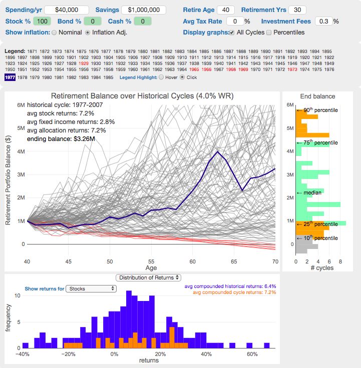
One way to test this is through a backtesting simulation which forms the basis for the “Trinity Study”.
What is the Trinity Study?
The “Trinity Study” is a paper and analysis of this topic entitled “Retirement Spending: Choosing a Sustainable Withdrawal Rate,” by Philip L. Cooley, Carl M. Hubbard, and Daniel T. Walz, three professors at Trinity University. This study is a backtesting simulation that uses historical data to see if a retirement plan (i.e. a withdrawal rate) would have survived under past economic conditions. The approach is to take a “historical cycle”, i.e. a series of years from the past and test your retirement plan and see if it runs out of money (“fails”) or not (“survives”).
How do you test withdrawal rate?
Given modern equity and bond market data only stretches back about 150 years, there is some, but not a huge amount of data to use in this simulation. One example of a 30 year historical cycle would be 1900 to 1930, and another is 1970 to 2000. The Trinity study and this calculator tests withdrawal rates against all historical periods from 1871 until the present (e.g. 1871 to 1901, 1872 to 1902, 1873 to 1903, . . . . 1986 to 2016). Then across this 115 different historical cycles, it determines how many of these survived and how many failed.
The thinking is that if your retirement plan can survive periods that include recessions, depressions, world wars, and periods of high inflation, then perhaps it can survive the next 30-50 years.
The 4% rule that comes out of these studies basically states that a 4% withdrawal rate (e.g. $40,000 annual spending on a $1,000,000 retirement portfolio) will survive the vast majority of historical cycles (~96%). If you raise your withdrawal rate, the rate of failure increases, while if you lower your withdrawal rate, your rate of failure decreases.
The goal of this tool is to help you understand the mechanics of the a historical cycle simulation like was used in the Trinity Study and how the 4% rule came to be. This understanding can help you better plan for retirement with the uncertainty that goes along with planning 30+ years into the future. If you want to also see how longevity and life expectancy play a role in retirement planning, you can take a look at the Rich, Broke and Dead calculator.
This post and tool is a work in progress. I have a number of ideas that I will implement and add to it to help improve the visualization and clarity of these concepts.
If 4% is a conservative rate, what is the maximum withdrawal rate?
The future is unlikely to be identical to any of the set of historical cycles that are used in this simulation. And yet, there are enough years of data that there are a fairly large set of possible outcomes from running a simulation with this input data. One way to understand this variation is to see in the main graph above that the ending balance can potentially vary by more than $5 million dollars on an inflation adjusted basis on a starting balance of $1 million.
Another way to see this same variation in market returns is by looking at maximum withdrawal rate. This is the highest amount that you could withdraw annually over your retirement and (just barely) not run out of money by the end of your retirement.
This graph shows the maximum withdrawal rate for a given historical cycle (i.e. 1871 to 1901). For example, in the 1871 to 1901 30 year historical cycle, you could have used an 8.8% withdrawal rate (inflation adjusted $80,000 withdrawal annually on a $1 million initial investment balance) and not run out of money. This is because the sequence of market (stock and bond) returns in this historical cycle were able to (barely) outpace the rate of withdrawals at the end of the 30 year retirement period. Many other cycles show lower successful withdrawal rates, because those cycles had poorer sequences of returns, while some had higher maximum withdrawal rates.
The graph also highlights those cycles that show a maximum withdrawal rate below 4% in red, while all others are shown in green. Most of these withdrawal rates are well over 4%, with some quite a bit higher. This again shows that if the future is somewhat like one of these historical cycles, most likely a 4% withdrawal rate will be enough for you to retire without running out of money and that it is likely that you could end up with more money than you started.
Data source and Tools Historical Stock/Bond and Inflation data comes from Prof. Robert Shiller. Javascript is used to create the interactive calculator tool and the create the code in the simulations to test each historical cycle and aggregate the results, and graphed using Plot.ly open-source, javascript graphing library.
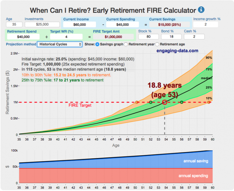
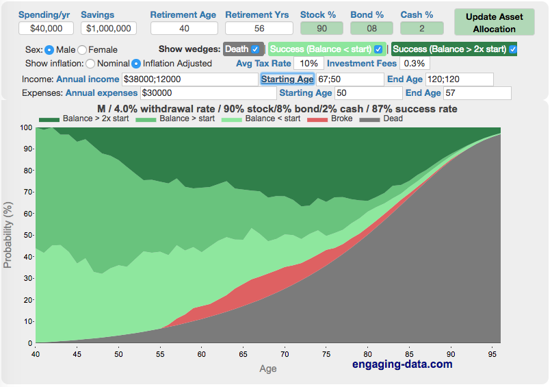
Rich, Broke or Dead? Post-Retirement FIRE Calculator: Visualizing Early Retirement Success and Longevity Risk
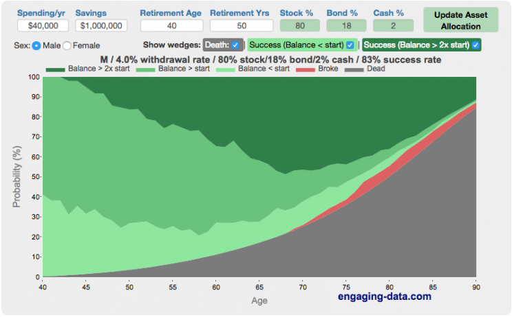
Rich, Broke or Dead?
One of the key issues with retiring is ensuring that the money you have saved will not be exhausted during your retirement. This is also known as Longevity Risk and is especially important if you want to retire early, since your retirement could be 50 years long (or more). This interactive post-retirement fire calculator and visualization looks at the question of whether your retirement savings can last long enough to support your retirement spending and combines it with average US life expectancy values to get a fuller picture of the likelihood of running out of money before you die.
It helps to answer the question: If I start out with $X dollars at the beginning of my retirement, will I run out of money before I die?
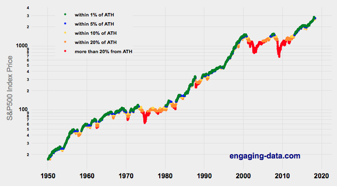
Should You Invest Or Wait When The Stock Market Is At An All-Time-High?

Whenever there’s been an extended bull run, one question that comes to mind “Should I invest in the market now, or wait until a pullback?” The question comes about because of fear and loss aversion: fear that the market will drop right after they invest and the observation that people want to avoid losses more than they value gains. However, historically, the correct answer, at least over the last 69 years, has been to invest and not to try to time the market.
This was also demonstrated in the Market Timing Game; that people are pretty bad at predicting the direction of the markets and given the upward trend of the market, it’s simpler and more likely than not, better to just stay invested in the market. The corollary to this is that when you have additional money to invest (e.g. from regular savings from your paycheck or a one-time event like the sale of a house), it makes sense to invest the money and not worry about whether the market is at a high or low point. Some graphs that look at the distribution of returns when the market is at an all time high (ATH) can help answer this question of whether you expect to see worse returns than investing at other times.
(more…)
Compound Interest and Stock Returns Calculator
Calculate returns on regular, periodic investments
This calculator lets you visualize the value of investing regularly. It lets you calculate the compounding from a simple interest rate or looking at specific returns from the stock market indexes or a few different individual stocks.
Instructions
- Enter the amount of money to be invested monthly
- Choose to use an interest rate (and enter a specific rate) or
- Choose a stock market index or individual stock
- Use the slider to change the initial starting date of your periodic investments – You can go as far back as 1970 or the IPO date of the stock if it is later than that.
- Use the “Generate URL to Share” button to create a special URL with the specific parameters of your choice to share with others – the URL will appear in your browser’s address bar.
You can hover over the graph to see the split between the money you invested and the gains from the investment. In most cases (unless returns are very high), initially the investments are the large majority of the total balance, but over time the gains compound and eventually, it is those gains rather than the initial investments that become the majority of the total.
Some of the tech stocks included in the dropdown list have very high annualized returns and thus the gains quickly overtake the additions as the dominant component of the balance and you can make a great deal of money fairly quickly.
It becomes clearer as you move the slider around, that longer investing time periods are the key to increasing your balance, so building financial prosperity through investing is generally more of a marathon and not really a sprint. However, if you invest in individual stocks and pick a good one, you can speed up that process, though it’s not necessarily the most advisable way to proceed. Lots of people underperform the market (i.e. index funds) or even lose money by trying to pick big winners.
Understanding the Calculations
Calculating compound returns is relatively easy and is just a matter of consecutively multiplying the return. If the return is 7% for 5 years, that is equal to multiplying 1.07 five times, i.e. 1.075 = 1.402 (or a 40.2% gain).
In this case, we are adding additional investments each month but the idea is the same. Take the amount of money (or value of shares) and multiply by the return (>1 if positive or <1 for negative returns) after each period of the analysis.
Sources and Tools:
Stock and index monthly data is downloaded from Yahoo! finance is downloaded regularly using a python script.
The graph is created using the open-source Plotly javascript visualization library, as well as HTML, CSS and Javascript code to create interactivity and UI.
Early Retirement Calculators and Tools
Interested in Early Retirement or FIRE (Financial Independence to Retire Early)?
Here are some interactive and educational planning tools that I developed to help you understand the concepts of FIRE and calculate how long it will take to achieve retirement and how likely you are to survive retirement. Click on the tools below to try them out.
Financial Independence Calculators
Regardless of where you are on your path to FIRE, there are several types of tools that are useful:
Planning to get to retirement

How long and how safe will your retirement be?
Rich, Broke or Dead? Will your Money Last Through Early Retirement?
Simulating retirement portfolio survival probability and human longevity
Determining the appropriate withdrawal rate (i.e. is 4% best?)
Understanding portfolio simulations and historical cycles
Interactive tool lets you explore the concept of historical simulations and understand how to determine a safe withdrawal rate
Tracking Progress to Retirement Target
Financial freedom calculator / calendar
Track your progress to retirement by calculating days of “freedom”, the number of days your savings could support you per year
These tools all focus on the concept of FIRE. FIRE is the concept that revolves around saving and investing to achieve Financial Independence (FI) and to potentially Retire Early (RE). One of the core concepts is that once you can save up enough money, you can retire by withdrawing a fraction of this money annually to cover your living expenses. Other important topics related to this core concept have to do with reducing spending so you can save money and investing so your money can grow and sustain your retirement over many decades.
Other visualizations and tools related to Financial Independence
These tools relate to taxes and stock market returns.
Calculating Returns from Periodic Investments
Visualizing Market Returns
Understanding Market Timing
How difficult is it to time the stock market?
Market Timing Game
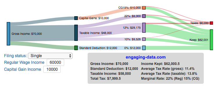
Income Taxes
Tax bracket calculator to visualize how income and capital gains taxed
Income Tax Bracket Calculator
Data Sources and Tools:
See the individual tool to learn more about how it was made.
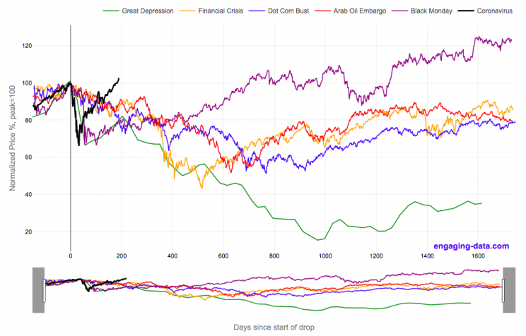
2020 Stock Market Drop Compared to other Bear Markets
2020’s stock market drop was unprecedented for the speed of the drop and also the speed of the recovery
This graph shows the stock market drops from the 2020 and other bear markets normalized so that the peak is at 100% at day 0. This lets you see the severity and duration of different bear markets from the Great Depression (1929), the Dot Com Bust (2000), and the Financial Crisis (2008) and other drops over 30%.
The coronavirus pandemic has significantly disrupted the global economy. Q2 GDP in the United States declined at an annualized rate of 32% and US unemployment reaching 15% due to coronavirus induced business shutdowns.
However, the stock market drop (represented by the S&P500 index) in late February and early March 2020 has somewhat surprisingly rebounded and reached a new all-time-high in August 2020, even as unemployment and GDP output has continued to falter. There certainly seems to be a disconnect between the fundamentals of the economy and the stock market.
Will the recovery in the stock markets continue or will it begin to align more closely with the fundamentals of the economy?
There are many proposed reasons why this disconnect is happening. The Federal Reserve actions to increase liquidity and prop up the stock market. The heavy weighting of tech in the S&P500 and the pandemic’s boost to many tech company’s business (i.e. Amazon, Zoom, Apple). Whatever the reason, the question of whether the market can continue at this pace or will have a correction is important and one to watch.
Data for the S&P500 price is daily from 1950 onward but before 1950, the data I had available was on a monthly basis. I interpolated this monthly data to create daily data, so not all the data is 100% accurate for any given day before 1950. Data for 2020 will continue to be updated daily.
Source and Tools:
Data on historical S&P500 prices is from Yahoo! Finance and downloaded and cleaned with a python script. Graph is made using the plotly open source javascript library.
The 4% Rule, Trinity Study and Safe Withdrawal Rates Calculator
This 4% rule early retirement calculator is designed to help you learn about safe withdrawal rates for early retirement withdrawals and the 4% rule. Use it with your own numbers to determine how much money you can withdraw in retirement and how long your money will last.
UPDATE: April 2020: I’ve updated the market data to include annual data up to and including 2019.
I also fixed a small bug which affected real stock market returns so you may see a very slight reduction in average returns and success rates.
Instructions for using the calculator:
This calculator is designed to let you learn as you play with it. Tweaking inputs and assumptions and hovering and clicking on results will help you to really gain a feel for how withdrawal rates and market returns affect your chance of retirement success (i.e. making it through without running out of money).
Inputs You Can Adjust:
- Spending and initial balance – This will affect your withdrawal rate. The withdrawal rate is really the only thing that is important (doubling spending and retirement savings will still yield the same success rate).
- Asset allocation – Raise or lower your risk tolerance by holding more or less stock vs bonds
- Adjust retirement length – This affects the number of historical cycles that are used in the simulation, but also increases risk of failure.
- Add tax rates and investment fees – these will put a drag (i.e. lower) market returns and lower success rates
Options for Visualization:
- Display all cycles – this is the mess of spaghetti like curves that show all historical cycle simulations
- Display percentiles – this aggregates the simulations into percentiles to show most likely outcomes
- Hover/Click on legend years – this will allow you to highlight a single historical cycle (you can also use the arrow keys to step through historical cycles)
- Bottom graph can show either the sequence of returns (with average returns in 5 year periods) for a single historical cycle or distributions of returns in our historical data (1871 to 2016) and a single historical cycle. You can choose to look at returns for stocks, bonds or your specific asset allocation.
- The graph on the right shows a histogram of the ending balance of each historical cycle and color codes them to show percentiles.
What is the 4% Rule?
The 4% rule is a “rule of thumb” relating to safe retirement withdrawals. It states that if 4% of your retirement savings can cover one years worth of retirement spending (an alternative way to phrase it is if you have saved up 25 times your annual retirement spending), you have a high likelihood of having enough money to last a 30+ year retirement. A key point is that the probabilities shown here are just historical frequencies and not a guarantee of the future. However, if your plan has a high success rate (95+%) in these simulations, this implies that retirement plan should be okay unless future returns are on par with some of the worst in history.
The overall goal of this rule and analysis is identifying a “safe withdrawal rate” or SWR for retirement. A withdrawal rate is the percentage of your money that you withdraw from your retirement savings each year. If you’ve saved up $1 million and withdraw $100,000 each year, that is a 10% withdrawal rate.
The “safe” part of the withdrawal rate relates to the fact that if your investments generally grow by more than your annual spending, then your retirement savings should last over the length of your retirement. But average returns do not tell the whole story as the sequence of returns also plays a very important role, as will be discussed later.
One way to test this is through a backtesting simulation which forms the basis for the “Trinity Study”.
What is the Trinity Study?
The “Trinity Study” is a paper and analysis of this topic entitled “Retirement Spending: Choosing a Sustainable Withdrawal Rate,” by Philip L. Cooley, Carl M. Hubbard, and Daniel T. Walz, three professors at Trinity University. This study is a backtesting simulation that uses historical data to see if a retirement plan (i.e. a withdrawal rate) would have survived under past economic conditions. The approach is to take a “historical cycle”, i.e. a series of years from the past and test your retirement plan and see if it runs out of money (“fails”) or not (“survives”).
How do you test withdrawal rate?
Given modern equity and bond market data only stretches back about 150 years, there is some, but not a huge amount of data to use in this simulation. One example of a 30 year historical cycle would be 1900 to 1930, and another is 1970 to 2000. The Trinity study and this calculator tests withdrawal rates against all historical periods from 1871 until the present (e.g. 1871 to 1901, 1872 to 1902, 1873 to 1903, . . . . 1986 to 2016). Then across this 115 different historical cycles, it determines how many of these survived and how many failed.
The thinking is that if your retirement plan can survive periods that include recessions, depressions, world wars, and periods of high inflation, then perhaps it can survive the next 30-50 years.
The 4% rule that comes out of these studies basically states that a 4% withdrawal rate (e.g. $40,000 annual spending on a $1,000,000 retirement portfolio) will survive the vast majority of historical cycles (~96%). If you raise your withdrawal rate, the rate of failure increases, while if you lower your withdrawal rate, your rate of failure decreases.
The goal of this tool is to help you understand the mechanics of the a historical cycle simulation like was used in the Trinity Study and how the 4% rule came to be. This understanding can help you better plan for retirement with the uncertainty that goes along with planning 30+ years into the future. If you want to also see how longevity and life expectancy play a role in retirement planning, you can take a look at the Rich, Broke and Dead calculator.
This post and tool is a work in progress. I have a number of ideas that I will implement and add to it to help improve the visualization and clarity of these concepts.
If 4% is a conservative rate, what is the maximum withdrawal rate?
The future is unlikely to be identical to any of the set of historical cycles that are used in this simulation. And yet, there are enough years of data that there are a fairly large set of possible outcomes from running a simulation with this input data. One way to understand this variation is to see in the main graph above that the ending balance can potentially vary by more than $5 million dollars on an inflation adjusted basis on a starting balance of $1 million.
Another way to see this same variation in market returns is by looking at maximum withdrawal rate. This is the highest amount that you could withdraw annually over your retirement and (just barely) not run out of money by the end of your retirement.
This graph shows the maximum withdrawal rate for a given historical cycle (i.e. 1871 to 1901). For example, in the 1871 to 1901 30 year historical cycle, you could have used an 8.8% withdrawal rate (inflation adjusted $80,000 withdrawal annually on a $1 million initial investment balance) and not run out of money. This is because the sequence of market (stock and bond) returns in this historical cycle were able to (barely) outpace the rate of withdrawals at the end of the 30 year retirement period. Many other cycles show lower successful withdrawal rates, because those cycles had poorer sequences of returns, while some had higher maximum withdrawal rates.
The graph also highlights those cycles that show a maximum withdrawal rate below 4% in red, while all others are shown in green. Most of these withdrawal rates are well over 4%, with some quite a bit higher. This again shows that if the future is somewhat like one of these historical cycles, most likely a 4% withdrawal rate will be enough for you to retire without running out of money and that it is likely that you could end up with more money than you started.
Data source and Tools Historical Stock/Bond and Inflation data comes from Prof. Robert Shiller. Javascript is used to create the interactive calculator tool and the create the code in the simulations to test each historical cycle and aggregate the results, and graphed using Plot.ly open-source, javascript graphing library.
Rich, Broke or Dead? Post-Retirement FIRE Calculator: Visualizing Early Retirement Success and Longevity Risk
Rich, Broke or Dead?
One of the key issues with retiring is ensuring that the money you have saved will not be exhausted during your retirement. This is also known as Longevity Risk and is especially important if you want to retire early, since your retirement could be 50 years long (or more). This interactive post-retirement fire calculator and visualization looks at the question of whether your retirement savings can last long enough to support your retirement spending and combines it with average US life expectancy values to get a fuller picture of the likelihood of running out of money before you die.
It helps to answer the question: If I start out with $X dollars at the beginning of my retirement, will I run out of money before I die?
Should You Invest Or Wait When The Stock Market Is At An All-Time-High?
Whenever there’s been an extended bull run, one question that comes to mind “Should I invest in the market now, or wait until a pullback?” The question comes about because of fear and loss aversion: fear that the market will drop right after they invest and the observation that people want to avoid losses more than they value gains. However, historically, the correct answer, at least over the last 69 years, has been to invest and not to try to time the market.
This was also demonstrated in the Market Timing Game; that people are pretty bad at predicting the direction of the markets and given the upward trend of the market, it’s simpler and more likely than not, better to just stay invested in the market. The corollary to this is that when you have additional money to invest (e.g. from regular savings from your paycheck or a one-time event like the sale of a house), it makes sense to invest the money and not worry about whether the market is at a high or low point. Some graphs that look at the distribution of returns when the market is at an all time high (ATH) can help answer this question of whether you expect to see worse returns than investing at other times.
(more…)
Recent Comments