Posts for Tag: graph
California Rainfall Totals

How do current California rainfall and precipitation totals compare with Historical Averages?
If you are lookin at this visualization, it’s likely winter in California and that means the rainy season (snowy in the mountains). I wanted to visualize how the current year compares with historical levels for this time of year. I used data for California rainfall totals from the California Department of Water Resources. Other California water-related visualizations include reservoir levels in the state as well.
There are three sets of stations that are tracked in the data and these plots:
- Northern Sierra 8-station index
- Tulare Basin 6-station index
- San Joaquin 5-station index
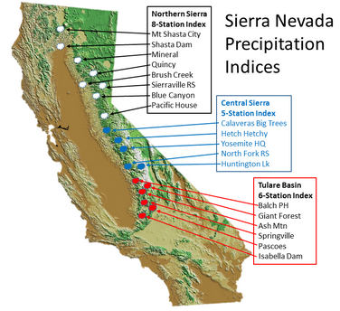
These stations are tracked because they provide important information about the state’s water supply (most of which originates from the Sierra Nevada Mountains). Data from the CDEC website appears to be updated at around 8:30am PST each day.
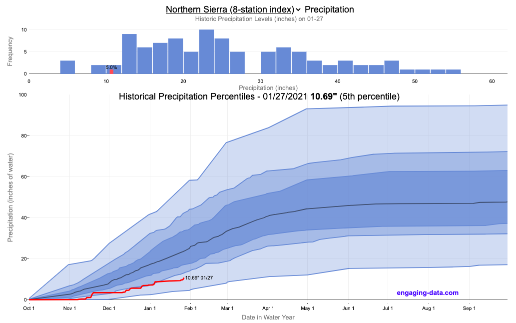
The visualization consists of two primary graphs both of which show the range of historical values for precipitation. The top graph is a histogram of water year precipitation totals on the specified date (in blue) as well as the precipitation total for the current water year in red.
The second graph shows the percentiles of precipitation over the course of the historical water year, spreading out like a cone from the start of the water year (October 1). You can see the current water year plotted on this to show how it compares to historical values. It also shows the present precipitation level and its percentile within the historical data for the day of the water year.
You can hover (or click) on the graph to audit the data a little more clearly.
Sources and Tools
Data is downloaded from the California Data Exchange Center website of the California Department of Water Resources using a python script. The data is processed in javascript and visualized here using HTML, CSS and javascript and the open source Plotly javascript graphing library.
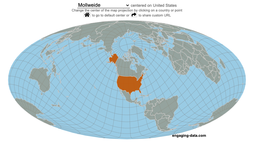
Country Centered Map Projections

What does it look like if you center a map on a specific country? Click on a country to find out.
World maps are used to show the geographic relationships between the countries and regions of the world. Their design shapes our perception of the world and those relationships. Two of the important aspects of map design are the choice of map projection and what is centered in the map. The idea for this map dataviz is to let users create their own country centered map by centering the map where you choose (on a country of your choice or a specific point) and the map projection.
As discussed in my real country size mercator map, there aren’t any perfect map projections as you try to represent the 3-dimensional surface of a sphere on a 2-dimensional map. Each map projection has advantages and disadvantages.
Instructions
- Click on a country or point on the ocean to center the map projection onto this area
You can choose between the following map projections:
- Orthographic (globe) – a map projection that looks like a globe
- Mercator – a very common cylindrical map projection used in many web maps which expands sizes of land near the top and bottom edges
- Mollweide – a pseudocylindrical projection that maintains equal area of land masses. Areas near the top and bottom edges can be distorted
- Equirectangular – another cylindrical projection but latitude lines are kept equidistant. Areas near top and bottom edges of map are wider than in reality.
- Gall Peters – an equal area cylindrical projection that stretches shapes vertically at the equator and shrinks shapes vertically at the poles.
In addition, you can:
- Rotate the map in increments of 45 degrees using the ⟲ and ⟳ buttons.
- Share maps of your home country, chosen map projection and rotation by clicking on the share button (and copying the URL).
The number of different maps you can create is quite large and will give you a different and often unusual perspective on the world. If you choose the cylindrical projections (Mercator, equirectangular, Gall Peters) you will see some interesting distortions when you focus on different countries or regions. The reasoning is that because the map is rectangular (i.e. the longitude lines are kept parallel on the map, while in reality longitude lines converge at the poles), land masses near the top and bottom of the map will grow as they are widened (and in the case of the Mercator, made taller) to accommodate the map projection. Because the Orthographic and Mollweide projections have converging longitude lines, they do not exhibit the same level of distortion.
If you are interested in map projections, they are described in this wikipedia article. For a cylindrical projections, you can think of it as encircling the globe with a rolled surface which forms the side of a cylinder. See this image from wikipedia.

In the standard projection, the globe is touching this cylinder at the equator, but this map lets you move any country or point to the place where it intersects the cylinder and then projects the land masses onto the cylinder. Land masses at the top and bottom of the sphere in this orientation will be more distorted at top and bottom of the map projections in these cylindrical projections.
Sources and Tools:
This map was made using the open-source, d3 javascript dataviz library and based on Mike Bostock’s observable maps notebook.
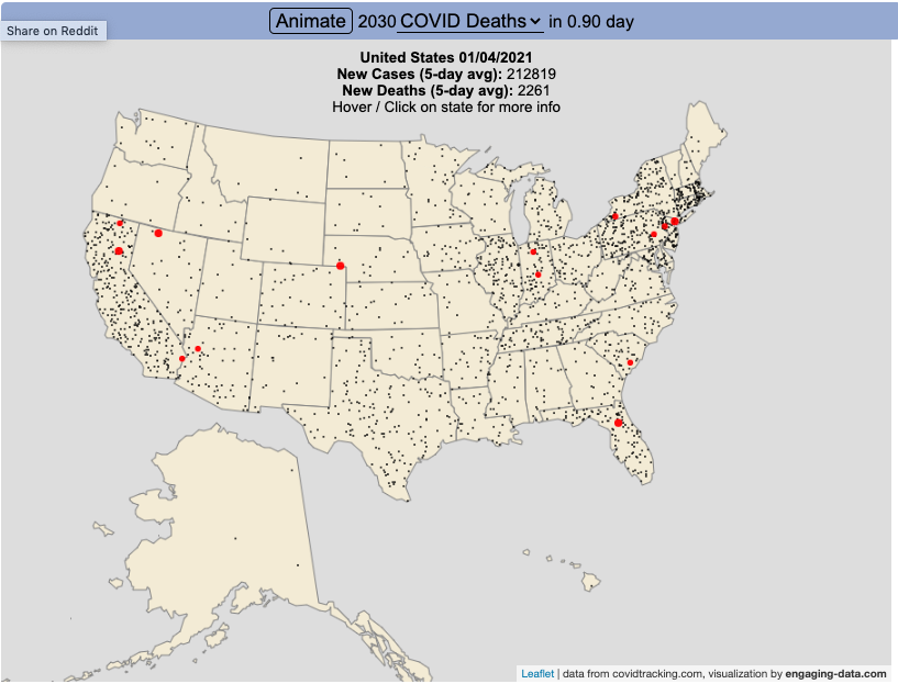
Animation of Coronavirus Cases and Deaths in US

Visualize the large number of coronavirus cases and deaths in the US each day/hour in about 10 seconds
The rate of COVID-19 deaths and cases in the US is crazy high after the 2020 winter holidays and maybe still be going up. This visualization shows the number of COVID cases that occur in one hour or the COVID deaths that occur in one day based on the average of the last five days. This is another attempt to show the true scale of how many cases and deaths the US is dealing with, since it is often hard to understand large numbers. I have also attempted to show the scale of US deaths/cases here and here. Unfortunately, there are so many people getting sick and dying, it’s hard to fathom just how many people this actually is.
The 5-day averaging was done to smooth out any peaks and troughs in data reporting due to weekends/holidays, since I noticed that some states were literally reporting zero COVID cases some days while reporting many hundreds or thousands of cases other days.
The dots shown on the animation are located in the state that the cases or deaths occur but are randomly spread out within the state. This is done for visual clarity since if they were shown in their actual location, most of the dots would be overlapping in urban, high density areas. This approach lets you see which states have high COVID instances but still locate them by state.
You can share this animation by putting ?cat=deaths or ?cat=cases behind the url or copying and sharing one of these links:
https://engaging-data.com/animation-of-us-covid/?cat=cases
https://engaging-data.com/animation-of-us-covid/?cat=deaths
Sources and Tools:
The coronavirus data comes from the covidtracking.com API. The data is parsed daily using a custom python script and visualizations are made using the open-source Leaflet javascript mapping library and the interface and animation are made using HTML/CSS/javascript.
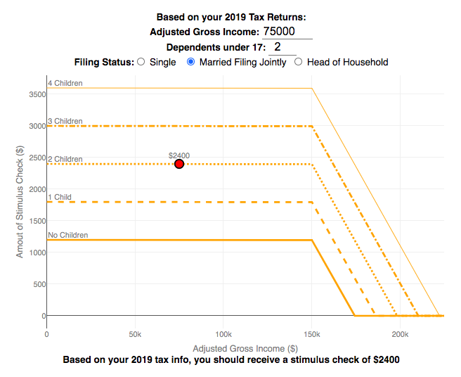
Stimulus Check Calculator (Late 2020 & Early 2021)

How much money can you expect in your stimulus check?
Updated to include the $1400 stimulus payment per adult and dependent in March 2021.
Use this stimulus check calculator to figure out how much you will receive in your thrid stimulus check.
On December 21, 2020, Congress passed a $900 billion dollar stimulus package in response to the COVID pandemic. The bill authorizes economic assistance to Americans in the amount of $600 per person subject to income limits. It also includes expanded unemployment benefits, rental assistance and an extension to the eviction ban. This calculator helps you calculate the amount of stimulus check that you can expect to receive based on your 2019 tax return filing status, adjusted gross income and number of dependents under 17.
Changing the inputs to the calculator, will show you how your expected stimulus check amount will change. The graph shows for a giving filing status (single, married filing jointly or head of household) how the stimulus check amount will change as a function of income and number of children. You can share a URL with specific parameters included
Sounds like some checks may even get to folks at the end of December and many more will get them in January 2021.
On March 5, congress passed the American Rescue Plan which includes $1400 payments for all Americans. The phase out of this stimulus check is different in that over a $10000 range the stimulus goes from 100% to 0% at the phase out threshold, no matter how many dependents you have. This changes things significantly as you’ll see in the calculator.
Sources and Tools:
The stimulus check calculator is made using javascript and the plotly open source graphing library. It is based on news reports of the expected stimulus amounts and income thresholds.
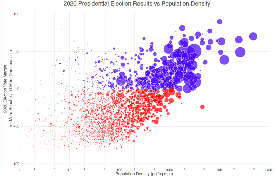
Election Results and Population Density

How do 2020 presidential election results correlate with population density?
The visualization I made about county election results and comparing land area to population size was very popular around the time of the 2020 presidential election. As the counties were represented by population, it was clear that democratic-leaning areas on that map tended to grow in size, while republican-leaning areas tended to shrink. This raised the question of exactly how population density correlates with election results.
Hover over (or click on) the bubbles to see information about the county.
It’s clear there is a very strong correlation between the vote margin and population density. Vote margin is the percentage amount that one candidate beat the other candidate by in the county (0% means a tie while 50% means that one candidate got 75% and the other got 25% of the voteshare). Population density is calculated as people per square mile in the county and is shown in the graph on a log scale, where each major grid line is 10 time greater than the previous one. This is done because there is one to two orders of magnitude difference in the densest counties (in New York City) and even moderately dense counties. There are also several counties with population density below 1 person per square mile (several in Alaska because of the size of their counties) but these are excluded from the graph.
Richmond County, NY (i.e. the Borough of Staten Island) is the densest county (17th densest) in the country that Trump won. The densest counties favored Biden quite heavily as he won 45 of the 50 densest counties in the country, which also tend to have a fairly high population.
This second graph is a histogram that specifically categorizes counties into discreet bins by population density. Note that they are on a log scale as well. You can toggle the graph to show the number of counties won by each candidate or the number of votes won in each of the population density bins. The black line shows the percentage of counties (or votes) won by the democratic candidate (Joe Biden) in each of those bins.
Hover over (or click on) the bars to see information about each county bin.
It’s pretty clear in these graphs that low population density areas clearly favor the republican while the denser areas favor the democrat.
Data and Tools
The 2020 county-level election data is downloaded from the New York Times county election data API and processed using a python script. Population data used is for 2018. The visualization was created using the open-source plotly javascript graphing library.
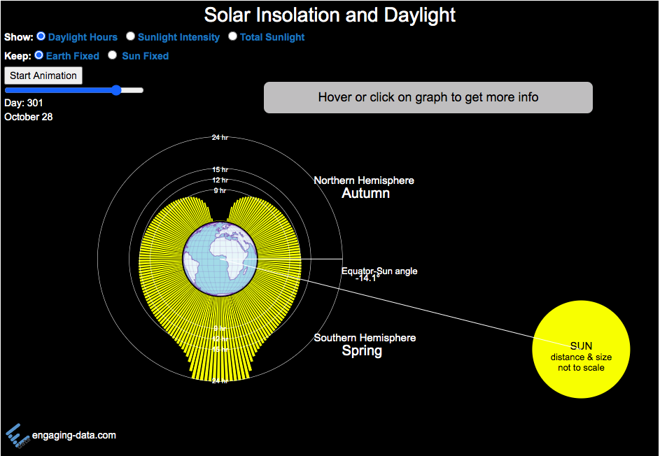
Visualizing the Variation in Sunlight by Latitude and Time of Year

How does the Earth’s tilt affect sunlight and seasons by latitude?
This visualization looks at the variation in the amount of sunlight different latitudes receive over the different days of the year. The amount of sunlight can be classified in 3 different categories:
- The number of hours of sunlight received each day
- The average sunlight intensity (in watts per square meter)
- The total amount of sunlight received across an entire latitude band (in gigawatt hours)
The default view is to see the number of hours of sunlight received by latitude on the current date, shown by the yellow bars. The sunlight hours range from 0 to 24 hours per day while most latitudes range from 9 to 15 hours.
If you hover over the yellow bars (or click on mobile), you will see the exact number of hours for that latitude band for that date.
Pressing the ‘Start Animation’ button, will change the angle of the sun relative to the Earth (as the earth rotates around the sun) and change the distribution of sunlight across the globe. You can view this animation with the earth fixed and the sun angle changing (the default view) or with the sun location fixed and the earth’s tilt changing.
This visualization helps to show how the seasons come about. When the Northern Hemisphere is tilted towards the sun, the amount of sunlight it receives increases (hours of daylight, average sun intensity and total amount of sunlight received). As the hemisphere tilts away from the sun, the amount of sunlight it receives decreases. The amount of sunlight a region receives causes the seasons that we experience.
Interestingly, when you are at the equator, the amount of sunlight per day does not really vary too significantly over the course of the year, whereas if you are near the poles, the difference between summer and winter is very dramatic. When looking at total sunlight received, the poles generally have lower sunlight because even in their summer, there is much lower land area relative to the middle latitudes (close to the equator)
The second visualization shown here shows how the tilt of the Earth’s axis is changed over the course of the Earth’s revolution around the sun. The Earth’s axis is tilted at 23.5 degrees relative to the plane of the Earth’s orbit around the sun. Like the last visualization, you can look at Earth the way we normally do (without the tilted axis) or from the perspective of the sun (with a tilted axis). This makes it a bit clearer why the tilt of the Earth’s axis can change from the north pole angled away to angled towards the sun.
Sources and Tools:
The equations for average daily solar insolation come from online lecture notes from University of Albany. The equations for number of hours of daylight comes from Wikipedia. The visualizations are made using the javascript d3 data visualization library and the interface and animation are made using javascript.
California Rainfall Totals
How do current California rainfall and precipitation totals compare with Historical Averages?
If you are lookin at this visualization, it’s likely winter in California and that means the rainy season (snowy in the mountains). I wanted to visualize how the current year compares with historical levels for this time of year. I used data for California rainfall totals from the California Department of Water Resources. Other California water-related visualizations include reservoir levels in the state as well.
There are three sets of stations that are tracked in the data and these plots:
- Northern Sierra 8-station index
- Tulare Basin 6-station index
- San Joaquin 5-station index
These stations are tracked because they provide important information about the state’s water supply (most of which originates from the Sierra Nevada Mountains). Data from the CDEC website appears to be updated at around 8:30am PST each day.
The visualization consists of two primary graphs both of which show the range of historical values for precipitation. The top graph is a histogram of water year precipitation totals on the specified date (in blue) as well as the precipitation total for the current water year in red.
The second graph shows the percentiles of precipitation over the course of the historical water year, spreading out like a cone from the start of the water year (October 1). You can see the current water year plotted on this to show how it compares to historical values. It also shows the present precipitation level and its percentile within the historical data for the day of the water year.
You can hover (or click) on the graph to audit the data a little more clearly.
Sources and Tools
Data is downloaded from the California Data Exchange Center website of the California Department of Water Resources using a python script. The data is processed in javascript and visualized here using HTML, CSS and javascript and the open source Plotly javascript graphing library.
Country Centered Map Projections
What does it look like if you center a map on a specific country? Click on a country to find out.
World maps are used to show the geographic relationships between the countries and regions of the world. Their design shapes our perception of the world and those relationships. Two of the important aspects of map design are the choice of map projection and what is centered in the map. The idea for this map dataviz is to let users create their own country centered map by centering the map where you choose (on a country of your choice or a specific point) and the map projection.
As discussed in my real country size mercator map, there aren’t any perfect map projections as you try to represent the 3-dimensional surface of a sphere on a 2-dimensional map. Each map projection has advantages and disadvantages.
Instructions
- Click on a country or point on the ocean to center the map projection onto this area
You can choose between the following map projections:
- Orthographic (globe) – a map projection that looks like a globe
- Mercator – a very common cylindrical map projection used in many web maps which expands sizes of land near the top and bottom edges
- Mollweide – a pseudocylindrical projection that maintains equal area of land masses. Areas near the top and bottom edges can be distorted
- Equirectangular – another cylindrical projection but latitude lines are kept equidistant. Areas near top and bottom edges of map are wider than in reality.
- Gall Peters – an equal area cylindrical projection that stretches shapes vertically at the equator and shrinks shapes vertically at the poles.
In addition, you can:
- Rotate the map in increments of 45 degrees using the ⟲ and ⟳ buttons.
- Share maps of your home country, chosen map projection and rotation by clicking on the share button (and copying the URL).
The number of different maps you can create is quite large and will give you a different and often unusual perspective on the world. If you choose the cylindrical projections (Mercator, equirectangular, Gall Peters) you will see some interesting distortions when you focus on different countries or regions. The reasoning is that because the map is rectangular (i.e. the longitude lines are kept parallel on the map, while in reality longitude lines converge at the poles), land masses near the top and bottom of the map will grow as they are widened (and in the case of the Mercator, made taller) to accommodate the map projection. Because the Orthographic and Mollweide projections have converging longitude lines, they do not exhibit the same level of distortion.
If you are interested in map projections, they are described in this wikipedia article. For a cylindrical projections, you can think of it as encircling the globe with a rolled surface which forms the side of a cylinder. See this image from wikipedia.
In the standard projection, the globe is touching this cylinder at the equator, but this map lets you move any country or point to the place where it intersects the cylinder and then projects the land masses onto the cylinder. Land masses at the top and bottom of the sphere in this orientation will be more distorted at top and bottom of the map projections in these cylindrical projections.
Sources and Tools:
This map was made using the open-source, d3 javascript dataviz library and based on Mike Bostock’s observable maps notebook.
Animation of Coronavirus Cases and Deaths in US
Visualize the large number of coronavirus cases and deaths in the US each day/hour in about 10 seconds
The rate of COVID-19 deaths and cases in the US is crazy high after the 2020 winter holidays and maybe still be going up. This visualization shows the number of COVID cases that occur in one hour or the COVID deaths that occur in one day based on the average of the last five days. This is another attempt to show the true scale of how many cases and deaths the US is dealing with, since it is often hard to understand large numbers. I have also attempted to show the scale of US deaths/cases here and here. Unfortunately, there are so many people getting sick and dying, it’s hard to fathom just how many people this actually is.
The 5-day averaging was done to smooth out any peaks and troughs in data reporting due to weekends/holidays, since I noticed that some states were literally reporting zero COVID cases some days while reporting many hundreds or thousands of cases other days.
The dots shown on the animation are located in the state that the cases or deaths occur but are randomly spread out within the state. This is done for visual clarity since if they were shown in their actual location, most of the dots would be overlapping in urban, high density areas. This approach lets you see which states have high COVID instances but still locate them by state.
You can share this animation by putting ?cat=deaths or ?cat=cases behind the url or copying and sharing one of these links:
Sources and Tools:
The coronavirus data comes from the covidtracking.com API. The data is parsed daily using a custom python script and visualizations are made using the open-source Leaflet javascript mapping library and the interface and animation are made using HTML/CSS/javascript.
Stimulus Check Calculator (Late 2020 & Early 2021)
How much money can you expect in your stimulus check?
Updated to include the $1400 stimulus payment per adult and dependent in March 2021.
Use this stimulus check calculator to figure out how much you will receive in your thrid stimulus check.
On December 21, 2020, Congress passed a $900 billion dollar stimulus package in response to the COVID pandemic. The bill authorizes economic assistance to Americans in the amount of $600 per person subject to income limits. It also includes expanded unemployment benefits, rental assistance and an extension to the eviction ban. This calculator helps you calculate the amount of stimulus check that you can expect to receive based on your 2019 tax return filing status, adjusted gross income and number of dependents under 17.
Changing the inputs to the calculator, will show you how your expected stimulus check amount will change. The graph shows for a giving filing status (single, married filing jointly or head of household) how the stimulus check amount will change as a function of income and number of children. You can share a URL with specific parameters included
Sounds like some checks may even get to folks at the end of December and many more will get them in January 2021.
On March 5, congress passed the American Rescue Plan which includes $1400 payments for all Americans. The phase out of this stimulus check is different in that over a $10000 range the stimulus goes from 100% to 0% at the phase out threshold, no matter how many dependents you have. This changes things significantly as you’ll see in the calculator.
Sources and Tools:
The stimulus check calculator is made using javascript and the plotly open source graphing library. It is based on news reports of the expected stimulus amounts and income thresholds.
Election Results and Population Density
How do 2020 presidential election results correlate with population density?
The visualization I made about county election results and comparing land area to population size was very popular around the time of the 2020 presidential election. As the counties were represented by population, it was clear that democratic-leaning areas on that map tended to grow in size, while republican-leaning areas tended to shrink. This raised the question of exactly how population density correlates with election results.
Hover over (or click on) the bubbles to see information about the county.
It’s clear there is a very strong correlation between the vote margin and population density. Vote margin is the percentage amount that one candidate beat the other candidate by in the county (0% means a tie while 50% means that one candidate got 75% and the other got 25% of the voteshare). Population density is calculated as people per square mile in the county and is shown in the graph on a log scale, where each major grid line is 10 time greater than the previous one. This is done because there is one to two orders of magnitude difference in the densest counties (in New York City) and even moderately dense counties. There are also several counties with population density below 1 person per square mile (several in Alaska because of the size of their counties) but these are excluded from the graph.
Richmond County, NY (i.e. the Borough of Staten Island) is the densest county (17th densest) in the country that Trump won. The densest counties favored Biden quite heavily as he won 45 of the 50 densest counties in the country, which also tend to have a fairly high population.
This second graph is a histogram that specifically categorizes counties into discreet bins by population density. Note that they are on a log scale as well. You can toggle the graph to show the number of counties won by each candidate or the number of votes won in each of the population density bins. The black line shows the percentage of counties (or votes) won by the democratic candidate (Joe Biden) in each of those bins.
Hover over (or click on) the bars to see information about each county bin.
It’s pretty clear in these graphs that low population density areas clearly favor the republican while the denser areas favor the democrat.
Data and Tools
The 2020 county-level election data is downloaded from the New York Times county election data API and processed using a python script. Population data used is for 2018. The visualization was created using the open-source plotly javascript graphing library.
Visualizing the Variation in Sunlight by Latitude and Time of Year
How does the Earth’s tilt affect sunlight and seasons by latitude?
This visualization looks at the variation in the amount of sunlight different latitudes receive over the different days of the year. The amount of sunlight can be classified in 3 different categories:
- The number of hours of sunlight received each day
- The average sunlight intensity (in watts per square meter)
- The total amount of sunlight received across an entire latitude band (in gigawatt hours)
The default view is to see the number of hours of sunlight received by latitude on the current date, shown by the yellow bars. The sunlight hours range from 0 to 24 hours per day while most latitudes range from 9 to 15 hours.
If you hover over the yellow bars (or click on mobile), you will see the exact number of hours for that latitude band for that date.
Pressing the ‘Start Animation’ button, will change the angle of the sun relative to the Earth (as the earth rotates around the sun) and change the distribution of sunlight across the globe. You can view this animation with the earth fixed and the sun angle changing (the default view) or with the sun location fixed and the earth’s tilt changing.
This visualization helps to show how the seasons come about. When the Northern Hemisphere is tilted towards the sun, the amount of sunlight it receives increases (hours of daylight, average sun intensity and total amount of sunlight received). As the hemisphere tilts away from the sun, the amount of sunlight it receives decreases. The amount of sunlight a region receives causes the seasons that we experience.
Interestingly, when you are at the equator, the amount of sunlight per day does not really vary too significantly over the course of the year, whereas if you are near the poles, the difference between summer and winter is very dramatic. When looking at total sunlight received, the poles generally have lower sunlight because even in their summer, there is much lower land area relative to the middle latitudes (close to the equator)
The second visualization shown here shows how the tilt of the Earth’s axis is changed over the course of the Earth’s revolution around the sun. The Earth’s axis is tilted at 23.5 degrees relative to the plane of the Earth’s orbit around the sun. Like the last visualization, you can look at Earth the way we normally do (without the tilted axis) or from the perspective of the sun (with a tilted axis). This makes it a bit clearer why the tilt of the Earth’s axis can change from the north pole angled away to angled towards the sun.
Sources and Tools:
The equations for average daily solar insolation come from online lecture notes from University of Albany. The equations for number of hours of daylight comes from Wikipedia. The visualizations are made using the javascript d3 data visualization library and the interface and animation are made using javascript.
Recent Comments