Archive for the ‘Money’ Category:
Compound Interest and Stock Returns Calculator
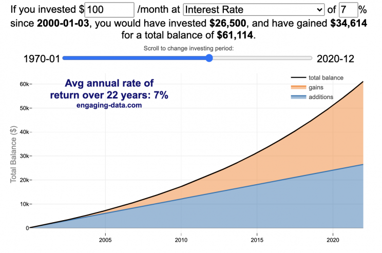
Calculate returns on regular, periodic investments
This calculator lets you visualize the value of investing regularly. It lets you calculate the compounding from a simple interest rate or looking at specific returns from the stock market indexes or a few different individual stocks.
Instructions
- Enter the amount of money to be invested monthly
- Choose to use an interest rate (and enter a specific rate) or
- Choose a stock market index or individual stock
- Use the slider to change the initial starting date of your periodic investments – You can go as far back as 1970 or the IPO date of the stock if it is later than that.
- Use the “Generate URL to Share” button to create a special URL with the specific parameters of your choice to share with others – the URL will appear in your browser’s address bar.
You can hover over the graph to see the split between the money you invested and the gains from the investment. In most cases (unless returns are very high), initially the investments are the large majority of the total balance, but over time the gains compound and eventually, it is those gains rather than the initial investments that become the majority of the total.
Some of the tech stocks included in the dropdown list have very high annualized returns and thus the gains quickly overtake the additions as the dominant component of the balance and you can make a great deal of money fairly quickly.
It becomes clearer as you move the slider around, that longer investing time periods are the key to increasing your balance, so building financial prosperity through investing is generally more of a marathon and not really a sprint. However, if you invest in individual stocks and pick a good one, you can speed up that process, though it’s not necessarily the most advisable way to proceed. Lots of people underperform the market (i.e. index funds) or even lose money by trying to pick big winners.
Understanding the Calculations
Calculating compound returns is relatively easy and is just a matter of consecutively multiplying the return. If the return is 7% for 5 years, that is equal to multiplying 1.07 five times, i.e. 1.075 = 1.402 (or a 40.2% gain).
In this case, we are adding additional investments each month but the idea is the same. Take the amount of money (or value of shares) and multiply by the return (>1 if positive or <1 for negative returns) after each period of the analysis.
Sources and Tools:
Stock and index monthly data is downloaded from Yahoo! finance is downloaded regularly using a python script.
The graph is created using the open-source Plotly javascript visualization library, as well as HTML, CSS and Javascript code to create interactivity and UI.

How much wealth do the world’s richest billionaires have?
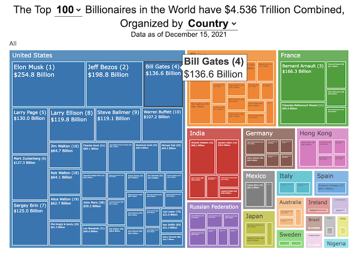
This dataviz compares how rich the world’s top billionaires are, showing their wealth as a treemap. The treemap is used to show the relative size of their wealth as boxes and is organized in order from largest to smallest.
User controls let you change the number of billionaires shown on the graph as well as group each person by their country or industry. If you group by country or industry, you can also click on a specific grouping to isolate that group and zoom in to see the contents more clearly. Hovering over each of the boxes (especially the smaller ones) will give you a popup that lets you see their name, ranking and net worth more clearly.
The popup shows how much total wealth the top billionaires control and for context compare it to the wealth of a certain number of households in the US. The comparison isn’t ideal as many of the billionaires are not from the US, but I think it still provides a useful point of comparison.
This visualization uses the same data that I needed in order to create my “How Rich is Elon Musk?” visualization. Since I had all this data, I figured I could crank out another related graph.
Sources and Tools:
Data from Bloomberg’s Billionaire’s index is downloaded regularly using a python script. Data on US household net worth is from DQYDJ’s net worth percentile calculator.
The treemap is created using the open-source Plotly javascript visualization library, as well as HTML, CSS and Javascript code to create interactivity and UI.

How Rich is Elon Musk? – Visualization of Extreme Wealth
See related visualization: How much wealth do the world’s richest billionaires have?
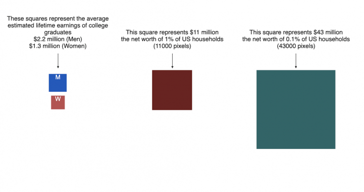
This visualization attempts to represent how much money Elon Musk, the richest person in the world, has. It gives context on this extreme amount of wealth by showing other very large sums of money that are somehow less than his net worth.
Each pixel on the screen represents a very modest amount of money (from
This visualization was inspired heavily by a similar visualization made by Matt Korostoff for Jeff Bezos (when he was the richest person in the world) called “Wealth shown to scale”.
If you have any ideas about other items that could be added to the money chart, please leave them in the comments, and I will see if I can add it.
Mega-billionaires such as Musk or Jeff Bezos are not just extremely rich, the wealth they possess is unimaginably large. There are some extremely rich folks shown in the visualization who can buy pretty much whatever they could ever possibly need and yet their wealth is closer to that of the average person than they are to that of Elon Musk.
Sources and Tools:
The full list of data sources for the various money amounts are listed below. The visualization was made using HTML, CSS and Javascript code to create interactivity and UI. Data from Bloomberg’s Billionaire’s index , which is the source of Musk’s (and others) estimated wealth, is updated regularly.
Full List of Data Sources:
- Cost of a supertanker’s worth of oil (at $70/barrel): https://en.wikipedia.org/wiki/Oil_tanker
- Cost of a Boeing 777-200ER Airplane: https://en.wikipedia.org/wiki/Boeing_777
- Lebron James and Cristiano Ronaldo Net Worth: https://wealthygorilla.com/top-20-richest-athletes-world/
- Tiger Woods Net Worth: https://wealthygorilla.com/top-20-richest-athletes-world/
- It’s alot of money, but we’ve still got a long way to go:
- Cost of building the Burj Khalifa (world’s tallest building in Dubai): https://en.wikipedia.org/wiki/Burj_Khalifa
- Total Ad Revenue for CNN, Fox News and MSNBC: https://www.pewresearch.org/journalism/fact-sheet/cable-news/
- Ophrah Winfrey Net Worth: https://www.celebritynetworth.com/richest-celebrities/actors/oprah-net-worth/
- Tuition for all 280,000 University of California Students: https://www.ucop.edu/operating-budget/_files/rbudget/2021-22-budget-detail.pdf
- One 40-Foot Shipping Container Full of $100 Bills: self-calculation
- Net Worth of Bottom 33% of Americans: https://dqydj.com/average-median-top-net-worth-percentiles/
- George Lucas Net Worth: https://www.bloomberg.com/billionaires/
- Cost of 2020 Tokyo Olympics: https://www.usnews.com/news/business/articles/2021-08-06/tokyo-olympics-cost-154-billion-what-else-could-that-buy
- Annual Budget of the US Department of Energy: https://en.wikipedia.org/wiki/United_States_Department_of_Energy
- Worldwide Box Office Revenue for Marvel Cinematic Universe (2008-2021): https://www.the-numbers.com/movies/franchise/Marvel-Cinematic-Universe#tab=summary
- Total Amount Spent of Gasoline in the State of Texas in one year: https://www.eia.gov/state/seds/data.php?incfile=/state/seds/sep_fuel/html/fuel_mg.html&sid=US
- Size of Harvard University’s Endowment: https://www.thecrimson.com/article/2021/10/15/endowment-returns-soar-2021/
- Annual Budget of the US Department of Transportation: https://en.wikipedia.org/wiki/United_States_Department_of_Transportation
- Total Gross State Product of Hawaii in 2021: https://en.wikipedia.org/wiki/List_of_states_and_territories_of_the_United_States_by_GDP
- Warren Buffet Net Worth: https://www.bloomberg.com/billionaires/
- State of Texas Operating Budget: https://en.wikipedia.org/wiki/List_of_U.S._state_budgets
- Total Value of all National Football League (NFL) Teams: https://www.profootballnetwork.com/nfl-franchise-values/
- Total Annual Income of 2 Million Residents of Silicon Valley (San Jose-Sunnyvale-Santa Clara CA Metro Area): https://censusreporter.org/profiles/31000US41940-san-jose-sunnyvale-santa-clara-ca-metro-area/
- Total Dollar Value of All US Agricultural Production: https://www.ers.usda.gov/data-products/ag-and-food-statistics-charting-the-essentials/ag-and-food-sectors-and-the-economy/
- Bill Gates Net Worth: https://www.bloomberg.com/billionaires/
- Total Tesla Revenue Since Founding (2008-2021): https://www.statista.com/statistics/272120/revenue-of-tesla/
- Annual Advertising Revenue for Google: https://www.cnbc.com/2021/05/18/how-does-google-make-money-advertising-business-breakdown-.html
- Total Amount Spent on US Residential Electricity In A Year: https://www.eia.gov/state/seds/data.php?incfile=/state/seds/sep_fuel/html/fuel_pr_es.html&sid=US
- Jeff Bezos Net Worth: https://www.bloomberg.com/billionaires/
- Annual Federal Taxes paid in Florida: https://en.wikipedia.org/wiki/Federal_tax_revenue_by_state
- Global Electric Vehicle Market Size in 2020: https://www.globenewswire.com/en/news-release/2021/09/06/2291730/0/en/Electric-Vehicle-Market-Size-Is-Anticipated-to-Grow-USD-1-318-22-Billion-in-2028-at-a-CAGR-of-24-3.html
- Value (i.e. Market Capitalization) of Walt Disney Company: https://www.google.com/finance/quote/DIS:NYSE
- Annual Revenue of Toyota Motor Corporation: https://money.cnn.com/quote/financials/financials.html?symb=TM
- Annual Health Care Expenditures for the entire State of California: https://www.kff.org/other/state-indicator/health-care-expenditures-by-state-of-residence-in-millions/?currentTimeframe=0&sortModel=%7B%22colId%22:%22Location%22,%22sort%22:%22asc%22%7D
- Total Annual Income for 100,000 Average US Households: https://www.census.gov/library/publications/2021/demo/p60-273.html
- Cost of one Gerald Ford Class Aircraft Carrier: https://en.wikipedia.org/wiki/Gerald_R._Ford-class_aircraft_carrier
- Cost to Build California High Speed Rail System: https://en.wikipedia.org/wiki/California_High-Speed_Rail
- Inflation Adjusted Cost of NASA’s Apollo Program: https://www.forbes.com/sites/alexknapp/2019/07/20/apollo-11-facts-figures-business/
- Total Annual Housing and Utilities Expenditures For All 6.6 Million Households in Los Angeles Metro Area: https://www.bls.gov/cex/tables/geographic/mean/cu-msa-west-2-year-average-2020.pdf
- Annual Amount Spent on the Purchase of iPhones: https://www.businessofapps.com/data/apple-statistics/
- Elon Musk Net Worth: https://www.bloomberg.com/billionaires/

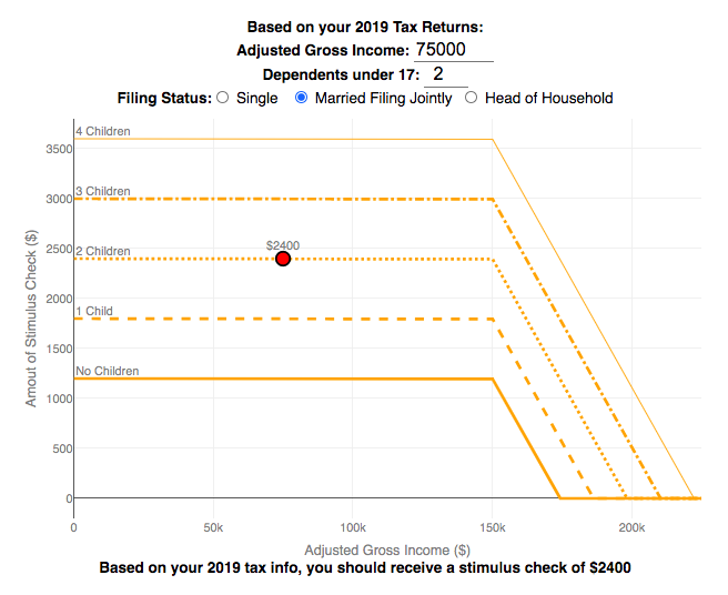
Stimulus Check Calculator (Late 2020 & Early 2021)

How much money can you expect in your stimulus check?
Updated to include the $1400 stimulus payment per adult and dependent in March 2021.
Use this stimulus check calculator to figure out how much you will receive in your thrid stimulus check.
On December 21, 2020, Congress passed a $900 billion dollar stimulus package in response to the COVID pandemic. The bill authorizes economic assistance to Americans in the amount of $600 per person subject to income limits. It also includes expanded unemployment benefits, rental assistance and an extension to the eviction ban. This calculator helps you calculate the amount of stimulus check that you can expect to receive based on your 2019 tax return filing status, adjusted gross income and number of dependents under 17.
Changing the inputs to the calculator, will show you how your expected stimulus check amount will change. The graph shows for a giving filing status (single, married filing jointly or head of household) how the stimulus check amount will change as a function of income and number of children. You can share a URL with specific parameters included
Sounds like some checks may even get to folks at the end of December and many more will get them in January 2021.
On March 5, congress passed the American Rescue Plan which includes $1400 payments for all Americans. The phase out of this stimulus check is different in that over a $10000 range the stimulus goes from 100% to 0% at the phase out threshold, no matter how many dependents you have. This changes things significantly as you’ll see in the calculator.
Sources and Tools:
The stimulus check calculator is made using javascript and the plotly open source graphing library. It is based on news reports of the expected stimulus amounts and income thresholds.
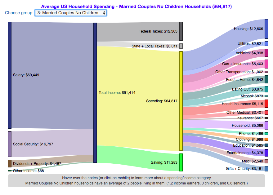
How do Americans Spend Money? US Household Spending Breakdown by Household Composition

How much do US households spend and how does it change with household composition?
This visualization is one of a series of visualizations that present US household spending data from the US Bureau of Labor Statistics. This one looks at the marital status and presence of children in the household.
- US Household spending by income group
- US Household spending by age of primary resident
- US Household spending by education level
- US Household spending by household composition (marital and children status)
This visualization focuses on how spending varies with the household composition (marital status and presence of children).
I obtained data from the US Bureau of Labor Statistics (BLS), based upon a survey of consumer households and their spending habits. This data breaks down spending and income into many categories that are aggregated and plotted in a Sankey graph.
One of the key factors in financial health of an individual or household is making sure that household spending is equal to or below household income. If your spending is higher than income, you will be drawing down your savings (if you have any) or borrowing money. If your spending is lower than your income, you will presumably be saving money which can provide flexibility in the future, fund your retirement (maybe even early) and generally give you peace of mind.
Instructions:
- Hover (or on mobile click) on a link to get more information on the definition of a particular spending or income category.
- Use the dropdown menu to look at averages for different groups of households based on the education level of the primary resident. This data breaks households into the following groups:
- All
- Single person households (and other households) – Unfortunately BLS lumps single households with other categories that don’t fit into the remaining three categories (i.e. non-married couple households).
- Single parent households
- Married couples with no children
- Married couples with children
The composition of households and income change as the marital status of and presence of children in the household changes, which in turn affects spending totals and individual categories.
As stated before, one of the keys to financial security is spending less than your income. We can see that on average, income tends to increase the larger the number of children and adults in the household. Married couples with children have the highest incomes and greatest spending, but they also save the most money.
Households with a single occupant (and also single parent households) have lower incomes than married couples and on average need to borrow or draw down on savings to live their lifestyle.
How does your overall spending compare with those that have the same household composition as you? How about spending in individual categories like housing, vehicles, food, clothing, etc…?
Probably one of the best things you can do from a financial perspective is to go through your spending and understand where your money is going. These sankey diagrams are one way to do it and see it visually, but of course, you can also make a table or pie chart (Honestly, whatever gets you to look at your income and expenses is a good thing).
The main thing is to understand where your money is going. Once you’ve done this you can be more conscious of what you are spending your money on, and then decide if you are spending too much (or too little) in certain categories. Having context of what other people spend money on is helpful as well, and why it is useful to compare to these averages, even though the income level, regional cost of living, and household composition won’t look exactly the same as your household.
**Click Here to view other financial-related tools and data visualizations from engaging-data**
Here is more information about the Consumer Expenditure Surveys from the BLS website:
The Consumer Expenditure Surveys (CE) collect information from the US households and families on their spending habits (expenditures), income, and household characteristics. The strength of the surveys is that it allows data users to relate the expenditures and income of consumers to the characteristics of those consumers. The surveys consist of two components, a quarterly Interview Survey and a weekly Diary Survey, each with its own questionnaire and sample.
Data and Tools:
Data on 2017 consumer spending was obtained from the BLS Consumer Expenditure Surveys, and aggregation and calculations were done using javascript and code modified from the Sankeymatic plotting website. I aggregated many of the survey output categories so as to make the graph legible, otherwise there’d be 4x as many spending categories and all very small and difficult to read.
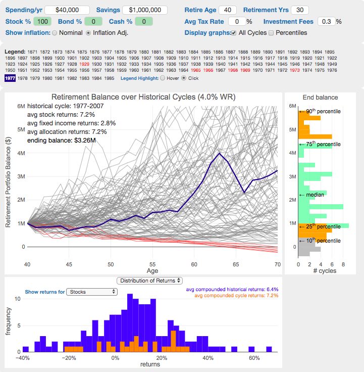
The 4% Rule, Trinity Study and Safe Withdrawal Rates Calculator

This 4% rule early retirement calculator is designed to help you learn about safe withdrawal rates for early retirement withdrawals and the 4% rule. Use it with your own numbers to determine how much money you can withdraw in retirement and how long your money will last.
UPDATE: April 2020: I’ve updated the market data to include annual data up to and including 2019.
I also fixed a small bug which affected real stock market returns so you may see a very slight reduction in average returns and success rates.
Instructions for using the calculator:
This calculator is designed to let you learn as you play with it. Tweaking inputs and assumptions and hovering and clicking on results will help you to really gain a feel for how withdrawal rates and market returns affect your chance of retirement success (i.e. making it through without running out of money).
Inputs You Can Adjust:
- Spending and initial balance – This will affect your withdrawal rate. The withdrawal rate is really the only thing that is important (doubling spending and retirement savings will still yield the same success rate).
- Asset allocation – Raise or lower your risk tolerance by holding more or less stock vs bonds
- Adjust retirement length – This affects the number of historical cycles that are used in the simulation, but also increases risk of failure.
- Add tax rates and investment fees – these will put a drag (i.e. lower) market returns and lower success rates
Options for Visualization:
- Display all cycles – this is the mess of spaghetti like curves that show all historical cycle simulations
- Display percentiles – this aggregates the simulations into percentiles to show most likely outcomes
- Hover/Click on legend years – this will allow you to highlight a single historical cycle (you can also use the arrow keys to step through historical cycles)
- Bottom graph can show either the sequence of returns (with average returns in 5 year periods) for a single historical cycle or distributions of returns in our historical data (1871 to 2016) and a single historical cycle. You can choose to look at returns for stocks, bonds or your specific asset allocation.
- The graph on the right shows a histogram of the ending balance of each historical cycle and color codes them to show percentiles.
What is the 4% Rule?
The 4% rule is a “rule of thumb” relating to safe retirement withdrawals. It states that if 4% of your retirement savings can cover one years worth of retirement spending (an alternative way to phrase it is if you have saved up 25 times your annual retirement spending), you have a high likelihood of having enough money to last a 30+ year retirement. A key point is that the probabilities shown here are just historical frequencies and not a guarantee of the future. However, if your plan has a high success rate (95+%) in these simulations, this implies that retirement plan should be okay unless future returns are on par with some of the worst in history.
The overall goal of this rule and analysis is identifying a “safe withdrawal rate” or SWR for retirement. A withdrawal rate is the percentage of your money that you withdraw from your retirement savings each year. If you’ve saved up $1 million and withdraw $100,000 each year, that is a 10% withdrawal rate.
The “safe” part of the withdrawal rate relates to the fact that if your investments generally grow by more than your annual spending, then your retirement savings should last over the length of your retirement. But average returns do not tell the whole story as the sequence of returns also plays a very important role, as will be discussed later.
One way to test this is through a backtesting simulation which forms the basis for the “Trinity Study”.
What is the Trinity Study?
The “Trinity Study” is a paper and analysis of this topic entitled “Retirement Spending: Choosing a Sustainable Withdrawal Rate,” by Philip L. Cooley, Carl M. Hubbard, and Daniel T. Walz, three professors at Trinity University. This study is a backtesting simulation that uses historical data to see if a retirement plan (i.e. a withdrawal rate) would have survived under past economic conditions. The approach is to take a “historical cycle”, i.e. a series of years from the past and test your retirement plan and see if it runs out of money (“fails”) or not (“survives”).
How do you test withdrawal rate?
Given modern equity and bond market data only stretches back about 150 years, there is some, but not a huge amount of data to use in this simulation. One example of a 30 year historical cycle would be 1900 to 1930, and another is 1970 to 2000. The Trinity study and this calculator tests withdrawal rates against all historical periods from 1871 until the present (e.g. 1871 to 1901, 1872 to 1902, 1873 to 1903, . . . . 1986 to 2016). Then across this 115 different historical cycles, it determines how many of these survived and how many failed.
The thinking is that if your retirement plan can survive periods that include recessions, depressions, world wars, and periods of high inflation, then perhaps it can survive the next 30-50 years.
The 4% rule that comes out of these studies basically states that a 4% withdrawal rate (e.g. $40,000 annual spending on a $1,000,000 retirement portfolio) will survive the vast majority of historical cycles (~96%). If you raise your withdrawal rate, the rate of failure increases, while if you lower your withdrawal rate, your rate of failure decreases.
The goal of this tool is to help you understand the mechanics of the a historical cycle simulation like was used in the Trinity Study and how the 4% rule came to be. This understanding can help you better plan for retirement with the uncertainty that goes along with planning 30+ years into the future. If you want to also see how longevity and life expectancy play a role in retirement planning, you can take a look at the Rich, Broke and Dead calculator.
This post and tool is a work in progress. I have a number of ideas that I will implement and add to it to help improve the visualization and clarity of these concepts.
If 4% is a conservative rate, what is the maximum withdrawal rate?
The future is unlikely to be identical to any of the set of historical cycles that are used in this simulation. And yet, there are enough years of data that there are a fairly large set of possible outcomes from running a simulation with this input data. One way to understand this variation is to see in the main graph above that the ending balance can potentially vary by more than $5 million dollars on an inflation adjusted basis on a starting balance of $1 million.
Another way to see this same variation in market returns is by looking at maximum withdrawal rate. This is the highest amount that you could withdraw annually over your retirement and (just barely) not run out of money by the end of your retirement.
This graph shows the maximum withdrawal rate for a given historical cycle (i.e. 1871 to 1901). For example, in the 1871 to 1901 30 year historical cycle, you could have used an 8.8% withdrawal rate (inflation adjusted $80,000 withdrawal annually on a $1 million initial investment balance) and not run out of money. This is because the sequence of market (stock and bond) returns in this historical cycle were able to (barely) outpace the rate of withdrawals at the end of the 30 year retirement period. Many other cycles show lower successful withdrawal rates, because those cycles had poorer sequences of returns, while some had higher maximum withdrawal rates.
The graph also highlights those cycles that show a maximum withdrawal rate below 4% in red, while all others are shown in green. Most of these withdrawal rates are well over 4%, with some quite a bit higher. This again shows that if the future is somewhat like one of these historical cycles, most likely a 4% withdrawal rate will be enough for you to retire without running out of money and that it is likely that you could end up with more money than you started.
Data source and Tools Historical Stock/Bond and Inflation data comes from Prof. Robert Shiller. Javascript is used to create the interactive calculator tool and the create the code in the simulations to test each historical cycle and aggregate the results, and graphed using Plot.ly open-source, javascript graphing library.
Recent Comments